Dashboard - navigation and column optimizations

I am less than a month into Home Assistant and loving it. My questions are related to optimizing navigation of my dashboards. As can be seen from the snapshot below, I added all the rooms (or groups) I have a dashboard for in a column on the left and the same list is replicated on the top using icons. The icons up top are to make it easier to change rooms on a mobile phone. The dashboard uses 3 grid cards to split the dashboard in 3 columns so as to make it compatible with mobiles phones. Each child dashboard has a banner on the top that takes you back to the main dashboard when clicked. This gives me a rudimentary navigation scheme that doesn’t require swiping through all the views or remembering the less-than-obvious icons up top.

Question 1:

Is it possible to create a drop down with all dashboards listed (yes, I figured this part out) and to navigate to that view by selecting it? The goal is to be able to pick the desired dashboard from any other dashboard.

Question 2:

On my Samsung S20 Ultra, some room names wrap causing the button to expand. Is it possible to pick the desired width of the column (column 1 of 3 in the grid card I use for the layout) without over the top customizations (trying to keep it as simple and default as possible to avoid extra trouble when/if something breaks) of the dashboard? I would like to make column 1 a tiny bit wider so all labels don’t wrap, and use the remaining just-less-than 2 columns for the door and lock (see next question)

Question 3:

I would like to do what a Glance card does for the door and lock icons. The goal is to put the door name in the title, and have the two large icons in a single card. The door icon reflects open/closed while a long press on the lock will lock/unlock. By making it a single card, and adding the title, I can get rid of the entity names as well. This will reduce the required space making room for a wider column 1 (see question 2). I can’t figure out how to have this card span 2 columns, and when I manage to get the 2 entities in the same card, the icons are tiny.

Question 4 (unrelated to navigation):

Ecobee confirmed that they round to the nearest 0.5C when displaying temperatures on their app or thermostat. While that explains the unusual rounding of the readings I see on Home Assistant, it does not explain why my setpoint have the same issue as well. The setpoints are 23.5 and 24, but HA shows 23.3 and 23.9.

I live in the USA but am European so I keep everything set to Celsius. I wonder whether there are any unnecessary conversions happening in the background…

Ecobee also stated that they drop decimals when dealing with F. Assuming their base unit of measure is C (they are in Canada), maybe my setpoints are getting the following treatment:

(HA showing 23.3 as shown below)
23.5 degree Celsius = 74.3 degree Fahrenheit
74 degree Fahrenheit = 23.3333333 degree Celsius

(HA showing 23.9 - not captured in screenshot below)
24 degree Celsius = 75.2 degree Fahrenheit
75 degree Fahrenheit = 23.8888889 degree Celsius

Long shot… but I thought the coincidence was interesting.

Question 5:

I am using custom:button-card to display the water leak alert with changing colors and motion. While that part works, the lower than the rest “Water Leak” label is annoying the OCD in me. Any suggestion on what is causing it?

Apologies for all these questions in the same post… Hope it is not bad form.

Re #1:

Yes. Have a look at Collapsable Card, State Switch Card or - if you want to stay as much default as possible - diy by using an input boolean as trigger and a conditional card which is only shown when the input boolean is hit.

Re #2:

Is it all custom:button-card inside? If yes, give the cbc a width. I can also recommend to get in touch with CSS viewpoints.

Re #3:

Difficult to answer without posting your code.

Re #4:

Have you defined presicion?

Re #5:

It’s caused by the architecture of cbc. Give the na/label a margin-bottom:
(or again: Post your code).

@pedolsky Thanks for the tips. I’ve been working on them, but tot avoid responding too late, I wanted to provide an update of where I got with your suggestions.

Re #1

Below is my code for the Collapsable Card approach. If in column one I can put a direct link to home (1 click) and in column 2 and 3 I can span this card, then I would have a perfect solution. However, there is one big issue… Hopefully I will use the correct terms to describe it… I currently have 2 dashboards (Overview and Admin) accessible from the sidebar. If I flip between dashboards, the collapsable card is collapsed when I navigate back to the view that has it. In other words, if I am in the Office view under Overview dashboard, and got to a Settings view in the Admin Dashboard, then go back to the Office view, the card will be closed (as desired). However, if I use the collapsable card to navigate to the Kitchen view which is also under the Overview dashboard, when I go back, the collapsable card is still open (undesired).

There is a default option of defaultOpen which is false by default (as desired). Adding it made no difference.

Am I missing something?

The other solution you proposed is a bit harder to implement and I have not had time yet to dedicate to it.

type: custom:collapsable-cards
title: Dashboards
cards:
  - type: button
    tap_action:
      action: navigate
      navigation_path: /lovelace/home
    name: Home
    show_icon: false
  - type: button
    tap_action:
      action: navigate
      navigation_path: /lovelace/entrance
    name: Entrance
    show_icon: false
  - type: button
    tap_action:
      action: navigate
      navigation_path: /lovelace/kitchen
    name: Kitchen
    show_icon: false
  - type: button
    tap_action:
      action: navigate
      navigation_path: /lovelace/living-room
    name: Living Room
    show_icon: false
  - type: button
    tap_action:
      action: navigate
      navigation_path: /lovelace/master-suite
    show_icon: false
    name: Master Suite
  - type: button
    tap_action:
      action: navigate
      navigation_path: /lovelace/study
    name: Study
    show_icon: false
  - type: button
    tap_action:
      action: navigate
      navigation_path: /lovelace/utility-room
    name: Utility Room
    show_icon: false
  - type: button
    tap_action:
      action: navigate
      navigation_path: /lovelace/game-room
    show_icon: false
    name: Game Room
  - type: button
    tap_action:
      action: navigate
      navigation_path: /lovelace/upstairs-bathroom
    name: Upstairs Bathroom
  - type: button
    tap_action:
      action: navigate
      navigation_path: /lovelace/office
    show_icon: false
    name: Office
  - type: button
    tap_action:
      action: navigate
      navigation_path: /lovelace/kids-bedroom
    show_icon: false
    name: Kids Bedroom
  - type: button
    tap_action:
      action: navigate
      navigation_path: /lovelace/media-room
    show_icon: false
    name: Media Room
  - type: button
    tap_action:
      action: navigate
      navigation_path: /lovelace/guest-bedroom
    show_icon: false
    name: Guest Bedroom
  - type: button
    tap_action:
      action: navigate
      navigation_path: /lovelace/garage
    show_icon: false
    name: Garage
  - type: button
    tap_action:
      action: navigate
      navigation_path: /lovelace/outdoors
    name: Outdoors
    show_icon: false
  - type: button
    tap_action:
      action: navigate
      navigation_path: /lovelace/safety
    name: Safety
    show_icon: false
    show_header_toggle: false

Re #2

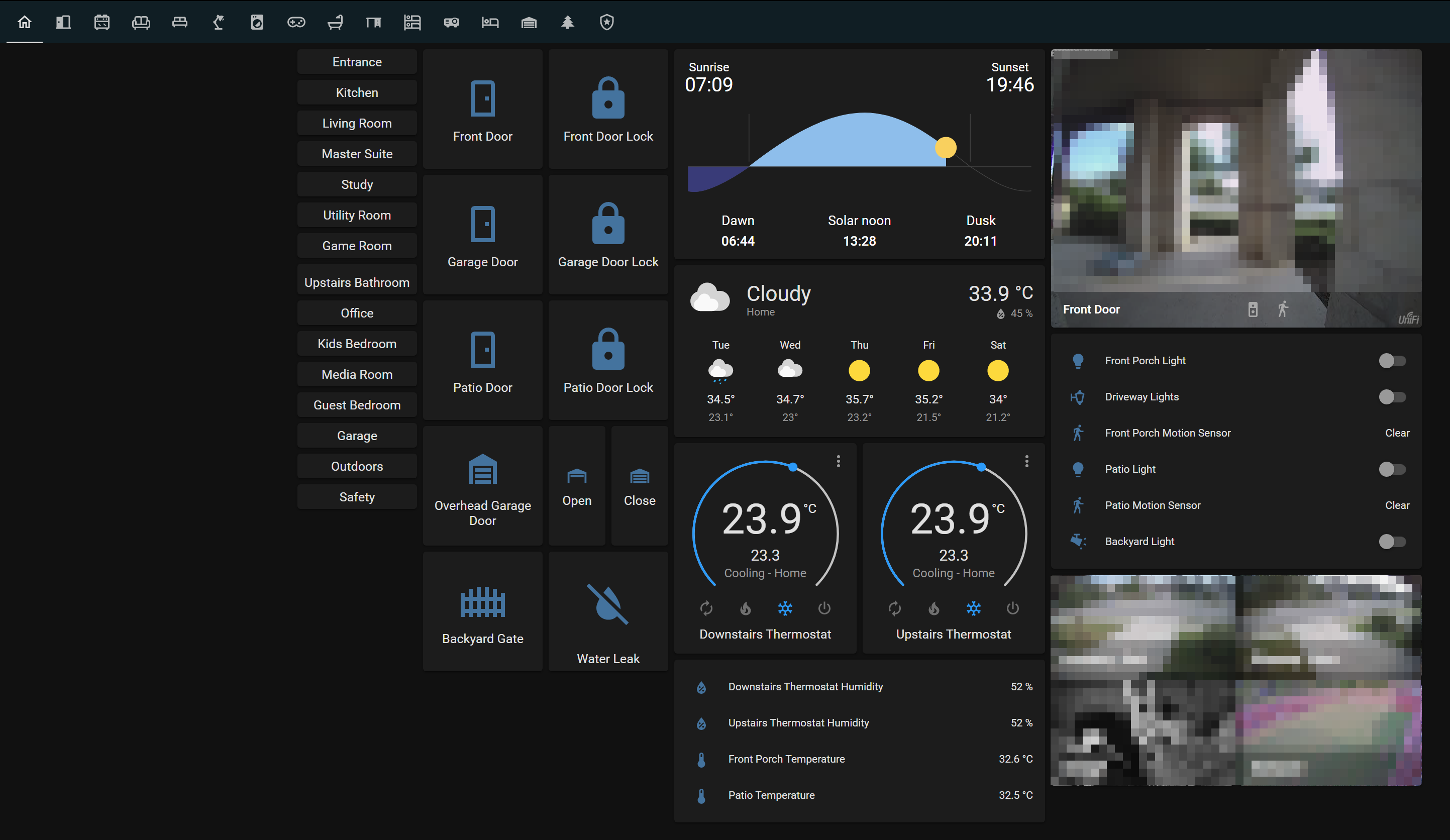
The view is divided into 3 wide columns that are 3 columns wide each but set as 1 column (done via grid card). (Is this the proper terminology? if so, confusing…) Not sure why I started doing it like that, but I had read it was a more flexible way of doing it. Other than this current issue, it is working for me.

Inside the grid card, I use another nested grid card when I want to place 2 or 3 cards.

I would like to control the width of column 1 which has my navigation menu so as to stop text from wrapping. I too wondered about using CSS but am a bit afraid of causing a mess… but I will look into it.

Re #3

I then also want to merge the 2 cards in columns 2 and 3 into a single one to reduce the space they require and to make it even more obvious that the door contact and lock belong to the same door. I would add a title, and remove the entity names. The icons, and possible state labels will show the state.

This is the closest I got, but I had to set the column width to 2:

What I am hoping for is more like this but to fit in just under 2 columns (in the snapshot it is using all 3):

Just in case it helps for the questions above, this is the code I am currently using for the view column that has the 3 column’d grid card with menue and door contacts and locks:

type: grid
cards:
  - type: grid
    cards:
      - type: button
        tap_action:
          action: navigate
          navigation_path: /lovelace/entrance
        name: Entrance
        show_icon: false
      - type: button
        tap_action:
          action: navigate
          navigation_path: /lovelace/kitchen
        name: Kitchen
        show_icon: false
      - type: button
        tap_action:
          action: navigate
          navigation_path: /lovelace/living-room
        name: Living Room
        show_icon: false
      - type: button
        tap_action:
          action: navigate
          navigation_path: /lovelace/master-suite
        show_icon: false
        name: Master Suite
      - type: button
        tap_action:
          action: navigate
          navigation_path: /lovelace/study
        name: Study
        show_icon: false
      - type: button
        tap_action:
          action: navigate
          navigation_path: /lovelace/utility-room
        name: Utility Room
        show_icon: false
      - type: button
        tap_action:
          action: navigate
          navigation_path: /lovelace/game-room
        show_icon: false
        name: Game Room
      - type: button
        tap_action:
          action: navigate
          navigation_path: /lovelace/upstairs-bathroom
        name: Upstairs Bathroom
      - type: button
        tap_action:
          action: navigate
          navigation_path: /lovelace/office
        show_icon: false
        name: Office
      - type: button
        tap_action:
          action: navigate
          navigation_path: /lovelace/kids-bedroom
        show_icon: false
        name: Kids Bedroom
      - type: button
        tap_action:
          action: navigate
          navigation_path: /lovelace/media-room
        show_icon: false
        name: Media Room
      - type: button
        tap_action:
          action: navigate
          navigation_path: /lovelace/guest-bedroom
        show_icon: false
        name: Guest Bedroom
      - type: button
        tap_action:
          action: navigate
          navigation_path: /lovelace/garage
        show_icon: false
        name: Garage
      - type: button
        tap_action:
          action: navigate
          navigation_path: /lovelace/outdoors
        name: Outdoors
        show_icon: false
      - type: button
        tap_action:
          action: navigate
          navigation_path: /lovelace/safety
        name: Safety
        show_icon: false
    columns: 1
    square: false
  - type: grid
    cards:
      - type: button
        tap_action:
          action: more-info
        entity: binary_sensor.front_door
        show_state: false
        icon: hass:door
      - type: button
        tap_action:
          action: more-info
        entity: binary_sensor.garage_door
        icon: hass:door
        show_state: false
      - type: button
        tap_action:
          action: more-info
        entity: binary_sensor.patio_door
        icon: hass:door
        show_state: false
      - type: button
        tap_action:
          action: more-info
        entity: cover.overhead_garage_door
        show_state: false
      - type: button
        entity: binary_sensor.backyard_gate
        icon: hass:gate
        show_state: false
    columns: 1
  - type: grid
    cards:
      - type: button
        tap_action:
          action: more-info
        entity: lock.front_door_lock
        show_state: false
        hold_action:
          action: toggle
      - type: button
        tap_action:
          action: more-info
        entity: lock.garage_door_lock
        show_state: false
        hold_action:
          action: toggle
      - type: button
        tap_action:
          action: more-info
        entity: lock.patio_door_lock
        show_state: false
        hold_action:
          action: toggle
      - type: horizontal-stack
        cards:
          - type: button
            tap_action:
              action: more-info
            entity: cover.overhead_garage_door
            name: Open
            icon: hass:garage-open-variant
            show_state: false
            hold_action:
              action: call-service
              service: cover.open_cover
              service_data: {}
              target:
                device_id: <redacted>
          - type: button
            tap_action:
              action: more-info
            entity: cover.overhead_garage_door
            name: Close
            icon: hass:garage-variant
            hold_action:
              action: call-service
              service: cover.close_cover
              service_data: {}
              target:
                device_id: <redacted>
      - type: custom:button-card
        show_entity_picture: true
        aspect_ratio: 1/1
        state:
          - value: 'on'
            color: red
            icon: hass:water
            styles:
              icon:
                - animation:
                    - blink 2s linear infinite
          - value: 'off'
            icon: hass:water-off
        tap_action:
          action: navigate
          navigation_path: /lovelace/safety
        entity: input_boolean.water_leak_alarm
        name: Water Leak
    columns: 1
    square: true
columns: 3
square: false

Re #4:

presicion seems to be what I need however I am using the ecobee integration so I can’t find where to add that control. I’ll keep looking…

Re #5:

Code posted above. Sounds like I really need to jump in with CSS :slight_smile: - Should I install the frontend card that add the ability to tweak everything with CSS or is this something that is native?

I REALLY appreciate your time and shared knowledge!

I’m afraid that the collapsable card isn’t able to do that. But feel free to ask the owner on github or publish a feature request.

What about using custom:button-card for your doors? You could merge the icon and the closed state together. For my covers I did it in a similiar way:

Bild

There are several ways to use the whole space, the easiest would be to test the built-in panel view.

1 Like

Now I had a bit more time to play:

1 Like

hello can you share your card for shutter? thank you @pedolsky

Sure. Love and credits go to tben an his awesome Lovelace UI Minimalist. I adjusted his template to my needs, so here’s my template:


#rollo:

variables:   ## Variables for the „lock“ function
  gesperrt: |
    [[[
      if (entity.entity_id == 'cover.tradfri_blind') return 'binary_sensor.schlafzfenster';
      if (entity.entity_id == 'cover.tradfri_blind2') return 'binary_sensor.wohnzfenster';
      return 'binary_sensor.kuechenfenster';
    ]]]

#type: custom:button-card
show_name: false
show_icon: false
show_state: false
show_label: false

styles:
  card:
    - border-radius: 5px
    - padding: 10px 10px 0px
  grid:
    - grid-template-areas: '"item1" "item2"'
    - grid-template-columns: 1fr
    - grid-template-rows: min-content  min-content
    - row-gap: 10px

custom_fields:
  item1:
    card:
      type: custom:button-card
      entity: '[[[ return entity.entity_id ]]]'
      name: '[[[ return entity.name ]]]'
      tap_action:
        action: more-info
    #  template:
    #    - icon_info
    #    - cover

    # icon_info, cover:
      show_icon: true
      show_name: true
      show_state: false # true
      show_label: true
      size: 20px
      icon: |
        [[[
          if (entity.attributes.current_position <= 20)
            return 'mdi:window-shutter';
          return 'mdi:window-shutter-open';
         ]]]

      label: |
        [[[ 
          if (entity.state == 'opening') return 'wird geöffnet…';
          if (entity.state == 'closing') return 'wird geschlossen…';
          if (entity.attributes.current_position == 100) return 'vollständig geöffnet';
          if (entity.attributes.current_position == 0) return 'vollständig geschlossen';
          if (entity.attributes.current_position <= 20) return 'geschlossen';
          else return entity.attributes.current_position + '% geöffnet';
        ]]]

      styles:
        card:
          - border-radius: 21px 8px 8px 21px 
          - box-shadow: none
          - padding: 0px
        grid:
          - grid-template-areas: '"i n" "i l"'
          - grid-template-columns: min-content auto
          - grid-template-rows: min-content min-content
        img_cell:
          - border-radius: 50%
          - place-self: center
          - width: 42px
          - height: 42px
          - border: 1px solid 
        name:
          - align-self: end
          - justify-self: start
          - font-weight: 500
          - font-size: 13px
          - margin-left: 12px
        label:
          - justify-self: start
          - align-self: start
          - font-weight: 450
          - font-size: 12px
          - filter: opacity(70%)
          - margin-left: 12px
        state:
          - justify-self: start
          - align-self: start
          - font-weight: 450
          - font-size: 12px
          - filter: opacity(70%)
          - margin-left: 12px


#### BUTTONS

  item2:
    card:
      type: custom:button-card
      # list_items:
      styles:
        card:
          - box-shadow: none
          - padding: 10px
        grid:
          - grid-template-areas: '"item1 item2 item3 item4"'
          - grid-template-columns: 1fr 1fr 1fr 1fr
          - grid-template-rows: min-content
        #  - column-gap: 7px
          - justify-items: center
          - justify-content: space-between

      custom_fields:

#### 1. ROLLO SCHLIEĂźEN    ## close cover
        item1:
          card:
            type: custom:button-card
            icon: mdi:arrow-down
            tap_action:
              action: |     ## don't allow button function if window is opened
                [[[
                  if (states[variables.gesperrt].state == 'on') return 'none'; 
                  return 'call-service'
                ]]]
              confirmation:
                text: |
                  [[[
                    if (states[variables.gesperrt].state == 'on') 
                      return 'Rollo kann nicht bewegt werden, weil das Fenster geöffnet ist.'; 
                    return 'Rollo bewegen?'
                  ]]]
              service: cover.close_cover
              service_data:
                entity_id: '[[[ return entity.entity_id ]]]'
            # widget_icon:
            show_name: false
            show_icon: true
            size: 20px
            styles:
              card:
            #    - box-shadow: none
                - padding: 0px
                - border-radius: 50%
                - place-self: center
                - width: 42px
                - height: 42px
                - overflow: visible
              grid:
                - grid-template-areas: '"i"'
              custom_fields:
                sperre:
                  - position: absolute
                  - top: -10px
                  - left: 30px

            custom_fields:
              sperre: |     ## show lock icon if window is opened
                [[[
                  if (states[variables.gesperrt].state == 'on') 
                    return `<ha-icon icon='mdi:lock' style='width: 18px; height: 18px; color: red;'></ha-icon>`;
                  return ' '
                ]]]


#### 2. ROLLO STOPPEN     ## stop cover
        item2:
          card:
            type: custom:button-card
            icon: mdi:pause
            tap_action:
              action: call-service
              service: cover.stop_cover
              service_data:
                entity_id: '[[[ return entity.entity_id ]]]'
            # widget_icon:
            show_name: false
            show_icon: true
            size: 20px
            styles:
              card:
            #    - box-shadow: none
                - padding: 0px
                - border-radius: 50%
                - place-self: center
                - width: 42px
                - height: 42px
              grid:
                - grid-template-areas: '"i"'


#### 3. ROLLO Ă–FFNEN     ## open cover
        item3:
          card:
            type: custom:button-card
            icon: mdi:arrow-up
            tap_action:
              action: |
                [[[
                  if (states[variables.gesperrt].state == 'on') return 'none'; 
                  return 'call-service'
                ]]]
              confirmation:
                text: Rollo bewegen?
              service: cover.set_cover_position # cover.open_cover
              service_data:
                entity_id: '[[[ return entity.entity_id ]]]'
                position: 90
            # widget_icon:
            show_name: false
            show_icon: true
            size: 20px
            styles:
              card:
            #    - box-shadow: none
                - padding: 0px
                - border-radius: 50%
                - place-self: center
                - width: 42px
                - height: 42px
                - overflow: visible
              grid:
                - grid-template-areas: '"i"'
              custom_fields:
                sperre:
                  - position: absolute
                  - top: -10px
                  - left: 30px

            custom_fields:
              sperre: |
                [[[
                  if (states[variables.gesperrt].state == 'on') 
                    return `<ha-icon icon='mdi:lock' style='width: 18px; height: 18px; color: red;'></ha-icon>`;
                  return ' '
                ]]]


#### 4. ROLLO 50%
        item4:
          card:
            type: custom:button-card
            name: '50%'
        #    icon: mdi:percent-outline
            tap_action:
              action: |
                [[[
                  if (states[variables.gesperrt].state == 'on') return 'none'; 
                  return 'call-service'
                ]]]
              confirmation:
                text: Rollo bewegen?
              service: cover.set_cover_position
              service_data:
                entity_id: '[[[ return entity.entity_id ]]]'
                position: 50
            # widget_icon:
            show_name: true #false
            show_icon: false #true
        #    size: 20px  # Icon-Größe
            styles:
              card:
                - padding: 0px
                - border-radius: 50%
                - place-self: center
                - width: 42px
                - height: 42px
                - overflow: visible
              grid:
                - grid-template-areas: '"n"'
              name:
                - padding: 0.6rem
                - font-size: 12px
              custom_fields:
                sperre:
                  - position: absolute
                  - top: -10px
                  - left: 30px

            custom_fields:
              sperre: |
                [[[
                  if (states[variables.gesperrt].state == 'on') 
                    return `<ha-icon icon='mdi:lock' style='width: 18px; height: 18px; color: red;'></ha-icon>`;
                  return ' '
                ]]]


#### ENDE ####


This is the button for the frontend:


#### ROLLO
      - type: custom:button-card
        entity: cover.tradfri_blind
        template: rollos

1 Like