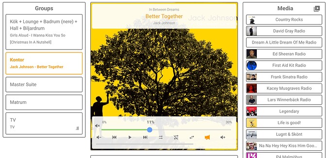
No not normal. Must be an unlucky coincidence
The following is now out of beta and released properly:
-
v5.9.0 Feature: Each section can now be added as its own card and selected in the UI.
-
singleSectionModeis now deprecated, since there are individual cards for every section. -
type custom:custom-sonos-cardis now deprecated,custom:sonos-cardshould be used instead.
-
- v5.10.0 Feature: Make it possible to style name and icon of member in the grouping section
- v5.11.0 Fix: Avoid requiring two clicks on back button in browser
@Sergeantpup @wmn79 @finity There is now a beta available for testing for track progress bar in the player:
v5.12.0-track-progress_beta
Please let me know if you see any issues!

Works good for me, thanks!
How do you turn on the progress bar? I tried attributes trackprogress: true and trackprogressbar: true
What is the secret attribute?
Just make sure you use the beta, then it’s shown by default. As long as it’s not radio you are playing.
OK, got it. I pretty much only stream music with my Sonos, finding my Squeezebox to be much better when I want to play DJ with my locally served music.
I got it to work and found some oddities. I posted my findings to your Github project in the issue thread I originally started.
It appears this might be more trouble to implement than it’s ultimately worth. But thank you for the effort, and thank you for the fantastic card.
No worries, it mostly makes sense for individual songs anyway, and many others have requested that, so it is not a wasted effort at all 
v5.14.0 released with the possibility to show media browser items as a list instead of icons.
I have been experimenting a bit with this new feature, but I can’t seem to get it to work. My dashboard:
  - theme: Backend-selected
    title: Radio
    path: test2
    type: custom:sonos-card
    mediaArtworkOverrides:
      - mediaTitleEquals: TV
        imageUrl: https://cdn-icons-png.flaticon.com/512/716/716429.png
    mediaBrowserItemsAsList: true
    skipAdditionalPlayerSwitches: true
    disableDynamicVolumeSlider: true
    noMediaText: No media selected
    icon: mdi:radio
    badges: []
    cards: []
Keeps showing:
sorry about that, I forgot to Mark it as non beta. Please update your card in hacs now to v5.14.0
Yes, thanks a lot. Was already running the beta btw, but now it works just fine. Thanks!
Probably a dumb question, but how do I make the cards (eg. media, groups etc) transparent, but the buttons a certain colour? At the moment I have added the below to my theme:
  sonos-ha-card-background-color: "rgba(0,0,0,0)"
  sonos-background-color: "none"
  sonos-border-width: "0rem"
  sonos-border-radius: "var(--border-radius-bar)"
Is there also a way to align the font on the buttons to the left?
Yea, you can change it all using CSS. Check the readme for ‘styles:’
Thanks heaps, worked it out! One hopefully final question, is there a way to remove the titles from each section independently. I have used the independent cards to get it looking like more of a Mushroom feel, want to remove the headings so I use my own ones instead.
That’s a nice looking dashboard! Care to share the raw yaml for it?
Maybe using gist or pastebin.
Then I can also see how you can remove the titles.
Would also appriciate the raw code for that. individual speaker adjustment ability is great
This is great! Well done!
styles:
    title:
      display: none
Worked perfectly, thanks!


