Sonos Card
Sonos Card for Home Assistant UI with a focus on managing multiple media players!
This card is nearly identical to the Maxi Media Player, but is optimized for Sonos players. It will, by default, automatically discover all Sonos players in your Home Assistant instance. It also includes some Sonos specific features like queue management and sleep timer.
Features:
- Group/Ungroup speakers
- Control multiple speakers
- Play favorites from list
- Favorites section
- Control individual volumes in a group
- Artwork background
- Possibility to override artwork
- Shuffle and repeat mode
- Theming
- Configurable styling
- Dynamic volume level slider
- Track progress bar
- Show, play and rearrange tracks in play queue (Sonos and Music Assistant)
- Set and clear sleep timer (Sonos)
- Search for music via Music Assistant
and more!


Support the project
Do you like the Sonos Card? Support the project with a coffee 
Installation
With HACS (recommended)
Recommended way of installing this card is with HACS Home Assistant Community Store.
Without HACS
- Download this file: custom-sonos-card.js
- Add this file into your /www folder
- On your dashboard click on the icon at the right top corner then on Edit dashboard
- Click again on that icon and then on Manage resources
- Click on Add resource
- Copy and paste this: /local/custom-sonos-card.js?v=1
- Click on JavaScript Module then Create
- Go back and refresh your page
- You can now click on Add card in the bottom right corner and search for Maxi Media Player
- After any update of the file you will have to edit /local/custom-sonos-card.js?v=1 and change the version to any higher number
Usage
Individual sections
By default, all sections of the card is available, and you can jump between them in the footer of the card.
However, you can also select individual sections to enable. Use this if you want to show the different sections next to
each other (by adding multiple instances of the card with different sections enabled).
By using the section configuration you can utilise the full power of Home Assistant's layout capabilities and also drag in other cards in your Dashboard view.
sections: # Choose which sections to show in the card. Available sections are:
  - volumes
  - groups
  - grouping
  - media browser
  - player
  - queue
  - search
Configuration
Use the Visual Editor in Home Assistant to configure the card. Most options are available there.
Configuration in YAML
type: custom:sonos-card
entities: # Entities are automatically discovered if you don't supply this setting. You can also use this sort your entities in a specific order (instead of alphabetically).
  - media_player.sonos_kitchen
  - media_player.sonos_hallway
  - media_player.sonos_bedroom
  - media_player.sonos_livingroom
excludeItemsInEntitiesList: true # Will invert the selection in the `entities` list, so that all players that are not in the list will be used.
showNonSonosPlayers: true # default is false, which means only Sonos players will be shown.
Common Configuration
title: ''
sections: # see explanation further up
  - media browser
  - player
baseFontSize: 1.5 # default is 1. Unit is 'rem'. Use this to change the base font size for the entire card.
doNotRememberSelectedPlayer: true # default is false. If set to true, the selected player will not be remembered in URL hash or session storage.
entityId: media_player.bedroom # Forces this player to be the selected one on loading the card (overrides url param etc)
entityNameRegexToReplace: ' PLAYER' # Regex pattern to replace parts of the entity names
entityNameReplacement: ''
fontFamily: 'Roboto, sans-serif' # Use this to change the font family for the entire card.
footerHeight: 4 # default is 5. Unit is 'rem'. Use this to change the height of the footer.
heightPercentage: 75 # default is 100. Use this to change the height of the card. Set to 'auto' to make the card height adjust to the content.
mediaTitleRegexToReplace: '.wav?.*' # Regex pattern to replace parts of the media title
mediaTitleReplacement: ' radio' # Replacement for the media title regex pattern
minWidth: 10 # default is 20. Unit is 'rem'. Use this to change the minimum width of the card.
sectionButtonIconSize: 5 # Set the size of section button icons in rem units (e.g., 5 for 5rem)
sectionButtonIcons: # customize icons for the section buttons
  player: mdi:ab-testing
  mediaBrowser: mdi:star-box-multiple
  groups: mdi:multicast
  grouping: mdi:group
  volumes: mdi:volume-high
startSection: groups # default is player. Use this to set the default section to show.
storePlayerInSessionStorage: true # default is false. If set to true, the active player will be stored in the session storage instead of URL hash.
widthPercentage: 75 # default is 100. Use this to change the width of the card.
allowPlayerVolumeEntityOutsideOfGroup: true # default is false. Will allow the playerVolumeEntityId to be outside the group of the selected player.
dynamicVolumeSlider: true # default is false. See more in section further down.
dynamicVolumeSliderMax: 40 # default is 30. Use this to change the max value for the dynamic volume slider.
dynamicVolumeSliderThreshold: 30 # default is 20. Use this to change the threshold for the dynamic volume slider.
entitiesToIgnoreVolumeLevelFor: # default is empty. Use this if you want to ignore volume level for certain players in the player section. Useful if you have a main device with fixed volume.
  - media_player.my_sonos_port_device
entityPlatform: music_assistant # default is empty.
predefinedGroups: # defaults to empty. More advanced features in separate section further down.
  - name: Inside
    volume: 15 # If you want to set the volume of all speakers when grouping
    unmuteWhenGrouped: true # If you want to unmute all speakers when grouping
    entities:
      - media_player.bedroom
      - media_player.hall
  - name: Kitchen&Hall
    media: Legendary # If you want to start playing a specific favorite when grouping
    entities: # Use below format if you want to set the volume of the speakers when grouping
      - player: media_player.kitchen
        volume: 10
      - player: media_player.hall
        volume: 5
  - name: All (except TV)
    excludeItemsInEntitiesList: true # Invert entities selection, so that all players will be grouped except those in the entities list
    entities:
      - media_player.tv
  # below advanced settings for predefined groups fully depend on what features your device supports
  - name: Party Mode # Example with device-specific settings
    bass: 10 # Set bass level (-10 to 10)
    treble: -2 # Set treble level (-10 to 10)
    loudness: true # Enable/disable loudness
    entities:
      - media_player.living_room
      - media_player.kitchen
  - name: Podcast Mode
    bass: -5
    loudness: false
    speechEnhancement: true # Enable speech enhancement (soundbars only)
    nightSound: true # Enable night sound mode (soundbars only)
    entities:
      - media_player.living_room
  - name: All with Crossfade
    crossfade: true # Enable/disable crossfade between tracks
    touchControls: true # Enable/disable touch controls
    statusLight: false # Enable/disable status light
    entities:
      - media_player.bedroom
      - media_player.hall
Player Configuration
player:
  hideHeader: true # default is false. Hides the player header (entity name, song, album, progress).
  artworkAsBackground: true # default is false. Will show the artwork as background for the player section.
  artworkAsBackgroundBlur: 10 # default is 0 (no blur). Adds a blur effect to the background artwork and shows the normal artwork on top. Higher values = more blur. Creates a modern look similar to Apple Music. Implies artworkAsBackground.
  artworkBorderRadius: 10 # default is 0. Adds a border radius to the player artwork in pixels.
  artworkHostname: http://192.168.0.59:8123 #default is ''. Usually not needed, but depending on your setup your device might not be able to access the artwork on the default host. One example where it could be needed is if you cast the dashboard with Google Cast.
  artworkMinHeight: 10 # default is 5. Use this to change the minimum height of the artwork in the player section. Unit is in rem.
  fallbackArtwork: https://cdn-icons-png.flaticon.com/512/651/651717.png # Override default fallback artwork image if artwork is missing for the currently selected media.
  fastForwardAndRewindStepSizeSeconds: 60 # default is 15 seconds
  hideArtwork: true # default is false. Hides the artwork in the player section.
  labelWhenNoMediaIsSelected: 'No media selected'
  mediaArtworkOverrides: # Show your own selected artwork if certain rules match
    - mediaTitleEquals: TV
      imageUrl: https://cdn-icons-png.flaticon.com/512/716/716429.png
      sizePercentage: 40
    - mediaContentIdEquals: 'x-htastream:RINCON_949F3EC2E15B01400:spdif'
      imageUrl: https://cdn-icons-png.flaticon.com/512/4108/4108783.png
    - mediaTitleEquals: p4malmo-aac-192
      imageUrl: >-
        https://mytuner.global.ssl.fastly.net/media/tvos_radios/2BDTPrpMbn_cTdteqo.jpg
    - mediaArtistEquals: Metallica
      imageUrl: >-
        https://mytuner.global.ssl.fastly.net/media/tvos_radios/2BDTPrpMbn_cTdteqo.jpg
    - mediaAlbumNameEquals: 'Master of Puppets'
      imageUrl: >-
        https://mytuner.global.ssl.fastly.net/media/tvos_radios/2BDTPrpMbn_cTdteqo.jpg
    - mediaChannelEquals: 'Sky Radio Smooth Hits'
      imageUrl: https://cdn-icons-png.flaticon.com/512/4108/4108794.png
    - mediaTitleRegexp: ^NRK # Use regexp to match multiple titles, e.g. NRK P1, NRK P2, NRK P3
      imageUrl: https://upload.wikimedia.org/wikipedia/commons/thumb/0/0f/NRK_logo.svg/200px-NRK_logo.svg.png
      sizePercentage: 50
    - mediaArtistRegexp: '.*Radio.*' # Regexp matching any artist containing "Radio"
      imageUrl: https://cdn-icons-png.flaticon.com/512/3659/3659784.png
    - mediaAlbumNameRegexp: 'Greatest.*Hits' # Regexp matching album names like "Greatest Hits", "Greatest Love Hits"
      imageUrl: https://cdn-icons-png.flaticon.com/512/3844/3844724.png
    - mediaContentIdRegexp: 'spotify:.*' # Regexp matching Spotify content IDs
      imageUrl: https://cdn-icons-png.flaticon.com/512/174/174872.png
    - mediaChannelRegexp: '^P[1-4]$' # Regexp matching channels P1, P2, P3, P4
      imageUrl: https://cdn-icons-png.flaticon.com/512/2995/2995101.png
    - ifMissing: true # ifMissing will only be used if none of the "Equals" or "Regexp" overrides above resulted in a match
      imageUrl: https://cdn-icons-png.flaticon.com/512/651/651758.png
    - mediaTitleEquals: 'My Radio Station' # imageUrl supports templates
      imageUrl: '{{ states("sensor.my_cover_image_entity") }}'
  backgroundOverlayColor: 'rgba(0,0,0, 0.3)' # When artworkAsBackground is true, this sets the background overlay color for controls and header.
  controlsAndHeaderBackgroundOpacity: 0.7 # default is 0.9. Adjusts the opacity of the header and controls background when artworkAsBackground is enabled. Range 0-1.
  controlsColor: pink # default is theme color. Use this to change the color of player control icons.
  controlsLargeIcons: true # default is false. Makes the player control icons larger.
  controlsMargin: '0 3rem' # default is '0.25rem'. Use this to change the margin around the player controls area.
  headerEntityFontSize: 0.8 # default is 1. Unit is 'rem'. Use this to change the font size of the entity name in the player header.
  headerSongFontSize: 1.2 # default is 1.15. Unit is 'rem'. Use this to change the font size of the song title in the player header.
  hideArtistAlbum: true # default is false. Hides the artist/album text in the player header.
  hideControlNextTrackButton: true # default is false, hides player control next track button.
  hideControlPowerButton: true # default is false, hides player control power button if media player TURN_ON feature is enabled.  This setting does nothing if media player TURN_ON feature is not supported.
  hideControlPrevTrackButton: true # default is false, hides player control previous track button.
  hideControlRepeatButton: true # default is false, hides player control track repeat mode button.
  hideControlShuffleButton: true # default is false, hides player control track shuffle mode button.
  hideControls: true # default is false. Hides the player controls (play/pause, next, prev, volume, etc.).
  hideEntityName: true # default is false. Hides the entity/group name in the player header.
  hidePlaylist: true # default is false. Will hide the playlist name in the player section.
  hideVolume: true # default is false. Hides the entire volume component in the player.
  hideVolumeMuteButton: true # default is false. Hides the mute/unmute button in the player.
  hideVolumePercentage: true # default is false. Hides the volume percentage display in the player.
  volumeMuteButtonSize: 2 # default is 2.5. Unit is 'rem'. Use this to change the size of the mute button in the player.
  volumeSliderHeight: 0.5 # default is 1.5. Unit is 'rem'. Use this to change the height of the volume slider in the player.
  volumeEntityId: media_player.bedroom # default is empty. Use this to control the volume of another player in the player section. Entity ID must the selected player or part of the selected player's group, otherwise it will not be controlled.
  showAudioInputFormat: true # default is false. Will show the audio input format (e.g. Dolby Digital) in the player section if available. By default, it will only show if the input format in the volumes section.
  showBrowseMediaButton: true # default is false. Will show the browse media button in the player section.
  showChannel: true # default is false. Will show the channel (if available) in the player section. This can for instance be the radio station name.
  showFastForwardAndRewindButtons: true # default is false, shows fast-forward and rewind buttons
  showSource: true # default is false. Will show the source (if available) in the player section.
  showVolumeUpAndDownButtons: true # default is false, shows buttons for increasing and decreasing volume
  stopInsteadOfPause: true # default is false. Will show the stop button instead of the pause button when media is playing.
Media Browser Configuration
mediaBrowser:
  hideHeader: true # default is false. Hides the header of the media browser section (title and navigation buttons).
  itemsPerRow: 1 # default is 4. Use this to show items as list. Applies to both favorites and media browser.
  onlyFavorites: true # default is false. Hides the media browser button, showing only favorites.
  shortcut: # Optional shortcut button for quick access to a specific folder in the media browser. media_content_id, media_content_type, and name are required.
    media_content_id: 'media-source://spotify/library/made-for-you' # Required: The content ID of the folder
    media_content_type: 'spotify://library' # Required: The content type
    icon: 'mdi:spotify' # Optional: Icon for the shortcut button (default is bookmark icon)
    name: 'Made for You' # Required: Tooltip/name for the shortcut button
  favorites: # Settings specific to the favorites view within media browser
    title: My favorites # default is 'Favorites'. Use this to change the title for the favorites view.
    customFavorites: # Read more in 'Custom Favorites' section below
      media_player.tv: # set this to 'all' to show the custom favorite for all players
        - title: TV # Must match the name of the source (unless you specify media_content_id/type as shown below)
          thumbnail: https://cdn-icons-png.flaticon.com/512/716/716429.png
      all:
        - title: BBC
          media_content_id: media-source://radio_browser/98adecf7-2683-4408-9be7-02d3f9098eb8
          media_content_type: music
          thumbnail: http://cdn-profiles.tunein.com/s24948/images/logoq.jpg?t=1
    customThumbnails:
      Voyage: https://i.scdn.co/image/ab67706f000000027b2e7ee752dc222ff2fd466f
    customThumbnailsIfMissing:
      Ed Sheeran Radio: https://i.scdn.co/image/ab6761610000e5eb4d2f80ceffc6c70a432ccd7c
      Legendary: https://i.scdn.co/image/ab67706f000000027b2e7ee752dc222ff2fd466f
      fallback: https://cdn-icons-png.flaticon.com/512/651/651717.png # will use this if thumbnail is missing and none of the above matches. Defaults to image of music notes.
    exclude: # will compare both against title and media_content_id
      - My Favorite Album # Hide specific title
      - Christmas # Hide any titles matching 'Christmas'
      - radio_browser # Hide any radio stations from radio_browser (since their media_content_id contains this string)
    hideTitleForThumbnailIcons: true # default is false. Only makes a difference if itemsPerRow > 1. Will hide title for thumbnail artworks.
    iconBorder: 1px solid white # default is none. Use this to add a border to favorites icons.
    iconPadding: 0.25 # default is 0.75. Unit is 'rem'. Use this to change the padding around favorites icon artwork.
    iconTitleBackgroundColor: blue # default is card background with opacity. Use this to change the background color of favorites icon titles.
    iconTitleColor: red # default is theme text color. Use this to change the color of favorites icon titles.
    numberToShow: 10 # Use this to limit the amount of favorites to show.
    sortByType: true # default is false. Will group favorites by type (e.g. radio, playlist, album).
    typeColor: blue # default is theme text color. Color for type headers when sortByType is enabled.
    typeFontSize: 18px # default is inherited. Font size for type headers.
    typeFontWeight: normal # default is bold. Font weight for type headers.
    typeMarginBottom: 6px # default is none. Bottom margin for type headers.
    topItems: # Show these favorites at the top of the list
      - Legendary
      - Country Rocks
      - Kacey Musgraves Radio
Groups Configuration
groups:
  title: ''
  backgroundColor: '#2a2a2a' # Use this to change the background color of group buttons.
  buttonWidth: 10 # default is full width. Unit is 'rem'. Use this to change the width of the groups list.
  compact: true # default is false. Makes the groups section more compact.
  hideCurrentTrack: true # default is false, which means song/track info for groups will be shown
  itemMargin: '5px' # default is '1rem'. Use this to change the margin around groups list items.
  speakersFontSize: 1.2 # default is 1.1. Unit is 'em'. Use this to change the font size of the speakers name.
  titleFontSize: 1 # default is 0.9. Unit is 'em'. Use this to change the font size of the track title.
Grouping Configuration
grouping:
  title: ''
  compact: true # default is false. Makes the grouping section more compact.
  dontSwitchPlayer: true # default is false. Will not switch to another player if main player is ungrouped.
  buttonColor: black # default is theme accent color. Use this to change the background/accent color of grouping buttons.
  buttonFontSize: 1.2 # default is 1. Unit is 'em'. Use this to change the font size of grouping buttons.
  buttonIcons: # Use this to set custom icons for the grouping buttons.
    predefinedGroup: mdi:account-group # default is mdi:speaker-multiple
    joinAll: mdi:account-multiple # default is mdi:checkbox-multiple-marked-outline
    unJoinAll: mdi:account-remove # default is mdi:minus-box-multiple-outline
  disableMainSpeakers: true # default is false. Disables (greys out) any speaker that is currently the main speaker of a multi-speaker group.
  dontSortMembersOnTop: true # default is false. Will not sort members of the selected player on top of the list in the grouping section.
  hideUngroupAllButtons: true # default is false. Hides the join all/unjoin all buttons in the grouping section.
  hideVolumes: true # default is false. Hides the volume sliders in the grouping section.
  skipApplyButton: true # default is false. Will skip the apply button when grouping.
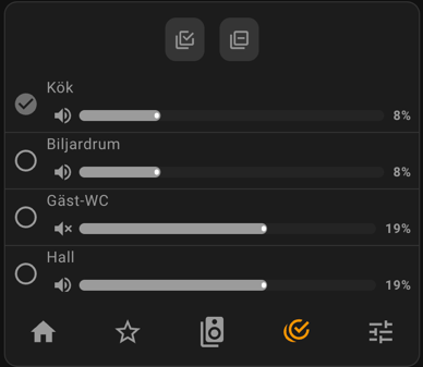
Volumes Configuration
volumes:
  title: '' # default is empty. Use this to change the title for the volumes section.
  additionalControlsFontSize: 0.9 # default is 0.75. Unit is 'em'. Font size for additional controls (e.g., Bass, Treble, Audio delay).
  hideCogwheel: true # default is false. Will hide the cogwheel for the volumes section.
  labelForAllSlider: 'All volumes' # default is 'All'. Use this to change the label for the all volumes slider.
adjustVolumeRelativeToMainPlayer: true # default is false, which means all players will be set to the same volume as the main player. If set to true, volume will be adjusted relative to the main player in the group.
changeVolumeOnSlide: true # default is false. If set to true, volume will be changed while sliding the volume slider. If false, volume will only be changed when releasing the slider.
inverseGroupMuteState: true # default is false, which means that only if all players are muted, mute icon shows as 'muted'. If set to true, mute icon will show as 'muted' if any player is muted.
volumeStepSize: 1 # Use this to change the step size when using volume up/down. Default is to use the step size of Home Assistant's media player integration.
Queue Configuration
queue:
  title: Songs # default is 'Play Queue'. Use this to change the title for the queue section.
  itemBackgroundColor: '#ff0000' # Use this to set a custom background color for queue items.
  itemTextColor: '#ffffff' # Use this to set a custom text color for queue items.
  selectedItemBackgroundColor: '#00ff00' # Use this to set a custom background color for the currently playing queue item.
  selectedItemTextColor: '#000000' # Use this to set a custom text color for the currently playing queue item.
Search Configuration
The Search section allows you to search for music using the Music Assistant integration. You must have Music Assistant installed and configured in Home Assistant to use this feature.
search:
  title: Search # default is 'Search'. Use this to change the title for the search section.
  massConfigEntryId: '' # Leave empty to auto-discover Music Assistant. Only needed if you have multiple Music Assistant instances.
  defaultMediaType: track # default is none. Pre-select a media type (track, artist, album, playlist).
  searchLimit: 50 # default is 50. Maximum number of results to show per search.
  autoSearchMinChars: 3 # default is 3. Minimum characters before auto-search triggers.
Queue supports:
- Sonos queue (native Sonos integration)
- Music Assistant queue (requires
entityPlatform: music_assistant)
If you use Music Assistant queue, install mass_queue from HACS.
Search Features:
- Search for tracks, artists, albums, or playlists
- Auto-search as you type (configurable)
- Select multiple items and play or queue them
- State persists when switching sections
Using individual section cards
As mentioned earlier, use the individual sections for more layout flexibility.
Here is an example:

type: horizontal-stack
cards:
  - type: custom:sonos-card
    sections:
      - groups
      - volumes
  - type: custom:sonos-card
    sections:
      - player
  - type: custom:sonos-card
    sections:
      - grouping
      - media browser
Theme variables
The following variables are being used and can be set in your theme to change the appearance of the card:
--accent-color
--primary-color
--secondary-text-color
--secondary-background-color
--disabled-text-color
Read more about using theme variables here: Home Assistant frontend - Home Assistant
Blurred background
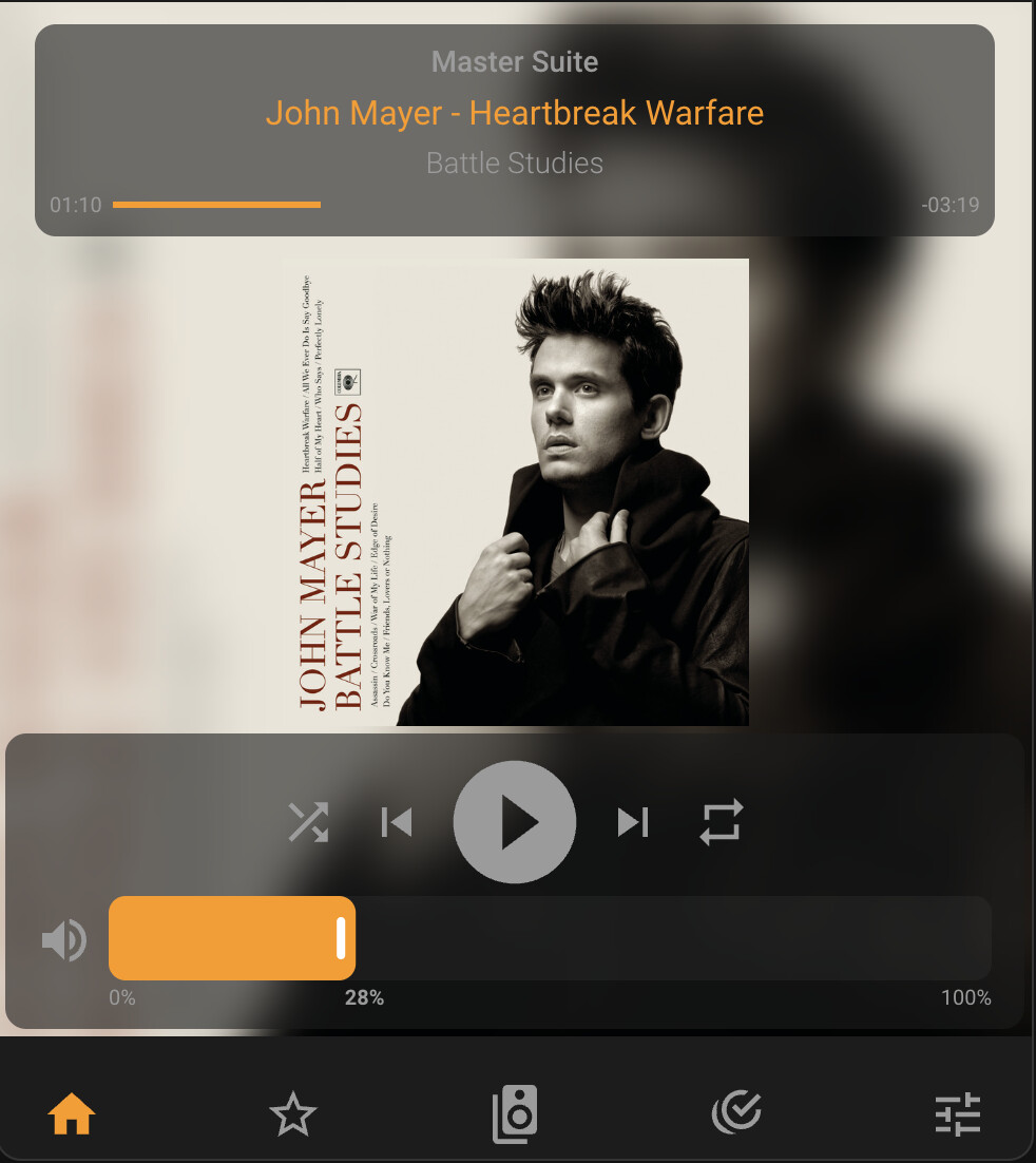
Create a modern look by using a blurred version of the album artwork as background. The normal artwork is displayed on top, and the header/controls have a semi-transparent background.
type: custom:sonos-card
player:
  artworkAsBackgroundBlur: 10
  controlsAndHeaderBackgroundOpacity: 0.7
Slim version
This example will give a slimmer version of the card.
type: custom:sonos-card
heightPercentage: 60
player:
  showVolumeUpAndDownButtons: true
  hideArtwork: true
  controlsLargeIcons: true
mediaBrowser:
  itemsPerRow: 6
  hideHeader: true
groups:
  compact: true
grouping:
  compact: true
footerHeight: 3.5
Custom Favorites
You can add your own buttons to the Favorites section. This can be useful if you want to quickly start a specific radio station or playlist.
To determine what to configure for a button do the following:
- Start playing the radio station or playlist you want to add. This can for instance be done in this card's favorites section or in the built-in Home Assistant Media page.
- Open the Developer Tools in Home Assistant.
- Go to the States tab.
- Find the media player entity that is playing the radio station or playlist.
- Look for the
media_content_idandmedia_content_typeattributes. - For the thumbnail, you can inspect the HTML to see what image the favorites section is using, or you can also use a local URL if you have the image stored locally.
- Use these values to configure the custom favorite.
Example:

type: custom:sonos-card
mediaBrowser:
  favorites:
    customFavorites:
      all: # 'all' means it will show for all players, otherwise specify the entity_id of the player.
        - title: BBC
          media_content_id: x-rincon-mp3radio://http://stream.live.vc.bbcmedia.co.uk/bbc_world_service
          media_content_type: music
          thumbnail: http://cdn-profiles.tunein.com/s24948/images/logoq.jpg?t=1
Finding media_content_id (advanced)
If you want to find the media_content_id for a specific radio station, playlist, or media browser folder, sometimes the above method is not enough. If so, you can use the following method to find it:
- Open your browser's Developer Tools (F12 or right-click → Inspect)
- Go to the Network tab
- Filter by WS (WebSocket)
- Reload the page
- Click on the
websocketconnection that appears - Go to the Messages tab
- Filter messages by:
play_media- for finding content to play (custom favorites)browse_media- for finding folder paths (media browser shortcuts)
- Navigate to your playlist/folder and start playing it or click on it
- A message will appear - click on it and expand the JSON object
- Look for
media_content_idandmedia_content_typein the data
Example for a playable item (custom favorite):
{
  "service_data": {
    "entity_id": "media_player.living_room",
    "media_content_id": "spotify://playlist:1Oz4xMzRKtRiEs51243ZknqGJm",
    "media_content_type": "spotify://playlist"
  }
}
Example for a folder (media browser shortcut):
{
  "type": "media_player/browse_media",
  "entity_id": "media_player.living_room",
  "media_content_id": "spotify://8fb1de564ba7e4c8c4561860574c83b9",
  "media_content_type": "spotify://library"
}
Media Browser Shortcut
You can configure a shortcut button in the media browser header that takes you directly to a specific folder. This is especially useful for wall-mounted touch displays where you want quick access to frequently used folders like Spotify playlists.
Example configuration
type: custom:sonos-card
mediaBrowser:
  shortcut:
    media_content_id: 'spotify://8fb1de564ba7e4c8c4561860574c83b9'
    media_content_type: 'spotify://library'
    icon: 'mdi:spotify'
    name: 'My Spotify'
The shortcut button will appear in the media browser header (both in Favorites and Browse Media views), to the left of the other navigation icons. Clicking it will navigate directly to the specified folder, reducing multiple taps to just one.
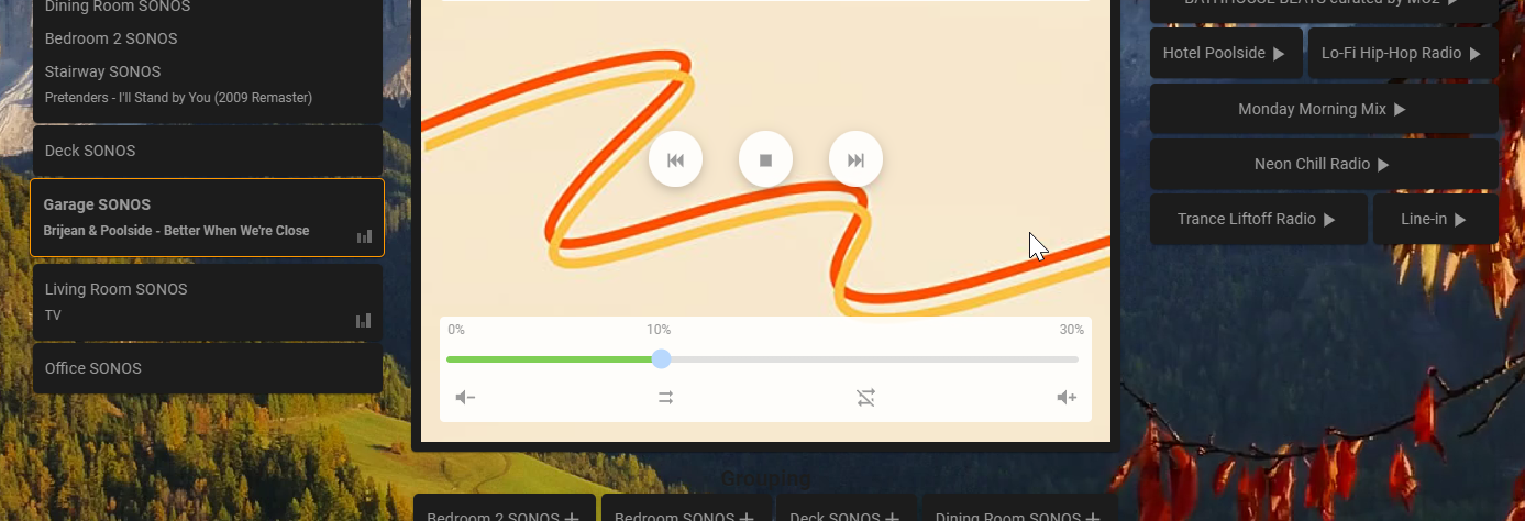
Dynamic volume level slider
The volume level slider is dynamically adjusting its scale. If volume is below 20% it will show a scale up to 30%. Above
20% it will show a scale up to 100%. The color will also change from green to red clearly indicating which scale is
being used.

Enable it in config with dynamicVolumeSlider: true
Linking and Player Persistence
By default, you can append a player in URL hash (e.g. #media_player.my_sonos_player) to have that player selected.
You can change this behavior to use the browser's session storage by setting storePlayerInSessionStorage: true. This prevents the URL from changing when you select a player.
If entityId is configured for the card, both the URL hash and session storage will be ignored on initial load. See more in the Usage section above.
If you never want to remember the selected player, you can set doNotRememberSelectedPlayer: true to an empty string.