Hi, I would like to show you my custom card project, which allows you to clearly display your statistics in HA. The ![]() Detailed Charts Panel is a powerful visualization solution for Home Assistant, allowing for in-depth analysis of historical data from your sensors. It offers features that go far beyond standard history, such as zoom, pan, grid layouts, various chart types, and persistent configuration. Furthermore, everything runs entirely locally using the Home Assistant WebSocket API.
Detailed Charts Panel is a powerful visualization solution for Home Assistant, allowing for in-depth analysis of historical data from your sensors. It offers features that go far beyond standard history, such as zoom, pan, grid layouts, various chart types, and persistent configuration. Furthermore, everything runs entirely locally using the Home Assistant WebSocket API.
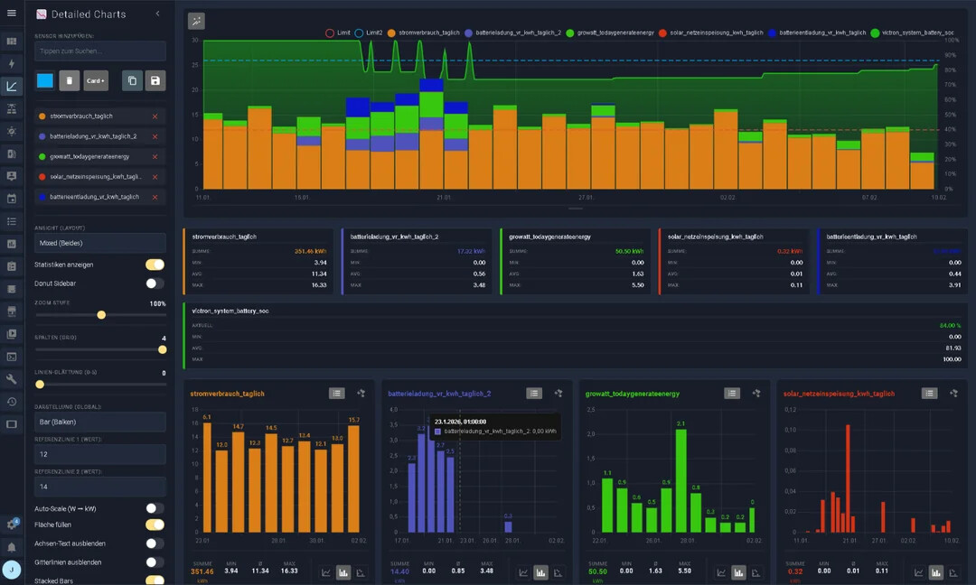
The panel automatically saves your settings (selected sensors, colors, view options) in the browser (Local Storage), ensuring your analysis environment is ready immediately after a reload.
You can configurate a complete panel linked to the sidebar or you can use the dashboard card to configurate your graphs.
If you like this panel, I would be very happy about a star rating ![]() .
. ![]()
Features
 Interactive Charts: Smooth zoom & pan (touch & mouse wheel) with automatic data reloading.
- Previous Year Comparison: Compare current data directly with the previous year.
- Short-Term & Long-Term Charts: Supports short-term and long-term data analysis.
 Multilingual: Full translation support for English and German.
 Panel Mode & Card Mode: Two viewing options — full panel view or as a dashboard card.
 Auto-Scale (W
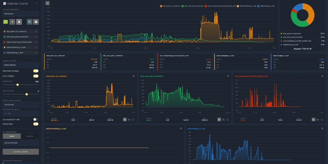
  kW): Automatically converts values from
 W/WhtokW/kWh— no mental math required! Donut Sidebar: Optional sidebar showing percentage distribution (ideal for power consumption).
 Flexible Layouts:
- Combined: Everything in a single chart.
- Grid: 1 to 4 columns side by side.
- Mixed: Overview on top, details below.
 Thresholds: Set warning lines (e.g. at 600 W) as visual references.
 Dual Storage: Save views locally in the browser or globally in a file.
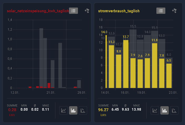
 Live Statistics: Min / Max / Average / Sum / Current — intelligently calculated.
 Drag & Drop: Easily rearrange charts in grid mode using drag & drop.
 Modern UI: Full support for Home Assistant themes (light & dark mode).
 Binary Sensors: Automatic detection and visualization of binary sensors (e.g. heating, windows).
 Precision & Rounding: Values in tooltips and statistics respect the sensor’s
 display_precisionsetting from Home Assistant. Smart Tooltips: The info popup automatically moves away from the cursor to avoid covering the chart.
You can also look at this video to see it in action, but don’t expect too much, I’m not a YouTuber, but it shows all the basic functions and you can turn on the subtitle translation
https://www.youtube.com/watch?v=o3h9qdb1-Fk
Installation via Hacs is possible.
Important Note to get the Sidebar link.
panel_custom:
- name: detailed-charts-panel
  sidebar_title: Detailed Charts
  sidebar_icon: mdi:chart-bell-curve-cumulative
  module_url: /local/community/detailed-charts-panel/detailed-charts-panel.js
Project on github
I have also written a small wiki: