Thank you.
The data was obtained through using Node-red and the Sun-position Node.
The Custom Button Card config, which isn’t too complicated, once I had worked out how to get a background and a separate picture.
type: custom:button-card
entity: sensor.phasedata
show_entity_picture: true
show_label: false
show_state: false
show_name: false
show_icon: false
name: |
  [[[
    return "Declination: " + states['sensor.k_sun_declination'].state +" deg"
  ]]]
entity_picture: |
  [[[
      return "/local/sun/earth7.png";
   ]]]
styles:
  card:
    - background: |
        [[[
          return 'url(/local/sun/backplatefin.png) round'
        ]]]
    - padding: 0
    - height: 400px
    - width: 400px
    - border: 1
    - background-size: cover
  entity_picture:
    - width: 300px
    - height: 300px
    - rotate: |
        [[[
          return states['sensor.k_sun_declination'].state +"deg"
        ]]]
The picture of the earth was just something I found on the internet and I added the crosshair in photoshop. The scale was made by using the canvas guage card, and captured as screen image, which I then overlaid in photoshop to the right size and in the right place . The two images were then saved as individual files.

The tricky part was getting it all to line up properly and I expect there is a better way of doing all of this nonsense. However it did keep me amused for a while.
The other guage card below was simple enough.
type: custom:canvas-gauge-card
entity: sensor.k_sun_declination
card_height: 150
background_color: rgb(250, 250, 250)
gauge:
  colorPlate: rgb(250, 250, 250)
  animation: false
  exactTicks: true
  animationTarget: needle
  type: radial-gauge
  needleType: arrow
  needleWidth: 3
  colorNeedle: rgb(77, 84, 92, .90)
  colorNeedleEnd: rgb(150, 161, 176, 90)
  needleShadow: true
  colorNeedleShadowUp: rgba(209, 223, 240,.90)
  colorNeedleShadowDown: rgba(77, 84, 92, .10)
  colorNeedleCircleOuterEnd: rgba(209, 223, 240)
  colorNeedleCircleOuter: rgba(77, 84, 92)
  colorNeedleCircleInnerEnd: rgba(77, 84, 92)
  colorNeedleCircleInner: rgba(209, 223, 240)
  title: DECLINATION
  width: 250
  height: 250
  colorTitle: '#fffff'
  colorUnits: '#fffff'
  colorNumbers: '#fffff'
  borderShadowWidth: 0
  borderOuterWidth: 0
  borderMiddleWidth: 0
  borderInnerWidth: 0
  minValue: -23.45
  maxValue: 23.45
  startAngle: 90
  ticksAngle: 180
  valueBox: true
  majorTicks:
    - -23.45
    - -20
    - -15
    - -10
    - -5
    - 0
    - 5
    - 10
    - 15
    - 20
    - 23.45
  fontTitleWeight: bolder
  colorValueBoxBackground: rgba(245, 240, 240, .90)
  colorValueBoxRectEnd: rgba(186, 196, 209,.90)
  colorValueBoxRect: rgba(186, 196, 209,.10)
  colorValueBoxShadow: rgba(93, 98, 105, .90)
  valueInt: 0
  valueDec: 0
  valueBoxBorderRadius: 0
  valueBoxStroke: 0
  valueBoxWidth: 0
  minorTicks: 1
  strokeTicks: true
  highlights:
    - from: -23.45
      to: -1
      color: rgba(255, 200, 1, .99)
    - from: -1
      to: 1
      color: rgba(7, 165, 0, .99)
    - from: 1
      to: 23.45
      color: rgba(149, 197, 245, .99)
and the label underneath
type: custom:button-card
entity: sensor.totalexchange
show_icon: false
show_name: true
show_state: false
show_label: false
name: |
  [[[
    return "Declination: " + states['sensor.k_sun_declination'].state +" deg"
  ]]]
styles:
  card:
    - background-color: rgb(250, 250, 250)
      font-weight: bold
      font-size: 15px
      height: 7px
      border: 0
You might well think the entire process was a bit over the top for the end result, but the thing is, I wanted to just see if I could do it and being retired I obviously have too much time on my hands.
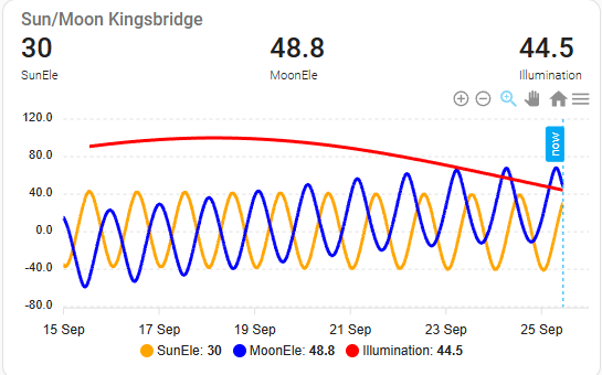
I seem to be a bit obsessed with the sun and the moon at the moment, but it is fascinating to see the synchronicity between the two and this simple graph of the sun and moon elevation is a little eye opener. When it is a full moon the two phases are entirely opposite and when it is a new moon the phases completely overlay. Simples I know, but, but I hadn’t appreciated that.


