Easy Entity Styler Card
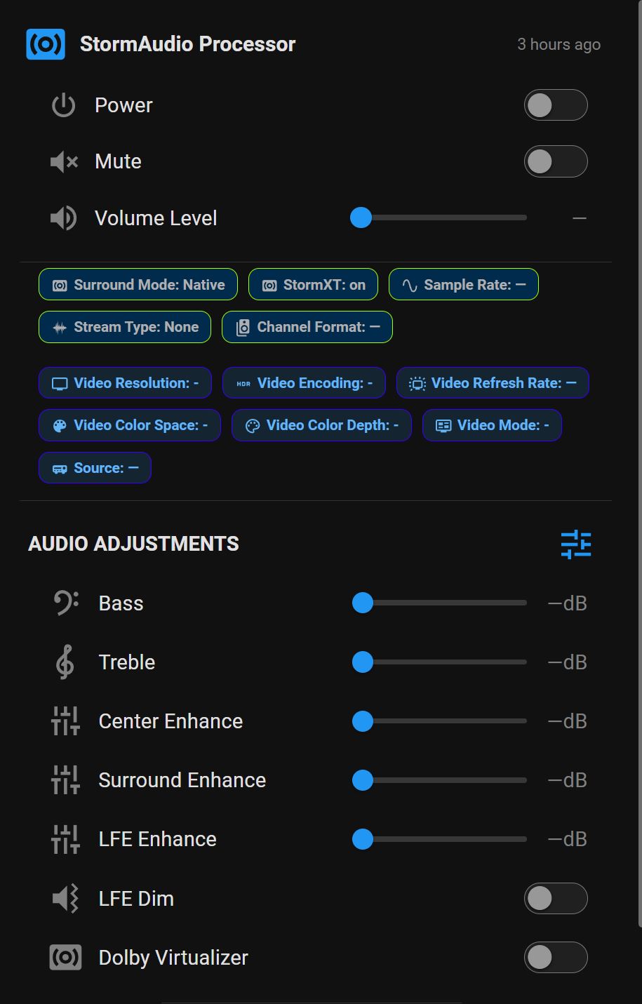
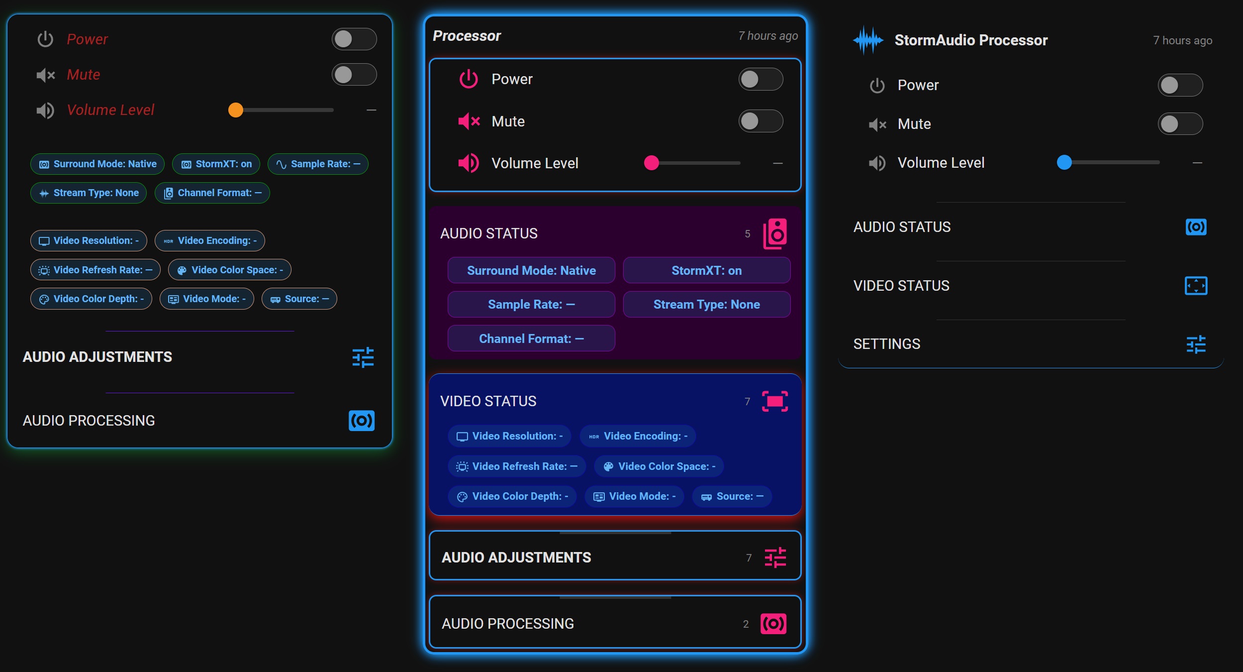
A highly customizable Home Assistant Dashboard card that organizes and displays your entities cleanly while giving you full control over the look and behavior of your entity cards. Bonus: far easier and far better performance than card-mod.
- Hundreds of styling options — card-wide, per section, and per entity
- Reusable rule sets, shared style libraries, and rich entity tables
- Everything in a visual editor — YAML optional, never required
Current build: v2026.08.29.186
Options at a glance
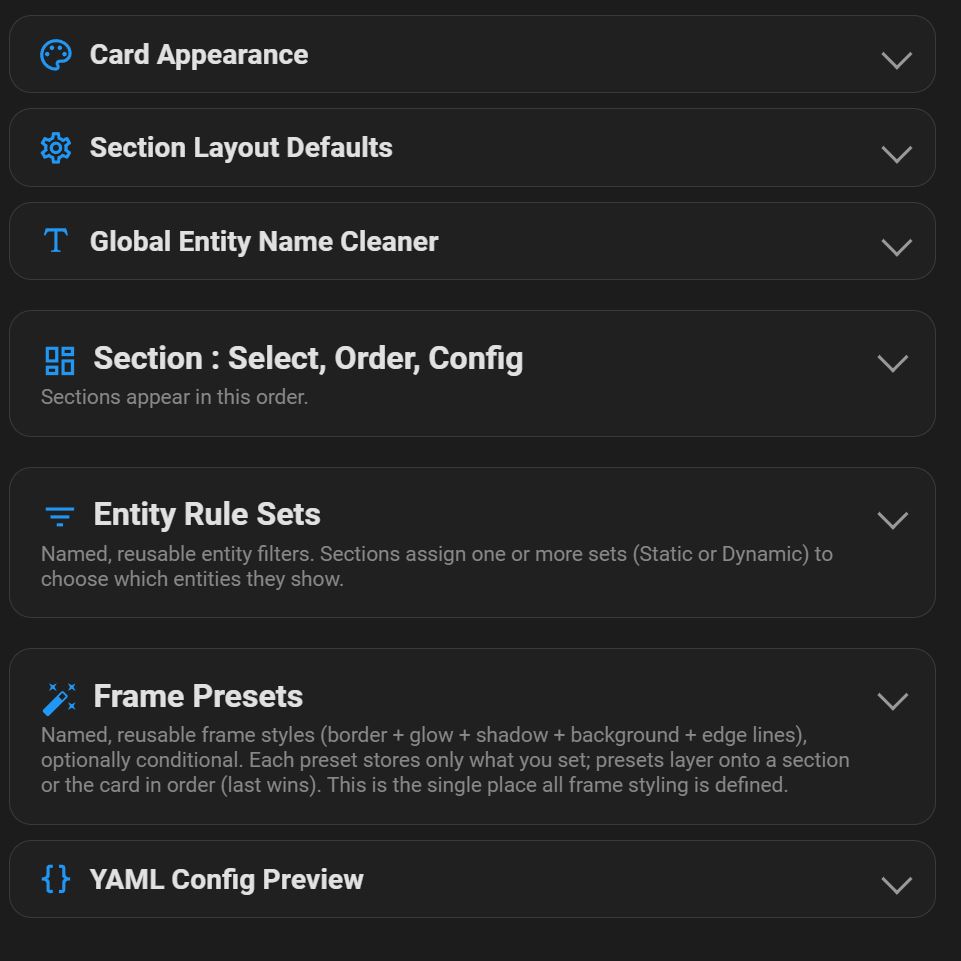
Every option below is fully point-and-click in the visual editor.
Sections & layout
- Collapsible sections and card — sections expand/collapse individually; the whole card can collapse to just its title bar (or run with no title bar); sections can auto-stay-open when they hold entities.
- Two section types — Entities (rows and/or chips) and Entity Tables (rich multi-column tables).
- Conditional display — show a section, entity, or the whole card only when your rules pass; auto-hide a section when it has nothing to show.
Entity selection
- Rules engine — build named, reusable rule sets with point-and-click include/exclude groups (match ALL or ANY); match on id, name, state, attribute, domain, area, label, group helper, integration, or device class, with operators like equals / contains / in / regex / numeric compare. Live dropdowns pull real values from your system.
- Static & dynamic lists — populate a section automatically from a rule set (dynamic re-evaluates live; static is a hand-curatable snapshot). Preview resolved entities before assigning.
Entity tables
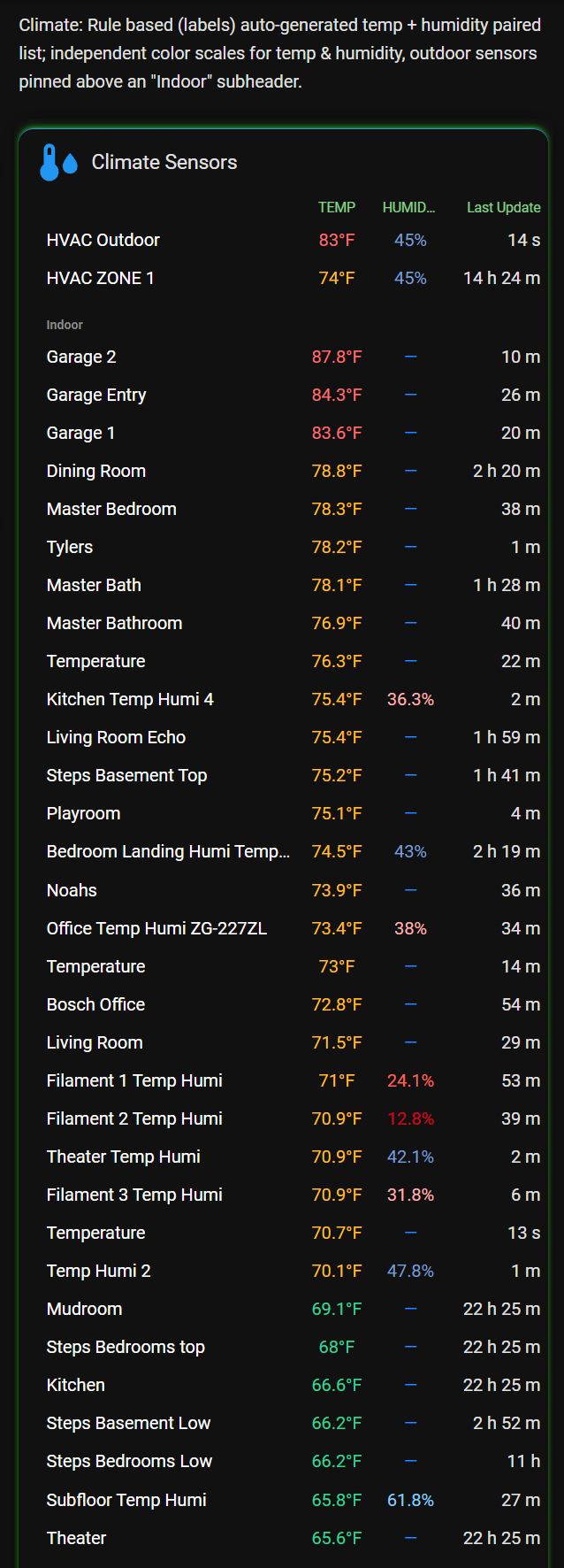
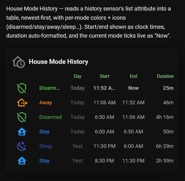
- Multi-column tables from your entities or from a sensor’s array attribute (one row per element).
- Columns for icon, name, value, “last changed” age, change time, or any attribute; flexible widths (px / % / fr / auto).
- Rule-based color coding, state/time-based icon rules, rule-based sorting with pin-to-top, templated title row, and global table defaults.
Appearance & styling
- Colors, fonts & scaling — global palette plus independent scale sliders (overall, icons, title icon/text, entity text); per-section header/row/chip styling; a secondary info line under entity names.
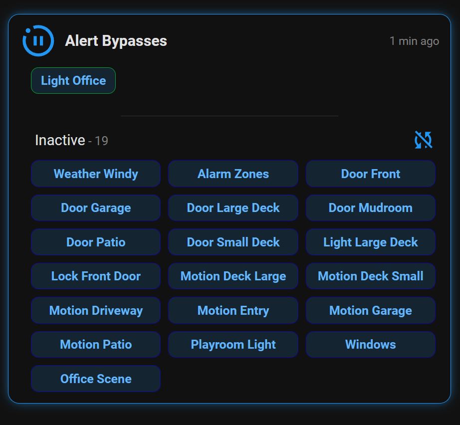
- Chips — compact, colorful chips in wrap / column / grid layouts, with separate tap and hold actions.
- Color blender — smooth value-driven color gradients for any icon or text color (value → color stops, interpolated).
- State-driven header icons — a section or title header icon whose glyph and color change from any entity’s value; pull entity values into title text with
{entity:…}tokens. - Entity name cleaner — strip repeated text (e.g. “Living Room”) card-wide or per section.
- Frame Styles and Header Rules — see Libraries below.
Interaction
- Native entity controls — toggle switches, adjust sliders, and interact with entities just like standard HA cards.
Libraries
Both this card and the Color Light & Scene Manager card share the same two style libraries, stored in Home Assistant’s built-in frontend key/value store — no add-on or custom integration required. A style you save in one place is available to every card of either type on the instance, and edits propagate live.
- Scope is system-wide. Libraries are shared across all users of the instance (Dashboard editing is admin-only, so there’s a single shared author). There is no per-user scope.
- Built-In styles are read-only. Each library ships with a set of Built-In examples you can’t overwrite; duplicate one to create an editable copy.
- Edit once, updates everywhere. A card references a library entry by name; editing that entry updates every card using it, live — no reload.
- Portable. Any entry can be exported as text and imported on another system to share a style with someone else.
Frame Styles
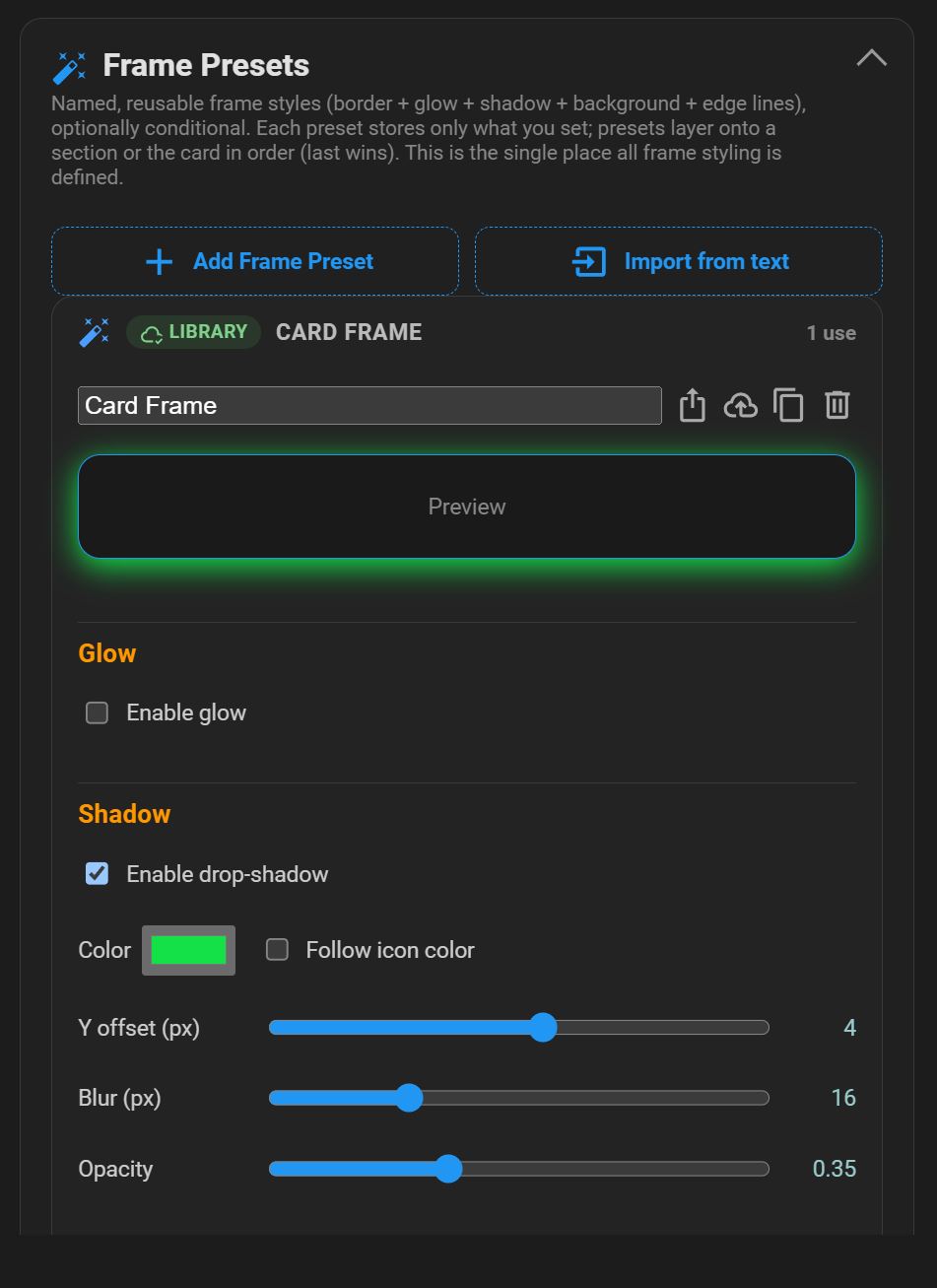
Named, reusable frame bundles — borders, glow, shadow, background, and per-side edge lines. Each style is sparse (it stores only the properties you set), so you can layer an ordered list on a section or the whole card and the last one wins per property. Styles can be conditional — applied only when an entity is in a given state, or when a section currently has / has no visible entities.
Storage key: ltek_frame_library
Header Rules
Named, reusable, state-driven header styling. A rule set is an ordered list of rules (a condition → the outputs it sets) plus optional defaults. Outputs can set the header’s icon color, icon glyph, text color, icon size, text size, and a secondary text line driven by an entity value. Outputs are sparse — anything left “Not set” defers to the card’s own header look — and revert automatically when a rule stops matching. Apply a set to the card title and/or to any section.
Storage key: ltek_header_library
Installation
- Create the folder
\config\www\community\easy-entity-styler-card. - Download
easy-entity-styler-card.jsand place it in that folder. - Add it as a Dashboard resource:
- Settings → Dashboards → ⋮ → Resources → Add Resource
- URL:
/local/community/easy-entity-styler-card/easy-entity-styler-card.js· Type: JavaScript Module
- Clear your browser cache and hard-refresh.
Version
Build number format: v<year>.<month>.<day>.<increment> — the trailing increment is a monotonic counter that never resets. It’s defined once at the top of easy-entity-styler-card.js (BUILD_NUMBER) and shown in the editor header and browser console on load.