After I posted this question Automation not firing from LIFX bulb being turned on I found that the error was I had connected to an automation and not the light as the trigger. Easy to see in the yaml view, but int he UI is was very difficult to notice my mistake.
I would recommend that in the entity dropdown, that we add the icon to the field so that you can tell what type of entity it was. So in my case I would see that it is an automation and not a light as I was hoping for.
That said, when entity selection is within layers of conditions the drop-down gets so narrow they are difficult to read on a phone. I’ll have to follow up on that, can’t replicate so perhaps that was fixed recently.
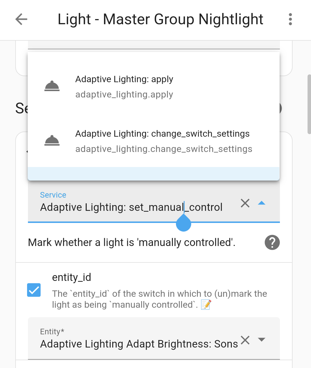
It does seem like the single entity drop-down gets narrower when it is within stacks of conditions, but this is an example of a pretty normal width menu.
However, when I really have difficulty is when I am picking from the colored tablet shaped buttons. I believe normally more narrow, but within layers of conditions it can be unusable (this example is the worst I could find, but I think it’s been worse in the others). I’ve taken to switching to landscape mode which requires closing and reopening the selection menu so that it adjusts it’s width.
With these specific entities it’s not hard to distinguish the names, but some devices have many that start similar and it’s impossible to distinguish which is which without making a selection. Likely not an issue on a PC with a mouse over (I’m guessing there may be more info on mouse over) but on a touchscreen I have difficulty.
Ah, yes, I have icons in the selection menu, but not once a selection has been made. I can see how a little more information could help with troubleshooting and avoiding a fumble with a thumb or mouse.