Thanks @MelleD, Card works as expected!
I have a request or question, if I have a light card in the expander card, is there a way to expand the card when the light turns on? and collapse when it’s off?
Tired of clunky, outdated accordion menus? simplicity meets sophistication, say hello to my new project…
here the card: GitHub - fastender/Accordion-Card: A custom card for Home Assistant
2 Likes
I have a sensor with attributes that lists the sensor counts by domain.
I then use a markdown card to display the attributes as a table, using card-mod to format the table as shown below: -
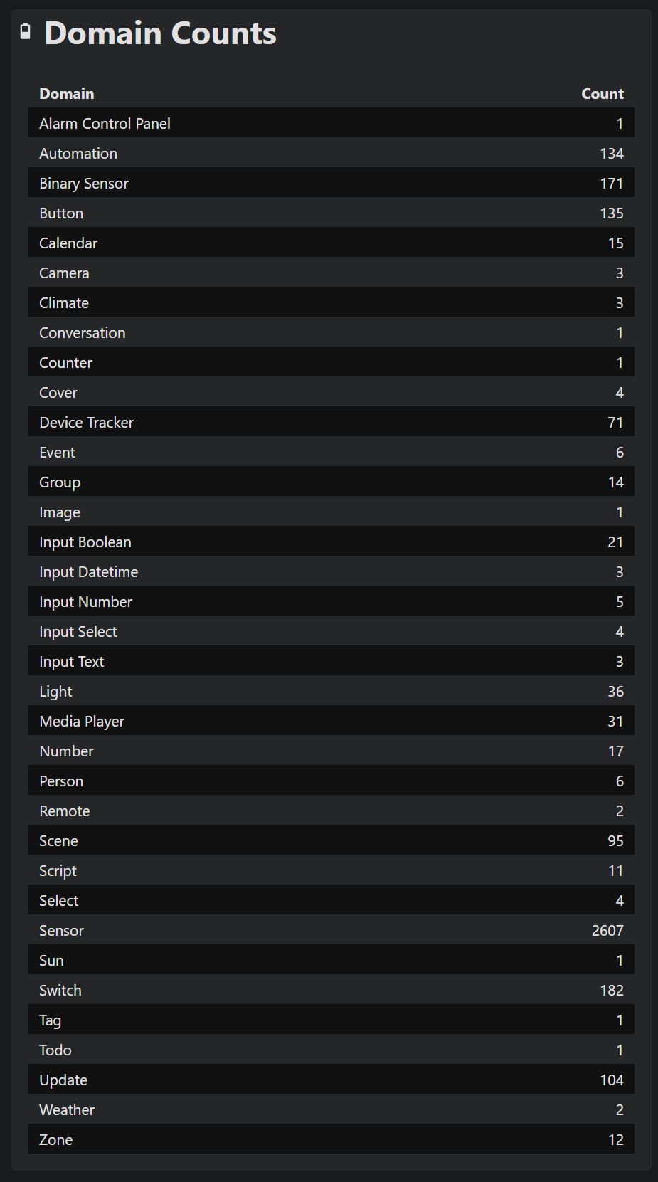
However, when I include that markdown card in the expander-card, the CSS styling is not applied.
I suspect I am using the wrong CCS selector within expander-card but I cannot track down what it should be.
Here’s the code for my expander-card: -
type: custom:expander-card
gap: 0.6em 0em
padding: 1em 0em
clear: false
clear-children: false
overlay-margin: 2em 0em
child-padding: 0.5em 0em
button-background: transparent
title-card-button-overlay: true
title-card-clickable: false
title-card:
  type: custom:button-card
  template: basic
  entity: sensor.domain_count
  layout: icon_name_state2nd
  show_state: true
  aspect_ratio: 6/1
cards:
  - type: markdown
    content: |
      | Domain | Count |
      | :-- | --: |
      {% for d in states | groupby('domain') -%}
        {{ d[0].replace('_', ' ') | title }} | {{ states[d[0]] | count  }}
      {% endfor %}
    card_mod:
      style:
        .:
          ha-markdown:
            $: >
              table { width: 100%; border-collapse: separate; border-spacing:
              0px; } tbody tr:nth-child(2n+1) { background-color:
              var(--table-row-background-color); } thead tr th, tbody tr td
              {padding: 4px 10px; }
Can anyone suggest what CSS selector I should be using to correctly style the markdown in the expander card?
Hey @nzrunner,
I think your card mod is wrong. From the documentation looks like this and worked on my machine:
           card_mod:
              style:
                ha-markdown$: |
                  table { width: 100%; border-collapse: separate; border-spacing:
                  0px; } tbody tr:nth-child(2n+1) { background-color:
                  var(--table-row-background-color); } thead tr th, tbody tr td
                  {padding: 4px 10px; }
Look here is an example with markdown
@fastender Are you using Expander Card to achieve this or something else? Can you share your yaml?
It has been online for about two weeks, I haven’t had much time to promote the card, I wish you a lot of fun.
@fawzi-iit see here
Maybe ask in the card mod channel, but open is just a css class so not sure if this can really work
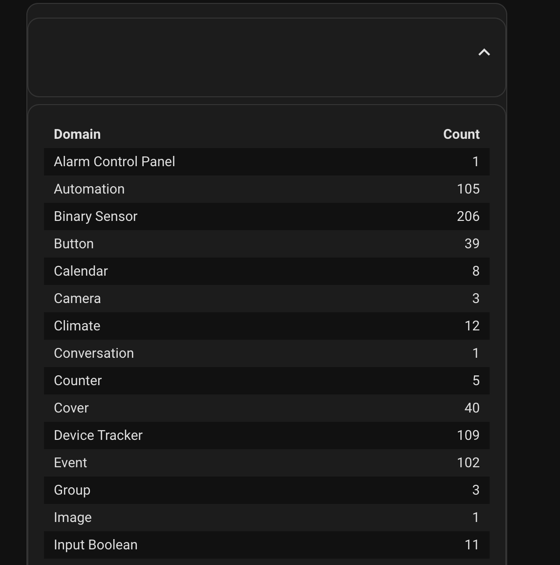
Thanks for the reply. Unfortunately, no difference for me. I started with that card-mod, and if I include it in a markdown card, I get a nicely formatted striped table.
However, if I add three lines at the top of the markdown card and turn it into an expander card, I get an unformatted table 
This is my “bare bones” expander card, using the card-mod you suggested: -
type: custom:expander-card
title: Domain Counts
cards:
- type: markdown
content: |
| Domain | Count |
| :-- | --: |
{% for d in states | groupby('domain') -%}
{{ d[0].replace('_', ' ') | title }} | {{ states[d[0]] | count }}
{% endfor %}
   card_mod:
              style:
                ha-markdown$: |
                  table { width: 100%; border-collapse: separate; border-spacing:
                  0px; } tbody tr:nth-child(2n+1) { background-color:
                  var(--table-row-background-color); } thead tr th, tbody tr td
                  {padding: 4px 10px; }
How I said cannot reproduce it. Works
---
views:
  - title: Test
    path: test
    badges: []
    cards:
      - type: custom:expander-card
        gap: 0.6em 0em
        padding: 1em 0em
        clear: false
        clear-children: false
        overlay-margin: 2em 0em
        child-padding: 0.5em 0em
        button-background: transparent
        title-card-button-overlay: true
        title-card-clickable: false
        title-card:
          type: custom:button-card
          entity: sensor.domain_count
          layout: icon_name_state2nd
          show_state: true
          aspect_ratio: 6/1
        cards:
          - type: markdown
            content: |
              | Domain | Count |
              | :-- | --: |
              {% for d in states | groupby('domain') -%}
                {{ d[0].replace('_', ' ') | title }} | {{ states[d[0]] | count  }}
              {% endfor %}
            card_mod:
              style:
                ha-markdown$: |
                  table { width: 100%; border-collapse: separate; border-spacing:
                  0px; } tbody tr:nth-child(2n+1) { background-color:
                  var(--table-row-background-color); } thead tr th, tbody tr td
                  {padding: 4px 10px; }
That is really strange as I copied your code, and this is what I get: -
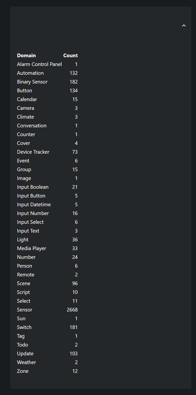
I changed the theme to the Home Assistant default and that made no difference.
Most strange. I will battle on and see if I can track down what is going on.
Clear cache maybe?
I just wanted to show off an example that I put together with this card. I used a stack-in-card to make everything look like a single card. A vertical stack to hold a Markdown card and Entities card showing two entities as the title. Some card_mod to hide borders and adjust top margins. When expanded, another Entities card shows the remaining entities.
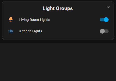
type: custom:stack-in-card
cards:
  - type: custom:expander-card
    child-margin-top: 0.0em
    padding: 0
    clear: true
    title-card-button-overlay: true
    title-card-clickable: true
    expanded: false
    title-card:
      type: vertical-stack
      cards:
        - type: markdown
          content: <h2><center>Light Groups</center></h2>
          card_mod:
            style: |
              ha-card {
                border: none
              }
        - type: entities
          entities:
            - light.living_room_lights
            - light.kitchen_lights
          card_mod:
            style: |
              ha-card {
                border: none;
                margin-top: -25px
              }
    cards:
      - type: entities
        entities:
          - light.bathroom_lights
          - light.bedroom_lights
          - light.office_lights
        card_mod:
          style: |
            ha-card {
              border: none;
              margin-top: -25px
            }
SOLVED: button rows are not spaced properly when converting the YAML to use Expander
before adding expander…
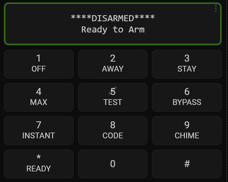
after…
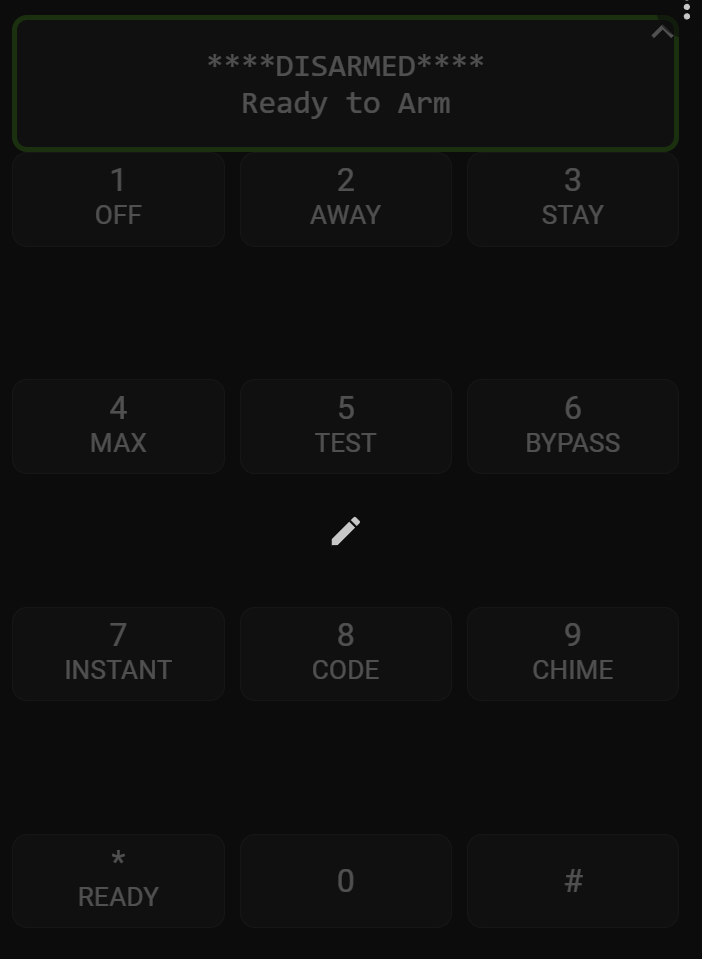
Here’s the YAML that fixes the spaces the Expander adds in (still no idea why it does that)…
type: custom:expander-card
title: null
expanded: false
child-margin-top: 0.5em
padding: 3px
clear-children: true
clear: true
title-card-button-overlay: true
title-card-clickable: true
title-card:
  type: custom:button-card
  entity: sensor.alarm_partition_1_keypad
  show_name: false
  show_icon: false
  label: |
    [[[
         var alpha = states['sensor.alarm_partition_1_keypad'].attributes.alpha;
         return alpha.substr(0,16) + '<br>' + alpha.substr(16,32)
    ]]]
  show_label: true
  styles:
    label:
      - font-family: monospace
    card:
      - border: >
          [[[  if (states['binary_sensor.alarm_partition_1_ready'].state ===
          'on') return 'solid 3px green';  if
          (states['binary_sensor.alarm_partition_1_ready'].state === 'off')
          return 'solid 3px orange'; ]]]
      - square: true
cards:
  - type: grid
    columns: 3
    square: false
    column_width: 60px
    cards:
      - type: custom:button-card
        show_label: true
        name: 1
        label: "OFF"
        tap_action:
          action: call-service
          service: envisalink_new.alarm_keypress
          service_data:
            entity_id: alarm_control_panel.alarm_partition_1
            keypress: "1"
        styles:
          card:
            - height: 45px
            - margin: 0px
            - padding: 0px
          label:
            - font-size: 14px
      - type: custom:button-card
        show_label: true
        name: 2
        label: AWAY
        tap_action:
          action: call-service
          service: envisalink_new.alarm_keypress
          service_data:
            entity_id: alarm_control_panel.alarm_partition_1
            keypress: "2"
        styles:
          card:
            - height: 45px
            - margin: 0px
            - padding: 0px
          label:
            - font-size: 14px
      - type: custom:button-card
        show_label: true
        name: 3
        label: STAY
        tap_action:
          action: call-service
          service: envisalink_new.alarm_keypress
          service_data:
            entity_id: alarm_control_panel.alarm_partition_1
            keypress: "3"
        styles:
          card:
            - height: 45px
            - margin: 0px
            - padding: 0px
          label:
            - font-size: 14px
      - type: custom:button-card
        show_label: true
        name: 4
        label: MAX
        tap_action:
          action: call-service
          service: envisalink_new.alarm_keypress
          service_data:
            entity_id: alarm_control_panel.alarm_partition_1
            keypress: "4"
        styles:
          card:
            - height: 45px
            - margin: 0px
            - padding: 0px
          label:
            - font-size: 14px
      - type: custom:button-card
        show_label: true
        name: 5
        label: TEST
        tap_action:
          action: call-service
          service: envisalink_new.alarm_keypress
          service_data:
            entity_id: alarm_control_panel.alarm_partition_1
            keypress: "5"
        styles:
          card:
            - height: 45px
            - margin: 0px
            - padding: 0px
          label:
            - font-size: 14px
      - type: custom:button-card
        show_label: true
        name: 6
        label: BYPASS
        tap_action:
          action: call-service
          service: envisalink_new.alarm_keypress
          service_data:
            entity_id: alarm_control_panel.alarm_partition_1
            keypress: "6"
        styles:
          card:
            - height: 45px
            - margin: 0px
            - padding: 0px
          label:
            - font-size: 14px
      - type: custom:button-card
        show_label: true
        name: 7
        label: INSTANT
        tap_action:
          action: call-service
          service: envisalink_new.alarm_keypress
          service_data:
            entity_id: alarm_control_panel.alarm_partition_1
            keypress: "7"
        styles:
          card:
            - height: 45px
            - margin: 0px
            - padding: 0px
          label:
            - font-size: 14px
      - type: custom:button-card
        show_label: true
        name: 8
        label: CODE
        tap_action:
          action: call-service
          service: envisalink_new.alarm_keypress
          service_data:
            entity_id: alarm_control_panel.alarm_partition_1
            keypress: "8"
        styles:
          card:
            - height: 45px
            - margin: 0px
            - padding: 0px
          label:
            - font-size: 14px
      - type: custom:button-card
        show_label: true
        name: 9
        label: CHIME
        tap_action:
          action: call-service
          service: envisalink_new.alarm_keypress
          service_data:
            entity_id: alarm_control_panel.alarm_partition_1
            keypress: "9"
        styles:
          card:
            - height: 45px
            - margin: 0px
            - padding: 0px
          label:
            - font-size: 14px
      - type: custom:button-card
        show_label: true
        name: "*"
        label: READY
        tap_action:
          action: call-service
          service: envisalink_new.alarm_keypress
          service_data:
            entity_id: alarm_control_panel.alarm_partition_1
            keypress: "*"
        styles:
          card:
            - height: 45px
            - margin: 0px
            - padding: 0px
          label:
            - font-size: 14px
      - type: custom:button-card
        show_label: true
        name: "0"
        tap_action:
          action: call-service
          service: envisalink_new.alarm_keypress
          service_data:
            entity_id: alarm_control_panel.alarm_partition_1
            keypress: "0"
        styles:
          card:
            - height: 45px
            - margin: 0px
            - padding: 0px
          label:
            - font-size: 14px
      - type: custom:button-card
        show_label: true
        name: "#"
        tap_action:
          action: call-service
          service: envisalink_new.alarm_keypress
          service_data:
            entity_id: alarm_control_panel.alarm_partition_1
            keypress: "#"
        styles:
          card:
            - height: 45px
            - margin: 0px
            - padding: 0px
          label:
            - font-size: 14px
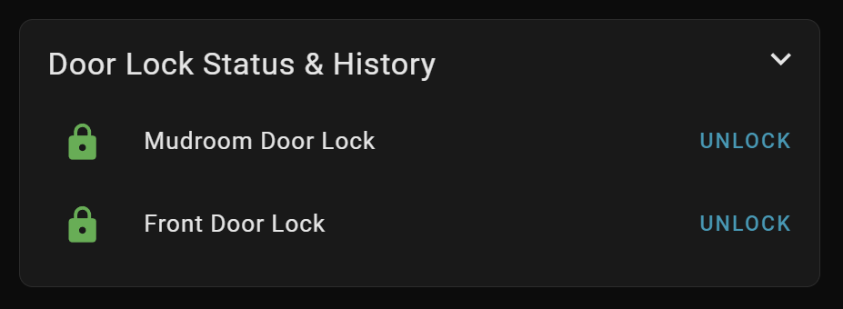
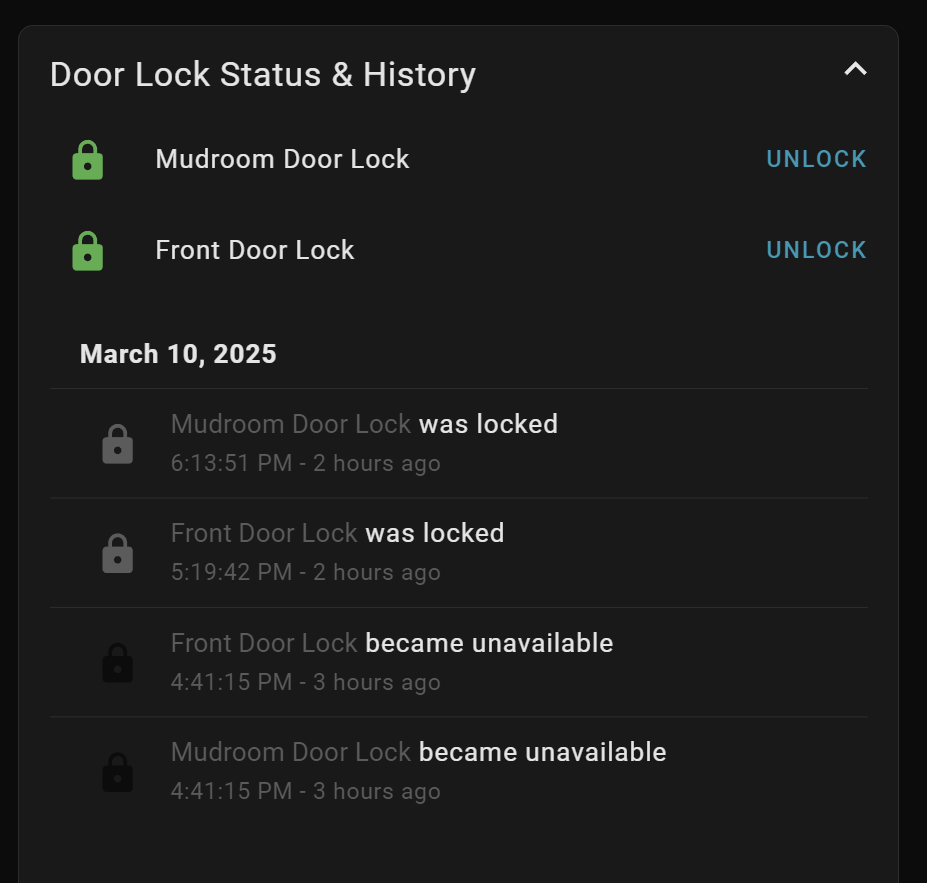
@d_sellers1 thank you for the example. I was trying to figure that out myself - and failing! Based on your example, I made several, like this one…
collapsed…
expanded…
type: custom:expander-card
expanded: false
child-margin-top: 0.0em
padding: 0
clear-children: true
clear: false
title-card-button-overlay: true
title-card-clickable: true
title-card:
  type: vertical-stack
  cards:
    - type: markdown
      content: Door Lock Status & History
      styles: null
      card_mod:
        style: |
          ha-card {
            border: none;
            background: transparent;
            box-shadow: none;
          }
          ha-markdown {
            font-size: 18px;
          }
    - type: custom:auto-entities
      card:
        type: entities
        state_color: true
        card_mod:
          style: |
            ha-card {
              background: transparent;
              box-shadow: none;
              border: none;
              margin-top: -25px
            }
      filter:
        include:
          - entity_id: "*_deadbolt"
        exclude: []
      grid_options:
        columns: full
        rows: auto
      style: |
        .container {
          padding-top: 0px;
          padding-bottom: 0px;
          background: transparent;
          box-shadow: none;
        }
        .content {
          background: transparent;
        }
cards:
  - type: logbook
    target:
      entity_id:
        - lock.front_entry_deadbolt
        - lock.mudroom_deadbolt
    hours_to_show: 8
    card_mod:
      style: |
        ha-card {
          border: none;
          margin-top: -15px;
          background: transparent;
          box-shadow: none;
        }
1 Like
title-card-clickable: true
This isn’t working for me for some reason – I assume this should make the whole title card clickable to expand it, correct? Anything I need to pay attention to here?
Here’s the yaml for the card:
    type: custom:expander-card
    entity: sensor.smart_radiator_thermostat_x_temperature
    padding: 0
    child-padding: 0
    overlay-margin: 0.4em
    expanded: false
    clear: true
    title-card-button-overlay: true
    title-card-clickable: true
    title-card:
      type: custom:mushroom-entity-card
      entity: sensor.smart_radiator_thermostat_x_temperature
      name: Temperature
      primary_info: state
      secondary_info: none
      tap_action: none
    cards:
      - type: custom:apexcharts-card
        series:
          - entity: sensor.smart_radiator_thermostat_x_temperature
            color: rgb(90,100,255)
            stroke_width: 2
        layout: minimal
        graph_span: 48h
those two lines work for me in my cards…
is this a new card you have created…or a new option added to existing card…try a cache refresh in your browser (CTRL + F5), it might be that simple?
Cache refresh doesn’t cut it unfortunately.
I did set the tap_action of the title-card (of type mushroom-entity-card) to none, was wondering if that might block it, but if I leave that out, it does the tap action of the title card instead of expanding it. All I can think that might be blocking it though 
This looks wrong. There is no entity on this level
it’s a mandatory propety of the mushroom entity card.
ohh, didn’t get that you meant on the top level of expander-card. true, let me check
now I’m seeing that there’s a hold and double tap action too, perhaps that’s whats blocking it – trying it out now. doesn’t work either, hmm
removing the unnecessary entity entry is also not making a difference.