Thank you so much! This worked like a charm!
Thanks for the card-mod saved digging around in the console. Changed to crimson from red.
Card View for Google Nest Hub
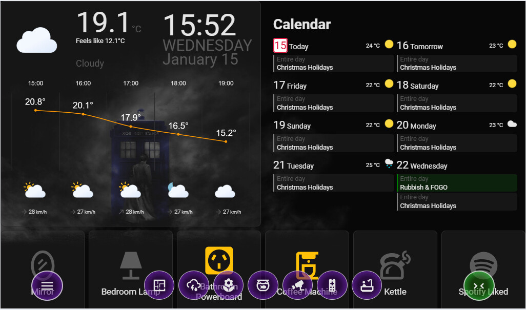
          - type: custom:week-planner-card
            title: Calendar
            calendars:
              - entity: calendar.australia_tas
                color: purple
                name: Public Holidays
              - entity: calendar.calendar
                color: grey
                name: Maverick
              - entity: calendar.recycle_pickup
                color: gold
                name: Recycling
              - entity: calendar.rubbish_pickup
                color: green
                name: Rubbish & FOGO
            days: 8
            compact: true
            weather:
              entity: weather.devonport
              showCondition: true
              showTemperature: true
            noCardBackground: true
            eventBackground: var(--ha-card-background)
            showLegend: false
            card_mod:
              style: |
                .day.past {
                  opacity: .3;
                }
                .today .number {
                  color: crimson;
                  border: solid 2px crimson;
                  border-radius: 4px;
                  background-color: white !important;
                  }
                .event[data-entity="calendar.recycle_pickup"] {
                  background-color: rgba(255,215,0,0.2) !important;
                }
                .event[data-entity="calendar.rubbish_pickup"] {
                  background-color: rgba(34,139,34,0.2) !important;
                }
                .event[data-entity="calendar.australia_tas"] {
                  background-color: rgba(148,0,211,0.2) !important;
                }
Mobile View
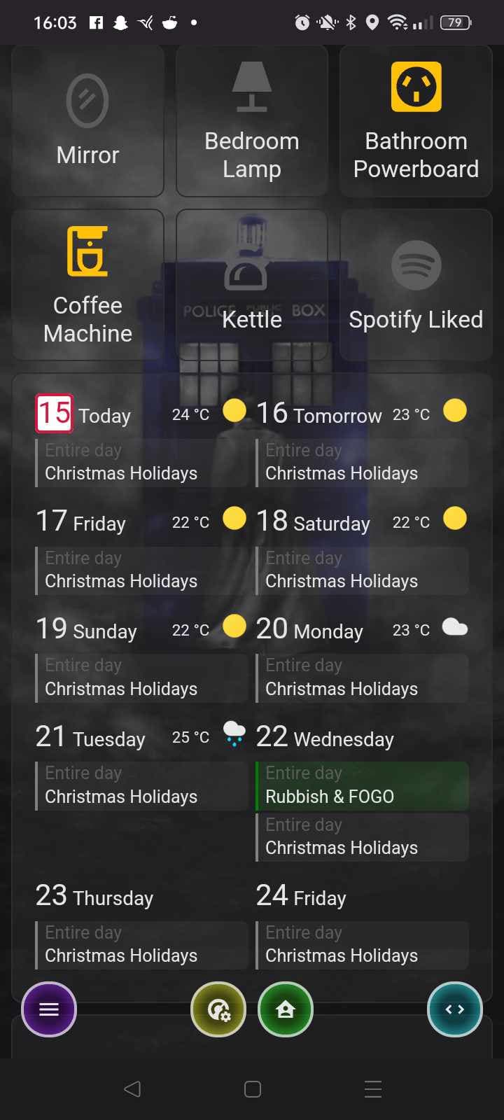
          - type: custom:week-planner-card
            calendars:
              - entity: calendar.australia_tas
                color: purple
                name: Public Holidays
              - entity: calendar.calendar
                color: grey
                name: Maverick
              - entity: calendar.recycle_pickup
                color: yellow
                name: Recycling
              - entity: calendar.rubbish_pickup
                color: green
                name: Rubbish & FOGO
            days: 10
            compact: true
            weather:
              entity: weather.devonport
              showCondition: true
              showTemperature: true
            noCardBackground: false
            eventBackground: var(--ha-card-background)
            showLegend: false
            card_mod:
              style: |
                .day.past {
                  opacity: .3;
                }
                .today .number {
                  color: crimson;
                  border: solid 2px crimson;
                  border-radius: 4px;
                  background-color: white !important;
                  }
                .event[data-entity="calendar.recycle_pickup"] {
                  background-color: rgba(255,215,0,0.2) !important;
                }
                .event[data-entity="calendar.rubbish_pickup"] {
                  background-color: rgba(34,139,34,0.2) !important;
                }
                .event[data-entity="calendar.australia_tas"] {
                  background-color: rgba(148,0,211,0.2) !important;
                }
1080p x 1920p vertical monitor

                    calendars:
                      - entity: calendar.australia_tas
                        color: purple
                        name: Public Holidays
                      - entity: calendar.calendar
                        color: grey
                        name: Maverick
                      - entity: calendar.recycle_pickup
                        color: yellow
                        name: Recycling
                      - entity: calendar.rubbish_pickup
                        color: green
                        name: Rubbish & FOGO
                    weather:
                      entity: weather.devonport
                      showCondition: true
                      showTemperature: true
                    noCardBackground: true
                    eventBackground: var(--ha-card-background)
                    showLegend: true
                    days: 14
                    compact: true
                    card_mod:
                      style: |
                        .day.past {
                          opacity: .3;
                        }
                        .today .number {
                          color: crimson;
                          border: solid 2px crimson;
                          border-radius: 4px;
                          background-color: white !important;
                          }
                        .event[data-entity="calendar.recycle_pickup"] {
                          background-color: rgba(255,215,0,0.2) !important;
                        }
                        .event[data-entity="calendar.rubbish_pickup"] {
                          background-color: rgba(34,139,34,0.2) !important;
                        }
                        .event[data-entity="calendar.australia_tas"] {
                          background-color: rgba(148,0,211,0.2) !important;
                        }
Nice Transparent look

I would just like to say thank you! This works well for my kids school tasks using google calendar.
Hi,
is it possible to have the correct day names instead of “yesterday”, “today” and “tomorrow”?
Hi
New to HA and looking to start out with a new digital wall planner. I am after this exact same idea. Is it possible? Everything I see on DAKboard, Mango and HA has the classic Google monthly calendar, without individual columns per person.
Just knowing its possible is a good start, but any guidance on where to begin would be great, thanks
Husbs

I quickly knocked this up in sections view, multiple calendars stacked side by side in sections view. each calendar card set to half width of the section and single column.

Simulation on 1080p vertical monitor

You will have to play with the parameters in the card to get the exact view you want. But each calendar can be dedicated to a person or event type.
Also experimenting with a Horizontal Stack Card in Panel View may give to the best results.
Code for my card below
type: custom:week-planner-card
title: Calendar 3
calendars:
  - entity: calendar.australia_tas
    color: purple
    name: Public Holidays
  - entity: calendar.calendar
    color: grey
    name: Maverick
  - entity: calendar.recycle_pickup
    color: gold
    name: Recycling
  - entity: calendar.rubbish_pickup
    color: green
    name: Rubbish & FOGO
days: "31"
compact: true
weather:
  entity: weather.devonport
  showCondition: false
  showTemperature: false
noCardBackground: true
eventBackground: var(--ha-card-background)
showLegend: false
columns:
  extraLarge: "1"
  large: "1"
  medium: "1"
  small: "1"
  extraSmall: "1"
grid_options:
  columns: 6
  rows: 1
card_mod:
  style: |
    .day.past {
      opacity: .3;
    }
    .today .number {
      color: crimson;
      border: solid 2px crimson;
      border-radius: 4px;
      background-color: white !important;
      }
    .event[data-entity="calendar.recycle_pickup"] {
      background-color: rgba(255,215,0,0.2) !important;
    }
    .event[data-entity="calendar.rubbish_pickup"] {
      background-color: rgba(34,139,34,0.2) !important;
    }
    .event[data-entity="calendar.australia_tas"] {
      background-color: rgba(148,0,211,0.2) !important;
    }
1 Like
Thats useful to see. Im completely new to HA, just waiting for my rasp 5 to arrive so i can install the OS and get working.
I did think about individual calendars. But wasnt sure if you can remove the day/date from each line and have a single set of dates in a column on the left?
Hopefully that made sense?

You will need card-mod and code to adjust height of each event cell. Also you will require the same amount of days for each calendar and no hiding events.
Yes makes sense but you will have to play around with card mod to get it looking right.
I’ll explore card-mod and see what I can achieve.
Out of curiosity is there a way to play about with this code now before I have HA installed, is there a way to just view the result, or do i need to be running it in HA?
Just so I can start playing about and exploring sooner
You will most likely need a running instance of HA. Also another tip to get the spacing you want is to set the text colour for calendar heading, day and date invisible on the secondary calendars. Only place you would run into alignment issues is if there is multiple events on one day.
Yeah I was thinking if you play with spacing so its more aligned, it assumes some level of permance, which then might not adapt if there are multiple events beyound the size of the space thats been set…that made sense in my head 
There is definitely some padding or an frame that holds things in alignment. Just experimenting on my phone I produced a single calendar that lined up.
Unfortunately I am on my tablet and not computer so can’t dig in though the console with card-mod.

For each column of events you probably need to ensure there is only one event. So you can set each frame to the same height.
1 Like
Hi, thanks for the awesome card, using it already.
But one question: When i add a calendar with some issues (ics coming from an integration), the card just shows error 400 even if the other calendars are working. Could you add an option to ignore errors and displaying the other events at least? The core issue needs to be tackled in the integration ofc.
Loving this calendar view, but I do not see a way to get the final touch done…
I am leveraging the CS modifications described here: GitHub - arogers86/HABoard: Home Assistant dashboard inspired by DAKBoard
For whatever reason though, I cannot seem to get the month to start on a Sunday and end on a Saturday (how a typical calendar does). I saw this was asked earlier on (like 10 months ago) and based on other’s photos it appears to have been a possibility. Not sure who arogers86 is or if they are seeing this, but would love your input as well since I’m leveraging what you shared for CS styling. I have card-mod installed and use your styling, but I’d love to see what exact config you have for the rest of the card as well!
Thanks
Can this card (with card mod) modify the background of individual events (not the calendar as a whole)? At the moment I’m using a single calendar; it’s a time block of how I want to use my time over the day. In theory, each block should be a different color.
I can see the code to change the background color, I guess I’m just trying to find out if there’s any way to avoid having to create what amounts to being duplicate calendars that each have a single event.
Thanks kindly to anyone who answers/shares thoughts.
Yes, yes it can.
image removed and replaced with new/current one at the bottom.
Code for the card if anyone wants/needs to steal any aspect of it.
type: custom:week-planner-card
calendars:
  - entity: calendar.time_blocks
days: 7
startingDay: today
startingDayOffset: 0
hideWeekend: false
noCardBackground: true
compact: false
weather:
  showCondition: false
  showTemperature: false
  showLowTemperature: false
  useTwiceDaily: false
locale: en
showLocation: false
hidePastEvents: true
hideDaysWithoutEvents: false
hideTodayWithoutEvents: false
combineSimilarEvents: false
showLegend: false
dateFormat: LLL d, y
timeFormat: h:mm:ss a
columns:
  extraLarge: "7"
  large: "7"
  medium: "7"
  small: "3"
  extraSmall: "1"
card_mod:
  style: |

    .event[data-summary="Morning Routine"] .inner {
      background-color: rgba(188, 81, 210, 0.27); !important
    }
    .event[data-summary="Breakfast for Everyone"] .inner {
      background-color: rgba(81, 210, 128, 0.27); !important
    }
    .event[data-summary="Schoolwork"] .inner {
      background-color: rgba(58, 25, 255, 0.27); !important
    }
    .event[data-summary="Lunch"] .inner {
      background-color: rgba(81, 210, 128, 0.27); !important
    }
    .event[data-summary="Cleaning"] .inner {
      background-color: rgba(230, 255, 25, 0.27); !important
    }
    .event[data-summary="Afternoon Snack + Donut"] .inner {
      background-color: rgba(81, 210, 128, 0.27); !important
    }
    .event[data-summary="Themed Afternoon Activites"] .inner {
      background-color: rgba(25, 206, 255, 0.27); !important
    }
    .event[data-summary="Late Afternoon Snack & Stuff"] .inner {
      background-color: rgba(81, 210, 128, 0.27); !important
    }
    .event[data-summary="Pet Needs"] .inner {
      background-color: rgba(255, 25, 172, 0.27); !important
    }
    .event[data-summary="Dinner + Hygiene"] .inner {
      background-color: rgba(81, 210, 128, 0.27); !important
    }
    .event[data-summary="Wind down"] .inner {
      background-color: rgba(25, 206, 255, 0.27); !important
    }
    .event[data-summary="Settle Down + Bedtime"] .inner {
      background-color: rgba(188, 81, 210, 0.27); !important
    }
    .event {
      background-color: var(--border-color) !important;
      color: white !important;
      font-size: 1.2em !important;
    }
    .event.past {
        opacity: 0.3;
    }
Only thing I haven’t been able to figure out yet is how to get rid of the big numbers, but I’m sure I’ll be coming back to strike this out and sharing that code shortly, as well.
Fixed it. Here’s the code to remove the number and center the day of the week.
    .container .day .date {
      font-size: 1.3em !important;
      text-align: center !important;
    }

    .container .day .date .number { display:none }
I think this is where I’m leaving it. Now to just decide if this is a single view on it’s own, or if I want the breakdown of these tasks on the same view as well.

1 Like

@FamousWolf i have the actuall Verison and the event time are not working.
in you integration he say 24-24 but it should be 06:45 - 16:30 any ideas?

in the weekly planner card is there a way to trigger calendar visibility from external buttons? Like mimic the behavior of the legend and the legend toggles but from buttons outside the card?
I tried creating boolean helpers input_boolean.show_calendar_x and input_boolean.show_calendar_y but I havent figured a way to link them to the weekly planner card