Hi Simon, would you mind sharing the code?
sure. uses mushroom, card_mod, stack-in-card and Google material icons.
  - type: custom:stack-in-card
    mode: vertical
    cards:
      - type: horizontal-stack
        card_mod:
          style: |
            ha-card {
              box-shadow: none;
              border: none;
              ha-card-border-width: 0px;
            }
        cards:
          - type: custom:mushroom-template-card
            card_mod:
              style: |
                ha-card {
                  border: none;
                  box-shadow: none;
                  ha-card-border-width: 0px;
                }
            primary: Bin Collection
            secondary: ' {{ states(''sensor.all_waste_types'') }}'
            icon: mdi:sack
            icon_color: >-
              {{ 'blue' if '0 days' in states('sensor.all_waste_types') else
              'blue' }}
            multiline_secondary: true
            tap_action:
              action: none
            hold_action:
              action: none
            double_tap_action:
              action: none
          - type: custom:mushroom-chips-card
            chips:
              - type: template
                content: ''
                icon: mdi:trash-can
                icon_color: >-
                  {{ 'green ' if 'Rubbish' in states('sensor.all_waste_types')
                  else 'grey' }}
                card_mod:
                  style: |
                    ha-card {
                      background: rgba(var(--rgb-{{ 'green' if 'Rubbish' in states('sensor.all_waste_types') else 'grey' }}), 0.2) !important;
                      border: none;
                      box-shadow: none;
                      ha-card-border-width: 0px;
                    }
                    ha-card:after {
                      content: "{{ 'done' if 'Rubbish' in states('sensor.all_waste_types') else 'close' }}";
                      position: absolute;
                      display: flex;
                      justify-content: center;
                      align-items: center;
                      background: rgb(var(--rgb-{{ 'green' if 'Rubbish' in states('sensor.all_waste_types') else 'grey' }}));
                      color: var(--card-background-color);
                      font-weight: bolder;
                      border-radius: 50%;
                      top: -5px;
                      right: -5px;
                      width: 16px;
                      height: 16px;
                      font-size: 11px;
                      font-family: 'Material Icons';
                    }
              - type: template
                content: ''
                icon: mdi:recycle
                icon_color: >-
                  {{ 'indigo' if 'Recycling' in states('sensor.all_waste_types')
                  else 'grey' }}
                card_mod:
                  style: |
                    ha-card {
                      background: rgba(var(--rgb-{{ 'indigo' if 'Recycling' in states('sensor.all_waste_types') else 'grey' }}), 0.2) !important;
                      border: none;
                      box-shadow: none;
                    }
                    ha-card:after {
                      content: "{{ 'done' if 'Recycling' in states('sensor.all_waste_types') else 'close' }}";
                      position: absolute;
                      display: flex;
                      justify-content: center;
                      align-items: center;
                      background: rgb(var(--rgb-{{ 'indigo' if 'Recycling' in states('sensor.all_waste_types') else 'grey' }}));
                      color: var(--card-background-color);
                      font-weight: bolder;
                      border-radius: 50%;
                      top: -5px;
                      right: -5px;
                      width: 16px;
                      height: 16px;
                      font-size: 11px;
                      font-family: 'Material Icons';
                    }
              - type: template
                content: ''
                icon: mdi:leaf
                icon_color: >-
                  {{ 'brown' if 'Garden' in states('sensor.all_waste_types')
                  else 'grey' }}
                card_mod:
                  style: |
                    ha-card {
                      background: rgba(var(--rgb-{{ 'brown' if 'Garden' in states('sensor.all_waste_types') else 'grey' }}), 0.2) !important;
                      border: none;
                      box-shadow: none;
                    }
                    ha-card:after {
                      content: "{{ 'done' if 'Garden' in states('sensor.all_waste_types') else 'close' }}";
                      position: absolute;
                      display: flex;
                      justify-content: center;
                      align-items: center;
                      background: rgb(var(--rgb-{{ 'brown' if 'Garden' in states('sensor.all_waste_types') else 'grey' }}));
                      color: var(--card-background-color);
                      font-weight: bolder;
                      border-radius: 50%;
                      top: -5px;
                      right: -5px;
                      width: 16px;
                      height: 16px;
                      font-size: 11px;
                      font-family: 'Material Icons';
                    }
            alignment: end
            card_mod:
              style: |
                ha-card {
                  top: 10px;
                  right: 17px;
                }
    card_mod:
      style: |
        ha-card {

          --ha-card-box-shadow: 0px;
        }
1 Like
You have learned a lot Frosty!!!
Thank you! I can’t take credit for the code. but understanding what your copy, pasting and modifying is important.
3 months ago I knew nothing, I’ve read through every post on mushroom especially the ones from your self helping other people. silently in the background understanding and reading the examples you so kindly provided lol.
my dashboard looks so different now as to when I started.
1 Like
The Google material icons is that a HACS integration? And is it perhaps this one?
it was along time ago. I think this is the method I used
https://community.home-assistant.io/t/mushroom-cards-build-a-beautiful-dashboard-easily-part-1/388590/3050?u=frosty
1 Like
I’ll look into this! Thanks!
Hi all, I wondered if I could get some help please.
I’ve recently implemented custom:button-card into a could of my dashboard elements and so far this post along with a few other resources has given me everything I need.
I’m trying to add some logic into a template so that the notification element in custom_fields is only displayed when a variable matches some specific values. I’ve tested the logic and that’s all working but I’m not even sure if it’s possible to do what I want. Here is an example which hopefully shows what I’m getting at.
button_card_templates:
  lightandoccupancy:
    icon: mdi:lightbulb
    aspect_ratio: 1/1
    name: |
      [[[ return [variables.cardname] ]]]
    styles:
      name:
        - font-size: 15px
        - padding: 7%
      icon:
        - margin-top: 18%
        - scale: 95%
      card:
        - scale: 80%
      grid:
        - position: relative
      custom_fields: |
        [[[
          if (states[variables.occupancyentity].state in ['on', 'off'])
            return
              notification:;
                - background-color: |
                    [[[
                      if (states[variables.occupancyentity].state == 'on')
                        return "#ffc107";
                      return "#44739e";
                    ]]]
                - border-radius: 50%;
                - position: absolute;
                - left: 70%;
                - top: 5%;
                - height: 15px;
                - width: 15px;
                - font-size: 0px;
                - line-height: 20px;
                - icon: mdi:lightbulb;
       ]]]
    custom_fields:
      notification: |
        [[[ return (states[variables.lightentity].state) ]]]
Hi, the if else should be like this
    - background: |
        [[[
          if (states['yourentity'].state == 'off')
            return '#FF204E';
          else
            return '#8DECB4';
        ]]]
You need the ‘ ‘ in the last code too
Thanks for the tips
Hello everyone!
I’m stuck here. I’m just trying to create a stack of buttons, and one of them is supposed to toggle the side menu bar, but I’m getting an error with this code:
  bnt_3:
    card:
      type: custom:button-card
      icon: mdi:menu
      tap_action:
        action: call-service
        service: |-
          [[[
            this.dispatchEvent(new Event('hass-toggle-menu', { bubbles: true, composed: true}));
            return none;
          ]]]
If the button is a single one it works:
type: custom:button-card
icon: mdi:menu
tap_action:
  action: call-service
  service: |-
    [[[
      this.dispatchEvent(new Event('hass-toggle-menu', { bubbles: true, composed: true}));
      return none;
    ]]]
lets keep discussing this in the ‘official’ button-card thread, and not double do things… keeps it tidy
Hi Mike, can you share code? Looks awesome:)
thx
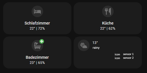
hey guys, could someone help me create a card like the one on the bottom right?
where, if possible, the icon is the weather entity.
Hi.
Do you have an idea how to display name as day of the week in weather forecast?
I would like to use horizontal stack with 4 button-card.
Each button-card will have a name of next day.
Something like this:

Need assistance with this one. I’m trying to make a custom button card for my music playlists. what I’m trying to make is when i press the playlist I want the card too glow red and stay red until I select another playlist to another one. This is my yaml so far:
type: custom:button-card
entity: input_button.rap_button
name: Rap
icon: mdi:microphone-variant
color_type: card
color: rgba(0,0,0,0%)
tap_action:
  action: toggle
state:
  - value: Rap
    color: red

Something like this … hard to tell , as you just show a picture
name: |
              [[[
                return helpers.formatDateWeekdayShort(entity.attributes.weather_datetime)
              ]]]
PS: note that i use template-sensors, and button_card_templates
For further Inspiration, Read the Documentation  , it’s there, lots of tips, ideas.
And the Various Date, Time and Date Time format helpers !
GitHub - custom-cards/button-card: ❇️ Lovelace button-card for home assistant.
You would need an input_select toggle helper. I’m not sure if the input_button has an on/off state?
Hi,
could someone, please create this type of card for me.
i was trying for hours 

found on youtube, but can’t follow the creator
You Tube - direct at beginning
Thanks in advance
I’m having trouble getting the name and state to fully utilize the width of the right cards. Any help would be much appreciated.

                - font-weight: bold
      - type: vertical-stack
        cards:
          - type: custom:button-card
            entity: device_tracker.A_iphone_3
            name: Riley
            show_state: true
            show_icon: false
            layout: icon_name_state
            styles:
              name:
                - font-size: 30px
                - font-weight: bold
              state:
                - font-size: 30px
              card:
                - background-color: |
                    [[[
                      if (entity.state == 'home') return ''; else return 'red';
                    ]]]
                - height: 85px
              grid:
                - grid-template-areas: '"n" "s"'
          - type: custom:button-card
            entity: device_tracker.iphone_2
            show_state: true
            show_icon: false
            layout: icon_name_state
            styles:
              name:
                - font-size: 30px
                - font-weight: bold
              state:
                - font-size: 30px
              card:
                - background-color: |
                    [[[
                      if (entity.state == 'home') return ''; else return 'red';
                    ]]]
                - height: 85px
                - padding: 10px 0px 0px 0px
              grid:
                - grid-template-areas: '"n" "s"'
          - type: custom:button-card
            entity: device_tracker.B_iphone
            show_state: true
            show_icon: false
            layout: icon_name_state
            styles:
              name:
                - font-size: 30px
                - font-weight: bold
              state:
                - font-size: 30px
              card:
                - background-color: |
                    [[[
                      if (entity.state == 'home') return ''; else return 'red';
                    ]]]
                - height: 85px
              grid:
                - grid-template-areas: '"n" "s"'