That’s what I figured. I will convert it to a decluttering card and test then post my code once I get all the sensors I ordered. I needed to learn the decluttering card also, so good timing.
Hey guys,
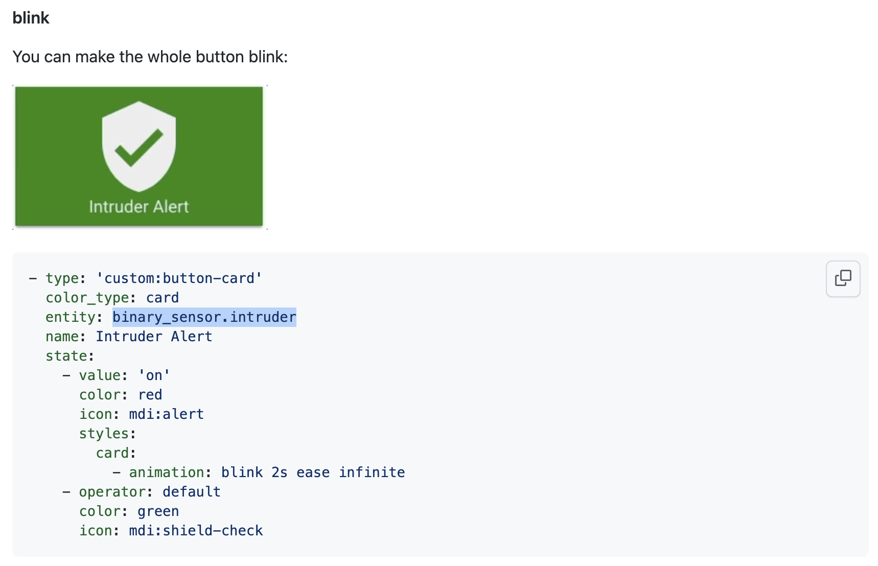
Im trying to replicate this flashing button which flashes red when my home security gets breached. Aside of that it should be static green when it is not breached. However, i have no idea how to replicate this binary sensor. Could someone help me out?
You need to have a sensor, that shows if the alarm is on or off. This is the sensor you set here. Where do you get the information, that the alarm is on?
Thanks for answering, I have no idea how to create a binary sensor like that. This is, however, where I see when my alarm is on or off:
alarm_control_panel.home_alarm
What does state does alarm_control_panel.home_alarm return?
I would assume something like “armed home”, “armed away”, and “disarmed”.
That would tell you whether the system was armed, but you really need the status that tells you whether the alarm has been triggered. Is there either another entity connected with the alarm that does that or, perhaps, a property of alarm_control_panel.home_alarm that will do that?
And which entity triggers your alarm?
My frontdoor sensor triggers my alarm. Aside of that, states that the alarm has:
Armed night
Armed away
Armed home
Disarmed
Thanks for helping out guys, appreciate it
Then this sensor is the tool of choice.
If you want to use your alarm panel entity, insert alarm_control_panel.home_alarm as entity and triggered as value.
I would like to have a coontainer card with two rows of buttons, because with more than 4 button it doesnt fit on the screen, but I cant figure how to do it.
I tried with grid instead of horizontal-stack but when I change it button become super spaced and the card is super large.
Can anyone point me in the right direction ?
in this specific card, I would like the 5th entity to be on a second row, or 3-2 or 3-3, just not more than 4 max
type: custom:button-card
template: container
color: '#FCD299'
name: Chambre Dom
styles:
  card:
    - width: 545px
custom_fields:
  buttons:
    card:
      type: horizontal-stack
      cards:
        - entity: light.lumieres_lit_dom
          name: Lumières lit
          template: standard
          icon: null
          type: custom:button-card
          styles:
            card:
              - width: 90px
              - height: 68px
          state:
            - value: 'on'
              color: Gold
            - value: 'off'
              color: SlateGrey
        - entity: light.suite_parentale_lumieres_principales
          name: Plafonnier
          template: standard
          icon: null
          type: custom:button-card
          styles:
            card:
              - width: 90px
              - height: 68px
          state:
            - value: 'on'
              color: Gold
              tap_Action: toggle
            - value: 'off'
              color: SlateGrey
              tap_Action: toggle
        - entity: climate.mysa_1facb8
          template: bigtemp
          name: HVAC
          type: custom:button-card
          style:
            top: 40%
            left: 20%
        - entity: climate.mysa_d37cb4
          template: bigtemp
          name: PLINTHE
          type: custom:button-card
          style:
            top: 40%
            left: 20%
        - entity: climate.mysa_d37b98
          template: bigtemp
          name: Walk-In
          type: custom:button-card
          style:
            top: 40%
            left: 20%
I can’t seem to get the buttons to appear on the container card. Is there something I’m doing wrong? The templates seems to come up but I only see the label card. Thanks!
type: custom:button-card
template: container
name: Test
custom fields:
  buttons:
    card:
      type: horizontal-stack
      cards:
        - entity: light.guest_strip
          name: guest strip
          template: standard
          icon: mdi:lightbulb
          type: custom:button-card
        - entity: light.guest_strip
          name: guest strip
          template: standard
          icon: mdi:lightbulb
          type: custom:button-card
        - entity: light.guest_strip
          name: guest strip
          template: standard
          icon: mdi:lightbulb
          type: custom:button-card
        - entity: light.guest_strip
          name: guest strip
          template: standard
          icon: mdi:lightbulb
          type: custom:button-card
If this is the only code, it won’t work. You need to define the custom_fields and where to show them. Right now you’re populating something to the custom_field but nowhere is defined where this custom_field should be and how it should look. 
Despite the thing, that custom fields is not correct, it needs to be custom_fields (the underscore).
It is not easy to help you with this, as your intention is not clear. If you describe what exactly you want to achieve, preferable with all code you use (including the template definitions), there might be will be someone who can give a corrected example.
Thanks. I realised what was the issue. I missed out the ‘underscore’.
Wondering if anybody figured out a way for it to show a slider on the button card for dimmer lights? I see that long pressing on it will bring up the bar with a slider, was just hoping for something up front with the button. Regardless, great stuff.
You can find such a button in the Minimalist “theme”. The code for that light_slider would be this:
card_light_slider:
  variables:
    ulm_card_light_slider_name: "[[[ return entity.attributes.friendly_name ]]]"
  show_icon: false
  show_name: false
  show_label: false
  state:
    - operator: template
      value: "[[[ return entity.state == 'on' ]]]"
      styles:
        card:
          - background-color: 'rgba(var(--color-background-yellow),var(--opacity-bg))'
  styles:
    grid:
      - grid-template-areas: '"item1" "item2"'
      - grid-template-columns: 1fr
      - grid-template-rows: min-content  min-content
      - row-gap: 12px
    card:
      - border-radius: var(--border-radius)
      - box-shadow: var(--box-shadow)
      - padding: 12px
  custom_fields:
    item1:
      card:
        type: 'custom:button-card'
        template:
          - icon_info
          - light
        entity: "[[[ return entity.entity_id ]]]"
        name: "[[[ return variables.ulm_card_light_slider_name ]]]"
        styles:
          card:
            - box-shadow: none
            - border-radius: var(--border-radius) var(--border-radius) 0px 0px
            - padding: 0px
    item2:
      card:
        type: 'custom:my-slider'
        entity: '[[[ return entity.entity_id ]]]'
        radius: 14px
        height: 42px
        mainSliderColor: rgba(var(--color-yellow),1)
        secondarySliderColor: rgba(var(--color-yellow),0.2)
        mainSliderColorOff: rgba(var(--color-theme),0.05)
        secondarySliderColorOff: rgba(var(--color-theme),0.05)
        thumbHorizontalPadding: '0px'
        thumbVerticalPadding: '0px'
        thumbWidth: 0px
        card_mod:
        style: |
          ha-card {
            border-radius: 14px;
            box-shadow: none;
          }
You’d need my-cards for the slider component.
1 Like
@paddy0174 hanks for sharing that! I hadn’t encountered that slider component yet and I like the simplicity of it. I like how it lights up when the entity is turned on, but still shows the level clearly when the entity is toggled off.
I enhanced it a bit, sorry, posted the “old” code before.
I assume you get the variables, if not I can post some instructions.
Here are the changes for the “new” version, use them instead of the item2 definitions above:
    item2:
      card:
        type: conditional
        conditions:
          - entity: "[[[ return entity.entity_id ]]]"
            state: 'on'
        card:
          type: 'custom:my-slider'
          entity: '[[[ return entity.entity_id ]]]'
          radius: 14px
          height: 42px
          mainSliderColor: rgba(var(--color-yellow),1)
          secondarySliderColor: rgba(var(--color-yellow),0.2)
          mainSliderColorOff: rgba(var(--color-theme),0.05)
          secondarySliderColorOff: rgba(var(--color-theme),0.05)
          thumbHorizontalPadding: '0px'
          thumbVerticalPadding: '0px'
          thumbWidth: 0px
          card_mod:
          style: |
            ha-card {
              border-radius: 14px;
              box-shadow: none;
            }
It hides the slider, if the entity is off. 
I like the look of that theme, but I do enough digging through yaml and the like in my work hours, I don’t want to have to do it when I’m off work too. The WAF was apparently high enough to pass muster when I told her to long press on the icon to get the color changing pallet.
Appreciate the suggestion though.
One last (?) question, I have six lights in a container that I’d like to split into two rows. When I change the button type to grid and set columns to 3, I get huge amounts of spacing between the two rows. I imagine I’d need to add styling directly to the cards to fix this, but I’m not sure which need to be adjusted.

So you mean you’re an UI guy? Compared to what you’re doing now with the buttons, I can tell you, there is something in the making for the Minimalist “theme” to make that easier in the future. 
At least a lot easier than what you’re doing now. 
I’m not ready yet, but there will be some kind of generator to use the Minimalist theme. It will not free you from working in the UI editor (not the raw-config-editor, but the code editing mode), but it will be possible to generate the code to paste in there.
Take a look in the above linked thread in a few days, to get more info.
Please, no cross posting!  You won’t get more help, if you ask in two different threads, as mostly the same people will answer, no matter if here or there, but not in both.
So let’s stay where you want to end up, a swipe through your button-card, see here: