if this is an element of your vertical stack then it should be two steps to the left, at the same position as - type: custom:button-card
hi, would you shre the code of the this one? as i’m leaning, i would like to see how it was done.
Thx!
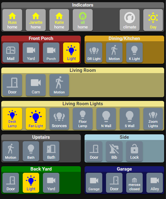
It’s changed a bit since that. Here’s the latest set-up:

I’m using the custom:button-card, custom:decluttering-card, browser_mod, template-entity-row, and the simple weather card all together.
Here is the lovelace UI:
decluttering_templates: !include lovelace-templates-decluttering.yaml
button_card_templates: !include lovelace-templates-button-card.yaml
title: Home
swipe_nav:
wrap: true
animate: swipe
views:
# Main
- title: Main
path: main
icon: 'mdi:home'
badges: []
cards:
- type: grid
columns: 1
square: false
cards:
- type: custom:simple-weather-card
entity: weather.home
card_mod:
style: |
ha-card {
padding: 0px;
}
name: " "
primary_info:
- extrema
- wind_speed
- wind_bearing
secondary_info:
- pressure
- precipitation_probability
- precipitation
- type: grid
columns: 3
square: false
cards:
- entity: sensor.family_sensor
name: Presence
template: presence-tile-compact
type: 'custom:button-card'
variables:
m1_entity: device_tracker.sm_n986u
m1_name: R
m2_entity: device_tracker.janettes_phone
m2_name: J
m3_entity: device_tracker.katies_phone
m3_name: K
- entity: climate.thermostat_2
name: Thermostat
template: climate-tile-compact
type: 'custom:button-card'
- type: 'custom:decluttering-card'
template: mode-thing
variables:
- aspect_ratio: 3/1.5
- card_background_color: darkSlateGrey
- thing_entity: input_boolean.in_bed
- thing_name: 'Modes'
- thing_icon_on: 'mdi:bed'
- thing_icon_color_on: yellow
- thing_name_on: 'in bed'
- thing_icon_off: 'mdi:walk'
- thing_icon_color_off: deepSkyBlue
- thing_name_off: 'about'
- thing_toggle: true
- m0_show: 'false'
- m1_show: 'true'
- m1_entity: sun.sun
- m1_on_state: 'above_horizon'
- m1_icon_on: 'mdi:weather-sunny'
- m1_icon_color_on: yellow
- m1_status_on: 'day'
- m1_icon_off: 'mdi:moon-waning-crescent'
- m1_icon_color_off: deepSkyBlue
- m1_status_off: 'night'
- m1_toggle: false
- m2_show: 'true'
- m2_entity: switch.presence_simulation
- m2_on_state: 'on'
- m2_icon_on: 'mdi:lightbulb-group'
- m2_icon_color_on: yellow
- m2_status_on: 'sim.lights on'
- m2_icon_off: 'mdi:lightbulb-group-outline'
- m2_icon_color_off: deepSkyBlue
- m2_status_off: 'sim.lights off'
- m2_toggle: true
- m3_show: 'true'
- m3_entity: switch.mailbox_opened
- m3_on_state: 'on'
- m3_icon_on: 'mdi:mailbox-open-up'
- m3_icon_color_on: yellow
- m3_status_on: 'check mail'
- m3_icon_off: 'mdi:mailbox-outline'
- m3_icon_color_off: deepSkyBlue
- m3_status_off: 'mail'
- m3_toggle: true
- type: grid
columns: 2
square: false
cards:
# Master Lighting
- type: 'custom:button-card'
template: container
color: Grey
name: Master Control
custom_fields:
buttons:
card:
type: grid
columns: 4
square: true
cards:
- entity: input_boolean.zoom_lighting
name: Zoom Lights
template: light-group-button
type: 'custom:button-card'
aspect_ratio: 1/1.1
- template: standard-button
type: 'custom:button-card'
aspect_ratio: 1/1.1
double_tap_action:
action: call-service
service: script.good_night_02
service_data:
lights_wait: '0'
in_bed_wait: '0'
tap_action:
action: call-service
service: script.good_night_02
service_data:
lights_wait: '10'
in_bed_wait: '15'
name: |
[[[
if (states["input_select.good_night_phase"].state == "lights") return "lights...";
if (states["input_select.good_night_phase"].state == "bed") return "in bed...";
return "Good Night";
]]]
icon: |
[[[
if (states["input_select.good_night_phase"].state == "lights") return "mdi:lightbulb-group";
if (states["input_select.good_night_phase"].state == "bed") return "mdi:bed";
return "mdi:power";
]]]
- entity: switch.presence_simulation
name: Mimic lights
template: light-group-button
type: 'custom:button-card'
aspect_ratio: 1/1.1
tap_action:
action: toggle
# Side
- type: 'custom:button-card'
template: container
color: LightBlue
name: Side
custom_fields:
buttons:
card:
type: grid
columns: 4
square: true
cards:
- entity: binary_sensor.side_door_sensor_contact
name: Outside Door
template: door-button-open
type: 'custom:button-card'
aspect_ratio: 1/1.1
- type: 'custom:decluttering-card'
template: locking-thing
variables:
- thing_entity: switch.outside_tap
- thing_name: 'Bib'
- lock_entity: switch.outside_water_valve_lock
- thing_icon_on: 'mdi:water-pump'
- thing_icon_off: 'mdi:water-pump-off'
- aspect_ratio: 1/1.1
- entity: binary_sensor.upstairs_motion_sensor_motion
name: Stairs Motion
template: standard-button
type: 'custom:button-card'
aspect_ratio: 1/1.1
styles:
name:
- font-size: 0.45em
tap_action:
action: fire-dom-event
browser_mod:
command: call-service
service: browser_mod.popup
service_data:
deviceID: this
title: Stairs Sensors
hide_header: false
card:
type: entities
entities:
- entity: sensor.upstairs_motion_sensor_temperature_measurement
name: temperature
- entity: camera.blueiris_side
name: Camera
template: standard
type: 'custom:button-card'
color: SlateGrey
aspect_ratio: 1/1.1
# Front Porch
- type: 'custom:button-card'
template: container
color: Brown
name: Front
custom_fields:
buttons:
card:
type: grid
columns: 4
square: true
cards:
- entity: camera.blueiris_front
name: Yard
template: standard
type: 'custom:button-card'
aspect_ratio: 1/1.1
color: SlateGrey
- entity: camera.front_doorbell
name: Doorbell
template: standard
type: 'custom:button-card'
aspect_ratio: 1/1.1
styles:
name:
- font-size: 0.45em
color: SlateGrey
- entity: switch.front_porch_light
name: Light
template: light-button
type: 'custom:button-card'
aspect_ratio: 1/1.1
# Dining Room/Kitchen
- type: 'custom:button-card'
template: container
color: GoldenRod
name: Dining Room/Kitchen
custom_fields:
buttons:
card:
type: grid
columns: 4
square: true
cards:
- entity: light.dining_room_chandelier
name: DR Light
template: light-group-button
type: 'custom:button-card'
aspect_ratio: 1/1.1
styles:
name:
- font-size: 0.45em
- entity: binary_sensor.dining_room_motion_motion
name: DR Motion
template: standard-button
type: 'custom:button-card'
aspect_ratio: 1/1.1
styles:
name:
- font-size: 0.45em
tap_action:
action: fire-dom-event
browser_mod:
command: call-service
service: browser_mod.popup
service_data:
deviceID: this
title: Dining Room Sensors
hide_header: false
card:
type: entities
entities:
- entity: sensor.dining_room_motion_temperature_measurement
name: temperature
- entity: switch.stove_sink_lights
name: K Light
template: light-button
type: 'custom:button-card'
aspect_ratio: 1/1.1
styles:
name:
- font-size: 0.45em
- entity: binary_sensor.side_kitchen_door_contact
name: Side Door
template: door-button-open
type: 'custom:button-card'
aspect_ratio: 1/1.1
# Living Room
- type: 'custom:button-card'
template: container
color: Khaki
name: Living Room
custom_fields:
buttons:
card:
type: grid
columns: 4
square: true
cards:
- entity: binary_sensor.front_door_sensor_contact
name: Door
template: door-button-open
type: 'custom:button-card'
aspect_ratio: 1/1.1
- entity: camera.blueiris_livingroom_ip2m
name: Camera
template: standard
type: 'custom:button-card'
color: SlateGrey
aspect_ratio: 1/1.1
- entity: binary_sensor.living_room_motion_motion
name: LR Motion
template: standard-button
type: 'custom:button-card'
aspect_ratio: 1/1.1
styles:
name:
- font-size: 0.45em
tap_action:
action: fire-dom-event
browser_mod:
command: call-service
service: browser_mod.popup
service_data:
deviceID: this
title: Livingroom Sensors
hide_header: false
card:
type: entities
entities:
- entity: sensor.living_room_motion_illuminance
name: illuminance
- entity: sensor.living_room_motion_relative_humidity_measurement
name: relative humidity
- entity: sensor.living_room_motion_temperature_measurement
name: temperature
- entity: fan.lr_sonoff
name: Ceiling Fan
template: fan-button
type: 'custom:button-card'
aspect_ratio: 1/1.1
styles:
name:
- font-size: 0.45em
hold_action:
action: more-info
# Living Room Lights
- type: 'custom:button-card'
template: container
color: Khaki
name: Living Room Lights
custom_fields:
buttons:
card:
type: grid
columns: 4
square: true
cards:
- entity: light.lr_sonoff
name: Ceiling Light
template: light-group-button
type: 'custom:button-card'
aspect_ratio: 1/1.1
styles:
name:
- font-size: 0.45em
- entity: switch.r_desk_lamp
name: 'R:Desk Lamp'
template: light-button
type: 'custom:button-card'
aspect_ratio: 1/1.1
styles:
name:
- font-size: 0.45em
- entity: switch.j_desk_lamp
name: 'J:Desk Lamp'
template: light-button
type: 'custom:button-card'
aspect_ratio: 1/1.1
styles:
name:
- font-size: 0.45em
- name: All Lights
template: standard-button
type: 'custom:button-card'
aspect_ratio: 1/1.1
icon: 'mdi:power'
tap_action:
action: fire-dom-event
browser_mod:
command: call-service
service: browser_mod.popup
service_data:
deviceID: this
title: Individual Items
hide_header: false
card:
type: entities
entities:
- entity: light.lr_sonoff
name: Ceiling Light
- entity: light.sconce_n
- entity: light.sconce_s
- entity: light.wall_n
- entity: light.wall_s
- entity: switch.table_lamp
icon: "mdi:lightbulb"
- entity: switch.s_floor_lamp
icon: "mdi:lightbulb"
- entity: switch.hurricane_lamp
icon: "mdi:lightbulb"
- entity: switch.r_desk_lamp
name: Russ' Desk Lamp
- entity: switch.j_desk_lamp
name: Janette's Desk Lamp
- type: grid
columns: 1
square: false
cards:
# Bathroom
- type: 'custom:button-card'
template: container
color: dimgrey
name: Bathroom
custom_fields:
buttons:
card:
type: grid
columns: 4
square: true
cards:
- entity: switch.bathroom_master_switch
name: Bath
template: light-button
type: 'custom:button-card'
aspect_ratio: 1/1.1
styles:
name:
- font-size: 0.45em
- entity: binary_sensor.bathroom_door_contact
name: Door
template: door-button-closed
type: 'custom:button-card'
aspect_ratio: 1/1.1
- entity: binary_sensor.bathroom_multipurpose_sensor_motion
name: Motion
template: standard-button
type: 'custom:button-card'
aspect_ratio: 1/1.1
styles:
name:
- font-size: 0.45em
tap_action:
action: fire-dom-event
browser_mod:
command: call-service
service: browser_mod.popup
service_data:
deviceID: this
title: Bathroom Sensors
hide_header: false
card:
type: entities
entities:
- entity: sensor.bathroom_multipurpose_sensor_illuminance
name: illuminance
- entity: sensor.bathroom_multipurpose_sensor_relative_humidity_measurement
name: relative humidity
- entity: sensor.bathroom_multipurpose_sensor_temperature_measurement
name: temperature
- type: grid
columns: 2
square: false
cards:
# R&J Bedroom
- type: 'custom:button-card'
template: container
color: skyBlue
name: R&J Bedroom
custom_fields:
buttons:
card:
type: grid
columns: 2
square: true
cards:
- entity: light.rj_sonoff
name: Ceiling Light
template: light-button
type: 'custom:button-card'
aspect_ratio: 1/1.1
- entity: fan.rj_sonoff
name: Ceiling Fan
template: fan-button
type: 'custom:button-card'
aspect_ratio: 1/1.1
# Kt Bedroom
- type: 'custom:button-card'
template: container
color: white
name: Kt Bedroom
custom_fields:
buttons:
card:
type: grid
columns: 2
square: true
cards:
- entity: light.k_sonoff
name: Ceiling Light
template: light-button
type: 'custom:button-card'
aspect_ratio: 1/1.1
- entity: fan.k_sonoff
name: Ceiling Fan
template: fan-button
type: 'custom:button-card'
aspect_ratio: 1/1.1
# Back Yard
- type: 'custom:button-card'
template: container
color: Green
name: Back Yard
custom_fields:
buttons:
card:
type: grid
columns: 4
square: true
cards:
- entity: binary_sensor.back_door_sensor_contact
name: Door
template: door-button-open
type: 'custom:button-card'
aspect_ratio: 1/1.1
- entity: switch.back_door_motion_light
name: Light
template: light-button
type: 'custom:button-card'
aspect_ratio: 1/1.1
- entity: camera.blueiris_back_yard
name: Yard
template: standard
type: 'custom:button-card'
aspect_ratio: 1/1.1
color: SlateGrey
# Garage
- type: 'custom:button-card'
template: container
color: MidnightBlue
name: Garage
custom_fields:
buttons:
card:
type: grid
columns: 4
square: true
cards:
- entity: camera.blueiris_garage
name: Garage
template: standard
type: 'custom:button-card'
aspect_ratio: 1/1.1
styles:
name:
- font-size: 0.45em
color: SlateGrey
- entity: binary_sensor.garage_door_hinge_sensor_contact
name: Door
template: door-button-open
type: 'custom:button-card'
aspect_ratio: 1/1.1
- entity: cover.overhead_garage_door
name: Overhead
aspect_ratio: 1/1.1
template: garage-cover
type: 'custom:button-card'
- entity: camera.alley_camera
name: Alley
template: standard
type: 'custom:button-card'
aspect_ratio: 1/1.1
color: SlateGrey
See the next post for the button-card and decluttering-card definitions.
3 Likes
Here’s the decluttering card definitions:
# card to show various (on/off) modes
  mode-thing:
    card:
      type: custom:button-card
      entity: '[[thing_entity]]'
      name: '[[thing_name]]'
      state_color: true
      triggers_update: all
      aspect_ratio: '[[aspect_ratio]]'
      hold_action:
        action: fire-dom-event
        browser_mod:
          command: call-service
          service: browser_mod.popup
          service_data:
            deviceID: this
            title: Modes
            hide_header: false
            card:
              type: entities
              entities:
                - type: custom:template-entity-row
                  entity: '[[thing_entity]]'
                  icon: "{% if is_state('[[thing_entity]]','on') %} [[thing_icon_on]] {% else %} [[thing_icon_off]] {% endif %}"
                  active: "{{ is_state('[[thing_entity]]','on') }}"
                  state: "{% if is_state('[[thing_entity]]','on') %} [[thing_name_on]] {% else %} [[thing_name_off]] {% endif %}"
                  toggle: '[[thing_toggle]]'
                - type: custom:template-entity-row
                  entity: '[[m0_entity]]'
                  icon: "{% if is_state('[[m0_entity]]','[[m0_on_state]]') %} [[m0_icon_on]] {% else %} [[m0_icon_off]] {% endif %}"
                  active: "{{ is_state('[[m0_entity]]','[[m0_on_state]]') }}"
                  state: "{% if is_state('[[m0_entity]]','[[m0_on_state]]') %} [[m0_status_on]] {% else %} [[m0_status_off]] {% endif %}"
                  toggle: '[[m0_toggle]]'
                  condition: '[[m0_show]]'
                - type: custom:template-entity-row
                  entity: '[[m1_entity]]'
                  icon: "{% if is_state('[[m1_entity]]','[[m1_on_state]]') %} [[m1_icon_on]] {% else %} [[m1_icon_off]] {% endif %}"
                  active: "{{ is_state('[[m1_entity]]','[[m1_on_state]]') }}"
                  state: "{% if is_state('[[m1_entity]]','[[m1_on_state]]') %} [[m1_status_on]] {% else %} [[m1_status_off]] {% endif %}"
                  toggle: '[[m1_toggle]]'
                  condition: '[[m1_show]]'
                - type: custom:template-entity-row
                  entity: '[[m2_entity]]'
                  icon: "{% if is_state('[[m2_entity]]','[[m2_on_state]]') %} [[m2_icon_on]] {% else %} [[m2_icon_off]] {% endif %}"
                  active: "{{ is_state('[[m2_entity]]','[[m2_on_state]]') }}"
                  state: "{% if is_state('[[m2_entity]]','[[m2_on_state]]') %} [[m2_status_on]] {% else %} [[m2_status_off]] {% endif %}"
                  toggle: '[[m2_toggle]]'
                  condition: '[[m2_show]]'
                - type: custom:template-entity-row
                  entity: '[[m3_entity]]'
                  icon: "{% if is_state('[[m3_entity]]','[[m3_on_state]]') %} [[m3_icon_on]] {% else %} [[m3_icon_off]] {% endif %}"
                  active: "{{ is_state('[[m3_entity]]','[[m3_on_state]]') }}"
                  state: "{% if is_state('[[m3_entity]]','[[m3_on_state]]') %} [[m3_status_on]] {% else %} [[m3_status_off]] {% endif %}"
                  toggle: '[[m3_toggle]]'
                  condition: '[[m3_show]]'
      styles:
        card:
          - background-color: '[[card_background_color]]'
          - border-radius: 0%
          - padding: 1%
          - color: ivory
          - font-size: 12px
          - text-transform: capitalize
        grid:
          - grid-template-areas: '"n n m0 m0 m0" "i i m1 m1 m1" "i i m2 m2 m2" "stat stat m3 m3 m3"'
          - grid-template-columns: 1fr 1fr 1fr 1fr 1fr
          - grid-template-rows: 1fr 1fr 1fr 1fr
        name:
          - font-weight: bold
          - font-size: 13px
          - color: white
          - align-self: middle
          - justify-self: start
          - padding-bottom: 0px
        img_cell:
          - justify-content: start
          - align-items: start
          - margin: 0%
        icon:
          - color: |
              [[[
                if (entity.state == 'on') return '[[thing_icon_color_on]]';
                else return '[[thing_icon_color_off]]';
              ]]]
          - width: 80%
          - margin-top: 0%
        custom_fields:
          stat:
            - font-size: 12px
            - align-self: middle
            - justify-self: start
          m0:
            - align-self: middle
            - justify-self: start
          m1:
            - align-self: middle
            - justify-self: start
          m2:
            - align-self: middle
            - justify-self: start
          m3:
            - align-self: middle
            - justify-self: start
      state:
        - value: 'on'
          id: value_on
          icon: '[[thing_icon_on]]'
        - value: 'off'
          id: value_off
          icon: '[[thing_icon_off]]'
      custom_fields:
        stat: |
          [[[
            var status = '[[thing_name_off]]';
            if (entity.state == "on") status = '[[thing_name_on]]';
            return `<span>${status}</span>`
          ]]]
        m0: |
          [[[
            if ('[[m0_show]]' == 'true') {
              var icon = '[[m0_icon_off]]';
              var icon_color = '[[m0_icon_color_off]]';
              var status = '[[m0_status_off]]';
              if (states['[[m0_entity]]'].state == '[[m0_on_state]]') {
                icon = '[[m0_icon_on]]';
                status = '[[m0_status_on]]';
                icon_color = '[[m0_icon_color_on]]';
              }
              return `<ha-icon icon=${icon}
              style="width: 14px; height: 14px; color: ${icon_color};">
              </ha-icon><span style="color: white";> ${status}</span>`
            }
            return ``
          ]]]
        m1: |
          [[[
            if ('[[m1_show]]' == 'true') {
              var icon = '[[m1_icon_off]]';
              var icon_color = '[[m1_icon_color_off]]';
              var status = '[[m1_status_off]]';
              if (states['[[m1_entity]]'].state == '[[m1_on_state]]') {
                icon = '[[m1_icon_on]]';
                status = '[[m1_status_on]]';
                icon_color = '[[m1_icon_color_on]]';
              }
              return `<ha-icon icon=${icon}
              style="width: 14px; height: 14px; color: ${icon_color};">
              </ha-icon><span style="color: white";> ${status}</span>`
            }
            return ``
          ]]]
        m2: |
          [[[
            if ('[[m2_show]]' == 'true') {
              var icon = '[[m2_icon_off]]';
              var icon_color = '[[m2_icon_color_off]]';
              var status = '[[m2_status_off]]';
              if (states['[[m2_entity]]'].state == '[[m2_on_state]]') {
                icon = '[[m2_icon_on]]';
                icon_color = '[[m2_icon_color_on]]';
                status = '[[m2_status_on]]';
              }
              return `<ha-icon icon=${icon}
              style="width: 14px; height: 14px; color: ${icon_color};">
              </ha-icon><span style="color: white";> ${status}</span>`
            }
            return ``
          ]]]
        m3: |
          [[[
            if ('[[m3_show]]' == 'true') {
              var icon = '[[m3_icon_off]]';
              var icon_color = '[[m3_icon_color_off]]';
              var status = '[[m3_status_off]]';
              if (states['[[m3_entity]]'].state == '[[m3_on_state]]') {
                icon = '[[m3_icon_on]]';
                icon_color = '[[m3_icon_color_on]]';
                status = '[[m3_status_on]]';
              }
              return `<ha-icon icon=${icon}
              style="width: 14px; height: 14px; color: ${icon_color};">
              </ha-icon><span style="color: white";> ${status}</span>`
           }
            return ``
          ]]]
# card with main entity and lock entity
  locking-thing:
    card:
      type: 'custom:button-card'
      entity: '[[thing_entity]]'
      name: '[[thing_name]]'
      template: standard-button
      triggers_update: all
      aspect_ratio: '[[aspect_ratio]]'
      styles:
        grid:
          - position: relative
        custom_fields:
          lock:
            - position: absolute
            - right: 0%
            - top: -10%
            - height: 18px
            - width: 12px
      custom_fields:
        lock: |
          [[[
            var icon = "mdi:lock-open-variant:";
            var color = "darkRed";
            var status = states['[[lock_entity]]'].state;
            if (status == 'on') {
              icon = "mdi:lock";
              color = "darkGreen";
            }
            return `<ha-icon icon="${icon}"
            style="width 12px; height: 12px; color: ${color};"></ha-icon>`
          ]]]
      hold_action:
        action: call-service
        service: homeassistant.toggle
        service_data:
          entity_id: '[[lock_entity]]'
      state:
        - value: 'on'
          id: value_on
          icon: '[[thing_icon_on]]'
        - value: 'off'
          id: value_off
          icon: '[[thing_icon_off]]'
Here are the button-card definitions:
standard:
color_type: card
size: 80%
hold_action:
action: more-info
styles:
card:
- padding: 0.2em
- '--mdc-ripple-color': yellow
- '--mdc-ripple-press-opacity': 0.5
icon:
- opacity: 0.75
name:
- font-size: 0.5em
- white-space: normal
state:
- font-size: 0.5em
- white-space: normal
label:
- font-size: 0.5em
- white-space: normal
wide:
template: standard
styles:
grid:
- position: relative
- grid-template-areas: '"i n"'
- grid-template-columns: 1fr 1fr
- grid-template-rows: 1fr
container:
color_type: label-card
color: dimgray
styles:
card:
- padding: 0
name:
- border-radius: 0.4em 0.4em 0 0
- padding: 0.0em
- width: 100%
- font-weight: bold
- font-size: 0.6em
grid:
- grid-template-areas: '"i" "n" "buttons"'
- grid-template-columns: 1fr
- grid-template-rows: 1fr min-content min-content
custom_fields:
buttons:
- background-color: 'rgba(0,0,0,0.3)'
- margin: 0
- padding: 0.15em
standard-button:
template: standard
variables:
value_on: 'on'
value_off: 'off'
background_color_on: gold
background_color_off: slategrey
text_color_on: blue
text_color_off: white
styles:
label:
- color: '[[[ return variables.text_color_off ]]]'
state:
- id: value_on
value: '[[[ return variables.value_on ]]]'
styles:
card:
- background-color: '[[[ return variables.background_color_on ]]]'
name:
- color: '[[[ return variables.text_color_on ]]]'
icon:
- color: '[[[ return variables.text_color_on ]]]'
- opacity: 1
- id: value_off
value: '[[[ return variables.value_off ]]]'
styles:
card:
- background-color: '[[[ return variables.background_color_off ]]]'
name:
- color: '[[[ return variables.text_color_off ]]]'
icon:
- color: '[[[ return variables.text_color_off ]]]'
- opacity: 0.5
# presence-tile
presence-tile-compact:
color_type: card
triggers_update: all
aspect_ratio: 3/1.5
tap_action:
action: navigate
navigation_path: /lovelace/map
styles:
card:
- background-color: darkGreen
- border-radius: 0%
- padding: 1%
- color: ivory
- font-size: 11px
- text-transform: capitalize
grid:
- grid-template-areas: '"n n n n n" "i i m1 m1 m1" "i i m2 m2 m2" "fam fam m3 m3 m3"'
- grid-template-columns: 1fr 1fr 1fr 1fr 1fr
- grid-template-rows: 1fr 1fr 1fr 1fr
name:
- font-weight: bold
- font-size: 13px
- color: white
- align-self: middle
- justify-self: start
- padding-bottom: 0px
img_cell:
- justify-content: start
- align-items: start
- margin: 0%
icon:
- color: |
[[[
if (entity.state == 'some home') return 'white';
if (entity.state == 'none home') return 'lightGrey';
else return 'yellow';
]]]
- width: 70%
- margin-top: 0%
custom_fields:
fam:
- font-size: 10px
- align-self: middle
- justify-self: start
m1:
- align-self: middle
- justify-self: start
m2:
- align-self: middle
- justify-self: start
m3:
- align-self: middle
- justify-self: start
custom_fields:
fam: '[[[ return `${entity.state}` ]]]'
m1: |
[[[
var icon = "mdi:map-marker";
var color = "lightGrey";
var status = states[variables.m1_entity].state;
if (status != 'not_home') {
icon = states['zone.'+status].attributes['icon'];
color = "white";
}
return `<span>${variables.m1_name}:</span>
<ha-icon icon="${icon}"
style="width: 14px; height: 14px; color: ${color};"></ha-icon>
<span>${status}</span>`
]]]
m2: |
[[[
var icon = "mdi:map-marker";
var color = "lightGrey";
var status = states[variables.m2_entity].state;
if (status != 'not_home') {
icon = states['zone.'+status].attributes['icon'];
color = "white";
}
return `<span>${variables.m2_name}:</span>
<ha-icon icon="${icon}"
style="width: 14px; height: 14px; color: ${color};"></ha-icon>
<span>${status}</span>`
]]]
m3: |
[[[
var icon = "mdi:map-marker";
var color = "lightGrey";
var status = states[variables.m3_entity].state;
if (status != 'not_home') {
icon = states['zone.'+status].attributes['icon'];
color = "white";
}
return `<span>${variables.m3_name}:</span>
<ha-icon icon="${icon}"
style="width: 14px; height: 14px; color: ${color};"></ha-icon>
<span>${status}</span>`
]]]
# climate-tile
climate-tile-compact:
color_type: card
triggers_update: all
aspect_ratio: 3/1.5
styles:
card:
- background-color: |
[[[
if (entity.state == 'heat') return 'darkRed';
if (entity.state == 'cool') return 'darkBlue';
if (entity.state == 'off') return 'darkSlateGrey';
else return 'yellow';
]]]
- border-radius: 0%
- padding: 1%
- color: ivory
- font-size: 12px
- text-transform: capitalize
grid:
- grid-template-areas: '"n n n n n" "i i stat stat stat" "i i fan fan fan" "temp temp set set set"'
- grid-template-columns: 1fr 1fr 1fr 1fr 1fr
- grid-template-rows: 1fr 1fr 1fr 1fr
name:
- font-weight: bold
- font-size: 13px
- color: white
- align-self: middle
- justify-self: start
- padding-bottom: 0px
img_cell:
- justify-content: start
- align-items: start
- margin: 0%
icon:
- color: yellow
- width: 90%
- margin-top: 0%
custom_fields:
temp:
- font-size: 20px
- align-self: middle
- justify-self: middle
set:
- font-size: 11px
- align-self: middle
- justify-self: start
stat:
- align-self: middle
- justify-self: start
- font-size: 11px
fan:
- align-self: middle
- justify-self: start
- font-size: 11px
custom_fields:
temp: |
[[[
return `<span>${entity.attributes['current_temperature']}°F</span>`
]]]
set: |
[[[
return `<span>set:${entity.attributes['temperature']}°F</span>`
]]]
stat: |
[[[
var hvac_action = entity.attributes['hvac_action'];
var icon = "hass:thermostat";
var color = "lightGrey";
if (entity.state == "heat") {
icon = "hass:fire";
if (hvac_action == 'heating')
color = 'orange';
else if (hvac_action == 'fan')
color = 'yellow';
else
color = 'white';
} else if (entity.state == 'cool') {
icon = "hass:snowflake";
if (hvac_action == 'cooling')
color = 'lightSkyBlue';
else if (hvac_action == 'fan')
color = 'lightGreen';
else
color = 'white';
}
return `<ha-icon icon="${icon}"
style="width: 14px; height: 14px; color: ${color};"></ha-icon>
${entity.state}/${hvac_action}`
]]]
fan: |
[[[
var fan_mode = entity.attributes['fan_mode'];
var fan_action = entity.attributes['fan_action'];
var color = "lightGrey";
if (fan_mode == "on")
if (fan_action == "running")
color = "lightSkyBlue";
else
color = "white";
else if (fan_mode == "auto")
if (fan_action == "running")
color = "lightSkyBlue";
else
color = "white";
return `<ha-icon icon="mdi:fan"
style="width: 14px; height: 14px; color: ${color};"></ha-icon>
${fan_mode}/${fan_action}`
]]]
# mode-tile
mode-tile-compact:
color_type: card
aspect_ratio: 3/1.5
tap_action:
action: toggle
styles:
card:
- background-color: darkSlateGrey
- border-radius: 0%
- padding: 1%
- color: ivory
- font-size: 12px
- text-transform: capitalize
grid:
- grid-template-areas: '"n n n n n" "i i m1 m1 m1" "i i m2 m2 m2" "stat stat m3 m3 m3"'
- grid-template-columns: 1fr 1fr 1fr 1fr 1fr
- grid-template-rows: 1fr 1fr 1fr 1fr
name:
- font-weight: bold
- font-size: 13px
- color: white
- align-self: middle
- justify-self: start
- padding-bottom: 0px
img_cell:
- justify-content: start
- align-items: start
- margin: 0%
icon:
- color: deepSkyBlue
- width: 80%
- margin-top: 0%
custom_fields:
stat:
- font-size: 12px
- align-self: middle
- justify-self: start
m1:
- align-self: middle
- justify-self: start
m2:
- align-self: middle
- justify-self: start
m3:
- align-self: middle
- justify-self: start
state:
- value: 'on'
id: value_on
icon: 'mdi:bed'
- value: 'off'
id: value_off
icon: 'mdi:walk'
custom_fields:
stat: |
[[[
var status = "about";
if (entity.state == "on") status = "in bed";
return `<span>${status}</span>`
]]]
m1: |
[[[
var icon = "mdi:weather-sunny";
var status = "Day";
if (states['sun.sun'].state == "below_horizon") {
icon = "mdi:moon-waning-crescent";
status = "Night";
}
return `<ha-icon icon=${icon}
style="width: 14px; height: 14px; color: yellow;">
</ha-icon><span> ${status}</span>`
]]]
# printer-tile
printer-tile:
color_type: card
triggers_update: all
styles:
card:
- background-color: slateGrey
- border-radius: 0%
- padding: 1%
- color: ivory
- font-size: 10px
- text-transform: capitalize
grid:
- grid-template-areas: '"n n n m1 m1" "i i i m2 m2" "i i i m3 m3" "stat stat stat m4 m4"'
- grid-template-columns: 1fr 1fr 1fr 1fr 1fr
- grid-template-rows: 1fr 1fr 1fr 1fr
name:
- font-weight: bold
- font-size: 13px
- color: white
- align-self: middle
- justify-self: start
- padding-bottom: 0px
img_cell:
- justify-content: start
- align-items: start
- margin: 0%
icon:
- color: |
[[[
if (entity.state == 'idle') return 'lightGrey';
if (entity.state == 'unavailable') return 'lightPink';
return 'lightGreen';
]]]
- width: 70%
- margin-top: 0%
custom_fields:
stat:
- font-size: 13px
- align-self: middle
- width: 70%
- justify-self: middle
m1:
- align-self: middle
- justify-self: start
m2:
- align-self: middle
- justify-self: start
m3:
- align-self: middle
- justify-self: start
m4:
- align-self: middle
- justify-self: start
custom_fields:
stat: '[[[ return `${entity.state}` ]]]'
m1: |
[[[
var level = states[variables.m1_entity].state;
var color = 'lightPink';
if (level == 'unavailable') color = 'lightGrey';
if (level > 10) color = 'yellow';
if (level > 25) color = 'lightGreen';
if (level > 50) color = 'white';
return `<ha-icon icon="mdi:water"
style="width: 14px; height: 14px; color: black;">
</ha-icon><span style="color: ${color};">${level}%</span>`
]]]
m2: |
[[[
var level = states[variables.m2_entity].state;
var color = 'lightPink';
if (level == 'unavailable') color = 'lightGrey';
if (level > 10) color = 'yellow';
if (level > 25) color = 'lightGreen';
if (level > 50) color = 'white';
return `<ha-icon icon="mdi:water"
style="width: 14px; height: 14px; color: cyan;">
</ha-icon><span style="color: ${color};">${level}%</span>`
]]]
m3: |
[[[
var level = states[variables.m3_entity].state;
var color = 'lightPink';
if (level == 'unavailable') color = 'lightGrey';
if (level > 10) color = 'yellow';
if (level > 25) color = 'lightGreen';
if (level > 50) color = 'white';
return `<ha-icon icon="mdi:water"
style="width: 14px; height: 14px; color: magenta;">
</ha-icon><span style="color: ${color};">${level}%</span>`
]]]
m4: |
[[[
var level = states[variables.m4_entity].state;
var color = 'lightPink';
if (level == 'unavailable') color = 'lightGrey';
if (level > 10) color = 'yellow';
if (level > 25) color = 'lightGreen';
if (level > 50) color = 'white';
return `<ha-icon icon="mdi:water"
style="width: 14px; height: 14px; color: yellow;">
</ha-icon><span style="color: ${color};">${level}%</span>`
]]]
# garage-cover
garage-cover:
type: 'custom:button-card'
template: standard-button
show_label: true
tap_action:
action: toggle
styles:
name:
- font-size: 0.45em
label:
- color: white
- font-size: 0.45em
state:
- value: open
id: value_on
label: open
styles:
label:
- color: blue
- value: closed
id: value_off
label: closed
styles:
label:
- color: white
- value: opening
label: opening
icon: 'mdi:arrow-up-bold-box-outline'
styles:
card:
- background-color: LightCoral
name:
- color: yellow
label:
- color: yellow
icon:
- color: yellow
- value: closing
label: closing
icon: 'mdi:arrow-down-bold-box-outline'
styles:
card:
- background-color: LightSkyBlue
name:
- color: yellow
label:
- color: yellow
icon:
- color: yellow
# fan-button
fan-button:
template: standard-button
state:
- id: value_on
value: 'on'
icon: 'mdi:fan'
- id: value_off
value: 'off'
icon: 'mdi:fan-off'
# light-buttons
light-button:
template: standard-button
state:
- id: value_on
value: 'on'
icon: 'mdi:lightbulb-on'
- id: value_off
value: 'off'
icon: 'mdi:lightbulb'
light-group-button:
template: standard-button
state:
- id: value_on
value: 'on'
icon: 'mdi:lightbulb-group-outline'
- id: value_off
value: 'off'
icon: 'mdi:lightbulb-group'
# door-buttons
door-button-open:
template: standard-button
state:
- id: value_on
value: 'on'
icon: 'mdi:door-open'
- id: value_off
value: 'off'
icon: 'mdi:door-closed'
door-button-closed:
template: standard-button
state:
- id: value_on
value: 'off'
icon: 'mdi:door-closed'
- id: value_off
value: 'on'
icon: 'mdi:door-open'
# drawer-button
drawer-button:
template: standard-button
state:
- id: value_on
value: 'on'
icon: 'mdi:archive-arrow-down'
- id: value_off
value: 'off'
icon: 'mdi:archive-arrow-up-outline'
option-button:
template: standard
show_icon: false
aspect_ratio: 1/1
styles:
card:
- border-radius: 20%
dimmer-option:
template: option-button
tap_action:
action: call-service
service: light.turn_on
service_data:
entity_id: entity
brightness: '[[[ return variables.set_value ]]]'
state:
- operator: default
styles:
card:
- background-color: '[[[ return variables.option_button_off_color ]]]'
- color: '[[[ return variables.option_text_off_color ]]]'
- operator: template
value: >-
[[[ return (entity.attributes.brightness||0) >= variables.range_start
&& (entity.attributes.brightness||0) <= variables.range_stop ]]]
styles:
card:
- background-color: '[[[ return variables.option_button_on_color ]]]'
- color: '[[[ return variables.option_text_on_color ]]]'
presets:
template: standard
color_type: icon
tap_action:
action: none
styles:
card:
- background-color: 'rgba(0,0,0,0.3)'
icon:
- color: white
grid:
- grid-template-areas: '"i opt1 opt2 opt3 opt4" "n opt1 opt2 opt3 opt4"'
- grid-template-columns: 1fr 1fr 1fr 1fr 1fr
custom_fields:
opt1:
- margin: 0.1em
- overflow: visible
opt2:
- margin: 0.1em
- overflow: visible
opt3:
- margin: 0.1em
- overflow: visible
opt4:
- margin: 0.1em
- overflow: visible
variables:
option_template: dimmer-option
option_button_on_color: var(--paper-item-icon-active-color)
option_text_on_color: white
option_button_off_color: var(--paper-card-background-color)
option_text_off_color: white
option1_name: Low
option1_set_value: 51
option1_range_start: 1
option1_range_stop: 77
option2_name: Med
option2_set_value: 102
option2_range_start: 78
option2_range_stop: 170
option3_name: High
option3_set_value: 255
option3_range_start: 171
option3_range_stop: 255
option4_name: 'Off'
option4_set_value: 0
option4_range_start: 0
option4_range_stop: 0
custom_fields:
opt1:
card:
type: 'custom:button-card'
entity: '[[[ return variables.entity ]]]'
template: '[[[ return variables.option_template ]]]'
name: '[[[ return variables.option1_name ]]]'
variables:
set_value: '[[[ return variables.option1_set_value ]]]'
range_start: '[[[ return variables.option1_range_start ]]]'
range_stop: '[[[ return variables.option1_range_stop ]]]'
option_button_on_color: '[[[ return variables.option_button_on_color ]]]'
option_button_off_color: '[[[ return variables.option_button_off_color ]]]'
option_text_on_color: '[[[ return variables.option_text_on_color ]]]'
option_text_off_color: '[[[ return variables.option_text_off_color ]]]'
opt2:
card:
type: 'custom:button-card'
entity: '[[[ return variables.entity ]]]'
template: '[[[ return variables.option_template ]]]'
name: '[[[ return variables.option2_name ]]]'
variables:
set_value: '[[[ return variables.option2_set_value ]]]'
range_start: '[[[ return variables.option2_range_start ]]]'
range_stop: '[[[ return variables.option2_range_stop ]]]'
option_button_on_color: '[[[ return variables.option_button_on_color ]]]'
option_button_off_color: '[[[ return variables.option_button_off_color ]]]'
option_text_on_color: '[[[ return variables.option_text_on_color ]]]'
option_text_off_color: '[[[ return variables.option_text_off_color ]]]'
opt3:
card:
type: 'custom:button-card'
entity: '[[[ return variables.entity ]]]'
template: '[[[ return variables.option_template ]]]'
name: '[[[ return variables.option3_name ]]]'
variables:
set_value: '[[[ return variables.option3_set_value ]]]'
range_start: '[[[ return variables.option3_range_start ]]]'
range_stop: '[[[ return variables.option3_range_stop ]]]'
option_button_on_color: '[[[ return variables.option_button_on_color ]]]'
option_button_off_color: '[[[ return variables.option_button_off_color ]]]'
option_text_on_color: '[[[ return variables.option_text_on_color ]]]'
option_text_off_color: '[[[ return variables.option_text_off_color ]]]'
opt4:
card:
type: 'custom:button-card'
entity: '[[[ return variables.entity ]]]'
template: '[[[ return variables.option_template ]]]'
name: '[[[ return variables.option4_name ]]]'
variables:
set_value: '[[[ return variables.option4_set_value ]]]'
range_start: '[[[ return variables.option4_range_start ]]]'
range_stop: '[[[ return variables.option4_range_stop ]]]'
option_button_on_color: '[[[ return variables.option_button_on_color ]]]'
option_button_off_color: '[[[ return variables.option_button_off_color ]]]'
option_text_on_color: '[[[ return variables.option_text_on_color ]]]'
option_text_off_color: '[[[ return variables.option_text_off_color ]]]'
alerter:
template: standard
show_last_changed: true
color_type: icon
extra_styles: |
[[[ return `
@keyframes pulse {
20% {
background-color: ${variables.color};
}
}
`]]]
variables:
color: var(--paper-item-icon-active-color)
state:
- value: 'on'
id: value_on
styles:
card:
- animation: pulse 1s infinite
alerter-dual:
template: standard
show_last_changed: true
color_type: icon
extra_styles: |
[[[ return `
@keyframes pulse1 {
20% {
background-color: ${variables.color_initial};
}
}
@keyframes pulse2 {
20% {
background-color: ${variables.color_extended};
}
}
@keyframes color {
0% {
color: unset;
opacity: 0.5
}
99% {
color: unset;
opacity: 0.5
}
100% {
color: ${variables.color_extended};
}
}
`]]]
variables:
color_initial: var(--paper-item-icon-active-color)
color_extended: 'rgba(240,52,52, 0.9)'
color_seconds: 60
state:
- value: 'on'
id: value_on
styles:
card:
- animation: >-
[[[ return `pulse1 1s ${variables.color_seconds}, pulse2 1s
${variables.color_seconds}s infinite` ]]]
icon:
- color: '[[[ return variables.color_extended ]]]'
- opacity: 1
- animation: '[[[ return `color ${variables.color_seconds}s 1` ]]]'
name:
- font-weight: bold
1 Like
I can save UI in raw mode if I add this. Why?
Erros:
Unable to parse YAML: YAMLException: Unknown tag !include
I stored yaml files under /config/
Sorry I didn’t see that before. 
Thank you @qoheleth for sharing. I am working on replicating an exact copy of your dashboard so i can start modifying to fit my needs. I do appreciate you sharing and giving us a heads start on the learning curve.
I was wondering if you could share the group you created for the presence card you are using. I am interested in doing the same for my family.
Thank you
H-
I’m actually not using a group per se. (A group will only show two states. Depending on the “all” setting, it will either be home when any member is home or it will only be on when all members are home. I needed to have three states: all, some, and none.) What I used instead was the sensor template you see below:
My /config/configuration.yalm file contains this line:
sensor: !include sensors.yaml
and my /config/sensors.yaml file contains this:
- platform: template
  sensors:
    family_sensor:
      value_template: >-
        {% set items = states.person %}
        {% set all = items|length %}
        {% set home = items|map(attribute="state")|select("equalto","home")|list|length %}
        {{ "none home" if home == 0 else "all home" if home == all else "some home" }}
      icon_template: >-
        {% if is_state('family_sensor', 'none') %}
          mdi:home-circle-outline
        {% else %}
          mdi:home-circle
        {% endif %}
That sensor is the primary entity of my presence tile which is defined in my /config/ui-lovelace.yaml file like this:
              - entity: sensor.family_sensor
                name: Presence
                template: presence-tile-compact
                type: 'custom:button-card'
                variables:
                  m1_entity: device_tracker.sm_n986u
                  m1_name: R
                  m2_entity: device_tracker.janettes_phone
                  m2_name: J
                  m3_entity: device_tracker.katies_phone
                  m3_name: K
(and, of course, that refers to the presence-tile definition in the /config/lovelace-templates-button-card.yaml file that I posted in the previous post set.)
1 Like
Thank you. Worked like a charm!
Hi, does anybody have an idea how to enable the button card to display the name or lable in two lines when the content is too long?

Abwesend = state
The adress is the label but I would like the butten card to use a second line for the rest of that adress.
You can use break.
        state_display: |
          [[[
            if (entity.state != states['sensor.ha_lokale_version'].state)
              return 'Update verfügbar:<br\>' + entity.state
                + '<br\>[Release Notes]';
              return states['sensor.ha_lokale_version'].state
                + '<br\>Version ist aktuell';
          ]]]
returns

2 Likes
Ok thanks: I try to find out the lenght of the string and in case of beeing longer then 15 letters then break into two parts.
Should work - thanks again.
PS:
that’s what I did so far:
name: |
  [[[
    var out = states['sensor.joergs_location'].state
    out = out.substring(0,12) + '<br\>' + out.substring(12,24) + '<br\>' + out.substring(24,36)
    return out ]]]
That works on my mobile but is not very flexible.
I have to investigate further but you brought me on the right track 
Then try
- white-space: pre-line
or
- white-space: normal

1 Like
For all who are interested:
looks like this now:
type: custom:button-card
entity: person.jorg
show_entity_picture: true
size: 60px
layout: icon_name_state2nd
show_icon: false
show_label: true
show_name: true
name: |
  [[[
    var street = states['sensor.joergs_location'].attributes.street
    var number = states['sensor.joergs_location'].attributes.street_number
    street = street.substring(0,30)
    if (states['device_tracker.sm_g973f'].state != 'home')
       return street + ' ' + number;
    else return states['device_tracker.sm_g973f'].state;
  ]]]
label: |
  [[[
     var town = states['sensor.joergs_location'].attributes.city
     town = town.substring(0,30)
     return town ]]]
show_state: false
styles:
  card:
    - height: 60px
  state:
    - font-size: 12px
  name:
    - font-size: 13px
    - justify-self: start
    - align-self: left
    - white-space: normal
  label:
    - font-size: 13px
    - justify-self: start
    - align-self: left
    - white-space: normal
looks like this

I’m having some trouble with making the cards align on different devices.
Eg. on PC it looks fine:

but on phone it gets messed up:

Part of the problem is probably because I’m using fixed margins?:
type: vertical-stack
cards:
  - type: grid
    columns: 5
    square: true
    title: Living
    cards:
      - type: 'custom:button-card'
[....]
        styles:
          card:
            - border-radius: 15px
            - height: 85px
            - width: 85px
            - margin: 5px 5px 5px 10px
            - padding: 0px 0px
          icon:
            - height: 60px
            - width: 60px
            - margin: 10px 15px 5px 5px
          name:
            - justify-self: start
            - padding: 2px 28px
            - font-size: 13px
[....]
What is the correct way to do this?
If you want scalability use percentages instead of fixed values.
http://mattsnider.com/css-using-percent-for-margin-and-padding/
The percentage is based on the parent, so in your case the height.
Same goes for the icons. Just try out what works best.
I have been learning some of the button-cards, using the example in the thread.
I have been successful creating the following:

It is based on the example here.
I took the code and converted it to a template…with success. I plan on using it for some zigbee and z-wave multi-sensors which I will have in every room, or bathroom, etc.
Here is my code:
room-sensor-tile-compact:
    icon: 'mdi:motion-sensor'
    aspect_ratio: 1/1
    name: Sensors
    styles:
      card:
        - background-color: '#000044'
        - border-radius: 10%
        - padding: 10%
        - color: ivory
        - font-size: 10px
        - text-shadow: 0px 0px 5px black
        - text-transform: capitalize
      grid:
        - grid-template-areas: '"i temp_hdr" "n n" "temp temp" "humidity humidity" "light light" "pressure pressure"'
        - grid-template-columns: 1fr 1fr
        - grid-template-rows: 1fr min-content min-content min-content min-content min-content
      name:
        - font-weight: bold
        - font-size: 13px
        - color: white
        - align-self: middle
        - justify-self: start
        - padding-bottom: 4px
      img_cell:
        - justify-content: start
        - align-items: start
        - margin: none
      icon:
        - color: >
            [[[
              if (entity.state == 'on') return 'lime';
              else return 'red';
            ]]]
        - width: 60%
        - margin-top: -10%
      custom_fields:
        temp_hdr:
          - align-self: start
          - justify-self: end
          - font-size: 18px
          - font-weight: bold
          - --text-color-sensor: '[[[ if (states[variables.temp_hdr].state > 80) return "red"; ]]]'
        temp:
          - padding-bottom: 2px
          - align-self: middle
          - justify-self: start
          - --text-color-sensor: '[[[ if (states[variables.temp].state > 80) return "red"; ]]]'
        humidity:
          - padding-bottom: 2px
          - align-self: middle
          - justify-self: start
          - --text-color-sensor: '[[[ if (states[variables.humidity].state > 80) return "red"; ]]]'
        light:
          - align-self: middle
          - justify-self: start
          - --text-color-sensor: '[[[ if (states[variables.light].state > 80) return "red"; ]]]'
        pressure:
          - align-self: middle
          - justify-self: start
          - --text-color-sensor: '[[[ if (states[variables.pressure].state > 80) return "red"; ]]]'
    custom_fields:
      temp_hdr: >
        [[[
          return `<ha-icon
            icon="mdi:thermometer"
            style="width: 15px; height: 15px; color: yellow;">
            </ha-icon><span>${states[variables.temp_hdr].state}°F</span>`
        ]]]
      temp: >
        [[[
          return `<ha-icon
            icon="mdi:thermometer"
            style="width: 12px; height: 12px; color: deepskyblue;">
            </ha-icon><span>Temp: <span style="color: var(--text-color-sensor);">${states[variables.temp].state}°F</span></span>`
        ]]]
      humidity: >
        [[[
          return `<ha-icon
            icon="mdi:water-percent"
            style="width: 12px; height: 12px; color: deepskyblue;">
            </ha-icon><span>Humidity: <span style="color: var(--text-color-sensor);">${states[variables.humidity].state}%</span></span>`
        ]]]
      light: >
        [[[
          return `<ha-icon
            icon="mdi:wall-sconce-flat-variant"
            style="width: 12px; height: 12px; color: deepskyblue;">
            </ha-icon><span>Light: <span style="color: var(--text-color-sensor);">${states[variables.light].state}%</span></span>`
        ]]]
      pressure: >
        [[[
          return `<ha-icon
            icon="mdi:gauge"
            style="width: 12px; height: 12px; color: deepskyblue;">
            </ha-icon><span>Pressure: <span style="color: var(--text-color-sensor);">${states[variables.pressure].state}hPa</span></span>`
        ]]]
Here is my code in lovelace.yaml
- entity: binary_sensor.rpi_power_status
  name: Room sensors
  template: room-sensor-tile-compact
  type: custom:button-card
  aspect_ratio: 1/1.1
  variables:
    temp_hdr: sensor.office_temperature
    temp: sensor.office_temperature
    light: sensor.office_temperature
    humidity: sensor.office_humidity
    pressure: sensor.office_pressure
Ignore the Light sensor being a temp sensor, and the presence sensor being the Rpi…I don’t have the actual sensors yet and using similar entities to test. just haven’t gotten there yet, and thus my question.
If I have a room without a light sensor, and I don’t identify, and I skip the Light variable entity definition, the whole card disappears and does not show up or gives me an error.
I am trying not to create multiple templates.
In reading the decluttering card templates, there is a condition which allows us to show or not show the entity.
- type: custom:template-entity-row
entity: '[[m0_entity]]'
icon: "{% if is_state('[[m0_entity]]','[[m0_on_state]]') %} [[m0_icon_on]] {% else %} [[m0_icon_off]] {% endif %}"
active: "{{ is_state('[[m0_entity]]','[[m0_on_state]]') }}"
 state: "{% if is_state('[[m0_entity]]','[[m0_on_state]]') %} [[m0_status_on]] {% else %} [[m0_status_off]] {% endif %}"
toggle: '[[m0_toggle]]'
condition: '[[m0_show]]'

m0: |
[[[
if ('[[m0_show]]' == 'true') {
  var icon = '[[m0_icon_off]]';
  var icon_color = '[[m0_icon_color_off]]';
  var status = '[[m0_status_off]]';
  if (states['[[m0_entity]]'].state == '[[m0_on_state]]') {
    icon = '[[m0_icon_on]]';
    status = '[[m0_status_on]]';
    icon_color = '[[m0_icon_color_on]]';
  }
  return `<ha-icon icon=${icon}
  style="width: 14px; height: 14px; color: ${icon_color};">
  </ha-icon><span style="color: white";> ${status}</span>`
 }
return ``
]]]
Is there a way I can “skip” a variable in a template for a button card?
That’s one of the reasons I’m using the decluttering cards for templating. They allow me to use variables like [[m0_show]] to hide parts I’m not using in the particular instance.
I don’t see a way to do that with straight templates.