3d thread with the same question… instead of asking everyone, why not try to read the docs a bit more thoroughly? It’s all there
It’s because this isn’t a sensor. It’s a part of the Lovelace definition. (A completely different file in a different location.) The easiest way to edit that definition is exactly as ktownend-personal (Keith) describes above.
I finally understood what was being said. The template is loaded in the lovelace UI file, not in the configuration.yaml file. I am assuming it goes at the top of the main ui-lovelace.yaml file?
Sorry, I did read it and was confused by the wording.
.... but without using YAML anchors and is very useful if you split your config in multiple files
I split my configuration,yaml file into multiple files so I assumed incorrectly that the documentation was talking about the configuration.yaml files and not the main ui-lovelace.yaml file. I have never put anything other than resources and views in this file.
That’s referring to when you use manual yaml for your dashboard instead of editing your dashboard with the Lovelace UI. That’s a whole different animal, but I personally found it worth doing so I could more easily re-use parts of my dashboard layouts on multiple dashboards.
Keith,
No issues. I forgot about the ui-lovelace.yaml file as I never change it. I was referencing above to @Mariusthvdb. Saying to follow the directions. The directions on Github is what I was referring to. I wrongly assume that the “config” mentioned was my configuration.yaml (also split in many ways).
I uses multiple views for my lovelace interface. These are loaded via my ui-lovlace.yaml which I seldom touch, (almost never). All my editing of “Lovelace” is done in my different “views” yaml files and in the resource.yaml. I didn’t realize you could add templates to this file.
As I said many times, the more you use Home Assistant, the more you find out you don’t know and the more you need to learn. Threads like this and with the of the community it makes it an enjoyable experience.
It sounds like you’re on the right track now 
A new variation:
I added two additional button types: door-button-open (for doors that will highlight when they’re open) and door-button-closed (for doors that will highlight when they’re closed). “open” is the most common one, for house doors and the like, but I use “closed” for my bathroom door to see at a glance whether our [single] bathroom is in use. Here’s the coding for lovelace assuming you’ve already got custom button card installed:
  door-button-open:
    template: standard-button
    state:
      - id: value_on
        value: 'on'
        icon: 'mdi:door-open'
      - id: value_off
        value: 'off'
        icon: 'mdi:door-closed'
  door-button-closed:
    template: standard-button
    state:
      - id: value_on
        value: 'off'
        icon: 'mdi:door-closed'
      - id: value_off
        value: 'on'
        icon: 'mdi:door-open'
and an example of one of the doors:
                  cards:
                    - entity: binary_sensor.front_door_sensor_contact
                      name: Door
                      template: door-button-open
                      type: 'custom:button-card'
1 Like
@qoheleth, nice use of a door sensor on the bathroom. A single bathroom definitely deserves a special indicator.
1 Like
Very nice @ktownsend-personal
I would like to have 6 buttons to behave as radio buttons with input from input_select - as simple as possible. I don’t understand the templates directly.
I have this ìnput_select currently
albin_rgbw:
  name: Effect
  options:
    - None
    - Fireplace
    - Storm
    - Rainbow
    - Aurora
    - LAPD
  initial: None
and corresponding automations like:
- alias: RGBW Fireplace
  trigger:
    platform: state
    entity_id: input_select.albin_rgbw
    to: "Fireplace"
  action:
    service: zwave.set_config_parameter
    data_template: {
      "node_id": 7,
      "parameter": 72,
      "value": 6
    }
Any ideas how to create this buttons?
@4integration,
You can do it without templates. The templates just make it easier to re-use common parts of the buttons. When getting started with the custom button card, I recommend trying your ideas without templates first to see if they work as expected, then try making templates to get the same result.
As a non-template example, you can make 6 buttons based on this, with each one using a different - value: setting based on the values available in your input_select:
type: 'custom:button-card'
entity: input_select.albin_rgbw
styles:
  card:
    - background-color: 'gray'
state:
  - value: 'None' # different value here for each copy of the button
    styles:
      card:
        - background-color: 'green'
In that example, the gray style is default to use when the value doesn’t match, and the green style is what to use when the value matches.
To turn the above into a template, you would do something like this in your raw dashboard yaml:
button-card-templates:
  radio_albin_rgbw:
    entity: input_select.albin_rgbw
    styles:
      card:
        - background-color: gray
    state:
      - id: on_state # important id mapping for templated states
        styles:
          card:
            - background-color: green
And then your 6 buttons in your dashboard card can use the template:
(I put them in a horizontal-stack as a container)
type: horizontal-stack
cards:
  - type: 'custom:button-card'
    template: radio_albin_rgbw
    state:
      - id: on_state  # matches the id mapping in the template
        value: 'None' # defines the value to match
  - type: 'custom:button-card'
    template: radio_albin_rgbw
    state:
      - id: on_state
        value: 'Fireplace'
  - type: 'custom:button-card'
    template: radio_albin_rgbw
    state:
      - id: on_state
        value: 'Storm'
  - type: 'custom:button-card'
    template: radio_albin_rgbw
    state:
      - id: on_state
        value: 'Rainbow'
  - type: 'custom:button-card'
    template: radio_albin_rgbw
    state:
      - id: on_state
        value: 'Aurora'
  - type: 'custom:button-card'
    template: radio_albin_rgbw
    state:
      - id: on_state
        value: 'LAPD'
NOTE: the - id: on_state is important for templated states so they can be matched properly between the button and the template, otherwise you end up with the state lists of both being concatenated instead of merged. It’s only needed when using templates with states.
NOTE 2: if you want the template to be useful for different entities you can either move the entity property to the buttons instead of having it on the template, or you can have a base template plus a template for each entity.
Example of multiple templates:
button-card-templates:
  radio_button:                     # base template
    styles:
      card:
        - background-color: gray
    state:
      - id: on_state
        styles:
          card:
            - background-color: green
  radio_albin_rgbw:                 # template for your button to use
    template: radio_button          # refers to the base template
    entity: input_select.albin_rgbw # identifies the entity
In that example, the radio_albin_rgbw template refers to the radio_button template. Your buttons for the input_select.albin_rgbw would refer to radio_albin_rgbw.
Again, templates are optional. They just give you more organization of common parts.
2 Likes
Hey Guy´s, need some help. I´m trying something out with yahoofinance. What i´m trying is to show a icon trending up in green or a red icon trending down. But underneed i wanted to show the exact price of the stock. But that´s what i can´t see to figerout. So 2 entities in 1 custom-button.
You can do it easily with the custom_fields feature. Basically, you use a custom button card as a container of other cards. You can review the section Container with Header in my first post of this thread for one example. You can also check out my custom HVAC controller for a more complex example. The documentation for the custom button card is a great resource as well.
I am having trouble configuring a custom:button card, and would appreciate any help you can offer.
I have 4 seperate cards inside a grid, and for 2 of them I have managed to get the icon to flash and turn red based on a template, but I am having a problem with the remaining 2 buttons (icons).
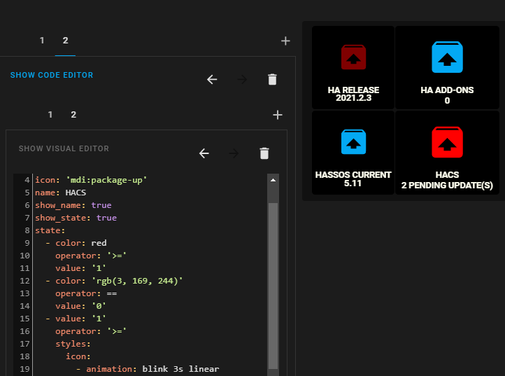
As you can see from the above screenshot, the icon colour is changing to red when the state is >= 1, but the animation (blinking) is not working for some reason.
This is the state part of the button code:
type: 'custom:button-card'
color_type: auto
entity: sensor.hacs
icon: 'mdi:package-up'
name: HACS
show_name: true
show_state: true
state:
  - color: red
    operator: '>='
    value: '1'
  - color: 'rgb(3, 169, 244)'
    operator: ==
    value: '0'
  - value: '1'
    operator: '>='
    styles:
      icon:
        - animation: blink 3s linear
  - value: 'off'
    styles:
      card:
        - filter: opacity(100%)
      icon:
        - filter: grayscale(50%)
          type: horizontal-stack
      type: vertical-stack
1 Like
@riddledaxis, you have the same condition for value >= 1 twice. Try having it just once with both color and styles defined for it.
That was it, all 4 buttons are now working.
Thank you 
1 Like
Thanks @ktownsend-personal for your great contribution. Unfortunately too much things have piled up and have not yet tested it.
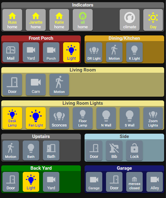
One of the things I like most about this custom button card is the way that I can get all kinds of information (and control) in a small space (one screen without scrolling on my phone and a small corner of my desktop(s)):
1 Like
@4integration, I can relate. I have an insane number of things on my list I can’t find time to get back to.
Hello
I have have also been playing with the custom: Button Card. I currently have my printer ink level and use a linear-gradient background. I wish to use the entity.status to set the % of the gradient.
    - background: |
        [[[
          var ink_level = 100 - entity.state;
          return 'linear-gradient(rgb(255, 255, 255) ink_level + '%', rgb(124, 124, 0) 0%)';
        ]]]
I have got a little stuck as I just cant get the correct syntax to work, and hope someone here can help.