Compact climate button using a custom button card

I have been really pleased with how my compact climate button turned out, so I decided to share with the community. This uses the custom button card and is designed to be used on a picture elements card, but it can be used by itself if you don’t mind the fixed sizing. I created it for my pool control UI, which you can read about here. That post was before I created this new climate button, so it is using a much simpler template for the various temperatures.

Example 1: four compact climate buttons on a picture elements card:
compact climate button

Example 2: five compact climate buttons used directly as a card in 2 horizontal-stacks:
image

If you use this, you may need to adjust a few things to fit your specific devices. I think it will work fine in most cases, but some of the states and attributes I watch for may be specific to my Venstar thermostats and Aqualink pool system.

Aside: if you have an Aqualink system, check out the aqualinkd project to interface it with Home Assistant. I’m happy to share my config if you decide to do it.

Some notable design features:

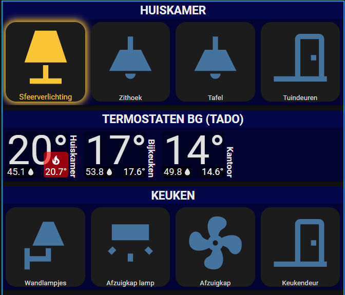
  • large display of current temperature
  • spinning fan icon behind temperature while actively cooling or heating
  • current setpoint at bottom right corner
    • green indicates idle
    • blue indicates cooling in progress
    • red indicates heating in progress
    • yellow indicates waiting (my Venstar thermostats do this to prevent short-cycling the HVAC)
    • 2 setpoint temperatures displayed if appropriate (auto cool/heat)
  • icon above setpoint indicates the operation mode (snowflake for cooling, flame for heating)
    • not shown while idle when 2 setpoint temperatures are applicable because the system can both heat and cool, but when actively cooling or heating the appropriate icon will appear along with the appropriate color
  • current humidity at bottom left corner, if available
    • alternate entity and attribute for humidity can be specified
  • signle-tap shows more-info dialog for making adjustments or viewing history
  • supports hiding the card with a variable, which can be set with a javascript template
  • various colors can be set with variables

A simple usage example:

  - type: 'custom:button-card'
    template: bigtemp
    entity: climate.upstairs

It expects a climate entity. You can certainly change the template if you need it to work with different devices. I figure this is a good starting point for anyone and you can change it any way you like.

There are a few variables you can use to adjust colors and a few behaviors:

variable default description
hide false conditionally hide with a javascript template
color rgba(0,0,0,0.3) background color of the card
device_name “Set at” text at bottom between humidity and setpoint
alt_humidity_entity null a different device to get humidity value from
alt_humidity_attr null attribute of the device to get humidity value from
icon_mode_disabled false set this true to hide the idle icon for setpoint
{item}_setpoint_{mode} various {item} is one of [color, text, icon] and mode is one of [off, idle, cool, heat, wait]; use to set background color, text color & icon for the setpoint for each of the operational modes

I have the template and example yaml folded below for reference.

yaml for the template
#put this in your button_card_templates section of your dashboard (raw configuration)
bigtemp:
    variables:
      hide: false
      color: 'rgba(0,0,0,0.3)'
      device_name: Set at
      alt_humidity_entity: null
      alt_humidity_attr: null
      color_setpoint_off: 'rgba(0,0,0,0.4)'
      color_setpoint_idle: 'rgba(144,238,144,0.6)'
      color_setpoint_cool: 'rgba(0,0,255,0.6)'
      color_setpoint_heat: 'rgba(255,0,0,0.6)'
      color_setpoint_wait: 'rgba(255,255,0,0.6)'
      icon_setpoint_off: 'mdi:thermometer-off'
      icon_setpoint_idle: null
      icon_setpoint_cool: 'mdi:snowflake'
      icon_setpoint_heat: 'mdi:fire'
      icon_setpoint_wait: 'mdi:timer-sand'
      text_setpoint_off: white
      text_setpoint_idle: black
      text_setpoint_cool: white
      text_setpoint_heat: white
      text_setpoint_wait: black
      icon_mode_disabled: false
    show_icon: true
    icon: 'mdi:fan'
    show_state: true
    state_display: |-
      [[[ 
        return Math.trunc(entity.attributes.current_temperature).toString()+"°" 
      ]]]
    custom_fields:
      device: |
        [[[
          return `<div style="line-height:1">${variables.device_name}</div>`;
        ]]]
      humidity:
        card:
          type: 'custom:button-card'
          show_icon: true
          icon: 'mdi:water-percent'
          show_name: false
          show_state: true
          state_display: |
            [[[
              if (entity.attributes.current_humidity) 
                return entity.attributes.current_humidity;
              var alt = variables.alt_humidity_entity && states[variables.alt_humidity_entity];
              var attr = alt && alt.attributes[variables.alt_humidity_attr];
              return attr;
            ]]]
          styles:
            grid:
              - grid-template-areas: '"s i"'
            img_cell:
              - display: contents
            state:
              - font-size: 0.8em
              - align-self: flex-end
            card:
              - padding: 0
              - padding-left: 2px
              - background-color: 'rgba(0,0,0,0.6)'
            icon:
              - width: 18px
              - height: 15px
              - margin-top: '-4px'
              - margin-left: '-4px'
              - margin-right: '-3px'
      mode:
        card:
          type: 'custom:button-card'
          show_icon: true
          show_name: false
          show_state: false
          icon: |
            [[[
              if(variables.icon_setpoint_idle || variables.icon_mode_disabled) return '';
              switch(entity.attributes.hvac_action) {
                case "cool":
                case "cooling":
                case "heat":
                case "heating":
                  return '';
                default:
                  if (entity.attributes.hvac_mode == 3)
                    return '';
                  switch(entity.state){
                    case "heat":
                      return variables.icon_setpoint_heat;
                    case "cool":
                      return variables.icon_setpoint_cool;
                  }
              }
            ]]]
          styles:
            card:
              - background-color: transparent
            icon:
              - width: 18px
              - color: white
      setpoint:
        card:
          type: 'custom:button-card'
          show_icon: true
          show_name: true
          show_state: true
          state_display: |
            [[[ 
              return entity.attributes.temperature 
                ? entity.attributes.temperature + "°" 
                : entity.attributes.target_temp_low
                  ? entity.attributes.target_temp_low + "°" 
                  : ''
            ]]]
          name: |
            [[[ 
              return entity.attributes.target_temp_high
                ? entity.attributes.target_temp_high + "°" 
                : ''
            ]]]
          icon: |
            [[[
              switch(entity.attributes.hvac_action) {
                case "cool":
                case "cooling":
                  return variables.icon_setpoint_cool;
                case "heat":
                case "heating":
                  return variables.icon_setpoint_heat;
                default:
                  if (entity.attributes.hvac_mode == 3)
                    return variables.icon_setpoint_wait;
                  return entity.state != "off"
                    ? variables.icon_setpoint_idle
                    : entity.attributes.temperature
                      ? ''
                      : variables.icon_setpoint_off 
              }
            ]]]
          styles:
            icon:
              - width: 18px
              - color: |
                  [[[ 
                    switch(entity.attributes.hvac_action) {
                      case "cool":
                      case "cooling":
                        return variables.text_setpoint_cool;
                      case "heat":
                      case "heating":
                        return variables.text_setpoint_heat;
                      default:
                        if (entity.attributes.hvac_mode == 3)
                          return variables.text_setpoint_wait;
                        return entity.state == "off"
                          ? variables.text_setpoint_off
                          : variables.text_setpoint_idle 
                    }
                  ]]]
            state:
              - font-size: 0.8em
              - color: |
                  [[[ 
                    switch(entity.attributes.hvac_action) {
                      case "cool":
                      case "cooling":
                        return variables.text_setpoint_cool;
                      case "heat":
                      case "heating":
                        return variables.text_setpoint_heat;
                      default:
                        if (entity.attributes.hvac_mode == 3)
                          return variables.text_setpoint_wait;
                        return entity.state == "off"
                          ? variables.text_setpoint_off
                          : variables.text_setpoint_idle 
                    }
                  ]]]
            name:
              - font-size: 0.8em
              - color: |
                  [[[ 
                    switch(entity.attributes.hvac_action) {
                      case "cool":
                      case "cooling":
                        return variables.text_setpoint_cool;
                      case "heat":
                      case "heating":
                        return variables.text_setpoint_heat;
                      default:
                        if (entity.attributes.hvac_mode == 3)
                          return variables.text_setpoint_wait;
                        return entity.state == "off"
                          ? variables.text_setpoint_off
                          : variables.text_setpoint_idle 
                    }
                  ]]]
            card:
              - padding: 0 2px
              - background-color: |
                  [[[ 
                    switch(entity.attributes.hvac_action) {
                      case "cool":
                      case "cooling":
                        return variables.color_setpoint_cool;
                      case "heat":
                      case "heating":
                        return variables.color_setpoint_heat;
                      default:
                        if (entity.attributes.hvac_mode == 3)
                          return variables.color_setpoint_wait;
                        return entity.state == "off"
                          ? variables.color_setpoint_off
                          : variables.color_setpoint_idle 
                    }
                  ]]]
    state:
      - id: value_any
        operator: '!='
        value: all
        spin: true
    styles:
      card:
        - background-color: '[[[ return variables.color || "transparent" ]]]'
        - overflow: visible
        - box-shadow: none
        - padding: 2px 0 5px 2px
        - display: '[[[ return variables.hide ? "none" : "flex" ]]]'
        - width: fit-content
        - margin-right: 15px
      grid:
        - display: contents
      img_cell:
        - display: contents
      icon:
        - width: 70%
        - position: absolute
        - left: 3px
        - color: silver
        - display: >-
            [[[ return entity.attributes.fan_state &&
            entity.attributes.fan_state == 1 ? "block" : "none" ]]]
      state:
        - color: var(--primary-text-color)
        - font-size: 3.5em
        - text-shadow: 0 0 2px black
        - overflow: visible
        - z-index: 1
        - margin-top: '-10px'
      name:
        - color: var(--primary-text-color)
        - text-shadow: 0 0 2px black
        - overflow: visible
        - font-size: 0.75em
        - font-weight: 600
        - position: absolute
        - transform: rotate(90deg)
        - transform-origin: right bottom
        - bottom: 0
        - right: 0
        - z-index: 10
      custom_fields:
        device:
          - text-shadow: 0 0 0.2em black
          - overflow: visible
          - font-size: 0.6em
          - position: absolute
          - bottom: 1px
          - right: 28px
          - z-index: 1
        mode:
          - position: absolute
          - bottom: 18px
          - right: 2px
        setpoint:
          - position: absolute
          - bottom: 0
          - right: 0
          - z-index: 1
        humidity:
          - z-index: 2
          - position: absolute
          - bottom: 0
          - left: 0
          - display: |
              [[[ 
                return entity.attributes.current_humidity == undefined 
                        && !variables.alt_humidity_entity
                  ? "none" 
                  : "flex" 
              ]]]
yaml for example 1
type: picture-elements
image: >-
  https://beautifulcoolwallpapers.files.wordpress.com/2011/08/naturewallpaper.jpg
elements:
  - type: 'custom:button-card'
    template: bigtemp
    entity: climate.upstairs
    variables:
      device_name: HVAC
    style:
      top: 30%
      left: 30%
  - type: 'custom:button-card'
    template: bigtemp
    entity: climate.downstairs
    variables:
      device_name: HVAC
    style:
      top: 30%
      left: 70%
  - type: 'custom:button-card'
    template: bigtemp
    entity: climate.freeze_protect
    name: Outside
    variables:
      device_name: Run at
      alt_humidity_entity: weather.home
      alt_humidity_attr: humidity
      color_setpoint_cool: 'rgba(255,255,0,0.6)'
      icon_setpoint_cool: 'mdi:shield-alert'
      text_setpoint_cool: green
      icon_mode_disabled: true
    style:
      top: 70%
      left: 30%
  - type: 'custom:button-card'
    template: bigtemp
    entity: climate.pool_heater
    name: Pool
    variables:
      device_name: Heater
      hide: >-
        [[[ return states["switch.filter_pump"].state == "off" ||
        states["switch.spa_mode"].state == "on" ]]]
    style:
      top: 70%
      left: 70%
yaml for example 2
type: vertical-stack
cards:
  - type: horizontal-stack
    cards:
      - type: 'custom:button-card'
        template: bigtemp
        entity: climate.upstairs
        variables:
          color: 'rgba(255,0,0,0.5)'
          device_name: HVAC
      - type: 'custom:button-card'
        template: bigtemp
        entity: climate.downstairs
        variables:
          color: 'rgba(0,255,0,0.5)'
          device_name: HVAC
      - type: 'custom:button-card'
        template: bigtemp
        entity: climate.freeze_protect
        name: Outside
        variables:
          color: 'rgba(0,0,255,0.5)'
          device_name: Run at
          alt_humidity_entity: weather.home
          alt_humidity_attr: humidity
          color_setpoint_cool: 'rgba(255,255,0,0.6)'
          icon_setpoint_cool: 'mdi:shield-alert'
          text_setpoint_cool: green
          icon_mode_disabled: true
  - type: horizontal-stack
    cards:
      - type: 'custom:button-card'
        template: bigtemp
        entity: climate.pool_heater
        name: Pool
        variables:
          color: 'rgba(255,0,255,0.5)'
          device_name: Heater
      - type: 'custom:button-card'
        template: bigtemp
        entity: climate.spa_heater
        name: Spa
        variables:
          color: 'rgba(0,255,255,0.5)'
          device_name: Heater
7 Likes

Hi Keith, I’m reading about what you have done with your UI. Planning to go this direction. Thank you in advance already for posting all what you have done.
I’m planning to use a bit of all of your ideas for my one… Did you ever have a look at lovelace_gen https://github.com/thomasloven/hass-lovelace_gen ?
Because it looks like you have a lot of different templates defined in your UI-lovelace or am I missing something ?

1 Like

I’m glad you found my UI elements inspirational :slight_smile:

I’m aware of lovelace_gen, but I haven’t needed to use it. My dashboards are almost completely made up with the custom button card, which has its own templating mechanism. I think it’s best to use the custom button card’s built-in templating mechanism because it’s tuned to what the custom button card is capable of.

I do, however, have my dashboard sections organized as separate yaml files so that I can re-use them on different dashboards. That technique has worked well for my wall tablets, where I have a dedicated dashboard and user for each tablet so that each tablet is appropriate for its location. The re-usable sections don’t require adjustable configuration based on where they are displayed, so the split yaml approach is working well for me.

I have been keeping lovelace_gen in the back of my mind for when I need more templating.

If you haven’t found them, here are some other posts on my UI elements:

Hi Keith,

Thank you for your quick reply. I’ve been playing with the cluttering card to make 5 custom remote controls. So I’ll probably stay with what I know and go in the same direction as you did. Templating and separating the yaml files.
I’m still in the exploration phase and have a bunch of questions

  • I’m thinking of having one view that summarizes the rests of the views and linking this summary to the detailed views. Did you explore this ? If so, how can I group devices together ?
  • I read that in the end you didn’t use the banner card. Is there a reason for that ? I’ve used if for my remotes, and it worked quite well.
  • What about custom icons ? I don’t find all what I’m looking for with mdi.
  • You wrote that you have different dashboards per device. Can you link me to where I find more information on this ? Or give me some pointers ?

child-views
I haven’t needed to do any child-view navigation yet. My goal with each dashboard was to get everything relevant to that location in one view that doesn’t require scrolling or navigation. I had to get fairly compact with my design to achieve that, hence my using the custom button card everywhere to maximize control of the styles and layout.

Dialogs are a good UI element as well. It lets me reduce my dashboard down to just the indicators and buttons, but long-pressing a button can give me more options if I need it. Mostly that’s the built-in more-info dialog, but it can just as easily be a custom card if you use browser-mod.

The thing I like about dialogs is that they are intuitive, don’t have to use the whole display when they don’t have a lot to show. They also don’t need a UI element of their own to take you back to the main view, since that is automatic when you dismiss them.

If I had a case where I might leave the child view open for long periods of time, then I would definitely go with a view-linking scenario like you are considering. For that, I think you can simply make each child-view a tab of the dashboard and use links to the desired tab view. There are ways to hide the tabs if needed.

banner card
If you mean banner-card, it simply wasn’t compact enough. It didn’t give enough control of margins and font size and such. It also didn’t let me do my own UI for each device. It has a nice look, and I used it for a few months, but I needed more and eventually discovered the custom button card. The custom button card was the magic unicorn that unleashed my UI creativity LOL

custom icons
I’ve been limiting myself to the material design icons simply because I haven’t had a chance to figure out how to do custom icons yet. I have found a few things mentioning that it can be done, but haven’t dug into it to figure it out. I use this resource for finding mdi icons and have usually found something close enough to get the job done. When it opens, close the dialog and use the search to filter the icons.

dashboard per device
Basically, I have a separate yaml dashboard for each device, and all the views in that dashboard have their visible config set to myself and a dedicated user I set up in home assistant for that dashboard (the view’s visible setting takes an array of - user: user-id). On each tablet I log in as the tablet-specific user and navigate to the appropriate dashboard. I also use fully-kiosk to further lock down my tablets, but that’s not necessary for just limiting what dashboards are available for the tablet.

Here is a view of one of my dashboards, to help see my overall vision. Everything on it was made with a custom button card, except for the pool view being an image element. Even the items on the image element are custom button cards. The main grid is done with horizontal and vertical stack cards, but beyond that everything is a custom button card. The custom button card has allowed me unprecedented control of layout, styles and animations in lovelace dashboards. It takes a while to fully understand all the options of the custom button card, but it’s worth it.

1 Like

I made a simpler version of this that shows just a temperature sensor value. During the Texas freeze crisis I wanted monitor my attic and garage temperatures on my main dashboard because my water heater is in the attic and my unheated garage has an exterior hose faucet. There was room for the decimal value, so I included that as well. I also added an animation to flash the background if the value is above or below a range that I can adjust via the config (default is 32 to 100 F).

image

bigtemp-sensor template
type: custom:button-card
show_state: true
show_icon: false
show_name: true
show_label: true
state_display: '[[[ return parseInt(entity.state) + "°" ]]]'
label: '[[[ return "." + entity.state.split(".")[1] ]]]'
extra_styles: |
  [[[ return `
    @keyframes pulse {
      5% {
        background-color: rgba(240,52,52, 0.9);
      }
    }
  `]]]
state:
  - index: cold-cutoff
    value: 32
    operator: '<='
    styles:
      card:
        - animation: pulse ease-in-out 1s infinite
  - index: hot-cutoff
    value: 100
    operator: '>='
    styles:
      card:
        - animation: pulse ease-in-out 1s infinite
styles:
  grid:
    - display: contents
  img_cell:
    - display: contents
  card:
    - background-color: rgba(0, 64, 255, 0.3)
    - -webkit-backdrop-filter: blur(4px)
    - backdrop-filter: blur(4px)
    - display: flex
    - padding: 2px 0 5px 2px
    - width: fit-content
    - overflow: visible
  state:
    - color: var(--primary-text-color)
    - font-size: 3.5em
    - line-height: 0.75em
    - text-shadow: 0 0 2px black
    - overflow: visible
    - z-index: 1
  name:
    - color: var(--primary-text-color)
    - text-shadow: 0 0 2px black
    - overflow: visible
    - font-size: 0.75em
    - font-weight: 600
    - position: absolute
    - transform: rotate(90deg)
    - transform-origin: right bottom
    - bottom: 0
    - right: 0
    - z-index: 10
  label:
    - color: var(--primary-text-color)
    - position: absolute
    - bottom: 0
    - left: 2.4em
    - font-size: 1.6em
    - font-weight: 600
    - text-shadow: 0 0 2px black
    - overflow: visible

Example using the template below. Expand the section above to see the template. The state section is only needed if you want to override the default 32 to 100 F defaults for the flash animation.

type: custom:button-card
template: bigtemp-sensor
entity: sensor.office_motion_temperature
name: Attic
state:
  - index: cold-cutoff
    value: 40
  - index: hot-cutoff
    value: 120
1 Like

Hi Keith,
I really like your dashboard and the fact that you share your projects.
I’m just a noob who copies and alters some code for my own benefit :wink:
This way I was able to ‘build’ my dasboad with the button-card.
Now I want to integrate your climate button but the size does not match.
I would like to change it a bit, so that the name positions horizontal at the bottom and the size matches my other buttons.
This is my current ‘work in progress’ dashboard :


The mismatch :

my code :

  jja_standaard:
    hold_action:
      action: more-info
    aspect_ratio: 1/1
    size: 80%
    label: >
      [[[ var bri = Math.round(entity.attributes.brightness / 2.55);  if
      (entity.state === 'on') return (bri ? (bri+"%") : '') ]]]
    show_label: true
    show_name: true
    state: null
    styles:
      card:
        - border-radius: 15px
        - margin: 5px 5px 5x 5x
        - padding: 0px 0px
        - '--paper-card-background-color': 'rgba(40, 40, 40, 0.7)'
        - '--mdc-ripple-color': green
        - '--mdc-ripple-press-opacity': 0.5
      name:
        - font-size: 10px
        - white-space: normal
      state:
        - font-size: 10px
        - white-space: normal
      label:
        - font-size: 10px
        - white-space: normal
  jja_gloed_geel:
    template: jja_standaard
    state:
      - styles:
          card:
            - box-shadow: '0px 0px 10px 3px #F9C536'
          icon:
            - color: '#F9C536'
          name:
            - color: '#F9C536'
            - font-size: 11px
        value: 'on'

Thank you in advance!

It’s not set up to size the same as other buttons, but you can probably get close to what you want by modifying the bigtemp template.

The width is based on the size of the main temp display, so you can increase the font size from 3.5em to something bigger that gets you the width you need. It’s the only 3.5 value in the template, so search for that to find where to change it. It’s in the state styles config. Note, that may not match the widths on different devices. It’s a limitation of how the text is unable to scale to match the card size, so we are letting the card scale to contain the font size.

The rotated name can be moved to the bottom by removing - transform: rotate(90deg) and transform-origin: right bottom from the name styles config. To push it down below the card so it doesn’t overlap the other content, change bottom: 0 to bottom: -15px (adjust negative value as needed). To make it centered you can add left: 0. You’ll also want to change - margin-right: 15px to - margin-bottom: 15px in the card styles section to ensure there is a gap on the bottom for the name, since it’s technically outside of the card when absolutely positioned that way and other cards would overlap with the name if the margin wasn’t there.

Thanks for your help.
It is a pity that the button is not scalable, but it is fine to use for display on a tablet.
climate2

@Plaatjesdraaier, that looks good.

Just to avoid confusion, I’d like to clarify that the custom button card normally scales quite well. It’s the way I am using it in my template based on a font size that is causing the scaling challenges. My normal use of this template is an overlay on a picture elements card, so the relative scaling isn’t an issue.

hey @ktownsend-personal these look amazing. I’m pretty new to home assistant and was wondering if you had any step by step out there on how you do these? I would love to mimic your pool one in particular

@scautomation, my post in this thread on January 12th has a link to my post about the pool UI. There is a lot going on in that UI, but it’s basically a picture elements card with other cards positioned on it.

Hi @ktownsend-personal

I finally got around to working on this. You spend a lot of time on the design which is amazing. One part doesn’t work with me though which I would like. The fact when a HVAC is working that you see an animation of the fan like in example 1. What do i need to do to make this work ?

I assume this part of the code makes it work or not


state:
      - id: value_any
        operator: "!="
        value: all
        spin: true

...

- display: >-
            [[[ return entity.attributes.fan_state &&
            entity.attributes.fan_state == 1 ? "block" : "none" ]]]

it would be great to understand what these parts of the code do, so i can adjust them accordingly.
Regards,
Jens

@Jens_Wymeersch, that’s the right spot. The logic in - display: is showing (block) or hiding (none) the icon based on whether the thermostat is reporting that the blower is on. For my thermostat, that’s a fan_state attribute. It might be a different attribute on your thermostat, or it might use a different value to indicate on/off, or your thermostat might not have an attribute for the blower. You can modify that to use a different attribute or state value.

Keith, thanks for your quick reply. I understand what you say, but I don’t understand the coding logic. Can you please explain me in plain English what this code block means and what I should change ?

@ktownsend-personal I’m already on the way to simplifying the design a little. I’ll send the code shortly. I want all my buttons to be of a similar size and look&feel.

@Jens_Wymeersch,

The syntax I had used in the template is a ternary, which returns either what’s after the ? or the : depending on whether the first part is true or false. Here is a page about it: Conditional (ternary) operator - JavaScript | MDN

Here is the same logic, but formatted as a standard if/else, and explicitly comparing the first part to undefined instead of the shorthand that treats an undefined value as false:

if (entity.attributes.fan_state != undefined && entity.attributes.fan_state == 1)
    return "block";
else
    return "none";

Thank you so much for the clarification !

Hi @ktownsend-personal,

Please have a look at what I’ve done. I’m stuck with the changing of the mode. Can you please advise?