Fun with custom:button-card

That was a great question, and the answer is that the dashboard is showing the right URL with the javascript. In both cases (with and without the javascript) the URL just flashes up briefly. When the URL doesn’t have javascript, the ?anchor=menu flashes briefly and then the site scrolls. With the javascript and the on state, the ?anchor=menu flashes briefly and there is a tiny bump in the page. This behavior suggests that the problem is the anchor card. There are various options I can try with it. I tried extending the timeout to 2 seconds but that made no difference. I’ll have another go at it soon. Thanks for the idea!

oh and I have 16 conditional cards, each opened by clicking on a custom:button-card, and the scrolling puts the conditional card at the top when opened, scrolling back to the top of the page when closed.

Sheesh, I reversed the order of the actions, and everything works. I think what was happening is that the first action toggled the state, but it took an appreciable amount of time to do it because it also shuts all other conditionals if they are open, so the second action wasn’t picking up the correct state or was somehow reacting to a state change. Instead, I scroll first to the correct location, then toggle the state, and everything just works.

Yet another example of the difficulty of adjusting to a language like javascript, where things happen simultaneously, when you grew up with Fortran.

1 Like

Hello all :wave: 
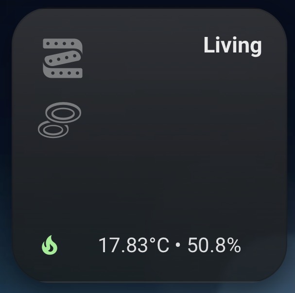
I made this “room card” for some reason I can’t get it to work the way I want.

I tried searching the www and ChatGPT :sweat_smile::face_with_peeking_eye: but still no success.

I want the icons of the light.entity’s toggle the light.

The code that I have so far:

type: grid
columns: 2
square: true
cards:
  - type: custom:button-card
    entity: light.woonkamer_groep
    icon: hue:lightstrip
    aspect_ratio: 1/1
    show_icon: true
    show_name: false
    show_state: false
    tap_action:
      action: none
    styles:
      card:
        - border-radius: 26px
        - padding: 16px
        - background: |
            linear-gradient(180deg,
            rgba(60,60,60,0.75),
            rgba(25,25,25,0.75))
        - box-shadow: 0 8px 18px rgba(0,0,0,0.45)
        - color: white
      grid:
        - display: grid
        - grid-template-areas: |
            "i  name"
            "i2 ."
            "temp_icon info"
        - grid-template-columns: min-content 1fr
        - grid-template-rows: min-content 1fr min-content
        - column-gap: 6px
        - row-gap: 8px
      img_cell:
        - grid-area: i
        - place-self: start
        - width: 36px
        - height: 36px
      icon:
        - width: 36px
        - height: 36px
        - color: |
            [[[ return entity.state === 'on'
              ? 'rgb(255,214,102)'
              : 'rgba(180,180,180,0.6)'; ]]]
      custom_fields:
        name:
          - grid-area: name
          - font-size: 15px
          - font-weight: 600
          - opacity: 0.9
          - place-self: start end
          - text-align: right
        i2:
          - grid-area: i2
          - place-self: start
          - width: 32px
          - height: 32px
        temp_icon:
          - grid-area: temp_icon
          - place-self: end start
        info:
          - grid-area: info
          - font-size: 14px
          - opacity: 0.85
          - place-self: end start
    custom_fields:
      name: Living
      i2: |
        [[[
          const state = states['light.woonkamer']?.state;
          const color = state === 'on'
            ? 'rgb(255,214,102)'
            : 'rgba(180,180,180,0.6)';
          return `
            <ha-icon
              icon="hue:bulb-group-ceiling-flush-circular"
              style="color:${color}; width:32px; height:32px;">
            </ha-icon>
          `;
        ]]]
      temp_icon: |
        [[[
          const color =
            states['climate.woonkamer']?.state === 'auto'
              ? 'lightgreen'
              : 'orange';
          return `
            <ha-icon
              icon="mdi:fire"
              style="color:${color}; width:18px; height:18px;">
            </ha-icon>
          `;
        ]]]
      info: |
        [[[
          const t = states['sensor.woonkamer_temperatuur']?.state ?? '--';
          const h = states['sensor.woonkamer_luchtvochtigheid']?.state ?? '--';
          return `${t}°C  •  ${h}%`;
        ]]]

Thx

Edit: I have found “icon_tap_action” but that only works on the first/main icon. Not on the second icon.

You can give your icon an id attribute and then check during tap whether an element with that id is under the pointer:

tap_action:
  action: javascript
  javascript: |
    [[[
      /* example action; you can also define it as a variable */
      const myAction = {
        action: 'switch.toggle',
        target: {
          entity_id: 'switch.something'
        }
      };
      const elements = this.shadowRoot?.querySelectorAll(':hover') ?? [];
      const filtered = Array.from(elements).filter(el => el.id === 'my-icon-with-action');
      if (filtered.length > 0) helpers.runAction(myAction);
    ]]]

The above code can only handle 1 additional element with its own action; for more elements you can use pattern shown here.