Gauge Card: how to get a gradually changing color?

Thanks!
I clearly misunderstood the documentation.
Firstly, I thought that the code above the example gauge card was used for the example, but apparently it is the code below the example.
And secondly I understood that it would be a true gradually changing of color, but that apparently is not the case: it still is a hard transition between the colors:
afbeeldingafbeeldingafbeeldingafbeeldingafbeelding

Anyhow, these Gauge Cards are still a nice option in Home Assistant.

Thanks for your extensive explanation :grinning:
I got all of this, but just misunderstood the example in the documentation as being a truly gradually changing color, but that appears to be not the case.

Indeed… just 4 colors…
nothing fancy with gradients :frowning:

Actually, you can set colors for every step.

Well, I think I have to come back on this.
It seems that in fact gradually changing of the colors already is implemented in the current Gauge Card. When using the example from the documentation, and changing the input sensor value from let’s say 44% to 45%, the color indeed is changing from green to yellow, but this happens gradually within roughly half a second or so.
So implementing a gradually changing color over a large gauge sector probably isn’t as big of an impact on the coding as I initially thought.
So I hope that the Gauge Card code owners are reading this, because it would be nice when this will be implemented in the future.

But… in the mean time I also found another solution :smiley:
It appears that it is possible to define many more segments.
This is an example of a gauge that will “gradually” change its color from yellow to red over the full scale:

type: gauge
name: Test
unit: '%'
entity: input_number.number
min: 0
max: 100
segments:
  - from: 0
    color: '#ffff00'
  - from: 5
    color: '#fff200'
  - from: 10
    color: '#ffe600'
  - from: 15
    color: '#ffd900'
  - from: 20
    color: '#ffcc00'
  - from: 25
    color: '#ffbf00'
  - from: 30
    color: '#ffb200'
  - from: 35
    color: '#ffa600'
  - from: 40
    color: '#ff9900'
  - from: 45
    color: '#ff8c00'
  - from: 50
    color: '#ff8000'
  - from: 55
    color: '#ff7300'
  - from: 60
    color: '#ff6600'
  - from: 65
    color: '#ff5900'
  - from: 70
    color: '#ff4c00'
  - from: 75
    color: '#ff4000'
  - from: 80
    color: '#ff3300'
  - from: 85
    color: '#ff2600'
  - from: 90
    color: '#ff1a00'
  - from: 95
    color: '#ff0d00'

For defining the color codes I did use the HTML Color Mixer web page.

3 Likes

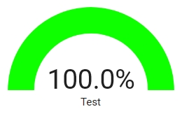
I updated my gauge configuration one more time, making the color changing a little more gradual, and adding one more color.
With this gauge the color changes in 40 steps from red via yellow to green over a range from 0 % to 100 %:

type: gauge
entity: input_number.number
name: Test
unit: '%'
needle: false
min: 0
max: 100
segments:
  - from: 0
    color: '#ff0d00'
  - from: 2.5
    color: '#ff1a00'
  - from: 5
    color: '#ff2600'
  - from: 7.5
    color: '#ff3300'
  - from: 10
    color: '#ff4000'
  - from: 12.5
    color: '#ff4c00'
  - from: 15
    color: '#ff5900'
  - from: 17.5
    color: '#ff6600'
  - from: 20
    color: '#ff7300'
  - from: 22.5
    color: '#ff8000'
  - from: 25
    color: '#ff8c00'
  - from: 27.5
    color: '#ff9900'
  - from: 30
    color: '#ffa600'
  - from: 32.5
    color: '#ffb200'
  - from: 35
    color: '#ffbf00'
  - from: 37.5
    color: '#ffcc00'
  - from: 40
    color: '#ffd900'
  - from: 42.5
    color: '#ffe600'
  - from: 45
    color: '#fff200'
  - from: 47.5
    color: '#ffff00'
  - from: 50
    color: '#ffff00'
  - from: 52.5
    color: '#f2ff00'
  - from: 55
    color: '#e6ff00'
  - from: 57.5
    color: '#d9ff00'
  - from: 60
    color: '#ccff00'
  - from: 62.5
    color: '#bfff00'
  - from: 65
    color: '#b2ff00'
  - from: 67.5
    color: '#a6ff00'
  - from: 70
    color: '#99ff00'
  - from: 72.5
    color: '#8cff00'
  - from: 75
    color: '#80ff00'
  - from: 77.5
    color: '#73ff00'
  - from: 80
    color: '#66ff00'
  - from: 82.5
    color: '#59ff00'
  - from: 85
    color: '#4dff00'
  - from: 87.5
    color: '#40ff00'
  - from: 90
    color: '#33ff00'
  - from: 92.5
    color: '#26ff00'
  - from: 95
    color: '#19ff00'
  - from: 97.5
    color: '#0dff00'

And this is the result:

HA_GaugeTest_002_20221111_085127HA_GaugeTest_003_20221111_085134HA_GaugeTest_004_20221111_085140HA_GaugeTest_005_20221111_085143HA_GaugeTest_006_20221111_085147HA_GaugeTest_007_20221111_085151HA_GaugeTest_008_20221111_085156HA_GaugeTest_009_20221111_085201

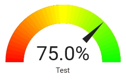
If you want to have a needle as pointer just set the option needle: true, with this result:

HA_GaugeTest_010_20221111_085236

I hope this is useful to others as well.
If you want to use this with another range you just have to modify the unit:, min: and max: values, and modify the from: values accordingly.

3 Likes

@thusassistint BRILLIANT!! I also managed to reverse the order (using Excel, filtering, sorting and writing back to a text file) so the colour order is reversed for different usage …ie CPU temperature. Looks fantastic!

Now to import them into some little gauge cards in a horizontal or vertical stack so I can combine all the Glances info I want in one place.

Awesome! Thanks for showing how this is done,

I’m using it for Colour Temperature,

It looks great now! :+1:

HA_Col_Temp_screnshot_1

Well… someone linked this on facebook, and it had me intrigued…

The gauge is drawn in SVG, and the bar itself is just a single, wide, line with a set stroke color.

SVG actually allows for a stroke to have a gradient color, by linking the color to an svg element that has that gradient.
Now, the gauge card doesn’t allow you to inject random SVG. That’d be a bad thing. Instead it lets you pick a CSS color for each segment.

but… css can contain url encoded data… such as SVG images…

Here’s what you do.

  • Define your gradient in SVG:
<svg width="100" height="100">
<defs>
<linearGradient id="linear" x1="0%" y1="0%" x2="100%" y2="0%">
<stop offset="0%" stop-color="red"/>
<stop offset="50%" stop-color="yellow"/>
<stop offset="100%" stop-color="green"/>
</linearGradient>
</defs>
</svg>
  • Paste it into an SVG URL encoder such as this: URL-encoder for SVG
  • Copy the encoded part that says url("data:image/svg+xml, ...");
  • Tack on a reference to your gradient on the end: url("data:image/svg+xml, ...#linear");. That’s #linear as in id="linear" from the SVG code.
  • Use that as your color:
type: gauge
entity: sensor.0x00178801086c6fed_battery
min: 0
max: 100
segments:
  - from: 0
    color: >-
      url("data:image/svg+xml,%3Csvg xmlns='http://www.w3.org/2000/svg'
      width='100' height='100'%3E%3Cdefs%3E%3ClinearGradient id='linear'
      x1='0%25' y1='0%25' x2='100%25' y2='0%25'%3E%3Cstop offset='0%25'
      stop-color='red'/%3E%3Cstop offset='50%25' stop-color='yellow'/%3E%3Cstop
      offset='100%25'
      stop-color='green'/%3E%3C/linearGradient%3E%3C/defs%3E%3C/svg%3E#linear");

bild

If you want to use the needle gauge you need another step. For the needle gauge the stroke is not handled through CSS but as a property of the line. So you need to go through a CSS custom property:

type: gauge
entity: sensor.0x00178801086c6fed_battery
min: 0
max: 100
segments:
  - from: 0
    color: var(--gauge-gradient)
needle: true

And then define the --gauge-gradient variable either in your theme:

gauge-gradient: >-
    url("data:image/svg+xml,%3Csvg
    xmlns='http://www.w3.org/2000/svg' width='100'
    height='100'%3E%3Cdefs%3E%3ClinearGradient id='linear' x1='0%25' y1='0%25'
    x2='100%25' y2='0%25'%3E%3Cstop offset='0%25' stop-color='red'/%3E%3Cstop
    offset='50%25' stop-color='yellow'/%3E%3Cstop offset='100%25'
    stop-color='green'/%3E%3C/linearGradient%3E%3C/defs%3E%3C/svg%3E#linear");

Or directly on the card using card-mod.

type: gauge
entity: sensor.0x00178801086c6fed_battery
min: 0
max: 100
segments:
  - from: 0
    color: var(--gauge-gradient)
needle: true
card_mod:
  style: >
    :host {
    --gauge-gradient: url("data:image/svg+xml,%3Csvg
    xmlns='http://www.w3.org/2000/svg' width='100'
    height='100'%3E%3Cdefs%3E%3ClinearGradient id='linear' x1='0%25' y1='0%25'
    x2='100%25' y2='0%25'%3E%3Cstop offset='0%25' stop-color='red'/%3E%3Cstop
    offset='50%25' stop-color='yellow'/%3E%3Cstop offset='100%25'
    stop-color='green'/%3E%3C/linearGradient%3E%3C/defs%3E%3C/svg%3E#linear");
    }

bild

5 Likes

very beautiful! However, I must be doing something wrong here, as I copied that gauge-gradient directly, and use the same gauge card config. And yet, there’s no colored gauge, only a needle :wink:

set it both in my themes, and directly on the card.

no gauge at all, only a needle.

cant we copy that gradient as is? should we actually ‘make’ it in that encoder? well, no that doesnt help, I did…

taking out the needle, I do get a gauge, but it has no color:

    - type: gauge
      entity: sensor.alarm_button_hall_battery
      min: 0
      max: 100
      segments:
        - from: 0
          color: var(--gauge-gradient)
#       needle: true

even tried it like:

    gauge-gradient: url("data:image/svg+xml,%3Csvg xmlns='http://www.w3.org/2000/svg' width='100' height='100'%3E%3Cdefs%3E%3ClinearGradient id='linear' x1='0%25' y1='0%25' x2='100%25' y2='0%25'%3E%3Cstop offset='0%25' stop-color='red'/%3E%3Cstop offset='50%25' stop-color='yellow'/%3E%3Cstop offset='100%25' stop-color='green'/%3E%3C/linearGradient%3E%3C/defs%3E%3C/svg%3E#linear")

Did you manage to figure it out?
I´ve tried a couple of different encoders but no luck

No sorry. Tbh I put it aside for a bit …

Is there a possibility to put an extra entity directly under the gauge? In my case it’s a target value, while the gauge shows the actual value. I don’t find a way that looks good.

THANK you in advance!

I’m also experiencing the same issue

same here, white no gradient.

Try Firefox as your browser.
Googling a little on SVG’s, it seems that Chrome, Edge, Safari may not support this type of linear gradient in SVG’s

That is not the solution of course… :slight_smile:

1 Like

I’ve tried quite a few ways now, including firefox, maybe a HA update patched this CSS behaviour?

I tried implementing the script that I posted to apply green-to-red color gradient icon color, but it only returns a single color. Green-to-red icon color gradient template (battery percentage)

I imagine that something like this might be able to be implemented but it would have to be added to the card’s code. Maybe some sort of “presets” could be defined within the code to allow a user to choose what type of gradient such as red-to-green (for battery), green-to-red (for utilization), blue-to-red (for temperature), color temp.

As others have mentioned, the SVG method only seems to work in Firefox. I also tried Edge, Chrome, Silk and FKB without success.

image
Shown: Firefox (card-mod method) left; red-to-green script via card-mod method right.

Looking at @thomasloven’s FontAwesome integration (GitHub - thomasloven/hass-fontawesome: 🔹 Use icons from fontawesome in home-assistant), he mentions:

IMPORTANT: As the note above implies, SVG can contain CSS and Javascript, and thus shall be considered unsafe. Home Assistant normally protects you from this by unly using a very specific part of the SVG file, but using the #fullcolor suffix circumvents this protection. I have tried adding another layer instead, but as those things go, you’re only safe from the things you know.

In short: Only do this with icons you trust (and preferably have inspected the code for).

Not sure if this is related to the browsers not wanting to display the SVG gradient.