this is the mobile phone charging state which provides “charging” or “discharging”. When using a tablet, I don’t get such information and rely on the state of a switch which is “on” of “off”:

I will add a state property to supply the state entity
fantastic ! will offer you a coffee 
1 Like
So sweet :D! Thanks!
Please checkout v1.3.0 which is just released.
In your case btw, you’ll need to create an extra (template) sensor as the icon state entity is looking for a charging state. This is a generalised state within HA. So on is still considered not-charging.
[Edit] Might accept on in the future. Will think about it 
Thank you, I’ll give it a try.
Hi, I’m trying to “abuse” your card to display a Gauge with a min/max needle.
My config seems to be working, but I can’t seem to get rid of the secondary text… Any suggestion?
type: custom:gauge-card-pro
segments:
  - pos: -6.3
    color: red
  - pos: -0.75
    color: yellow
  - pos: 0
    color: var(--green-color)
  - pos: 6.3
    color: green
needle: true
gradient: true
titles:
  primary: Batterij
gradient_resolution: medium
entity: sensor.battery_power_2
setpoint:
  value: "{{ states('sensor.maxbatterypower') | float }}"
icon:
  type: battery
  value: sensor.growattbatterysoc
  hide_label: false
inner:
  mode: on_main
  value: "{{ states('sensor.minbatterypower') | float }}"
min: -6.3
max: 6.3
hide_background: false
value_texts:
  secondary: " "
I do intend for this to work like this (or with just ""). I will look into it
Please try v1.3.2. Mind sharing a screenshot after? Interested to see what you’ve created! 
Thanks, it’s working now.
I haven’t created anything fancy (yet), I’m just in the middle of learning howto read and control my Growatt inverter/home battery. And I needed some kind of easy visualisation.

This shows the max battery discharging power (inner needle), the actual power (main needle) and the maximum charging power (setpoint needle).
Current battery state is in the icon.
Still thinking about the colors. Green is good (charging or discharging my nightly consumption). The rest I haven’t decided on yet.

Awesome, thanks for sharing!
Great to see so many gradient gauges working on one dashboard, which was an issue I fixed recently.
Just to show as an alternative and for other to see:
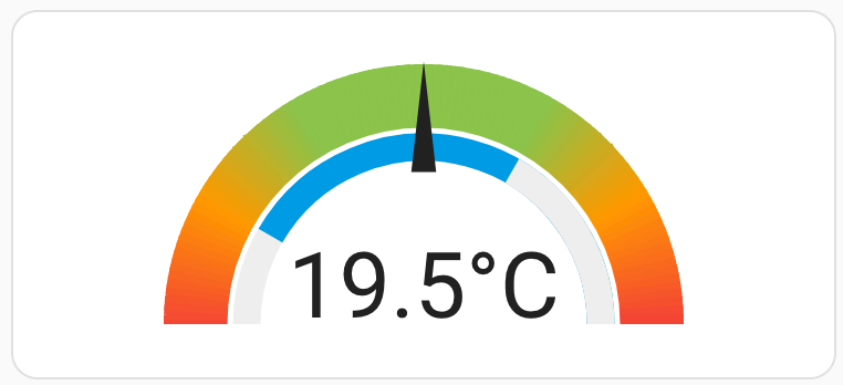
This uses the inner gauge in static mode to display a min-max on the main gauge. As the segments can be templated, you can also let this depend on other entities.
1 Like
Can you share the yaml for that one? I tried that before, but had trouble with day and night mode.
Can the icon in battery type be changed? In this example it isn’t actually a battery, but the percentage of the max capacity of my inverter that is used at the moment. So I would like to change it to “mdi:solar-power-variant” or so, but still have the colors change.

I don’t support light/dark-mode colors for the gauges themselves, just the needles and texts.
To change the icon, currently you will have to use template mode for this. ‘Battery’ is the only native icon currently supported
Oké, I see.
Thanks for the great card, really usefull.
1 Like