Hi,
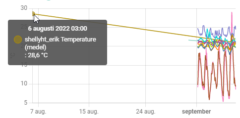
For some reason some of my graphs plots one (or sometimes two) stray data points that are well out of the defined range. In this example the set range is “last 6 days” (in this case Sept 1 to Sept 7). Works just fine for most sensors (in this case temp), but there is this one data point that for some reason always plots.
 .
.
I have this issue with more charts, like a humidity chart as an other example.
Anyone have an idea why and what I can do to fix it?
Tanks in advance for helping.
EDIT: Just noticed there is actually another “stray” data point in this chart…

EDIT 2: Same issue, different graph (humidity)…
