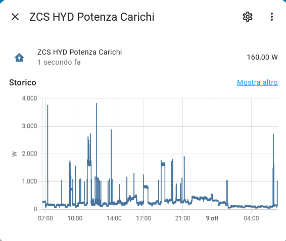
Why are some graphs without min, med, max and how can I make them the same?
Can I transform the second graph like the first?

Recommend either apexcharts or plotly …both are via HACS
Compare the properties and attributes of these sensors under the states tab of the dev tools. You’ll see some have long-term stats associated with them.
I think HA automatically displays sensors using the same base as the Statistics graph card - Home Assistant when it has a state class. So, you can this to visualise your own.