Hey could anyone share a new discord invite link of the HaCasa discord ? Thanks
Glad you like it,
I noticed i had a bug can you change the word “custom” to “mdi”
Also here is where you change the background
Change the ‘#1c1f27’ to the color you want.
 background: |
          [[[
            return variables.dark_mode === true ? '#1c1f27' : '#eff1f5';
          ]]]
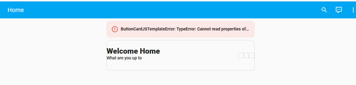
I managed to get the dashboard to display, thanks to ChatGPT. It seems one of the modules was not loaded properly, even though I copied it from the script. However, the example image links appear to be broken, so I am unsure what it is supposed to like.

I’ve continued to follow the guide, but despite modifying the YAML code, the pages do not appear to update. Could there be an additional step required? It still has not recognized the third page.

As you can tell, I am quite new to YAML dashboards! 
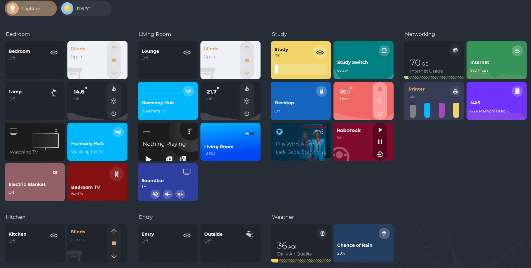
I have reworked the existing vacuum cards.
Thanks to the others for posting their designs on discord i have updated to make the buttons dynamic, you can choose the order and you can add your own.
The reason of this redesign is for work in the sections home design.
Here is an example of my card

type: custom:button-card
entity: vacuum.roborock_s50
template: hc_vacuum_card
variables:
  icon: custom:roborock-vacuum
  enabled_buttons:
    - resume
    - pause
    - home
  main_card_bg: rgb(128,10,45)
  hc_vacuum_card:
    label: |
      [[[
        const state = states[entity.entity_id].state;
        return state.charAt(0).toUpperCase() + state.slice(1);
      ]]]
    show_icon: true
    icon: "[[[ return variables.icon ]]]"
    styles:
      grid:
        - grid-template-areas: |
            'i room_buttons buttons'
            'i room_buttons buttons'
            'i room_buttons buttons'
        - grid-template-columns: 1fr auto auto
        - grid-template-rows: min-content min-content min-content
      card:
        - overflow: hidden
        - padding: 20px 20px 20px 10px
        - max-height: 120px
        - background: "[[[ return variables.main_card_bg ]]]"
      label:
        - grid-area: i
        - justify-self: start
        - align-self: start
        - opacity: 0.8
        - font-size: 12px
        - font-family: montserrat
        - font-weight: 400
        - padding-top: 40px
        - z-index: 2
      name:
        - grid-area: i
        - justify-self: start
        - align-self: start
        - font-weight: 700
        - font-size: 15px
        - font-family: montserrat
        - z-index: 2
        - padding-top: 15px
      img_cell:
        - position: absolute
        - top: 40%
        - right: 40%
        - overflow: visible
      icon:
        - position: absolute
        - overflow: visible
        - color: rgba(255,255,255,.3)
    custom_fields:
      buttons:
        card:
          type: custom:stack-in-card
          cards: |
            [[[
              const state = states[entity.entity_id].state;
              // Define all possible buttons with their IDs
              const buttonMap = {
                home: {
                  icon: 'mdi:home-import-outline',
                  perform_action: 'vacuum.return_to_base'
                },
                locate: {
                  icon: 'mdi:map-marker',
                  perform_action: 'vacuum.locate'
                },
                start: {
                  icon: state === 'cleaning' ? 'mdi:pause' : 'mdi:play',
                  perform_action: state === 'cleaning' ? 'vacuum.pause' : 'vacuum.start'
                },
                resume: {
                  icon: 'mdi:play',
                  perform_action: 'vacuum.start'
                },
                pause: {
                  icon: 'mdi:pause',
                  perform_action: 'vacuum.pause'
                }
              };
              // Order buttons according to enabled_buttons
              const enabled_buttons = variables.enabled_buttons || [];
              const orderedButtons = enabled_buttons
                .filter(id => buttonMap[id]) // only include valid IDs
                .map(id => ({ id, ...buttonMap[id] }));
              return orderedButtons.map(btn => ({
                type: 'custom:button-card',
                icon: btn.icon,
                show_name: false,
                styles: {
                  icon: [ { 'width': '25px' } ],
                  card: [
                    { 'padding': '5px 5px 0px 5px' },
                    { 'background': 'none' },
                    { 'box-shadow': 'none' }
                  ]
                },
                tap_action: {
                  action: 'perform-action',
                  perform_action: btn.perform_action,
                  target: { entity_id: entity.entity_id }
                }
              }));
            ]]]
          card_mod:
            style: |
              ha-card {
                background-color: rgba(0,0,0,0.3) !important;
                border-radius: 50px !important;
                padding: 5px !important;
                height: 120px !important;
              }

type: custom:button-card
entity: vacuum.roborock_s50
template: hc_vacuum_card
Newbie here and I thought I followed all the steps to get this configured but obviously missing sometihng. I don’t even know how to check the full error text. I did think I installed all the pre-requeisites so not sure why an issue.
I don’t even know where to start looking for an issue so any pointers appreciated!
This should be the default view, setting up 00-default_view.yaml Preformatted text file as instructed.
Edit: I installed Buienradar so that got rid of first error, now trying to get it to work with Met Eireann for the Irish weather
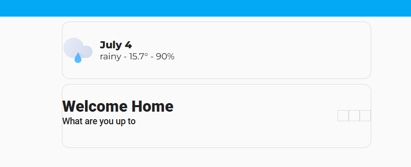
Should those three boxes be next to the Welcome home? the example dashboards don’t load for me in the instructions so I can’t compare.
type or paste code here
Thanks for the great work. I’m really happy with my new dashboard and now its fully responsive using sections.
5 Likes
Amazing work! The design and functionality look really well thought out, congratulations! I’d love to try something similar in my setup. Would you be willing to share the YAML code? It would be a great help. Thanks in advance!
Glad you like it. I try to make things as simple as possible.
Since it’s heavily customised, it can’t be shared as it won’t make sense but i can explain the cards to you.
Custom cards can be found on the HaCasa discord.
- hc_light_card
- hc_cover_card (custom)
- hc_hvac_card (custom)
- media-control cards for music
- hc_switch_card for harmony, electric blanket, power monitoring and TV
- hc_vacuum_card (custom)
- bar-card for printer
The rest of the information is driven from my MQTT server which dynamically updates the information based on feedback from the devices.
1 Like
same here, I am curious what those are for
Has anyone implemented a card like a Markdown card ?
This all seounds great, but where do i get this download
Been on the discord chanel but dontsee whers to get this
Or is it just bits i need to add to a new dashboard
I am confused
Berni…
Awesome. Could you share your code? Or can I find them in discord?
Hi,
I’m trying HaCasa following site instruction but the icons seems not to load. I only have the home icon in the sidebar (had to change the code from fapro: to local: but nothing else. Also on mobile I just lose the top bar when applying the theme and I cannot navigate anywhere. Ho desktop it happens also, I cannot see the top bar with the three dots when using the HaCasa theme (both of them).
I’ve already tried to change the templates for the icons to local: instead of fapro: or custom: (both don’t work) and verified that I’ve the correct icon in the custom_icon folder but nothing change.
Someone as some idea on how to debug/solve it?
I was just wondering if this is still maintained? Many recent comments have gone left unanswered and its a massive job to convert exisiting dashboards if we run into bugs and there is no cimmunity support.
With Regards,
NokoDsk
Hi, welcome to the forum!
Good that you are reluctant about using this.
Be aware that the creator had not been active here, his project website and GH since quite some time.
Also, this is a custom dashboard, created and maintained by maybe 1 person and it can take a lot of time to create, maintain, support this.
I’m not saying that they are abandoning it, I have the same info as you.
1 Like
Thanks mate. I saw he posted an update in Feb, and then when quiet again. I wish this was on git and had some fellow enthusiasts to help maintain. Oh well, ill just use tailwind css to generate some colours and do the best i can to replicate his sruff via button cards.
I dont want to install a whole new “theme” and not have any support. If i build something and it breaks i can only ask myself to fix it hah!
For anyone looking for the link its hidden on his github page: Release v2.1.3 · damianeickhoff/HaCasa · GitHub right at the bottom.
Can you share the code of the custom cards, the discord server it’s closed.
Thanks