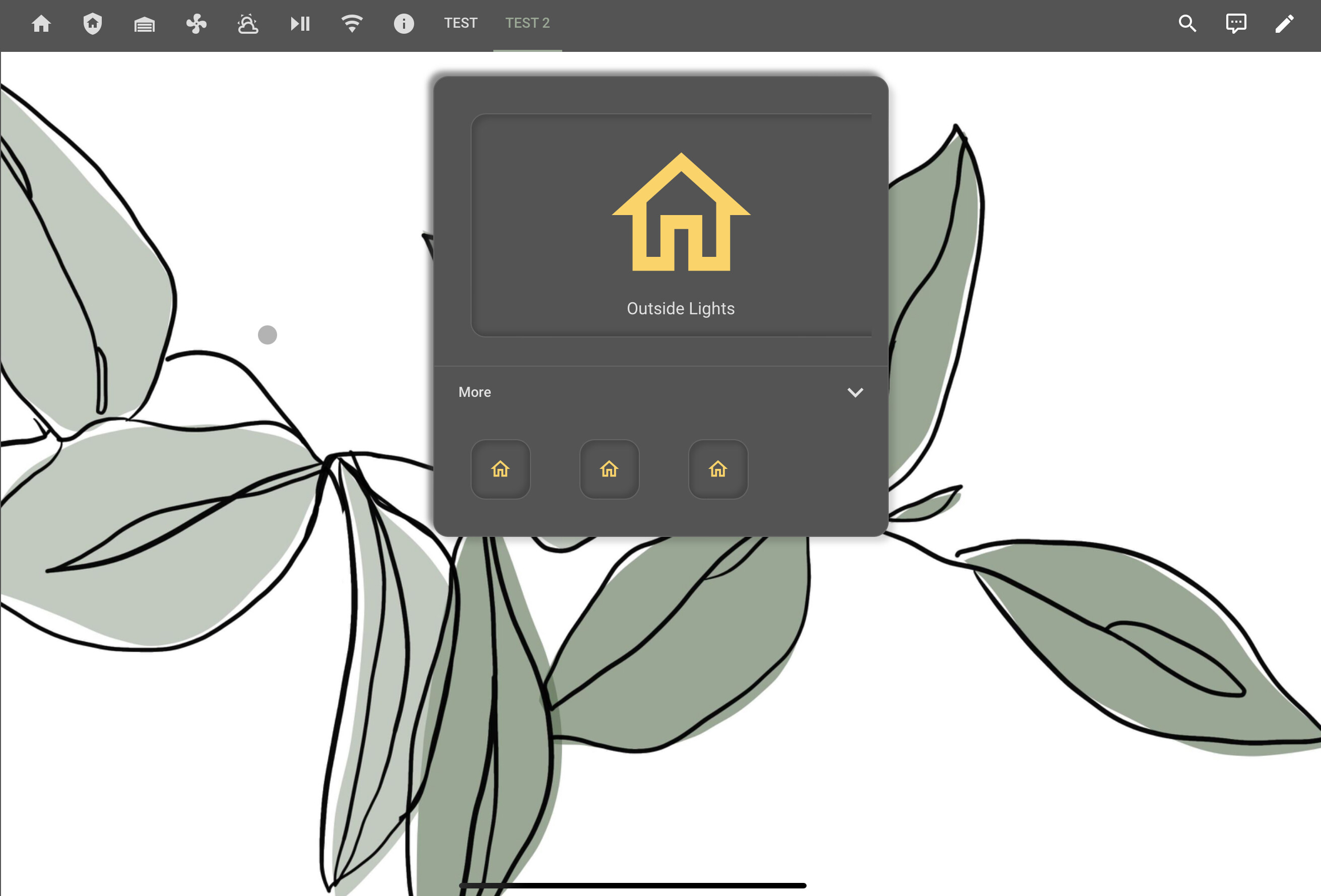
Hey guys, I cannot seem to figure out why my button card is falling out of the border here?
When I set the sizing to manual height and width I can achieve the result I am looking for but then it doesn’t look correct when I switch devices, (from desktop to tablet to phone).
Here is my current code:
type: entities
entities:
  - type: custom:button-card
    show_icon: true
    show_name: true
    state:
      - value: 'on'
        styles:
          icon:
            - color: var(--paper-item-icon-active-color)
          card:
            - box-shadow: var(--soft-ui-pressed)
    styles:
      card: null
      icon:
        - color: var(--primary-text-color)
    hold_action:
      action: more-info
      haptic: medium
    tap_action:
      action: toggle
      haptic: light
    entity: light.outside_lights
    icon: mdi:home-outline
    card_mod:
      class: soft-ui
  - type: custom:fold-entity-row
    head:
      type: section
      label: More
    entities:
      - light.front_porch_1
    show_header_toggle: false
    title: null
  - type: custom:hui-element
    card_type: horizontal-stack
    cards:
      - type: custom:button-card
        show_icon: true
        show_name: false
        state:
          - value: 'on'
            styles:
              icon:
                - color: var(--paper-item-icon-active-color)
              card:
                - box-shadow: var(--soft-ui-pressed)
        styles:
          card:
            - width: min(100vw, 60px)
            - height: min(100vw, 60px)
          icon:
            - color: var(--primary-text-color)
        hold_action:
          action: more-info
          haptic: medium
        tap_action:
          action: toggle
          haptic: light
        entity: light.outside_lights
        icon: mdi:home-outline
        card_mod:
          class: soft-ui
Please post your code using the community standards to expedite a resolution.
See #11
To start let’s eliminate the nulls.
You’ll have to bare with me, I’m not getting the off center look on the PC or mobile.
What manual setting did you apply?
You can try just the card height and let the width be calculated on it’s own.
    styles:
      card:
        - height: 200px;
LiQuid_cOOled:
- height: 200px;
Here is the code with successful card resizing for phone but this is where it gets messed up… It wont resize for anything else because it follows the manual button size but the box that the button sits on gets resized automatically to fit the larger screen:
type: entities
entities:
  - type: custom:button-card
    show_icon: true
    show_name: true
    state:
      - value: 'on'
        styles:
          icon:
            - color: var(--paper-item-icon-active-color)
          card:
            - box-shadow: var(--soft-ui-pressed)
    styles:
      card:
        - width: min(100vw, 270px)
        - height: min(100vw, 190px)
      icon:
        - color: var(--primary-text-color)
    hold_action:
      action: more-info
      haptic: medium
    tap_action:
      action: toggle
      haptic: light
    entity: light.outside_lights
    icon: mdi:home-outline
    card_mod:
      class: soft-ui
  - type: custom:fold-entity-row
    head:
      type: section
      label: More
    entities:
      - light.front_porch_1
    show_header_toggle: false
    title:
  - type: custom:hui-element
    card_type: horizontal-stack
    cards:
      - type: custom:button-card
        show_icon: true
        show_name: false
        state:
          - value: 'on'
            styles:
              icon:
                - color: var(--paper-item-icon-active-color)
              card:
                - box-shadow: var(--soft-ui-pressed)
        styles:
          card:
            - width: min(100vw, 60px)
            - height: min(100vw, 60px)
          icon:
            - color: var(--primary-text-color)
        hold_action:
          action: more-info
          haptic: medium
        tap_action:
          action: toggle
          haptic: light
        entity: light.outside_lights
        icon: mdi:home-outline
        card_mod:
          class: soft-ui
      - type: custom:button-card
        show_icon: true
        show_name: false
        state:
          - value: 'on'
            styles:
              icon:
                - color: var(--paper-item-icon-active-color)
              card:
                - box-shadow: var(--soft-ui-pressed)
        styles:
          card:
            - width: min(100vw, 60px)
            - height: min(100vw, 60px)
          icon:
            - color: var(--primary-text-color)
        hold_action:
          action: more-info
          haptic: medium
        tap_action:
          action: toggle
          haptic: light
        entity: light.outside_lights
        icon: mdi:home-outline
        card_mod:
          class: soft-ui
      - type: custom:button-card
        show_icon: true
        show_name: false
        state:
          - value: 'on'
            styles:
              icon:
                - color: var(--paper-item-icon-active-color)
              card:
                - box-shadow: var(--soft-ui-pressed)
        styles:
          card:
            - width: min(100vw, 60px)
            - height: min(100vw, 60px)
          icon:
            - color: var(--primary-text-color)
        hold_action:
          action: more-info
          haptic: medium
        tap_action:
          action: toggle
          haptic: light
        entity: light.outside_lights
        icon: mdi:home-outline
        card_mod:
          class: soft-ui
Here is what I get just by settings the height:
type: entities
entities:
  - type: custom:button-card
    show_icon: true
    show_name: true
    state:
      - value: 'on'
        styles:
          icon:
            - color: var(--paper-item-icon-active-color)
          card:
            - box-shadow: var(--soft-ui-pressed)
    styles:
      card:
        - height: 190px
      icon:
        - color: var(--primary-text-color)
    hold_action:
      action: more-info
      haptic: medium
    tap_action:
      action: toggle
      haptic: light
    entity: light.outside_lights
    icon: mdi:home-outline
    card_mod:
      class: soft-ui
  - type: custom:fold-entity-row
    head:
      type: section
      label: More
    entities:
      - light.front_porch_1
    show_header_toggle: false
    title:
  - type: custom:hui-element
    card_type: horizontal-stack
    cards:
      - type: custom:button-card
        show_icon: true
        show_name: false
        state:
          - value: 'on'
            styles:
              icon:
                - color: var(--paper-item-icon-active-color)
              card:
                - box-shadow: var(--soft-ui-pressed)
        styles:
          card:
            - width: min(100vw, 60px)
            - height: min(100vw, 60px)
          icon:
            - color: var(--primary-text-color)
        hold_action:
          action: more-info
          haptic: medium
        tap_action:
          action: toggle
          haptic: light
        entity: light.outside_lights
        icon: mdi:home-outline
        card_mod:
          class: soft-ui
      - type: custom:button-card
        show_icon: true
        show_name: false
        state:
          - value: 'on'
            styles:
              icon:
                - color: var(--paper-item-icon-active-color)
              card:
                - box-shadow: var(--soft-ui-pressed)
        styles:
          card:
            - width: min(100vw, 60px)
            - height: min(100vw, 60px)
          icon:
            - color: var(--primary-text-color)
        hold_action:
          action: more-info
          haptic: medium
        tap_action:
          action: toggle
          haptic: light
        entity: light.outside_lights
        icon: mdi:home-outline
        card_mod:
          class: soft-ui
      - type: custom:button-card
        show_icon: true
        show_name: false
        state:
          - value: 'on'
            styles:
              icon:
                - color: var(--paper-item-icon-active-color)
              card:
                - box-shadow: var(--soft-ui-pressed)
        styles:
          card:
            - width: min(100vw, 60px)
            - height: min(100vw, 60px)
          icon:
            - color: var(--primary-text-color)
        hold_action:
          action: more-info
          haptic: medium
        tap_action:
          action: toggle
          haptic: light
        entity: light.outside_lights
        icon: mdi:home-outline
        card_mod:
          class: soft-ui
You know what, I never thought that the theme could be the problem but yes I am running one:
Soft UI Leaf:
  card-mod-theme: Soft UI
  card-mod-card: |
    ha-card {
      margin: 20px;
      border-radius: 15px;
    }
  app-header-background-color: var(--primary-background-color)
  app-header-text-color: var(--primary-text-color)
  app-header-selection-bar-color: var(--primary-color)
  card-mod-root: |
    paper-tab[aria-selected="true"] {
      color: var(--primary-color);
    }
  accent-color: var(--primary-color)
  divider-color: transparent
  ha-card-background: var(--primary-background-color)
  card-background-color: var(--primary-background-color)
  lovelace-background: 'center / cover no-repeat url("/local/backgrounds/leaf.jpg") fixed'
  paper-item-icon-color: var(--secondary-text-color)
  modes:
    dark:
      primary-color: "#9AA795"
      light-primary-color: "#6F6F6F"
      primary-background-color: "#545454"
      primary-text-color: "#FFFFFF"
      secondary-text-color: var(--primary-text-color)
      codemirror-meta: var(--primary-text-color)
      material-secondary-text-color: var(--secondary-text-color)
      text-primary-color: "#FFFFFF"
      disabled-text-color: "#616387"
      state-icon-color: var(--primary-text-color)
      state-icon-active-color: "#FAD46B"
      state-icon-unavailable-color: var(--disabled-text-color)
      ha-card-box-shadow: -5.25px -5.25px 5.25px 0 rgba(60, 60, 60, .6), 5.25px 5.25px 5.25px 0 rgba(0, 0, 0, .15)
      soft-ui-pressed: "inset -4px -4px 5px rgba(60, 60, 60, .6), inset 4px 4px 5px rgba(0, 0, 0, .15)"
  card-mod-card-yaml: |
    .: |
      @keyframes spin {
        0% {
          transform: rotate(0deg);
        }
        100% {
          transform: rotate(359deg);
        }
      }
      ha-icon[data-domain="fan"][data-state="on"] {
        animation: spin 4s infinite linear;
      }
  card-mod-row-yaml: |
    "*:first-child":
      $: |
        @keyframes spin {
          0% {
            transform: rotate(0deg);
          }
          100% {
            transform: rotate(359deg);
          }
        }
        state-badge {
          {% if config.entity.startswith('fan.') and is_state(config.entity, 'on') %}
          animation: spin 4s infinite linear;
          {% endif %}
        }
I think that is your issue, try removing margin: 20px; temporarily in the theme.
It worked! Dude…. I have been pulling my hair out over this for so long. Can’t believe it was so simple. Thank you so much!
1 Like
I happy we were able to figure it out!!!
1 Like


