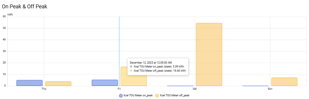
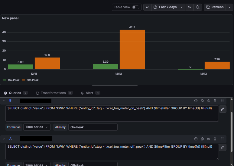
Hey all! Could use a little help here. I’ve got Home Assistant with InfluxDB and Grafana and want to produce a bar chart to show on-peak vs. off-peak energy consumption. The Home Assistant graph (using statistics graph) shows it great, but I can’t seem to get the same thing in Grafana. I notice that Grafana seems to show data not at 12:00am like Home Assistant does, but at 17:00:00? The timezones all appear to be my local (Denver) in InfluxDB and Grafana, and I’ve tried a couple things but can’t seem to figure this out.
Here are screenshots of the bar chart in Home Assistant and in Grafana with the queries. Any help in getting Grafana to look more like the Home Assistant chart would be awesome.
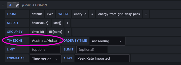
If using a query without the UI (at the end of the query):
SELECT last("value") FROM "kWh" WHERE ("entity_id" = 'energy_from_grid_daily_peak') AND $timeFilter GROUP BY time(1d) fill(none) tz('Australia/Hobart')
Have you set the the time zone in the Grafana sensor?
Jeeeeez… Ya know, I must have changed this 10 times, but apparently never hit “refresh”. This at least has me consistent with Home Assistant, but I think I found another logic issue I’ll need to troubleshoot. This got me where I need for today, thank you!