Home Assistant 2025.8.0 - Frontend - Additional theme color?

Since installing Home Assistant Core 2025.8.0 it looks like some Frontend elements are not following the Theme primary-color setting any more, but are using a separate color.
Because I personally don’t like the HA default color blue I created my own Theme with as primary-color green.
For instance these buttons were using the primary-color green:

But these now are back to the HA default color blue:

Is this an intentional change, or could it be a bug?
I cannot find anything specific about this in the Release Notes, but it might be related to this change:

It looks like these elements are using a specific color now, but on the Themes page only the primary-color and accent-color are given, which don’t influence these elements anymore.
Or is there any possibility to set this color in the Theme again, maybe with any of the shown state theme variables?

1 Like

Intended. See: 2025.8 Beta week! - #3 by Mariusthvdb

@Mariusthvdb did you work out which of the (badly named) new theme variables were the button text and hover background colour?

no, its a huge spaghetti of new color variable names, and inherited by the new semantic naming…
this is the resource frontend/src/resources/theme/color/semantic.globals.ts at bbd9d8887dd4ff3193086bd3320c19c5b0e08397 · home-assistant/frontend · GitHub

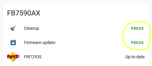
but you have to look up in inspector which button uses which semantic when.
as Marcin told me

With the new button you can theme any of the variables here and change for example all fill primary quiet/normal/loud to a different color palete just chainging the “primary” in --ha-color-primary-xx to something else, and do the same for the on primary quiet/normal/loud

Wendelin said:

So just set all of these core primary colors. And the semantics are build up on them

    --color-primary-05: #001721;
    --color-primary-10: #002e3e;
    --color-primary-20: #004156;
    --color-primary-30: #006787;
    --color-primary-40: #009ac7;
    --color-primary-50: #18bcf2;
    --color-primary-60: #37c8fd;
    --color-primary-70: #7bd4fb;
    --color-primary-80: #b9e6fc;
    --color-primary-90: #dff3fc;
    --color-primary-95: #eff9fe;

This is the beginning of our design system. We just use it for buttons now. But when we hopefully sometime use it on most parts of the software it will be really cool.

Which is what I did for all of my themes now like:

taking my original primary-color as the -40 variant and calculate from there

Dark blue:

# color palette
  ha-color-primary-05: '#001321'      # Near-black with a cool blue undertone
  ha-color-primary-10: '#012744'      # Very dark navy blue
  ha-color-primary-20: '#06457a'     # Deep, rich marine blue
  ha-color-primary-30: '#0d60ad'     # Bold cobalt-like blue
  ha-color-primary-40: '#1675C9'     # Vivid, primary-leaning sky blue (base)
  ha-color-primary-50: '#3d90d6'     # Lighter, softer azure tone
  ha-color-primary-60: '#68a9e1'     # Balanced light blue, good for highlights
  ha-color-primary-70: '#92c2ec'     # Gentle sky blue, ideal for backgrounds
  ha-color-primary-80: '#c0ddf6'     # Very light pastel blue
  ha-color-primary-90: '#e1effb'     # Pale icy blue, near-white
  ha-color-primary-95: '#f1f8fd'     # Almost white with a faint blue tint

and that worked up to b4, see 2025.8 Beta week! - #23 by Mariusthvdb

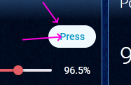
per b5 and now release, my buttons are all defaulted to the system default again, so I filed an issue to report that

edit
change the version numbers, I counted 6 betas, but we had only 5 :wink:

edit2
added the ha- prefix in this post, just to not confuse readers

3 Likes

Thanks @tom_l and @Mariusthvdb

So it is an intentional change, but a bug as well?
I hope it will be solved some how, either by a simple way to influence these colors, or preferable by giving us an opt-out on this so that the primary-color is used again for these elements.

The ‘bug’ was just a slight change in the variable names, from color-primary-xx to ha-color-primary-xx. Setting these in your theme will allow you to control what colours your buttons use. -0 is the darkest variant (almost black) and -95 is the lightest (almost white).

There are online theming sites that can suggest colour ranges for you, using your current primary-color as a starting point in the middle - I set my preferred primary color at -40

These type of color palette variables are apparently going to be adopted more widely in future - it’s just starting with buttons.

Check my gist and see how I did that for all of my themes

I am still flipping some of the darker themes but the method is very simple

the original order resulted in

flipping that makes those buttons more embedded

I must be thick then because it looks unnecessarily convoluted to me.

2 Likes

I see it as just a more precise way of setting variables equivalent toprimary-color, light-primary-color, accent-color and so on.

I assume it’s also connected with accessibility issues and achieving visual consistency and predictability across the frontend.

Hmm… OK, so it is possible now to have a very granular and thus complex control on the used colors?

Personally I am not into fancy UI’s.
For me the UI is functional only: just for setting options and monitoring.
It is just that I dislike the default blue color (I probably have an abnormality in my eyes that makes me rather sensitive to certain colors).
So I still would very much appreciate an opt-out on this, so that just one primary-color setting in the theme would solve that, like it was before.

There won’t be an ‘opt-out’ - by choosing to set your own themes, you’ve basically already oipted out, and now you’re effectively on your own, but with total control.

You could try setting all the ha-primary-color-xx variables to just your original primary color, but I’ve no idea what that looks like in practice.

Running in circles here… :wink:
Just give it a try and see for yourself. It works rather well

1 Like

I took your template:

# color palette
  ha-color-primary-0: '#001321'      # Near-black with a cool blue undertone
  ha-color-primary-1: '#012744'      # Very dark navy blue
  ha-color-primary-20: '#06457a'     # Deep, rich marine blue
  ha-color-primary-30: '#0d60ad'     # Bold cobalt-like blue
  ha-color-primary-40: '#1675C9'     # Vivid, primary-leaning sky blue (base)
  ha-color-primary-50: '#3d90d6'     # Lighter, softer azure tone
  ha-color-primary-60: '#68a9e1'     # Balanced light blue, good for highlights
  ha-color-primary-70: '#92c2ec'     # Gentle sky blue, ideal for backgrounds
  ha-color-primary-80: '#c0ddf6'     # Very light pastel blue
  ha-color-primary-90: '#e1effb'     # Pale icy blue, near-white
  ha-color-primary-95: '#f1f8fd'     # Almost white with a faint blue tint

… and asked ChatGPT to take my primary colour and use it for -40 and adjust:

Use rgb(129, 98, 226) as -40, and adjust

… copy/paste, job done. Ended up with:

      ha-color-primary-0:  '#0b051e'   # Near-black with cool purple undertone
      ha-color-primary-1:  '#180c3a'   # Very dark violet
      ha-color-primary-20: '#2e1870'   # Deep royal purple
      ha-color-primary-30: '#4624a5'   # Bold violet
      ha-color-primary-40: '#8162e2'   # Base (-40) vivid purple (rgb(129, 98, 226))
      ha-color-primary-50: '#9d84e7'   # Lighter lavender tone
      ha-color-primary-60: '#b7a5eb'   # Soft lilac, good for highlights
      ha-color-primary-70: '#d0c6f1'   # Pastel lavender, ideal for backgrounds
      ha-color-primary-80: '#e2dbf7'   # Very light purple
      ha-color-primary-90: '#f1effc'   # Pale icy lavender, near-white
      ha-color-primary-95: '#f8f7fe'   # Almost white with faint purple tint

yes that is what I did for all themes too :wink:
for starters that is, and see what happens. Maybe there are better tools to create those color scales, but I had a smooth experience.
At one point the button colors stood too strongly out from my card background and I just types that, and color scale was adjusted.

Also created flipped palettes, to match my dark themes.

Anyways, you get the drift here: set these palettes and experiment

Me? No, I don’t think I am. I felt the same about this from the beginning, and agree with Tom that this new setup is overly complicated.
It should be possible to just set one primary-color and then let Home Assistant determine all the different light / dark shades for that.

OK, so I did, using the HTML Color Picker site.
I selected a green as default color in the Pick a Color graphic, and then used the color codes from the Lighter / Darker table, following the percentages (just used the 5% value for the ha-color-primary-1 parameter).
This is my new theme setup:

frontend:
  themes:
    standard:
      ha-color-primary-0: '#000000'
      ha-color-primary-1: '#051405'
      ha-color-primary-20: '#145214'
      ha-color-primary-30: '#1f7a1f'
      ha-color-primary-40: '#29a329'
      ha-color-primary-50: '#33cc33'
      ha-color-primary-60: '#5cd65c'
      ha-color-primary-70: '#85e085'
      ha-color-primary-80: '#adebad'
      ha-color-primary-90: '#d6f5d6'
      ha-color-primary-95: '#ebfaeb'

It is looking OK for now, but I hope that I don’t have to modify this all the time.

1 Like

Rather than consuming the energy of a small nation I just used this tool:

1 Like

Thanks for the idea, but that indeed doesn’t work: like that the button background color is identical to the foreground color, masking the button text.

I just updated from 2025.7 directly to 2025.9 and I noticed my entities card that has a play action button .

It now has an ugly blue background when the text used to be transparent and my card mod color changes sis no lol get working.

Is this anyway related to what you guys are talking about? I would love to know how to fix this.

Sorry, but I don’t understand what you are talking about.
Please rephrase your wording, and show an example of what you are seeing.

Did you already try the shown ha-color-primary-x theme color modifications?

Hi everyone, i spent some (too much) time identifying the variables:

  ha-color-primary-05:  # DARK outlined_hover + DARK plain_hover
  ha-color-primary-10:  # DARK filled_bg
  ha-color-primary-20:  # DARK filled_hover
  ha-color-primary-30:  # DARK/LIGHT accent_hover
  ha-color-primary-40:  # DARK/LIGHT accent_bg + LIGHT filled + LIGHT plain
  ha-color-primary-50:  # LIGHT outlined
  ha-color-primary-60:  # DARK filled + DARK plain
  ha-color-primary-70:  # DARK outlined
  ha-color-primary-80:  # LIGHT filled_hover
  ha-color-primary-90:  # LIGHT filled_bg
  ha-color-primary-95:  # LIGHT outlined_hover + LIGHT plain_hover

  ha-color-neutral-05:  # DARK outlined_hover + DARK plain_hover
  ha-color-neutral-10:  # DARK filled_bg
  ha-color-neutral-20:  # DARK filled_hover
  ha-color-neutral-30:  # DARK/LIGHT accent_hover
  ha-color-neutral-40:  # DARK/LIGHT accent_bg + LIGHT filled + LIGHT plain
  ha-color-neutral-50:  # LIGHT outlined
  ha-color-neutral-60:  # DARK filled + DARK plain
  ha-color-neutral-70:  # DARK outlined
  ha-color-neutral-80:  # LIGHT filled_hover
  ha-color-neutral-90:  # LIGHT filled_bg
  ha-color-neutral-95:  # LIGHT outlined_hover + LIGHT plain_hover

  ha-color-green-05:  # DARK outlined_hover + DARK plain_hover
  ha-color-green-10:  # DARK filled_bg
  ha-color-green-20:  # DARK filled_hover
  ha-color-green-30:  # DARK accent_hover
  ha-color-green-40:  # DARK accent_bg + LIGHT filled + LIGHT plain + LIGHT accent_hover
  ha-color-green-50:  # LIGHT outlined + LIGHT accent_bg
  ha-color-green-60:  # DARK filled + DARK plain
  ha-color-green-70:  # DARK outlined
  ha-color-green-80:  # LIGHT filled_hover
  ha-color-green-90:  # LIGHT filled_bg
  ha-color-green-95:  # LIGHT outlined_hover + LIGHT plain_hover

  ha-color-orange-05:  # DARK outlined_hover + DARK plain_hover
  ha-color-orange-10:  # DARK filled_bg
  ha-color-orange-20:  # DARK filled_hover
  ha-color-orange-30:  # DARK accent_hover
  ha-color-orange-40:  # DARK accent_bg + LIGHT filled + LIGHT plain
  ha-color-orange-50:  # LIGHT outlined + LIGHT accent_hover
  ha-color-orange-60:  # DARK filled + DARK plain
  ha-color-orange-70:  # DARK outlined + LIGHT accent_bg
  ha-color-orange-80:  # LIGHT filled_hover
  ha-color-orange-90:  # LIGHT filled_bg
  ha-color-orange-95:  # LIGHT outlined_hover + LIGHT plain_hover

  ha-color-red-05:  # DARK outlined_hover + DARK plain_hover
  ha-color-red-10:  # DARK filled_bg
  ha-color-red-20:  # DARK filled_hover
  ha-color-red-30:  # DARK accent_hover
  ha-color-red-40:  # DARK accent_bg + LIGHT filled + LIGHT plain + LIGHT accent_hover
  ha-color-red-50:  # LIGHT outlined + LIGHT accent_bg
  ha-color-red-60:  # DARK filled + DARK plain
  ha-color-red-70:  # DARK outlined
  ha-color-red-80:  # LIGHT filled_hover
  ha-color-red-90:  # LIGHT filled_bg
  ha-color-red-95:  # LIGHT outlined_hover + LIGHT plain_hover

Please notice the each ‘color part’ is different… WTH!?
I did something like this for each color section in my theme:

  ha-color-green-05: var(--green-palette-color-00) # lightest # DARK outlined_hover + DARK plain_hover
  ha-color-green-10: var(--green-palette-color-01) # DARK filled_bg
  ha-color-green-20: var(--green-palette-color-02) # DARK filled_hover
  ha-color-green-30: var(--green-palette-color-03) # DARK accent_hover
  ha-color-green-40: var(--green-palette-color-04) # DARK accent_bg + LIGHT filled + LIGHT plain + LIGHT ac
  ha-color-green-50: var(--green-palette-color-05) # var(--gr # LIGHT outlined + LIGHT accent_bg
  ha-color-green-60: var(--green-palette-color-06) # DARK filled + DARK plain
  ha-color-green-70: var(--green-palette-color-07) # DARK outlined
  ha-color-green-80: var(--green-palette-color-08) # LIGHT filled_hover
  ha-color-green-90: var(--green-palette-color-09) # LIGHT filled_bg
  ha-color-green-95: var(--green-palette-color-10) # darkest # LIGHT outlined_hover + LIGHT plain_hover
If you want to try my colors
      green-palette-color-00: "#d7f1ce" # lightest
      green-palette-color-01: "#c8ecbb"
      green-palette-color-02: "#b9e7a8"
      green-palette-color-03: "#abdf9b"
      green-palette-color-04: "#a6da95"
      green-palette-color-05: "#93c785" # var(--green)
      green-palette-color-06: "#82b676"
      green-palette-color-07: "#70a366"
      green-palette-color-08: "#5f8f57"
      green-palette-color-09: "#4d7a48"
      green-palette-color-10: "#3b6436" # darkest