I “created” two horizontal temperature gauges for my dashboard. I honestly tried to find a solution out of the box, but I never found anything. Forgive me if this already exists somewhere else or if there is an easier way to do this. I could not find it.
I say “created” as I relied heavily on chatgpt. I first created an image (using powerpoint) of what I wanted and then shared it with chatgpt and then took it step by step.
This gauge above shows a background bar of a “full” range of temperatures that are typical outside temperatures in my part of the world. The black outlined pill inside the temperature band, and the labels below, indicate the forecast high and low temp for the day. The white vertical bar is the current temperature, also in the top righthand corner.
This gauge shows another range of temperatures, suitable for the highs and lows temperatures that would be seen inside our house. The Upstairs marker/label on the top, Downstairs marker/label on the bottom, and the Garage marker/label on the bottom indicate the temperature at the thermostat for three different HVAC units. The marker will turn red when in heat mode and blue for cool mode. The middle labels of 65-degrees and 77-degrees indicate what I consider to be a comfort zone - HVAC is not required - put on a jacket or put on shorts…but don’t turn the HVAC on.
They are not intended to be interactive, and if clicked, they show the temperature of the lead entity. I have other buttons for the control of the HVAC units.
I’m happy to share the YAML code for each. They may appear to have extraneous code but it was a back-and-forth process and I tried several different avenues before arriving at where I ended up.
5 Likes
Hellis81
May 18, 2025, 5:22pm
2
However…
1 Like
Great suggestion., thank you. It took a bit, but each marker and title are now interactive and they will launch a bubble-card/pop-up for the thermostat.
2 Likes
Chykan
May 20, 2025, 8:24am
4
Looks good, would be great if you could share your code on here. Chat GPT is a good tool when used in the right way, with a reasonable understanding of where to steer it.
Happy to share the code. I did make a slight formatting adjustment as the title for the Garage, at a higher temperature, slide off the card, so the label and temperature are now stacked. ChatGPT suggested that it could work on dynamic positioning, but I’m going to work with this thru the summare and make adjustments if needed,
The labels are actionable and will open a thermostat pop-up card.
ChatGPT is wrong…a lot. And you’re right. When it is wrong, you need to know enough to suggest an alternative approach to solve the problems.
entity: sensor.upstairs_current_temperature
tap_action:
  action: none
show_name: false
show_icon: false
show_state: false
custom_fields:
  title: Current Inside Temperatures
  gradient: ""
  bar: ""
  temperature_ticks: |
    [[[
      const ticks = [];
      for (let t = 65; t <= 80; t += 5) {
        const left = ((t - 60) / (85 - 60)) * 100;
        ticks.push(`<div style="
          position: absolute;
          top: 47%;
          left: ${left}%;
          height: 10%;
          width: 0.5px;
          background-color: white;
          z-index: 2;
          transform: translateX(-50%);
        "></div>`);
      }
      return ticks.join('');
    ]]]
  upstairs_marker: |
    [[[
      const temp = Math.round(states['sensor.upstairs_current_temperature'].state);
      const mode = states['climate.upstairs'].state;
      const color = mode === 'cool' ? '#00bfff' : mode === 'heat' ? '#ff4d4d' : 'white';
      const left = ((temp - 60) / (85 - 60)) * 100;
      return `
        <span style="
          position: absolute;
          top: 28%;
          pointer-events: auto;
          touch-action: manipulation;
          cursor: pointer;
          left: ${left}%;
          transform: translateX(-50%);
          font-size: 24px;
          color: ${color};
          z-index: 3;"
          onclick="event.stopPropagation(); location.hash='#upstairs'"
          ontouchstart="event.stopPropagation(); location.hash='#upstairs'">
          ▼
        </span>
      `;
    ]]]
  downstairs_marker: |
    [[[
      const temp = Math.round(states['sensor.downstairs_current_temperature'].state);
      const mode = states['climate.downstairs'].state;
      const color = mode === 'cool' ? '#00bfff' : mode === 'heat' ? '#ff4d4d' : 'white';
      const left = ((temp - 60) / (85 - 60)) * 100;
      return `
        <span style="
          position: absolute;
          top: 55%;
          pointer-events: auto;
          touch-action: manipulation;
          cursor: pointer;
          left: ${left}%;
          transform: translateX(-50%);
          font-size: 24px;
          color: ${color};
          z-index: 3;"
          onclick="event.stopPropagation(); location.hash='#downstairs'"
          ontouchstart="event.stopPropagation(); location.hash='#downstairs'">
          ▲
        </span>
      `;
    ]]]
  garage_marker: |
    [[[
      const temp = Math.round(states['sensor.a3_garage_temperature'].state);
      const mode = states['climate.lounge'].state;
      const color = mode === 'cool' ? '#00bfff' : mode === 'heat' ? '#ff4d4d' : 'white';
      const left = ((temp - 60) / (85 - 60)) * 100;
      return `
        <span style="
          position: absolute;
          top: 55%;
          pointer-events: auto;
          touch-action: manipulation;
          cursor: pointer;
          left: ${left}%;
          transform: translateX(-50%);
          font-size: 24px;
          color: ${color};
          z-index: 3;"
          onclick="event.stopPropagation(); location.hash='#lounge'"
          ontouchstart="event.stopPropagation(); location.hash='#lounge'">
          ▲
        </span>
      `;
    ]]]
  fixed_77_marker: "|← 77"
  fixed_65_marker: 65 →|
  upstairs_label: |
    [[[
      const temp = Math.round(states['sensor.upstairs_current_temperature'].state);
      return `
        <div style="
          pointer-events: auto;
          cursor: pointer;
          padding: 4px 8px;
          border-radius: 6px;"
          onclick="event.stopPropagation(); location.hash='#upstairs'"
          ontouchstart="event.stopPropagation(); location.hash='#upstairs'">
          Upstairs: ${temp}°F
        </div>
      `;
    ]]]
  downstairs_label: |
    [[[
      const temp = Math.round(states['sensor.downstairs_current_temperature'].state);
      return `
        <div style="text-align: center; pointer-events: auto; cursor: pointer;"
             onclick="event.stopPropagation(); location.hash='#downstairs'"
             ontouchstart="event.stopPropagation(); location.hash='#downstairs'">
          <div style="padding: 2px 6px; border-radius: 6px;">Downstairs</div>
          <div style="font-size: 12px; margin-top: 2px;">${temp}°F</div>
        </div>
      `;
    ]]]
  garage_label: |
    [[[
      const temp = Math.round(states['sensor.a3_garage_temperature'].state);
      return `
        <div style="text-align: center; pointer-events: auto; cursor: pointer;"
             onclick="event.stopPropagation(); location.hash='#lounge'"
             ontouchstart="event.stopPropagation(); location.hash='#lounge'">
          <div style="padding: 2px 6px; border-radius: 6px;">Garage</div>
          <div style="font-size: 12px; margin-top: 2px;">${temp}°F</div>
        </div>
      `;
    ]]]
  top_right: |
    [[[
      let cur = Math.round(parseFloat(states['sensor.home_realfeel_temperature'].state));
      return 'Current: ' + cur + '°F';
    ]]]
styles:
  card:
    - background-color: transparent
    - border-radius: 30px
    - padding: 0
    - height: 140px
    - position: relative
    - font-size: 14px
    - color: white
    - overflow: visible
    - pointer-events: none
  custom_fields:
    title:
      - position: absolute
      - top: 0%
      - left: 1px
      - font-weight: bold
      - font-size: 14px
      - z-index: 2
    top_right:
      - position: absolute
      - top: 0%
      - right: 4px
      - font-size: 14px
    gradient:
      - position: absolute
      - top: 45%
      - left: 0
      - width: 100%
      - height: 15%
      - border-radius: 30px
      - background: |
          linear-gradient(to right,
            #001f3f 11.5%,
            #001f3f 23.1%,
            #0074D9 35.9%,
            #2ECC40 48.7%,
            #FFDC00 61.5%,
            #FF851B 74.4%,
            #FF4136 87.2%,
            #85144b 100%
          )
      - z-index: 0
    bar:
      - position: absolute
      - top: 40%
      - left: 0
      - width: 100%
      - height: 20%
      - background-color: rgba(255, 255, 255, 0.0)
      - border-radius: 30px
      - z-index: 1
    temperature_ticks:
      - position: absolute
      - top: 0
      - left: 0
      - width: 100%
      - height: 100%
      - z-index: 2
    upstairs_label:
      - position: absolute
      - top: 28%
      - font-size: 14px
      - left: |
          [[[
            let temp = Math.round(parseFloat(states['sensor.upstairs_current_temperature'].state)) + 0.5;
            return ((temp - 60) / (85 - 60) * 100) + '%';
          ]]]
      - transform: translateX(0%)
      - pointer-events: auto
    downstairs_label:
      - position: absolute
      - top: 62%
      - font-size: 14px
      - left: |
          [[[
            let temp = Math.round(parseFloat(states['sensor.downstairs_current_temperature'].state)) - 0.7;
            return ((temp - 60) / (85 - 60) * 100) + '%';
          ]]]
      - transform: translateX(-100%)
      - pointer-events: auto
    garage_label:
      - position: absolute
      - top: 62%
      - font-size: 14px
      - left: |
          [[[
            let temp = Math.round(parseFloat(states['sensor.a3_garage_temperature'].state)) + 0.7;
            return ((temp - 60) / (85 - 60) * 100) + '%';
          ]]]
      - transform: translateX(0%)
      - pointer-events: auto
    fixed_77_marker:
      - position: absolute
      - top: 46.5%
      - font-size: 12px
      - color: black
      - left: |
          [[[ return ((77 - 60) / (85 - 60) * 100) + '%'; ]]]
      - transform: translateX(-50%)
      - z-index: 3
    fixed_65_marker:
      - position: absolute
      - top: 46.5%
      - font-size: 12px
      - color: white
      - left: |
          [[[ return ((65 - 60) / (85 - 60) * 100 - 3) + '%'; ]]]
      - transform: translateX(-50%)
      - z-index: 3
I think it would be fairly easy to adapt the code - and no doubt, improve upon it.
3 Likes
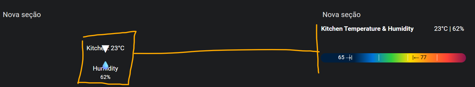
Nice card I loved it.
But I dont know why on mine the indicators are var away from the graph bar hahaha
I tried to fix it using Claude but no success
entity: sensor.shelly_b_c3bc_temperature
type: custom:button-card
tap_action:
  action: none
show_name: false
show_icon: false
show_state: false
custom_fields:
  title: Kitchen Temperature & Humidity
  gradient: ""
  bar: ""
  temperature_ticks: |
    [[[
      const ticks = [];
      for (let t = 65; t <= 80; t += 5) {
        const left = ((t - 60) / (85 - 60)) * 100;
        ticks.push(`<div style="
          position: absolute;
          top: 47%;
          left: ${left}%;
          height: 10%;
          width: 0.5px;
          background-color: white;
          z-index: 2;
          transform: translateX(-50%);
        "></div>`);
      }
      return ticks.join('');
    ]]]
  temperature_marker: |
    [[[
      const temp = Math.round(states['sensor.shelly_b_c3bc_temperature'].state);
      const mode = states['climate.ar_cozinha'].state;
      const color = mode === 'cool' ? '#00bfff' : mode === 'heat' ? '#ff4d4d' : 'white';
      const left = ((temp - 60) / (85 - 60)) * 100;
      return `
        <span style="
          position: absolute;
          top: 28%;
          pointer-events: auto;
          touch-action: manipulation;
          cursor: pointer;
          left: ${left}%;
          transform: translateX(-50%);
          font-size: 24px;
          color: ${color};
          z-index: 3;"
          onclick="event.stopPropagation(); location.hash='#kitchen'"
          ontouchstart="event.stopPropagation(); location.hash='#kitchen'">
          ▼
        </span>
      `;
    ]]]
  humidity_marker: |
    [[[
      const humidity = Math.round(states['sensor.shelly_b_c3bc_humidity'].state);
      const temp = Math.round(states['sensor.shelly_b_c3bc_temperature'].state);
      const left = ((temp - 60) / (85 - 60)) * 100;
      return `
        <span style="
          position: absolute;
          top: 55%;
          pointer-events: auto;
          touch-action: manipulation;
          cursor: pointer;
          left: ${left}%;
          transform: translateX(-50%);
          font-size: 18px;
          color: #4CAF50;
          z-index: 3;"
          onclick="event.stopPropagation(); location.hash='#kitchen-humidity'"
          ontouchstart="event.stopPropagation(); location.hash='#kitchen-humidity'">
          💧
        </span>
      `;
    ]]]
  fixed_77_marker: "|← 77"
  fixed_65_marker: 65 →|
  temperature_label: |
    [[[
      const temp = Math.round(states['sensor.shelly_b_c3bc_temperature'].state);
      return `
        <div style="
          pointer-events: auto;
          cursor: pointer;
          padding: 4px 8px;
          border-radius: 6px;
          white-space: nowrap;"
          onclick="event.stopPropagation(); location.hash='#kitchen'"
          ontouchstart="event.stopPropagation(); location.hash='#kitchen'">
          Kitchen: ${temp}°C
        </div>
      `;
    ]]]
  humidity_label: |
    [[[
      const humidity = Math.round(states['sensor.shelly_b_c3bc_humidity'].state);
      return `
        <div style="text-align: center; pointer-events: auto; cursor: pointer; white-space: nowrap;"
             onclick="event.stopPropagation(); location.hash='#kitchen-humidity'"
             ontouchstart="event.stopPropagation(); location.hash='#kitchen-humidity'">
          <div style="padding: 2px 6px; border-radius: 6px;">Humidity</div>
          <div style="font-size: 12px; margin-top: 2px;">${humidity}%</div>
        </div>
      `;
    ]]]
  top_right: |
    [[[
      let temp = Math.round(parseFloat(states['sensor.shelly_b_c3bc_temperature'].state));
      let humidity = Math.round(parseFloat(states['sensor.shelly_b_c3bc_humidity'].state));
      return temp + '°C | ' + humidity + '%';
    ]]]
styles:
  card:
    - background-color: transparent
    - border-radius: 30px
    - padding: 0
    - height: 140px
    - position: relative
    - font-size: 14px
    - color: white
    - overflow: visible
    - pointer-events: none
  custom_fields:
    title:
      - position: absolute
      - top: 0%
      - left: 1px
      - font-weight: bold
      - font-size: 14px
      - z-index: 2
    top_right:
      - position: absolute
      - top: 0%
      - right: 4px
      - font-size: 14px
    gradient:
      - position: absolute
      - top: 45%
      - left: 0
      - width: 100%
      - height: 15%
      - border-radius: 30px
      - background: |
          linear-gradient(to right,
            #001f3f 11.5%,
            #001f3f 23.1%,
            #0074D9 35.9%,
            #2ECC40 48.7%,
            #FFDC00 61.5%,
            #FF851B 74.4%,
            #FF4136 87.2%,
            #85144b 100%
          )
      - z-index: 0
    bar:
      - position: absolute
      - top: 40%
      - left: 0
      - width: 100%
      - height: 20%
      - background-color: rgba(255, 255, 255, 0.0)
      - border-radius: 30px
      - z-index: 1
    temperature_ticks:
      - position: absolute
      - top: 0
      - left: 0
      - width: 100%
      - height: 100%
      - z-index: 2
    temperature_label:
      - position: absolute
      - top: 28%
      - font-size: 14px
      - left: |
          [[[
            let temp = Math.round(parseFloat(states['sensor.shelly_b_c3bc_temperature'].state));
            return ((temp - 60) / (85 - 60) * 100) + '%';
          ]]]
      - transform: translateX(-50%)
      - pointer-events: auto
    humidity_label:
      - position: absolute
      - top: 62%
      - font-size: 14px
      - left: |
          [[[
            let temp = Math.round(parseFloat(states['sensor.shelly_b_c3bc_temperature'].state));
            return ((temp - 60) / (85 - 60) * 100) + '%';
          ]]]
      - transform: translateX(-50%)
      - pointer-events: auto
    fixed_77_marker:
      - position: absolute
      - top: 46.5%
      - font-size: 12px
      - color: black
      - left: |
          [[[ return ((77 - 60) / (85 - 60) * 100) + '%'; ]]]
      - transform: translateX(-50%)
      - z-index: 3
    fixed_65_marker:
      - position: absolute
      - top: 46.5%
      - font-size: 12px
      - color: white
      - left: |
          [[[ return ((65 - 60) / (85 - 60) * 100 - 3) + '%'; ]]]
      - transform: translateX(-50%)
      - z-index: 3
GRO
August 1, 2025, 4:17pm
7
You’re sensor is in Celsius but the gauge is made for Fahrenheit.
2 Likes