ChrisJ60
October 16, 2024, 1:12pm
1
I just updated to 2024.10.2 and I want to experiment with the new heading cards for the Sections layout. However, the default txt size for the cars is very small (given that they are meant to be titles or sub-titles) and the card doesn’t;t have any control to format the text to e.g. make it bigger. How can I make the text bigger? And is it possible to e.g. change the colour, make it bold etc. I’ve searched the doc and online but can’t seem to find anything on this topic for HA in general.
All I can find is something called ‘card-mod’ but reading about that it seems overly complex for what should be a simple thing.
card-mod seems to be only solution now. Examples of styling the card are provided in the main card-mod thread.
ChrisJ60
October 16, 2024, 2:29pm
3
Hmmm, that seems to be a huge oversight, not just for the new Heading card but for cards in general. From what I have seen card-mod is not especially user friendly. Sure it is very powerful but I suspect many use cases would be equally well served by providing some simple, generic text formatting capabilities as standard for all card types. Sigh. Guess I will live without the new heading card functionality for now.
When you say ‘the main card-mod thread’, do you man this one"
Hm. Where is the difference to your first try? I used the same for some months (not to hide, but for other colors). But unfortunately it works only on first tab.
1 Like
TJoe
May 4, 2025, 10:39pm
5
Adding this with card-mod will work, just adjust the size as needed.
card_mod:
  style: |
    ha-card .title p { font-size: 24px; }
    ha-card .title ha-icon { --mdc-icon-size: 30px; }
Or this if the card header is set to “subtitle” size instead of “title”:
card_mod:
  style: |
    ha-card .subtitle p { font-size: 24px;  }
    ha-card .subtitle ha-icon { --mdc-icon-size: 30px; }
The subtitle style is more centered in the whitespace so I prefer that, and you can set the text color to black by adding color: black; within the brackets.
You can also include both the title and subtitle styles and the respective one will apply if you switch between the styles.
Example:
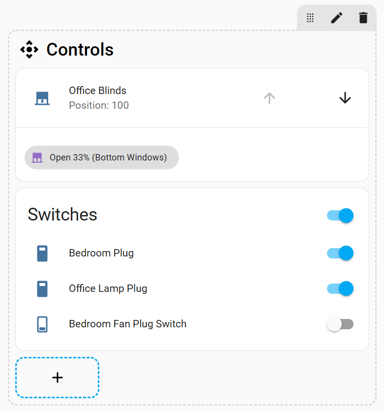
type: heading
icon: mdi:camera-control
heading: Controls
heading_style: subtitle
card_mod:
  style: |
    ha-card .title p { font-size: 24px; }
    ha-card .title ha-icon { --mdc-icon-size: 30px; }
    ha-card .subtitle p { font-size: 24px; color: black; }
    ha-card .subtitle ha-icon { --mdc-icon-size: 30px; color: black; }
6 Likes
sebpro
August 22, 2025, 4:12pm
6
Did you actually get this to work? I can’t for the life of me figure out why I cant change the size of the badges! Before I found this thread I did exactly what you’ve done but my css doesn’t register, not with “!important” either.
1 Like
Does anyone have any idea how to center the text for subtitles? I tried “text-align: center;” also including !important, but unfortunately it didn’t work. Changing the font size and color works fine.
Can you provide more details? Are you trying to align the text in the center of the card?
Providing your current code will help.
My best guess as to what you want
type: heading
icon: mdi:fridge
heading: Kitchen
heading_style: subtitle
card_mod:
  style: |
    .container {
      justify-content: center !important;
      }
Please post your code using the forum standards
See #11
It is still not clear what you want with the code you showed in the pic
And how it looks like
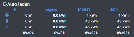
I want to center “P”, “täglich”, “Monat” & “Jahr”, the white entities are already center, but not the heading (subtitle).
sorry, next try for code:
type: custom:layout-card
layout_type: custom:grid-layout
cards:
  - type: heading
    icon: ""
    heading_style: title
    heading: E-Auto laden
    view_layout:
      grid-area: row1
  - type: heading
    icon: ""
    heading: null
    heading_style: subtitle
    view_layout:
      grid-area: r2c1
  - type: heading
    icon: ""
    heading: P
    heading_style: subtitle
    view_layout:
      grid-area: r2c2
    card_mod:
      style: |
        .container {
        justify-content: center !important;
        }
  - type: heading
    icon: ""
    heading_style: subtitle
    heading: täglich
    view_layout:
      grid-area: r2c3
    card_mod:
      style: |
        ha-card .subtitle p {
        font-size: 12px;
        text-align: center !important;
        display: block !important;
        }
Which card is providing the data below the headings?
mushroom template card, here my complete code:
type: custom:layout-card
layout_type: custom:grid-layout
cards:
  - type: heading
    icon: ""
    heading_style: title
    heading: E-Auto laden
    view_layout:
      grid-area: row1
  - type: heading
    icon: ""
    heading: null
    heading_style: subtitle
    view_layout:
      grid-area: r2c1
  - type: heading
    icon: ""
    heading: P
    heading_style: subtitle
    view_layout:
      grid-area: r2c2
    card_mod:
      style: |
        .text-content {
          text-align: center;
        }
  - type: heading
    icon: ""
    heading_style: subtitle
    heading: täglich
    view_layout:
      grid-area: r2c3
    card_mod:
      style: |
        ha-card .subtitle p {
        font-size: 12px;
        text-align: center !important;
        display: block !important;
        }
        .card-header {
        text-align: center;
        display: block !important;
        }
  - type: heading
    icon: ""
    heading_style: subtitle
    heading: Monat
    view_layout:
      grid-area: r2c4
  - type: heading
    icon: ""
    heading_style: subtitle
    heading: Jahr
    view_layout:
      grid-area: r2c5
    card_mod:
      style: |
        .card-header {
        text-align: center;
        display: block !important;
        }
  - type: heading
    icon: mdi:grid
    heading: ""
    heading_style: subtitle
    view_layout:
      grid-area: r3c1
    card_mod:
      style: |
        ha-card {
          justify-self: center;
        }
  - type: custom:mushroom-template-card
    entity: sensor.pv_laden_w
    name: P
    primary_info: none
    secondary: |
      {{ states('sensor.pv_laden_w', rounded=True) }} W
    view_layout:
      grid-area: r3c2
    card_mod:
      style: |
        ha-card {
          box-shadow: none;
          background: none;
          justify-self: center;
          padding: 0px !important;
        }
    icon_type: none
  - type: custom:mushroom-template-card
    icon_type: none
    layout: horizontal
    entity: sensor.pv_laden_taglich
    name: U
    primary_info: none
    secondary: |
      {{ states('sensor.pv_laden_taglich', rounded=True) }} kWh
    view_layout:
      grid-area: r3c3
    card_mod:
      style: |
        ha-card {
          box-shadow: none;
          background: none;
          justify-self: center;
          padding: 0px !important;
        }
  - type: custom:mushroom-template-card
    entity: sensor.pv_laden_monatlich
    name: I
    primary_info: none
    secondary: |
      {{ states('sensor.pv_laden_monatlich', rounded=True) }} kWh
    view_layout:
      grid-area: r3c4
    card_mod:
      style: |
        ha-card {
          box-shadow: none;
          background: none;
          justify-self: center;
          padding: 0px !important;
        }
    icon_type: none
  - type: custom:mushroom-template-card
    entity: sensor.pv_laden_jahrlich
    name: I
    primary_info: none
    secondary: |
      {{ states('sensor.pv_laden_jahrlich', rounded=True) }} kWh
    view_layout:
      grid-area: r3c5
    card_mod:
      style: |
        ha-card {
          box-shadow: none;
          background: none;
          justify-self: center;
          padding: 0px !important;
        }
    icon_type: none
  - type: heading
    icon: mdi:sigma
    heading: null
    heading_style: subtitle
    view_layout:
      grid-area: r5c1
    card_mod:
      style: |
        ha-card {
          justify-self: center;
        }
  - type: custom:mushroom-template-card
    entity: sensor.pv_laden
    name: P
    primary_info: none
    secondary: |
      {{ states('sensor.ladeleistung', rounded=True) }} W
    view_layout:
      grid-area: r5c2
    card_mod:
      style: |
        ha-card {
          box-shadow: none;
          background: none;
          justify-self: center;
          padding: 0px !important;
        }
    icon_type: none
  - type: custom:mushroom-template-card
    icon_type: none
    layout: horizontal
    entity: sensor.pv_laden_taglich_2
    name: U
    primary_info: none
    secondary: |
      {{ states('sensor.laden_taglich_kwh', rounded=True) }} kWh
    view_layout:
      grid-area: r5c3
    card_mod:
      style: |
        ha-card {
          box-shadow: none;
          background: none;
          justify-self: center;
          padding: 0px !important;
        }
  - type: custom:mushroom-template-card
    entity: sensor.pv_laden_monatlich_2
    name: I
    primary_info: none
    secondary: |
      {{ states('sensor.laden_monatlich_kwh', rounded=True) }} kWh
    view_layout:
      grid-area: r5c4
    card_mod:
      style: |
        ha-card {
          box-shadow: none;
          background: none;
          justify-self: center;
          padding: 0px !important;
        }
    icon_type: none
  - type: custom:mushroom-template-card
    entity: sensor.pv_laden_jahrlich_2
    name: I
    primary_info: none
    secondary: |
      {{ states('sensor.laden_jahrlich_kwh', rounded=True) }} kWh
    view_layout:
      grid-area: r5c5
    card_mod:
      style: |
        ha-card {
          box-shadow: none;
          background: none;
          justify-self: center;
          padding: 0px !important;
        }
    icon_type: none
  - type: heading
    icon: mdi:power-plug
    heading: ""
    heading_style: subtitle
    view_layout:
      grid-area: r4c1
    card_mod:
      style: |
        ha-card {
          justify-self: center;
        }
  - type: custom:mushroom-template-card
    entity: sensor.netzladen_w
    name: P
    primary_info: none
    secondary: |
      {{ states('sensor.netzladen_w', rounded=True) }} W
    view_layout:
      grid-area: r4c2
    card_mod:
      style: |
        ha-card {
          box-shadow: none;
          background: none;
          justify-self: center;
          padding: 0px !important;
        }
    icon_type: none
  - type: custom:mushroom-template-card
    layout: horizontal
    entity: sensor.netzladen_taglich
    name: U
    primary_info: none
    secondary: |
      {{ states('sensor.netzladen_taglich', rounded=True) }} kWh
    view_layout:
      grid-area: r4c3
    card_mod:
      style: |
        ha-card {
          box-shadow: none;
          background: none;
          justify-self: center;
          padding: 0px !important;
        }
    icon_type: none
  - type: custom:mushroom-template-card
    entity: sensor.netzladen_monatlich
    primary_info: none
    secondary: |
      {{ states('sensor.netzladen_monatlich', rounded=True) }} kWh
    view_layout:
      grid-area: r4c4
    card_mod:
      style: |
        ha-card {
          box-shadow: none;
          background: none;
          justify-self: center;
          padding: 0px !important;
        }
    icon_type: none
  - type: custom:mushroom-template-card
    entity: sensor.netzladen_jahrlich
    primary_info: none
    secondary: |
      {{ states('sensor.netzladen_jahrlich', rounded=True) }} kWh
    view_layout:
      grid-area: r4c5
    card_mod:
      style: |
        ha-card {
          box-shadow: none;
          background: none;
          justify-self: center;
          padding: 0px !important;
        }
    icon_type: none
  - type: heading
    icon: null
    heading: ""
    heading_style: subtitle
    view_layout:
      grid-area: r6c1
  - type: custom:mushroom-template-card
    entity: sensor.netzladen2
    name: P
    primary_info: none
    secondary: >
      {{ states('sensor.pv_laden', rounded=True) }}%/{{
      states('sensor.netzladen2', rounded=True) }}%
    icon_type: none
    view_layout:
      grid-area: r6c2
    card_mod:
      style: |
        ha-card {
          box-shadow: none;
          background: none;
          justify-self: center;
          padding: 0px !important;
        }
  - type: custom:mushroom-template-card
    layout: horizontal
    entity: sensor.netzladen_taglich2
    name: U
    primary_info: none
    secondary: >
      {{ states('sensor.pv_laden_taglich_2', rounded=True) }}%/{{
      states('sensor.netzladen_taglich2', rounded=True) }}%
    icon_type: none
    view_layout:
      grid-area: r6c3
    card_mod:
      style: |
        ha-card {
          box-shadow: none;
          background: none;
          justify-self: center;
          padding: 0px !important;
        }
  - type: custom:mushroom-template-card
    entity: sensor.netzladen_monatlich2
    primary_info: none
    secondary: >
      {{ states('sensor.pv_laden_monatlich_2', rounded=True) }}%/{{
      states('sensor.netzladen_monatlich2', rounded=True) }}%
    icon_type: none
    view_layout:
      grid-area: r6c4
    card_mod:
      style: |
        ha-card {
          box-shadow: none;
          background: none;
          justify-self: center;
          padding: 0px !important;
        }
  - type: custom:mushroom-template-card
    primary_info: none
    secondary: >
      {{ states('sensor.pv_laden_jahrlich_2', rounded=True) }}%/{{
      states('sensor.netzladen_jahrlich2', rounded=True) }}%
    icon_type: none
    entity: sensor.netzladen_jahrlich2
    view_layout:
      grid-area: r6c5
    card_mod:
      style: |
        ha-card {
          box-shadow: none;
          background: none;
          justify-self: center;
          padding: 0px !important;
        }
layout:
  margin: "-4px -4px -4px -4px"
  grid-template-rows: 15px 18px 20px 20px 20px 20px
  grid-template-columns: 9% 22% 23% 23% 23%
  grid-template-areas: |
    "row1 row1 row1 row1 row1"
    "r2c1 r2c2 r2c3 r2c4 r2c5"
    "r3c1 r3c2 r3c3 r3c4 r3c5"
    "r4c1 r4c2 r4c3 r4c4 r4c5"
    "r5c1 r5c2 r5c3 r5c4 r5c5"
    "r6c1 r6c2 r6c3 r6c4 r6c5"
Start with this format
type: custom:layout-card
layout_type: custom:grid-layout
cards:
  - type: heading
    heading_style: title
    heading: E-Auto laden
    view_layout:
      grid-area: row1
  - type: heading
    heading_style: subtitle
    view_layout:
      grid-area: r2c1
    card_mod:
      style: |
        .content.subtitle  {
         justify-content: center;
         }
  - type: heading
    heading: P
    heading_style: subtitle
    view_layout:
      grid-area: r2c2
    card_mod:
      style: |
        .content.subtitle  {
         justify-content: center;
         }
  - type: heading
    heading_style: subtitle
    heading: täglich
    view_layout:
      grid-area: r2c3
    card_mod:
      style: |
        .content.subtitle  {
         justify-content: center;
         }
  - type: heading
    heading_style: subtitle
    heading: Monat
    view_layout:
      grid-area: r2c4
    card_mod:
      style: |
        .content.subtitle  {
         justify-content: center;
         }
  - type: heading
    heading_style: subtitle
    heading: Jahr
    view_layout:
      grid-area: r2c5
    card_mod:
      style: |
        .content.subtitle  {
         justify-content: center;
         }
  - type: heading
    icon: mdi:grid
    heading_style: subtitle
    view_layout:
      grid-area: r3c1
    card_mod:
      style: |
        ha-card {
          justify-self: center;
        }
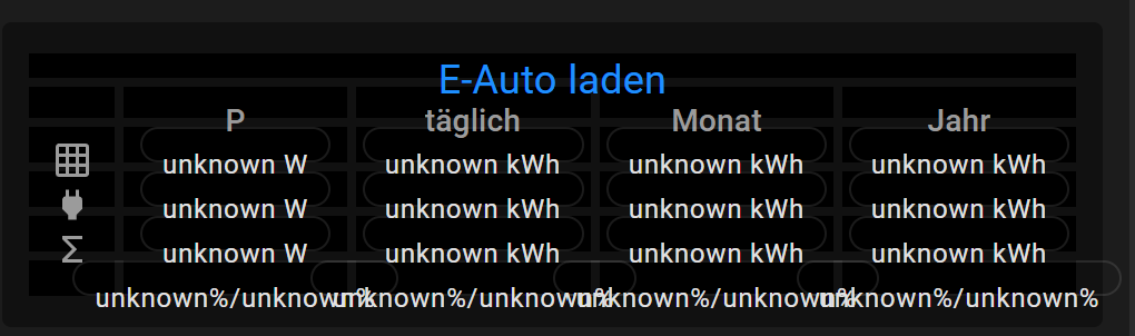
thanks a lot for your support, I have to change “grid-template-columns” necessarily to “Auto”? Otherwise It looks quite good on PC screen but on my mobil it fits not on the screen, for the last column I have to scroll. If I stay with my percent ratio for columns, the view fits to mobil screen but heading is not well centered anymore
I’ll have to play with it a little more. I started consolidating the code a bit
type: custom:layout-card
layout_type: custom:grid-layout
cards:
- type: heading
heading_style: title
heading: E-Auto laden
view_layout:
grid-area: row1
- type: heading
heading_style: subtitle
card_mod: ¢er_subtitle_mod
style: |
.content.subtitle {
justify-content: center;
}
view_layout:
grid-area: r2c1
- type: heading
heading_style: subtitle
card_mod: *center_subtitle_mod
heading: P
view_layout:
grid-area: r2c2
- type: heading
heading_style: subtitle
card_mod: *center_subtitle_mod
heading: täglich
view_layout:
grid-area: r2c3
- type: heading
heading_style: subtitle
card_mod: *center_subtitle_mod
heading: Monat
view_layout:
grid-area: r2c4
- type: heading
heading_style: subtitle
card_mod: *center_subtitle_mod
heading: Jahr
view_layout:
grid-area: r2c5
- type: heading
heading_style: subtitle
icon: mdi:grid
view_layout:
grid-area: r3c1
- type: heading
heading_style: subtitle
icon: mdi:sigma
view_layout:
grid-area: r5c1
layout:
grid-template-areas: |
"row1 row1 row1 row1 row1"
"r2c1 r2c2 r2c3 r2c4 r2c5"
"r3c1 r3c2 r3c3 r3c4 r3c5"
"r4c1 r4c2 r4c3 r4c4 r4c5"
"r5c1 r5c2 r5c3 r5c4 r5c5"
"r6c1 r6c2 r6c3 r6c4 r6c5"
 .
.