idro
April 30, 2024, 11:25am
1
Hello,
type: custom:bootstrap-grid-card
class: container-fluid g-0
cards:
  - type: row
    class: row
    cards:
      - type: custom:digital-clock
        class: col-xl-9 col-lg-7 col-xs-12
        timeFormat: HH:mm
        dateFormat: cccc d LLLL y
        card_mod:
          style: |
            ha-card {
              text-align: left !important;
              background-color: transparent !important;
              border: none !important;
              padding-left: 15px !important;
            }
            .first-line {
              font-size: 500% !important;
              font-weight: normal;
            }
            .second-line {
              font-size: 200% !important;
              font-weight: normal;
            }
      - type: todo-list
        entity: todo.le_mie_attivita
        class: col-xl-3 col-lg-5 col-xs-10
        theme: Graphite
        title: TASKS
        card_mod:
          style: |
            ha-card{
            text-align: center;
            color: yellow;
            margin-right: 30px !important;
            }
            .summary {
            font-family: 'Permanent Marker' !important;
            color: #ffff00 !important;
            text-align: left;
            font-size: 20px !important;
            -webkit-text-stroke: .5px yellow;
            }
            .due ha-svg-icon {
              color: yellowgreen !important;
              text-align: left;
            }
            .due {
              font-family: 'Verdana' !important;
              color: yellowgreen !important;
            }
      - type: weather-forecast
        class: col-xl-3 col-lg-5 col-xs-12
        entity: weather.accuweather
        forecast_type: daily
        card_mod:
          style: |
            ha-card {
              background-color: rgba(0, 0, 0, .75) !important;
              border: none !important;
              margin-top: 15px;
              margin-right: 30px;
            }
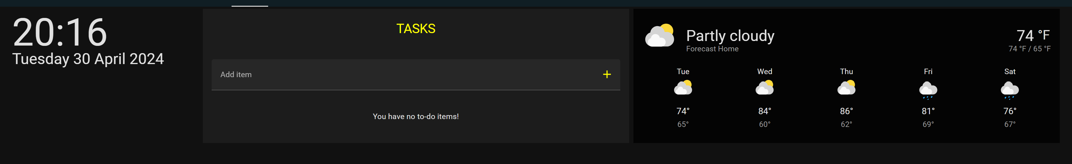
But I get the following result:
Indeed I’d like the clock on the left as it is now, but tasks card in the center and weather on the right.
Mikefila
April 30, 2024, 12:30pm
2
Can you put the 3 cards in a horizontal stack card?
idro
April 30, 2024, 12:49pm
3
I tried but the weather card, for example, gets a proportions that I don’t like:
Rather than this:
Check out layout card with the grid option. You can easily control the column width
grid-template-columns: .5fr 1fr 1fr
type: custom:layout-card
layout_type: custom:grid-layout
layout:
  grid-template-columns: .5fr 1fr 1fr
  margin: 0px 0px 0px 0px
cards:
  - type: custom:digital-clock
    class: col-xl-9 col-lg-7 col-xs-12
    timeFormat: HH:mm
    dateFormat: cccc d LLLL y
    card_mod:
      style: |
        ha-card {
          text-align: left !important;
          background-color: transparent !important;
          border: none !important;
          padding-left: 15px !important;
        }
        .first-line {
          font-size: 500% !important;
          font-weight: normal;
        }
        .second-line {
          font-size: 200% !important;
          font-weight: normal;
        }
  - type: todo-list
    entity: todo.le_mie_attivita
    theme: Graphite
    title: TASKS
    card_mod:
      style: |
        ha-card{
        text-align: center;
        color: yellow;
        left: -30px;
        }
        .summary {
        font-family: 'Permanent Marker' !important;
        color: #ffff00 !important;
        text-align: left;
        font-size: 20px !important;
        -webkit-text-stroke: .5px yellow;
        }
        .due ha-svg-icon {
          color: yellowgreen !important;
          text-align: left;
        }
        .due {
          font-family: 'Verdana' !important;
          color: yellowgreen !important;
        }
  - type: weather-forecast
    entity: weather.accuweather
    forecast_type: daily
    card_mod:
      style: |
        ha-card {
          background-color: rgba(0, 0, 0, .75) !important;
          border: none !important;
          left: -30px;
        }
This code is used in a panel layout like type: custom:bootstrap-grid-card. If you want to stick with the type: custom:bootstrap-grid-card. I can assist with that setup.
type: custom:bootstrap-grid-card
cards:
  - type: row
    cards:
      - type: custom:digital-clock
        timeFormat: HH:mm
        dateFormat: cccc d LLLL y
        class: col-xs-12 col-lg-2
        card_mod:
          style: |
            ha-card {
             text-align: left !important;
             background-color: transparent !important;
             border: none !important;
             padding-left: 15px !important;
              }
             .first-line {
             font-size: 500% !important;
             font-weight: normal;
             }
             .second-line {
             font-size: 200% !important;
             font-weight: normal;
             }
             name: Button 1
      - type: todo-list
        entity: todo.le_mie_attivita
        class: col-xs-2 col-lg-7
        theme: Graphite
        title: TASKS
        card_mod:
          style: |
            ha-card{
            text-align: center;
            color: yellow;
            margin-right: 30px !important;
            }
            .summary {
            font-family: 'Permanent Marker' !important;
            color: #ffff00 !important;
            text-align: left;
            font-size: 20px !important;
            -webkit-text-stroke: .5px yellow;
            }
            .due ha-svg-icon {
              color: yellowgreen !important;
              text-align: left;
            }
            .due {
              font-family: 'Verdana' !important;
              color: yellowgreen !important;
            }
      - type: weather-forecast
        entity: weather.accuweather
        forecast_type: daily
        card_mod:
          style: |
            ha-card {
              background-color: rgba(0, 0, 0, .75) !important;
              border: none !important;
              margin-right: 30px;
            }
A good link
Use our powerful mobile-first flexbox grid to build layouts of all shapes and sizes thanks to a twelve column system, six default responsive tiers, Sass variables and mixins, and dozens of predefined classes.
1 Like