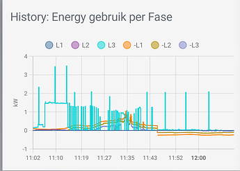
trying to gain more insight in my 3 phases comsumption/production data I receive over mqtt from my smart meter:
Id;love to bring that to the frontend like Homewizard:
So, I threw these in a core history-graph/statistics or custom mini-graph/apexcharts-card, but since they are all positive, that didnt really help… next I changed the export entities to be a negative value in the mqtt sensor using:
      <<: &kpower-neg
        unit_of_measurement: kW
        value_template: >
          -{{value|round(3,none)}}
        device_class: power
        state_class: measurement
and that’s a first step to being helpful. I can now plot these values, and, depending on the type of card, they center around the y-axis alright. However, it’s nowhere close to the Homeward graph ofc.
btw, not sure if I should do that, or have the negative value be determined by some graph card setting?
this is what they look like out of the box, without any finetuning:
  - type: history-graph
    entities: &phase_entities
      - entity: sensor.l1_power_import
        name: L1
      - entity: sensor.l2_power_import
        name: L2
      - entity: sensor.l3_power_import
        name: L3
      - entity: sensor.l1_power_export
        name: -L1
      - entity: sensor.l2_power_export
        name: -L2
      - entity: sensor.l3_power_export
        name: -L3
    title: 'History: Energy gebruik per Fase'
    hours_to_show: 48

  - type: statistics-graph
    entities: *phase_entities
    title: 'Statistics: Energy gebruik per Fase'
    hours_to_show: 48

  - type: custom:mini-graph-card
    entities: *phase_entities
    name: 'Mini: Energy gebruik per Fase'
    hours_to_show: 48

  - type: custom:apexcharts-card
    graph_span: 2d
    header:
      title: 'Apex: Energy gebruik per Fase'
      show: true
    entities: *phase_entities
History seems ok-ish, shows pos/neg alright,but would need a lot of customizing (card_mod probably)?:
Statistics Is beautiful, but does not do what I am after…:
Mini-graph doesnt pickup the pos.neg like this, can it?
Apexcharts probably can do it all, and shows pos/neg alright, but not sure how to proceed…
ofc, above is frustrated by the fact Ive only just started to record these values.
For now, my question to the community would be, which of the cards would be the obvious card to proceed with, and please, if you have suggestions how to approach the HomeWizard graph, I’d appreciate that a lot.
Thanks for having a look if you would!


