as repo owner of custom-ui, I am slowly (…) trying to move away from that, as modern UI changes often and more options get implemented in the Dashboards.
However, there is still no way to easily glob a certain customization, and icons are even more difficult to change in core entities cards
consider:
    input_number.*_volume:
      hide_attributes: templates
      templates:
        icon: >
          var vol = parseFloat(state);
          if (vol === 0.0) return 'mdi:volume-off';
          if (vol <= 0.3) return 'mdi:volume-low';
          if (vol <= 0.6) return 'mdi:volume-medium';
          return 'mdi:volume-high';
        icon_color: >
          var vol = parseFloat(state);
          if (vol === 0.0) return 'gray';
          if (vol <= 0.3) return 'dodgerblue';
          if (vol <= 0.6) return 'green';
          if (vol <= 0.8) return 'orange';
          return 'firebrick';
which allowed to do:
easily, and that for all input_number.*_volume in 1 go…
there is simply no way in core, so I tried a template-entity-row:
    - type: entities
      entities:
        - type: custom:template-entity-row
          entity: input_number.alarm_volume
          state: >
            {{states(config.entity)|float(0)}} %
          icon: >
            {% set vol = states(config.entity)|float(0) %}
            {% if vol == 0.0 %} mdi:volume-off
            {% elif vol <= 0.3 %} mdi:volume-low
            {% elif vol <= 0.6  %} mdi:volume-medium
            {% else %} mdi:volume-high
            {% endif %}
          card_mod:
            style:
              div#wrapper:
                state-badge $: |
                  ha-state-icon {
                    color:
                      {% set vol = states(config.entity)|float(0) %}
                      {% if vol == 0.0 %} gray
                      {% elif vol <= 0.3 %} dodgerblue
                      {% elif vol <= 0.6 %} green
                      {% elif vol <= 0.8 %} orange
                      {% else %} red
                      {% endif %}
                  }
but as we know that doesnt show the slider:
other than that, its perfect. But we need the slider.
we can use slider-entity-row:
        - type: custom:slider-entity-row
          entity: input_number.alarm_volume
#           state: >
#             {{states(config.entity)|float(0)}} %
#           icon: >
#             {% set vol = states(config.entity)|float(0) %}
#             {% if vol == 0.0 %} mdi:volume-off
#             {% elif vol <= 0.3 %} mdi:volume-low
#             {% elif vol <= 0.6  %} mdi:volume-medium
#             {% else %} mdi:volume-high
#             {% endif %}
          card_mod: &volume_color
            style: |
              :host {
                --paper-item-icon-color:
                  {% set vol = states(config.entity)|float(0) %}
                  {% if vol == 0.0 %} gray
                  {% elif vol <= 0.3 %} dodgerblue
                  {% elif vol <= 0.6 %} green
                  {% elif vol <= 0.8 %} orange
                  {% else %} red
                  {% endif %}
              }
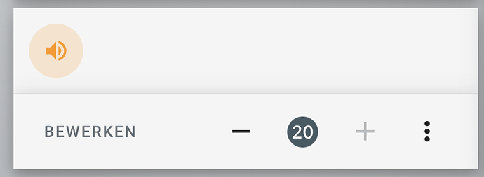
but cant customize the icon:
and that in the end is the same (almost) as the core slider entity with the same mod:
        - entity: input_number.alarm_volume
          card_mod: *volume_color
so, the challenge still stands: how to change those icons And colors, in a way to easily apply to all *_volume entities (whihc would probably end up being a decluttering template, so that the least of my concerns)
as an exercise I tried a tile card (or the mushroom variants ) (also button-card with embedded slider)
but the issue remains… cant template that, and tbh, I dont really like those Huge sliders at all (though admittedly their tactic handling is way better than the slider)
Would appreciate suggestions you might have to fill the gap taking out custom-ui leaves here (and many other spots with the same aspects).
any other card that would do the job, or maybe another mod (to change the icon on the entity),
thanks for having a look and letting me know what you all do


