Hey everyone! I’m on a quest to make my dashboard look exactly like I want, but without having to use things like card-mod. To that end, I need to make or modify a bunch of cards that let me customize aspects of them that I couldn’t before.
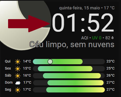
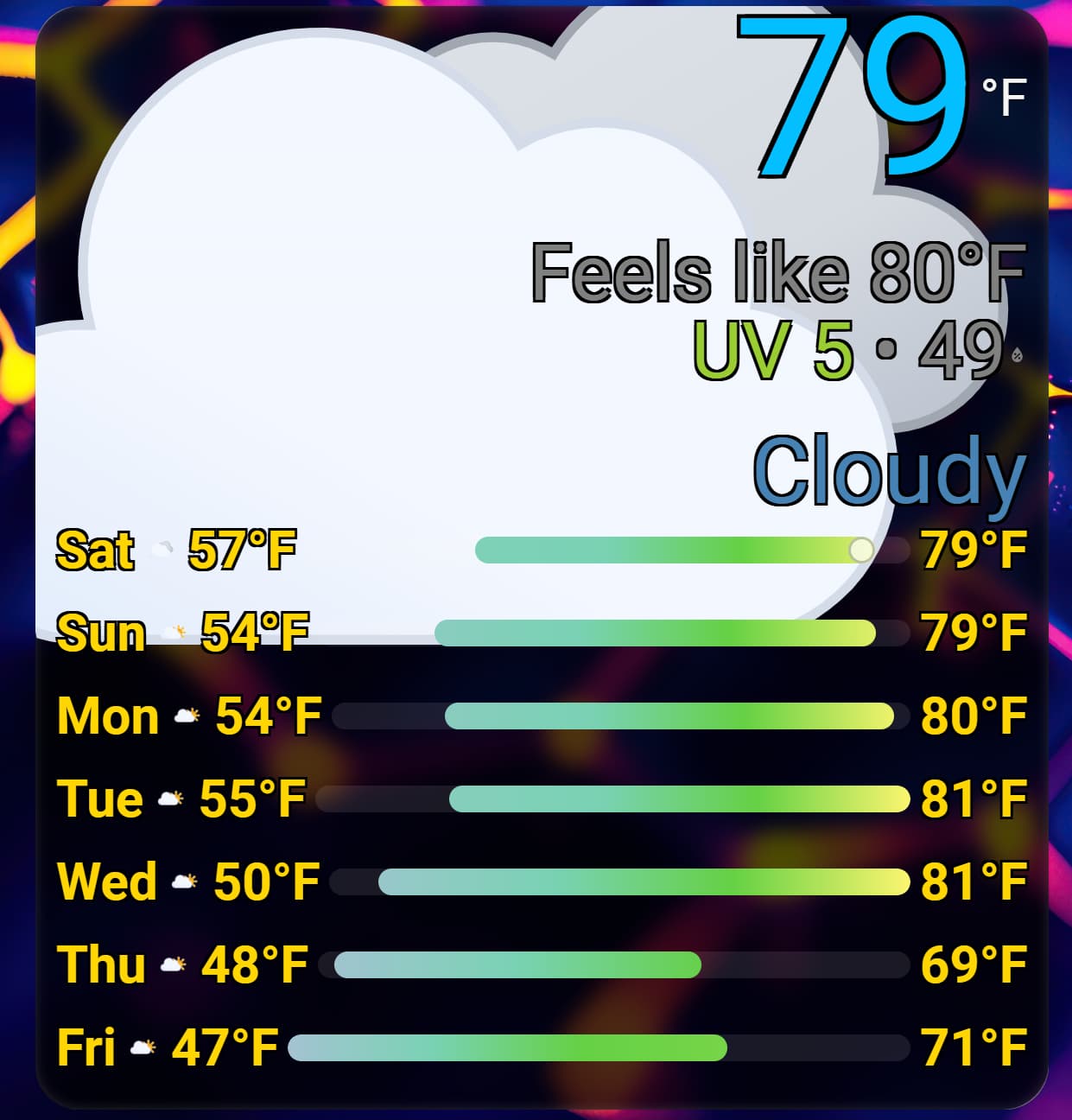
It’s based on @pkissling’s excellent Clock Weather Card, but with a totally redesigned Today section and full UI customization support.
I plan on trying to get this (and the other cards I have in the works) into the default HACS repository eventually, but am making it available as a custom repository right now:
Features:
Big bold text and images that are readable from a distance.
Full UI customization.
Day/Night colors.
All icons have been modified and cropped to look good on the card.
Theme variables to customize… basically every CSS aspect of the card. These can be applied in 2 ways:
Editing your theme’s YAML file to add them globally.
Using the individual card configuration.
New loading UI on the Forecast section so that it doesn’t resize when refreshing (vs the Clock Weather Card it’s based on).
Planned Features
* Ability to add a “style” ID in the configuration that makes custom CSS variable names so that you can single out one card only to apply certain theming to. This is no longer planned, as you can apply variables to individual cards using config now.
I don’t know if anyone else will find this useful, but it’s always good to share.
I released v1.2.2, which I believe fixes the issue. I don’t have an iOS device, but I used an online real-device service to test a fix, and it appears to be good now.
Version 1.3.0 adds the ability to make “Time” the primary element.
Note that if you do this (and you use 12h time), you should DEFINITELY modify the theme’s variable for the primary text size, otherwise it’s just too big.
Add this line to your theme’s yaml file:
bolder-weather-card-primary-text-size: 48pt # This seems reasonable
Love the card, having some issues trying to modify color though. Im trying to change the main temperature color, but it doesn’t change. The code below should make the temperature color black right?
Unfortunately, I’m not able to reproduce. I copied your styles code right into my dashboard, and it changed like I would expect (see below). I did have a bug-fix regarding configuration styles (version 1.5.2), so maybe it got fixed inadvertently?
Can you post your full card yaml configuration here, or on a github issue?
Side note: I’m serially on Reddit, so I get notifications on reports there, and I also check the GitHub page often, but I’m on these forums less frequently, so the best place for bug reports is GitHub.
It seems to be fixed after that update.
Now if I can only get the icon sizing to listen to me, it looks like it shrinks in the preview but on the card its huge!
Also, is there anyway to change the text color based on value, i know it can be done via card mod but in this card without that?
Adds the ability to flank the main temperature with the current day’s low and high temperature. (Optional dots between items, too)
Adds the ability to override the default gradient of the temperature bar. Note: Thar be dragons! It works best with at least 6 stops within the normal temperature range. See the github documentation (Full Configuration) for an example of how to override.
Fixes an issue where the decimal precision of a temperature sensor was being ignored.
All of a sudden, I’m having issues with the temperature changing randomly from Fahrenheit to Celsius. The temperature entity is still in Fahrenheit and I’m using en-us locale. Are there any other settings that force units?
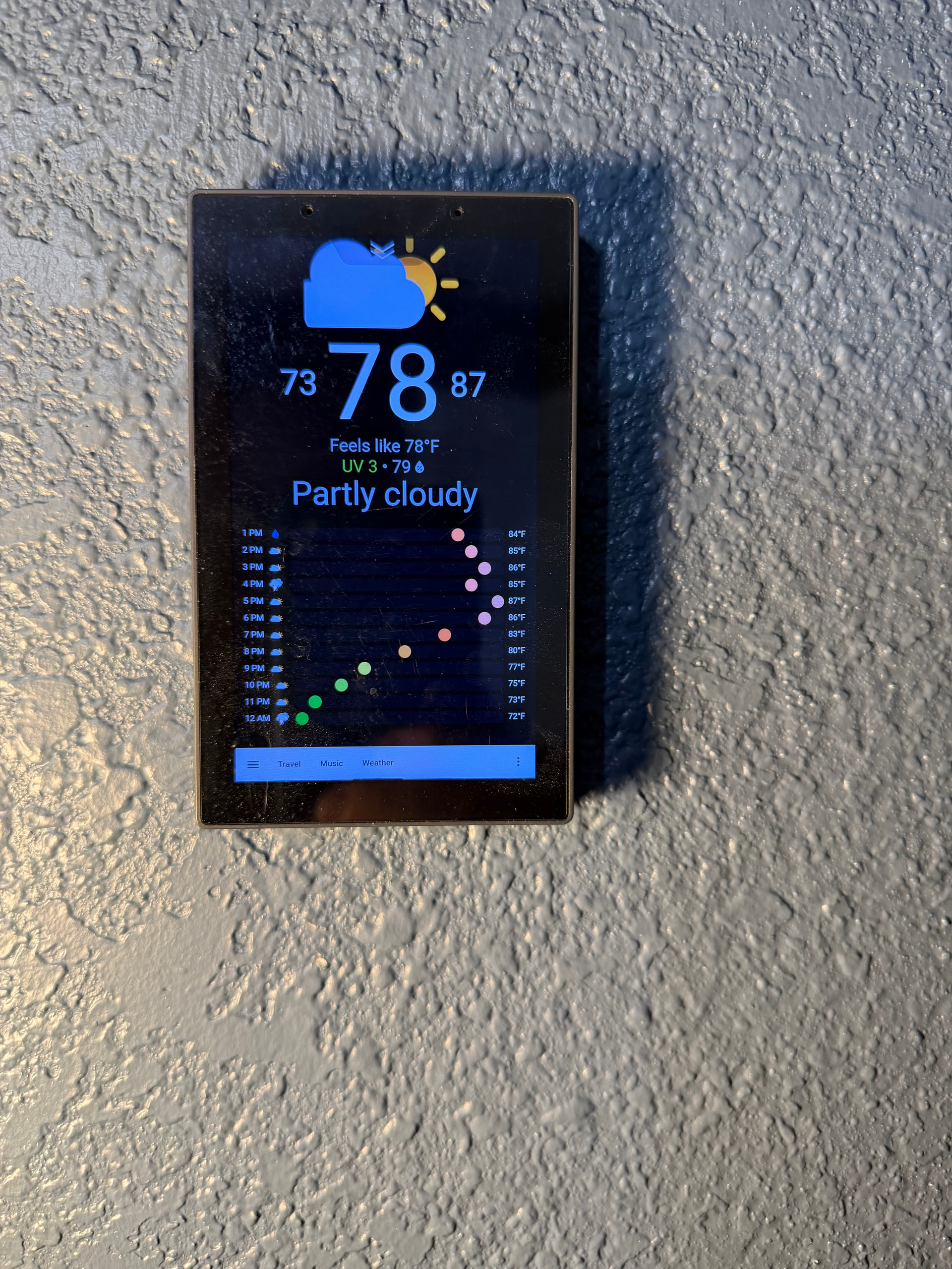
I was wondering if there is a way to change the grid column sizes to align the different columns. I’ve attached a screenshot of what mine looks like. Sun and Fri are out of alignment.
Also how can I increase the font size of the icons in forecast rows? I can’t for the life of me figure it out.
I know you were trying to avoid card-mod, but I used card-mod on your card to get exactly what I wanted for a Sonoff NSPanel Pro and it looks great! Thanks!