Hi HA-Community,
Im pretty new here and Im reading a lot concerning HA Dashboards.
I created a slider button card:
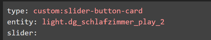
type: custom:slider-button-card
entity: light.dg_schlafzimmer_play_2
slider:
  direction: left-right
  background: gradient
  use_state_color: true
  use_percentage_bg_opacity: false
  show_track: false
  toggle_on_click: false
  force_square: false
  show_attribute: false
  state_content:
    - last-changed
show_name: true
state: true
compact: true
state:
  - value: 'on'
    icon: mdi:lightbulb-on
    show: true
    use_state_color: true
    tap_action:
      action: more-info
  - value: 'off'
    icon: mdi:lightbulb-off
    show: true
    use_state_color: true
    tap_action:
      action: more-info
action_button:
  mode: custom
  icon: mdi:power
  show: true
  show_spinner: true
  tap_action:
    action: toggle
name: Play 2   -
state_content:
  - last-changed
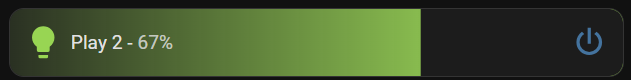
Something is wrong because the state: value: ‘on’ or value: ‘of’ code, so that I get different icons is maybe wrong… I don`t know.
The orignal code for this button:
and code:
type: custom:slider-button-card
entity: light.dg_schlafzimmer_play_2
slider:
  direction: left-right
  background: gradient
  use_state_color: true
  use_percentage_bg_opacity: false
  show_track: false
  toggle_on_click: false
  force_square: false
  show_attribute: false
  state_content:
    - last-changed
show_name: true
state: true
compact: true
icon:
  show: true
  use_state_color: true
  tap_action:
    action: more-info
  state:
    - value: 'on'
      icon: mdi:lightbulb-on
    - value: 'off'
      icon: mdi:lightbulb-off
action_button:
  mode: custom
  icon: mdi:power
  show: true
  show_spinner: true
  tap_action:
    action: toggle
name: Play 2   -
state_content:
  - last-changed
works fine…
Maybe its something simple... but I dont see it 
Thank you so much for your help and have a nice evening!
Kind regards
Niklas