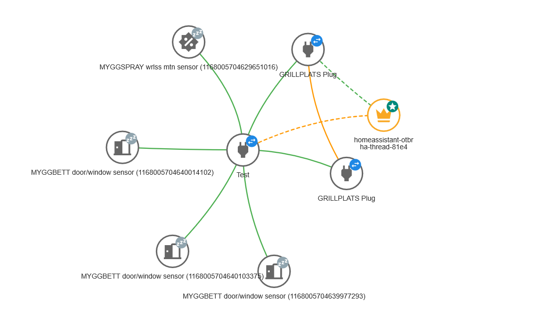
I’m struggling to interpret the Matter Server Thread Network Mesh visualisation, it feels like it’s missing a key / legend and if it has one, I can’t find it. What do the dashed lines denote? From playing with the ‘hide’ button, I deduced that green represents strong signal and yellow represents ‘medium’ signal strength.
I’m also unable to work out how to know which nodes in this visualisation relate to which devices in HA. I’ve got three Ikea Grillplats plugs and three Myggspray window sensors but can’t work out which one is which. I tried editing the label of one Grillsplats plug (to ‘Test’) but this seems to only affect this visualisation.
Thanks in anticipation