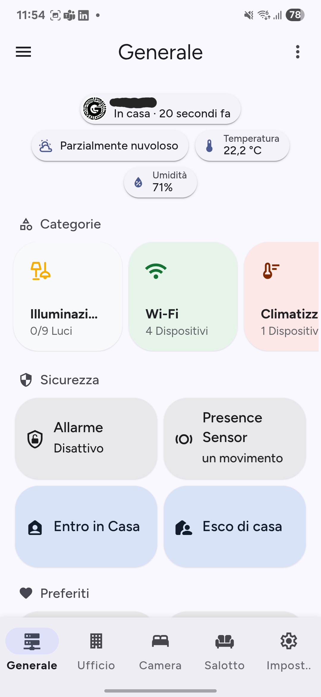
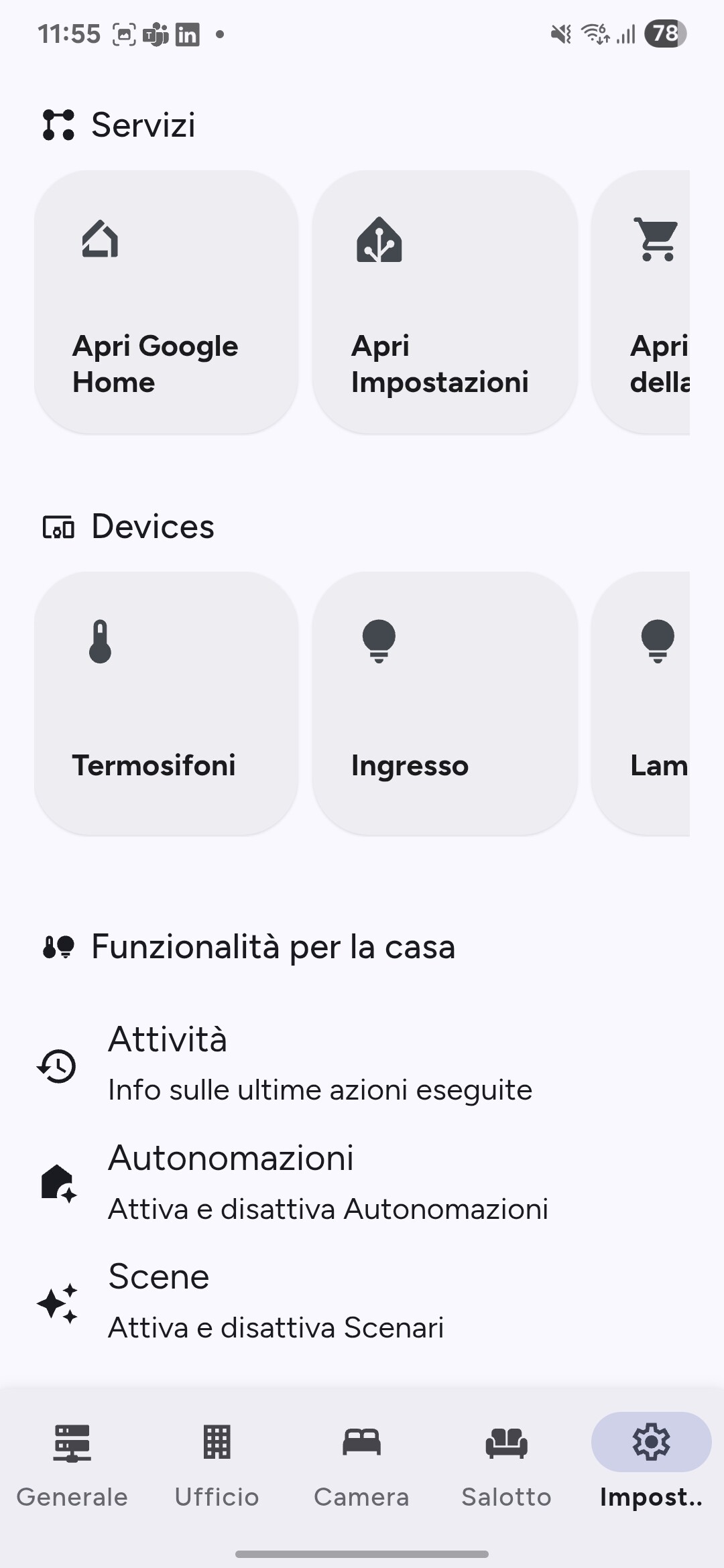
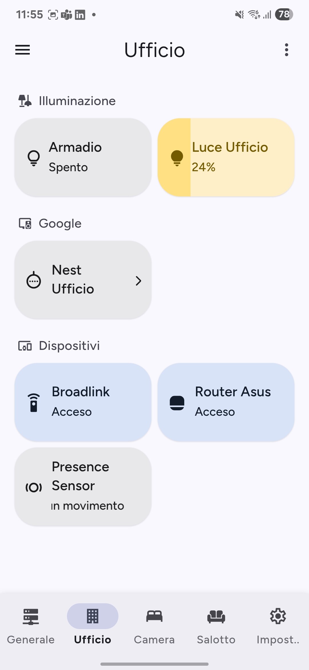
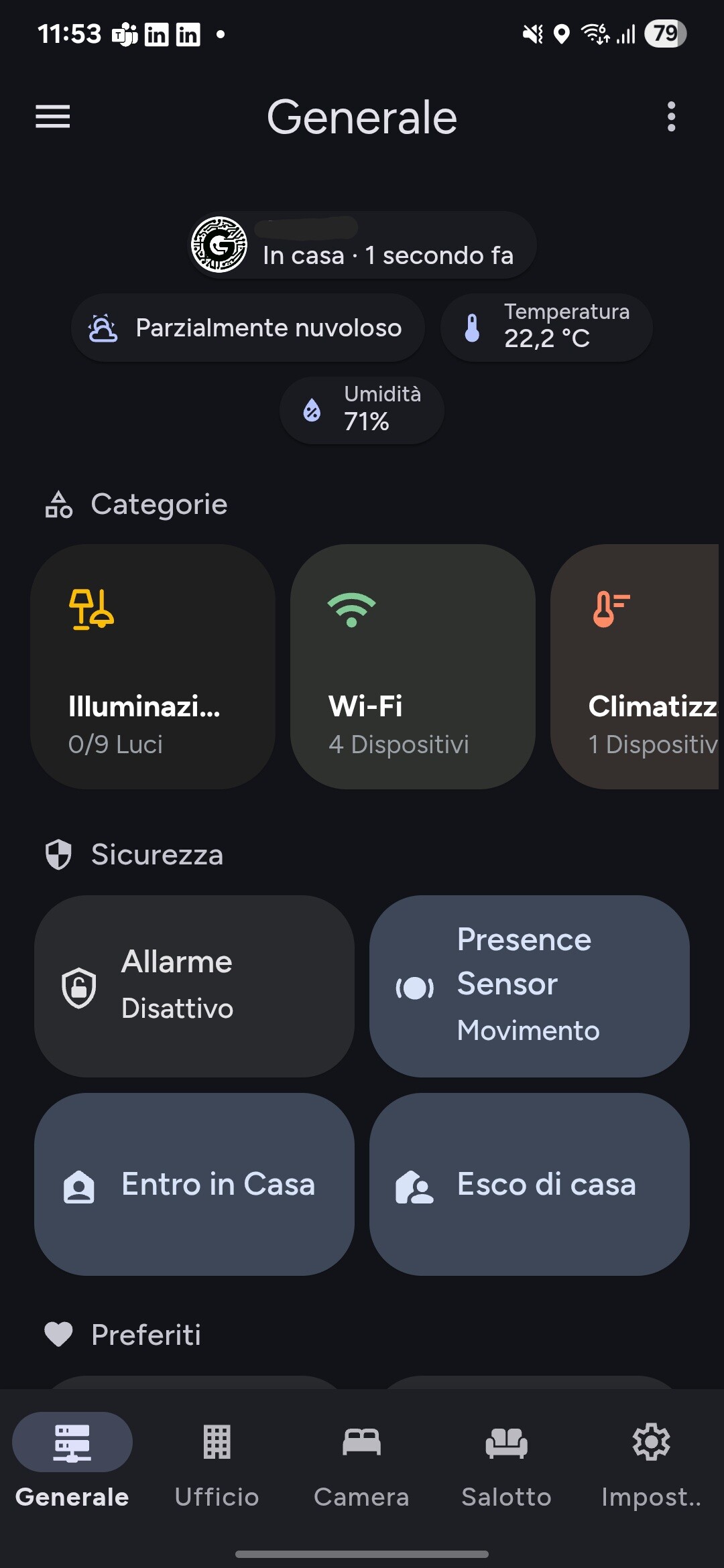
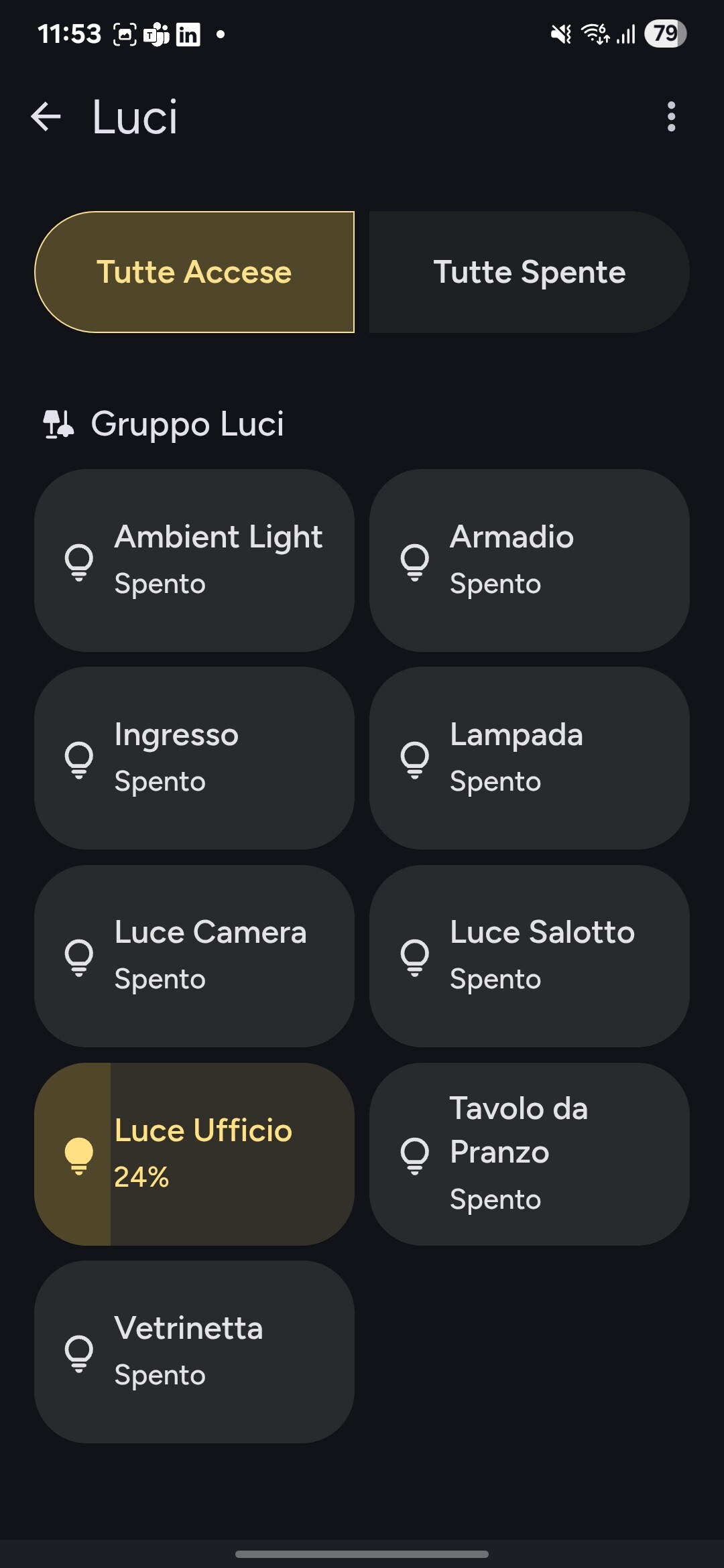
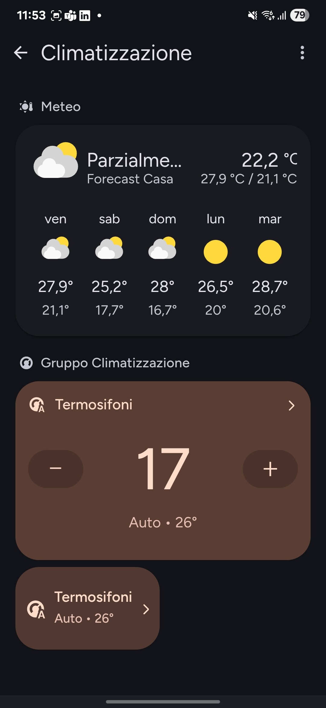
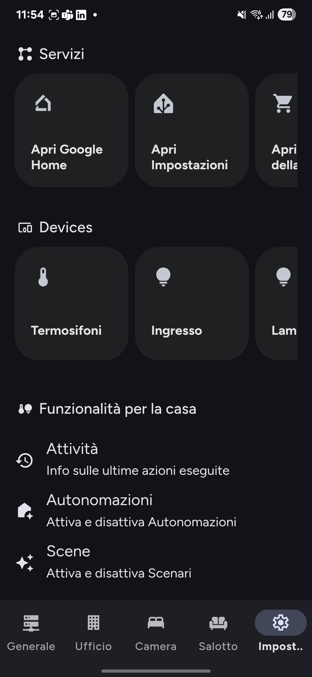
Are you looking to give your Home Assistant dashboard a modern, clean, and Google-inspired look?
Say hello to the Google Control Card, a custom card designed to bring elegance, clarity, and usability to your smart home interface.
I’ve been waiting for someone to resurrect big-slider-card for a long time. Thank you so much for your work.
I see that these cards use hard-coded colors like in the Google Home app. And it looks really cool, but it doesn’t align with Nerwyn’s Material You theme. How do you feel about using the material-color-utilities module to harmonize the colors according to the colors and scheme the user specifies in Material You Utilities?
Thanks for the heads-up! I’ll definitely take a look at the new color harmonization in the Material Expressive betas. It sounds like a great improvement.
I’ll work on applying the Home Assistant color custom properties soon!
Version 1.5.0 Released!
This new release brings the first experimental support for Material 3 Expressive with dynamic color harmony
Cards can now automatically harmonize with your active theme, delivering a more cohesive and polished visual experience.
This is just the beginning, your feedback is incredibly valuable to help refine and improve this feature.
Feel free to share your thoughts or open a discussion! If you enjoy the project and want to support its development, consider making a small donation:
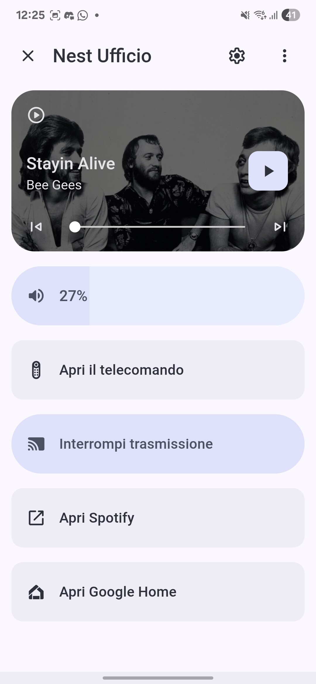
We’re excited to introduce a major update to your Home Assistant experience with the new Google Media Overlay. Designed for seamless control and intuitive interactions, this release makes media management smoother than ever
What’s new:
Enhanced Playback Controls – Play, pause, skip tracks, and seek with responsive, real-time feedback.
Smooth Volume Drag – Adjust volume with a fluid slider that updates instantly.
Integrated Device Actions – Access device settings, remote controls, and external apps directly from the overlay.
Dynamic Theme Harmony – Cards automatically adapt to your Home Assistant theme for a cohesive, polished look
This release focuses on making your media interactions effortless and visually consistent, with an emphasis on both usability and aesthetics. Your feedback is invaluable to refine these features even further!
We’d love to hear your thoughts! Share your feedback or open a discussion in our community. Enjoying the project? Consider supporting its development with a small donation:
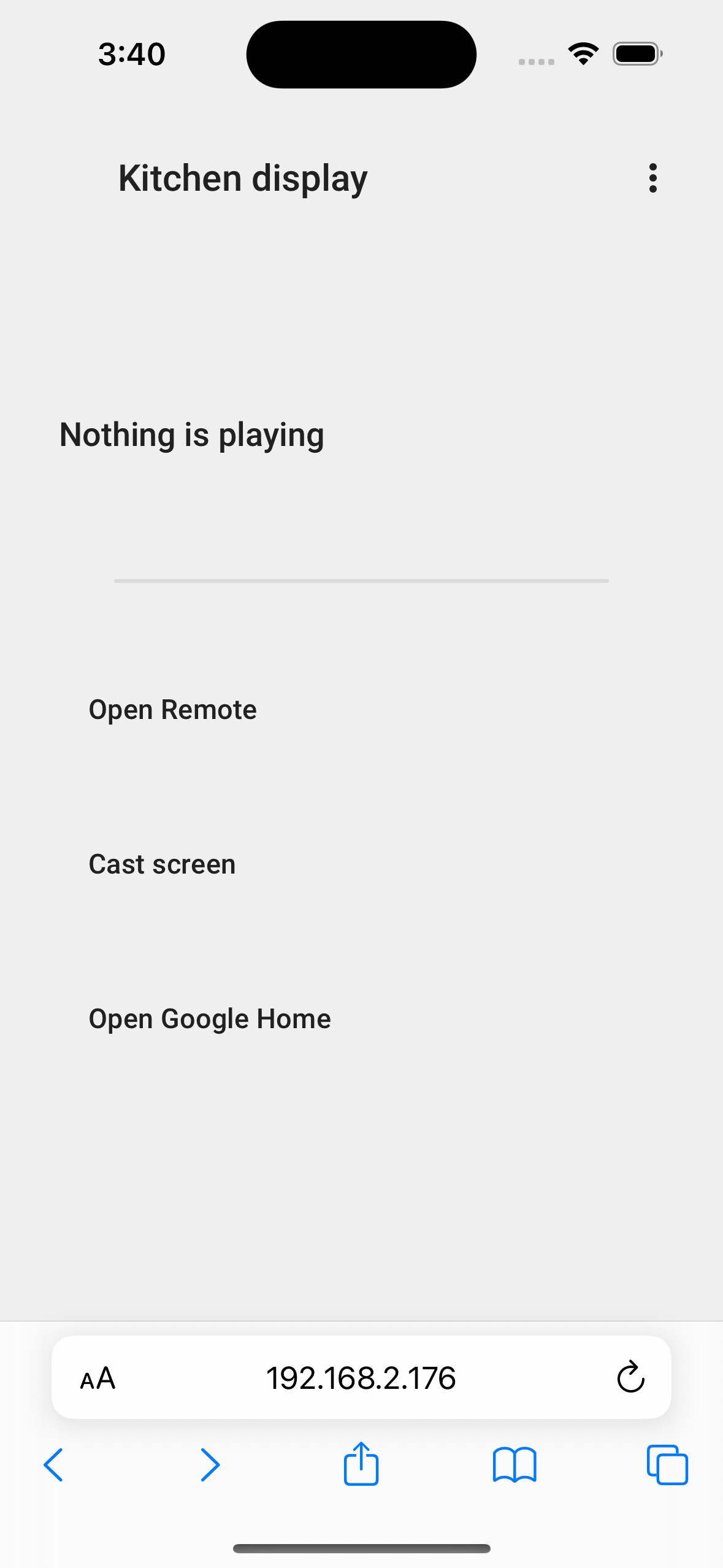
This is awesome but can’t figure out how to use it? There’s no new media card or the “Show information” long press action just opens the normal Home Assistant more-info.
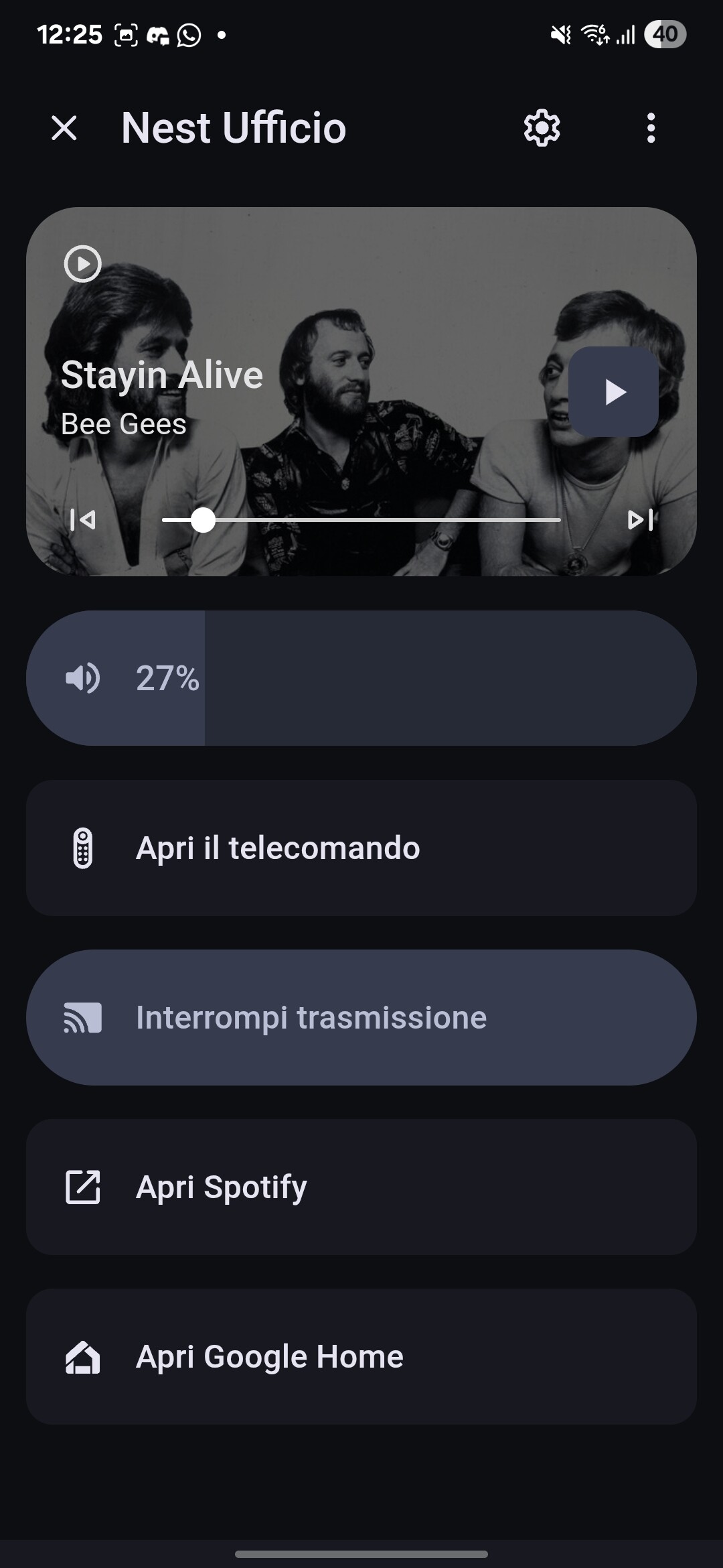
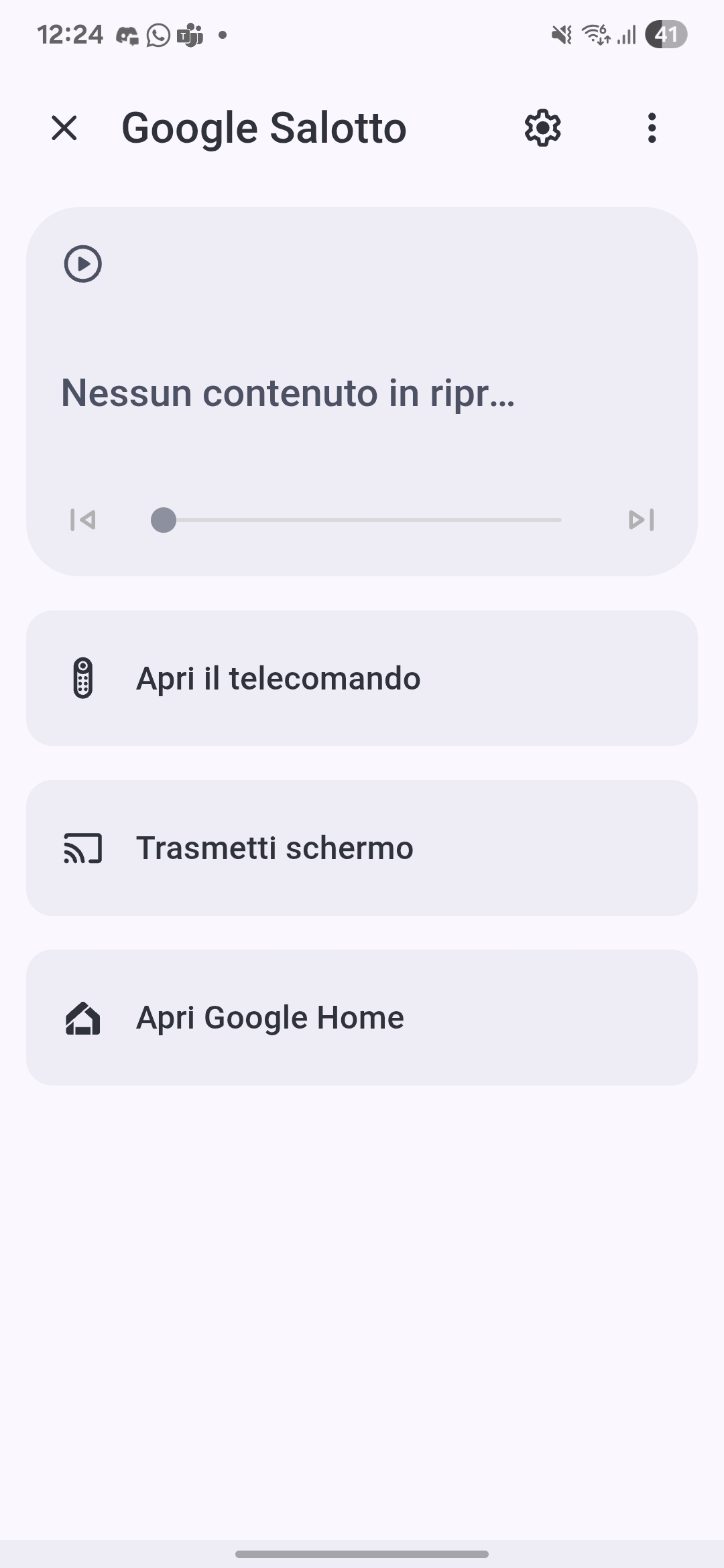
The Google Media (Overlay) allows you to open a full-screen media control panel for your Google Cast devices (Nest Hub, Chromecast, etc.) directly from Lovelace.
It provides media playback controls, volume, and an enhanced UI optimized for both desktop and the Home Assistant mobile app (including swipe-to-close support).
How to Add a Button to Open the Media (Overlay)
To open the media, you can use the google-button-card with control_type: media_player.
Ok I got it to work but this seems false imo, it does not work on desktop, it only worked on the mobile app and you should specify that.
Another problem I have with this addon is that it seems you’ve hardcoded special icons that do not appear if you use the default MDI icons and not that icon pack, for me, there are no icons in the overlay, and even on the buttons or other cards until I switch them back to MDI icons, so I feel this needs to be addressed imo.
Another question, I’m curious what “open remote” does, cuz for me it just did nothing and opened more-info.
Screenshots of the button card and overlay, no icons appear so I didn’t know how to close the overlay, and when nothing is playing, it’s just blank and also buttons too have no backgrounds.
Regarding the icons, the issue seems to be that the addon uses a custom icon set by default, not MDI. To make them appear correctly, you’ll need to install the icon pack available on the Documentation.
Once installed, they should show up in the overlay, buttons, and other cards.
As for desktop functionality, it should work there as well. If you’re still not seeing the controls, try clean the cache or sharing a browser inspect so we can better understand what’s going wrong.
About “Open remote,” for now it will just open the more-info dialog.
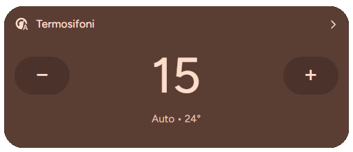
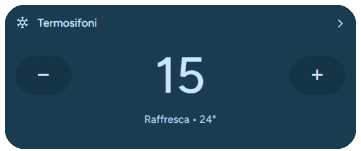
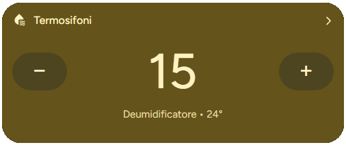
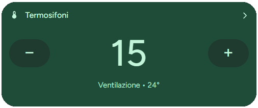
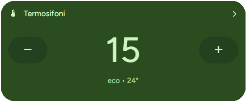
Starting from v1.9.5, the Google Climate Card introduces extended color support for all available HVAC modes. Each mode now comes with its own title, subtitle, icon, button, and background color scheme, consistent with Material Expressive 3 guidelines. This improves visual recognition and allows faster interaction based on color cues.
Auto and Heat Mode
Neutral warm tones for balanced automatic operation.
Hi I’m not totally sure what you mean by “adjust media card so we can change what we see in tap behavior”. Do you mean modifying what happens when we tap the media card (for example, opening a different popup or switching between Sonos and Shield)?
This is what I currently see, but some options aren’t relevant for me, like Open Google Home or Open Remote. I’d really like to have custom actions here for my Sonos and Nvidia Shield — ideally with buttons. For example, it would be great to have quick buttons to play a radio station or lower the bass for example.
Thanks a lot for the feedback! For the moment it will stay as it is, since I’m currently focusing on other projects. That said, this might change in the future as I revisit and expand the functionality.


 Features
 Documentation & Setup
 Full documentation
 Google Card Docs
 Install via HACS or manually from GitHub.
 GitHub Repository
 View the source code and contribute on GitHub:
 Support the Project
 Buy me a coffee
 What’s Next?
 Version 1.5.0 Released!
 Feel free to share your thoughts or open a discussion!
 If you enjoy the project and want to support its development, consider making a small donation:
 Buy me a coffee
 Learn more and download from here:
 Version 1.6.0 – Google Media Overlay is here!
 We’d love to hear your thoughts! Share your feedback or open a discussion in our community.
 1. Static Icon
 Important Notes
 Summary
 Using the Google Media (Overlay)
 Options
 Usage
Usage ).
).
 Climate Card – Extended Color Modes
 Auto and Heat Mode
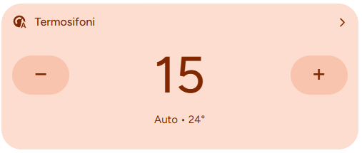
 Cool Mode
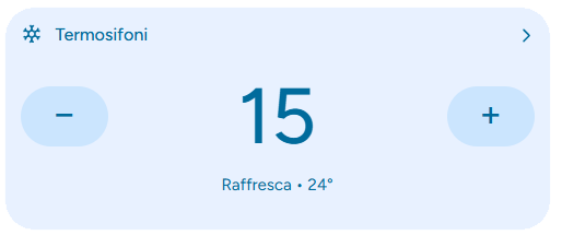
 Dry Mode
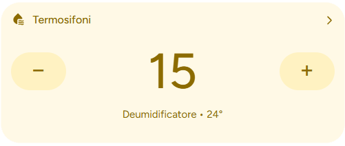
 Fan Mode
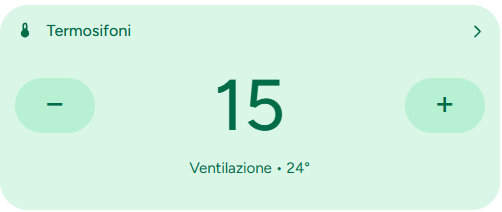
 Eco Mode
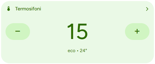
 I’m not totally sure what you mean by “adjust media card so we can change what we see in tap behavior”. Do you mean modifying what happens when we tap the media card (for example, opening a different popup or switching between Sonos and Shield)?