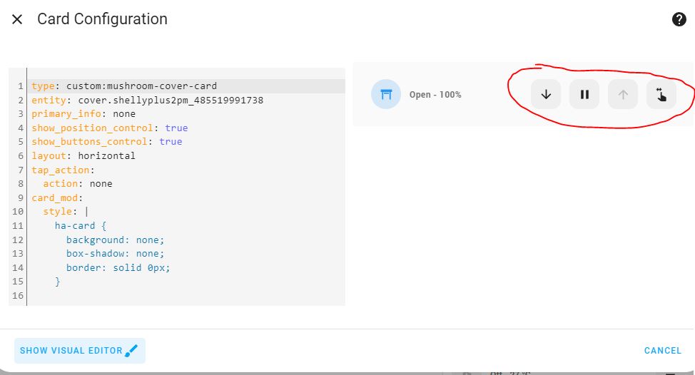
Is it possible to remove the background of the marked buttons ?
You can do it by adjusting the theme:

This would apply to all your dashboards, though.
In this example the card background colour is the same as the primary background colour, and card borders have been removed.
  primary-background-color: "#000000"
  card-background-color: "#000000"
  ha-card-border-radius: "0px"
  ha-card-border-width: "0px"
  ha-card-border-color: "#000000"
sorry, im just a starter. Where do I past those comands?
Docs are here:
What all the labels mean has always been a bit obscure, but someone posted this default theme file a while ago - it may be out of date but still helpful:
#################################################################
#                                                               #
#                        DEFAULT HA                             #
#                                                               #
#################################################################

default_ha:

  # The items below are some of the default values from
  # https://github.com/home-assistant/frontend/blob/cc41dbcb0b4e7686a6d2b0e737d890e7a52afb5b/src/resources/ha-style.ts

  # Text Colors
  primary-text-color: "#212121"
  secondary-text-color: "#727272"
  text-primary-color: "#ffffff"
  text-light-primary-color: "#212121"
  disabled-text-color: "#bdbdbd"

  # Main Interface Colors
  primary-color: "#03a9f4"
  dark-primary-color: "#0288d1"
  light-primary-color: "#b3e5fC"
  accent-color: "#ff9800"
  divider-color: "rgba(0, 0, 0, .12)"
  scrollbar-thumb-color: "rgb(194, 194, 194)"
  error-color: "#db4437"
  warning-color: "#FF9800"
  success-color: "#0f9d58"
  info-color: "#4285f4"

  #States and Badges
  state-icon-color: "#44739e"
  state-icon-active-color: "#FDD835"

  #Background and Sidebar
  card-background-color: "#ffffff"
  primary-background-color: "#fafafa"
  secondary-background-color: "#e5e5e5" #behind the cards on state

  #For Label-Badge
  label-badge-red: "#DF4C1E"
  label-badge-blue: "#039be5"
  label-badge-green: "#0DA035"
  label-badge-yellow: "#f4b400"

  # Paper Items
  paper-grey-50: "#fafafa" #default for: --mwc-switch-unchecked-button-color
  paper-grey-200: "#eeeeee"  #for ha-date-picker-style
  paper-grey-500: "#9e9e9e"  #label-badge-grey

  #For Paper-Slider
  paper-green-400: "#66bb6a"
  paper-blue-400: "#42a5f5"
  paper-orange-400: "#ffa726"

  #For Code Editor
  codemirror-keyword: "#C792EA"
  codemirror-operator: "#89DDFF"
  codemirror-variable: "#f07178"
  codemirror-variable-2: "#EEFFFF"
  codemirror-variable-3: "#DECB6B"
  codemirror-builtin: "#FFCB6B"
  codemirror-atom: "#F78C6C"
  codemirror-number: "#FF5370"
  codemirror-def: "#82AAFF"
  codemirror-string: "#C3E88D"
  codemirror-string-2: "#f07178"
  codemirror-comment: "#545454"
  codemirror-tag: "#FF5370"
  codemirror-meta: "#FFCB6B"
  codemirror-attribute: "#C792EA"
  codemirror-property: "#C792EA"
  codemirror-qualifier: "#DECB6B"
  codemirror-type: "#DECB6B"

  # The items below are some additional variables I have identified to control the theme
  # I have applied colors based on what the default theme of HA renders

  ha-card-background: "#ffffff"
  ha-card-border-radius: "3px"
  label-badge-text-color: "#000000"
  label-badge-background-color: "#ffffff"
  sidebar-background-color: "#ffffff"
  sidebar-icon-color: "#03a9f4"
  switch-checked-color: "#03a9f4"
  switch-unchecked-button-color: "#ffffff"
  table-row-background-color: "#e5e5e5"
  table-row-alternative-background-color: "#ffffff"
  lovelace-background: "#fafafa"

  # The items below are some additional variables I have identified to control the theme
  # I do not have equivelent values for the default theme for these items

  #ha-card-box-shadow: "0px 0px 0px -5px rgba(0,0,0,1)"
  #switch-unchecked-color: "#828282"

####################################################
#                                                  #
#            END OF CONFIGURATION FILE             #
#                                                  #
####################################################
There’s also a page on Github which is more up-to-date: