I encounter the same issue (grid within grid) and the additional margin of 4px that is added. Did you find a solution in the meantime?
Yes, most of the issue is solved through the new layout options margin , padding and card_margin. See the issue report below and its comments for details. You can now use negative margins to counteract the 4px default margins.
The only remaining issue is a 4px top-margin of the very first card in a nested grid layout. See my comment from March 12th for details about that.
I am having the same issue… Is worked for a couple of weeks… After updating some things and switching between some different themes it is not working anymore… Have you found a way to fix it?
I have tried with 2 layouts-
      grid-template-columns: 1fr 1fr 1fr 1fr 1fr 1fr 1fr 1fr
      grid-template-rows: auto
      grid-template-areas: |
        ". . . . . . . radar"
        "trip1 trip1 trip1 . trip2 trip2 trip2 ."
        "trip1 trip1 trip1 . trip2 trip2 trip2 ."
        "trip3 trip3 trip3 . trip4 trip4 trip4 ."
        "trip3 trip3 trip3 . trip4 trip4 trip4 ."
and
  grid-template: |
    [row1-start] "top1 top2 top3 top4 top5 top6 . radar" [row1-end]
    [row2-start] "trip1 trip1 trip1 camera11 trip2 trip2 trip2 camera21" [row2-end]
    [row3-start] "trip1 trip1 trip1 camera12 trip2 trip2 trip2 camera22" [row3-end]
    [row4-start] "trip3 trip3 trip3 camera31 trip4 trip4 trip4 camera41" [row4-end]
    [row5-start] "trip3 trip3 trip3 camera32 trip4 trip4 trip4 camera42" [row5-end]
All I get with either of them is full row for each element, not a grid with spacing. I plan to add elements to the spaced out areas after I can get this working, just wanted to try to keep it simple first.
Any pointers on what to try next?
A grid is a grid. If you want spaces, you have to add them,
row-gap
column-gap
or padding and margins in the cards
or …
Hello,
I want to have something like this

But I want all the buttons having the same size , e.g. height 50px and width 50px,so the row with 5 buttons wil have more space between the buttons.
I’ve tried with vertical and horizontal stack, grid, and now the layout card, but I’m not able achieve it.
Any hint to implement it?
Thanks!
Has anyone here been able to set te colors in the cover card? I would like to use a different color as default color instead of the blue color. I just can’t seem to figure out how to do this. Tried it with the theme, but no luck so far.
EDIT ive figured most of this out (it was nested)
EDIT 2 LOL found it, under visibility 
One thing I would love to know, can I hide cards from the media query view?
        /* Check if the screen size is at least 600px */
        @media only screen and (min-width: 600px) {
            .lg {
                display: block;
            }
        }[u]Text[/u]
I can see that it can be done in CSS, I just dont know how in yaml?
The layout card doco has only one reference to hiding a card
NOTE 2: The “default” layout option for layout-card (which you’ll see if you’re using the GUI lovelace editor) uses the default layout engine of lovelace. It’s basically the same as the Horizontal layout, but without any options, without being able to hide cards and with the number of columns based on the width of the window rather than the layout-card.
I don’t recommend using it, but it’s there.
Hey guys,
Just wondering if anyone can tell me how I’m screwing this up? LOL
My phone view is working how I think it should work.
But the tablet view does not make sense
title: "Home"
path: "home"
cards:
  - type: custom:layout-card
    layout_type: grid
    layout:
      #default
      grid-gap: 1px 1px
      grid-template-columns: 1fr 1fr 1fr 1fr 1fr 1fr
      grid-template-rows: auto
      grid-template-areas: |
        "  welcome      welcome      welcome      welcome      welcome      welcome      "
        "  devices1     devices2     devices3     .            .            .            "
        "  person1      person2      .            .            .            .            "
        "  navigation1  navigation2  navigation3  navigation4  navigation5  navigation6  "
        "  navigation7  navigation8  navigation9  .            .            .            "
        "  list1        list2        list3        .            .            .            "
        "  ble          .            .            .            .            .            "
      mediaquery:
        #phone
        "(max-width: 800px)":
          grid-gap: 1px 1px
          grid-template-columns: 1fr 1fr
          grid-template-rows: auto
          grid-template-areas: |
            "  welcome      welcome      "
            "  devices1     devices2     "
            "  devices3     devices3     "
            "  person1      person2       "
            "  navigation1  navigation2  "
            "  navigation3  navigation4  "
            "  navigation5  navigation6  "
            "  navigation7  navigation8  "
            "  navigation9  .            "
            "  list1        list1        "
            "  list2        list2        "
            "  list3        list3        "
            "  ble          ble          "
Why is the tablet view all bunched up in the middle of the screen?
Why are the navigationx cards all different sizes, some are huge, but it only shows three (the other three are tiny dots)?
Every item here has its own
        view_layout:
          grid-column: XXXX
Thanks!!!

Hi all, i have been asking this question over at the lovelace UI thread, but i figured it is most likely a layout-card question. hoping someone here can help me figure this out:
i am trying to do a layout that actually follows the placement of the rooms in the house (since it seemed the most logical way to do room cards). anyhow, i am confused on how to actually lay the cards out in yaml. this is what the layout of our top floor should look like:

I’ve tried every combination of grid-template-columns and grid-template-rows but it seems that it is something related to the grid-template-areas. as soon as i repeat an area name, things go wonky. for example, this is replacing some areas with . This is the code (excuse all the comment lines as i was trying everything i could think of):
      grid-gap: 2px 2px
      grid-template-columns: 1fr 1fr 1fr;
#      grid-template-rows: 1fr 1fr 1fr;
#      grid-template-columns: 33% 33% 33%
      grid-template-rows: auto
#      grid-template-columns: 33% 33% 33%;
#      grid-template-rows: 33% 33% 33%;
#      grid-template-columns: minmax(150px, 300px) minmax(150px, 300px) minmax(150px, 300px);
#      grid-template-rows: minmax(100px, 200px) minmax(100px, 200px) minmax(100px, 200px);
      grid-template-areas: |
        "  office   .   kitchen  "
        "  bath     closet   .  "
        "  living   .   dining   "
and this is the result
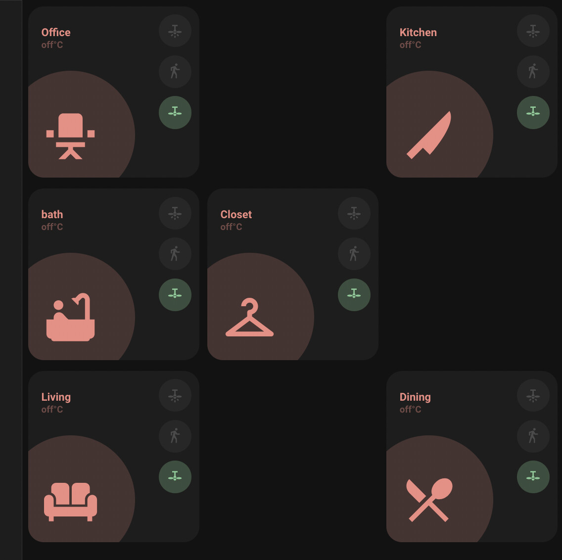
Ok, so then i modify to span the column with this code (i just did office and not others):
      grid-gap: 2px 2px
      grid-template-columns: 1fr 1fr 1fr;
#      grid-template-rows: 1fr 1fr 1fr;
#      grid-template-columns: 33% 33% 33%
      grid-template-rows: auto
#      grid-template-columns: 33% 33% 33%;
#      grid-template-rows: 33% 33% 33%;
#      grid-template-columns: minmax(150px, 300px) minmax(150px, 300px) minmax(150px, 300px);
#      grid-template-rows: minmax(100px, 200px) minmax(100px, 200px) minmax(100px, 200px);
      grid-template-areas: |
        "  office   office   kitchen  "
        "  bath     closet   .  "
        "  living   .   dining   "
and this is the result. the office block does span, but also expands the row. very strange. I must be missing one little thing to make them span correctly.

Try with the following:
" office  office kitchen "
" bath  closet  kitchen "
" living living dining "
Should work.
One thing I dont get, is why the cards are not consistent sizes.
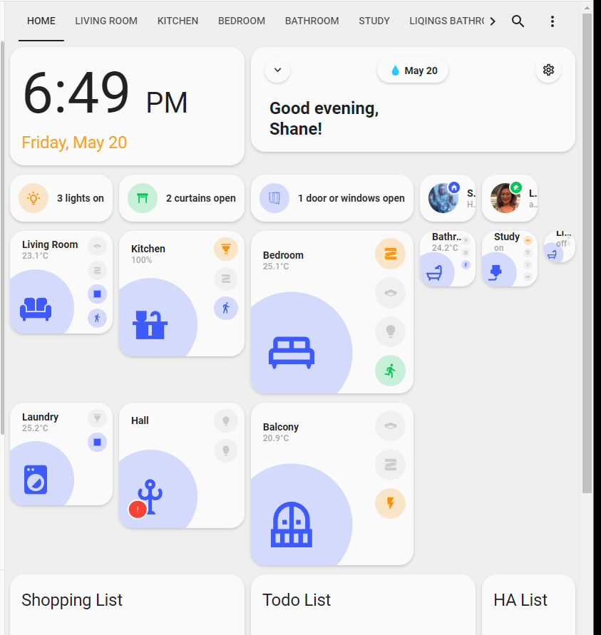
Should they not all reduce to the same consistent size? Is this a bug, or something I’m doing wrong?
type: custom:grid-layout
title: "Home"
path: "home"
layout:
  #default
  grid-gap: 1px 1px
  grid-template-columns: 1fr 1fr 1fr 1fr 1fr 1fr
  grid-template-rows: auto
  justify-items: "left"
  grid-template-areas: |
    "  clock        clock      welcome      welcome      welcome      welcome      "
    "  devices1     devices2     devices3     person1      person2      .            "
    "  nav1         nav2         nav3         nav4         nav5         nav6         "
    "  nav7         nav8         nav9         .            .            .            "
    "  list1        list1        list2        list2        list3        list3        "
    "  ble          .            .            .            .            .            "
  mediaquery:
    #phone
    "(max-width: 800px)":
      grid-gap: 1px 1px
      grid-template-columns: 1fr 1fr
      grid-template-rows: auto
      grid-template-areas: |
        "  welcome      welcome      "
        "  devices1     devices2     "
        "  devices3     devices3     "
        "  person1      person2       "
        "  nav1  nav2  "
        "  nav3  nav4  "
        "  nav5  nav6  "
        "  nav7  nav8  "
        "  nav9  .            "
        "  list1        list1        "
        "  list2        list2        "
        "  list3        list3        "
        "  ble          ble          "
thanks, it does work, but… the room card has an aspect ratio defined in the card that makes it expand and cause the distortion. i posted about this in the other thread about the minimalist UI. Thanks for the assist!
1 Like
Yeah, having an aspect ratio defined in a card and using a grid to define layout don’t mix very well in my experience.
ok, another strange issue, the grid layout does not seem to honer the width component. again, forgive all the comments in the code
---
button_card_templates: !include_dir_merge_named "../../custom_components/ui_lovelace_minimalist/__ui_minimalist__/ulm_templates/"

views:
  - type: custom:grid-layout
    title: "Home"
    path: home
#    width: 80%;
    width: 800px;
  #    type: custom:layout-card
  #    layout_type: grid
    layout:
      #default
  #  display: grid;
  #  grid-template-columns: 1fr 1fr 1fr;
  #  grid-template-rows: 1fr 1fr 1fr;
  #  gap: 1px 1px;
  #  grid-template-areas:
  #    "Office Office Kitchen"
  #    "Bath closet Kitchen"
  #    "Livingroom Livingroom dining";
      grid-gap: 2px 2px
  #      grid-template-columns: 1fr 1fr 1fr;
  #      grid-template-rows: 1fr 1fr 1fr;
  #      grid-template-columns: 33% 33% 33%
      grid-template-rows: auto
  #      grid-template-columns: 33% 33% 33%;
  #      grid-template-rows: 33% 33% 33%;
  #      grid-template-columns: minmax(150px, 300px) minmax(150px, 300px) minmax(150px, 300px);
  #      grid-template-rows: minmax(100px, 200px) minmax(100px, 200px) minmax(100px, 200px);
  #      grid-template-columns: auto auto auto;
  #      grid-template-rows: auto auto auto;
      grid-template-columns: 300px 300px 300px;
  #      grid-template-rows: 300px 300px 300px;
      grid-template-areas: |
        " head head head "
        " office . kitchen "
        " bath closet .  "
        " living . dining "
1 Like
so, in playing with it a bit more, it seems to honor the width component, but only if i specify columns in px. this actually yields the results i want, but none of the other grid-template-columns entries work, the grid just takes up the whole screen
    layout:
      width: 1200px
      grid-gap: 2px 2px
#      grid-template-columns: 1fr 1fr 1fr
#      grid-template-columns: 33% 33% 33%
#      grid-template-columns: minmax(150px, 400px) minmax(150px, 400px) minmax(150px, 400px);
#      grid-template-columns: auto auto auto;
      grid-template-columns: 400px 400px 400px
      grid-template-rows: auto
      grid-template-areas: |
        " office . kitchen "
        " bath closet .  "
        " living . dining "
That’s what it’s supposed to do when you use it as a view. If you want it to take up only a part of the space on your dashboard, you need to use the layout-card.
Is it possible to fix a grid component into view so that it’s always visible using the layout-card?
for example with the layout;
    grid-template-areas: |
      "header sidebar"
      "main main"
      "footer footer"
Is it possible to ‘pin’ the “footer” section so no it is always visible even when scrolled up to the top?
2 Likes
Ok, hope this helps someone in the future,
but using % fixed my issue of inconstant sizes turning this:

Into this

Code
type: custom:grid-layout
title: "Home"
path: "home"
layout:
  #default
  grid-gap: 1px 1px
  grid-template-columns: 16% 16% 16% 16% 16% 16%
  grid-template-rows: auto
  justify-items: "left"
  grid-template-areas: |
    "  clock        clock      welcome      welcome      welcome      welcome      "
    "  devices1     devices2     devices3     person1      person2      .            "
    "  nav1         nav2         nav3         nav4         nav5         nav6         "
    "  nav7         nav8         nav9         .            .            .            "
    "  list1        list1        list2        list2        list3        list3        "
    "  ble          .            .            .            .            .            "
  mediaquery:
    #phone
    "(max-width: 800px)":
      grid-gap: 1px 1px
      grid-template-columns: 1fr 1fr
      grid-template-rows: auto
      grid-template-areas: |
        "  welcome      welcome      "
        "  devices1     devices2     "
        "  devices3     devices3     "
        "  person1      person2       "
        "  nav1  nav2  "
        "  nav3  nav4  "
        "  nav5  nav6  "
        "  nav7  nav8  "
        "  nav9  .            "
        "  list1        list1        "
        "  list2        list2        "
        "  list3        list3        "
        "  ble          ble          "
        "  clock        clock          "
6 Likes
Not sure i understand what you are saying. is what you are saying to do is something like this (sorry, kind of new to this frontend stuff):
    cards:
      - type: 'custom:layout'
        #whatever grid info here?


        - type: 'custom:button-card'
          #card details here
        - type: 'custom:button-card'
          #card details here
        - type: 'custom:button-card'
          #card details here
        - type: 'custom:button-card'
          #card details here
Not quite, but almost. If you check in the docs, there’s a short section about custom:layout-card.
It would go something like:
    cards:
      - type: 'custom:layout-card'
        #all grid info here


        - type: 'custom:button-card'
          #card details here
        - type: 'custom:button-card'
          #card details here
        - type: 'custom:button-card'
          #card details here
        - type: 'custom:button-card'
          #card details here
1 Like