I’m looking for a way a way to graph/visualize the home assistant data that I store outside of the home assistant platform. I’m looking for something with graphing capabilities similar to home-assistant. In a perfect world, this application would be free, would work in a Windows11 environment, would be relatively easy to learn, and would work with SQLite databases.
I currently have my recorder “retention period” set for 30 days but would like to keep the data for much longer than that (like at least a year, longer would be better), and I don’t want to overburden my home-assistant install which is running on a Raspberry-Pi 5 with 128GB of storage and Home-Assistant OS.
What I’ve done is create a separate database on my desktop PC and every 2 or 3 weeks I make a copy of the HA database (I do a full backup then extract the database from that) then export the data I want from the states, statistics, and statistics_short_term tables reformatting the data slightly (converting date & time to something readable, adding a column for entity_id, etc), then import the data into my separate database.
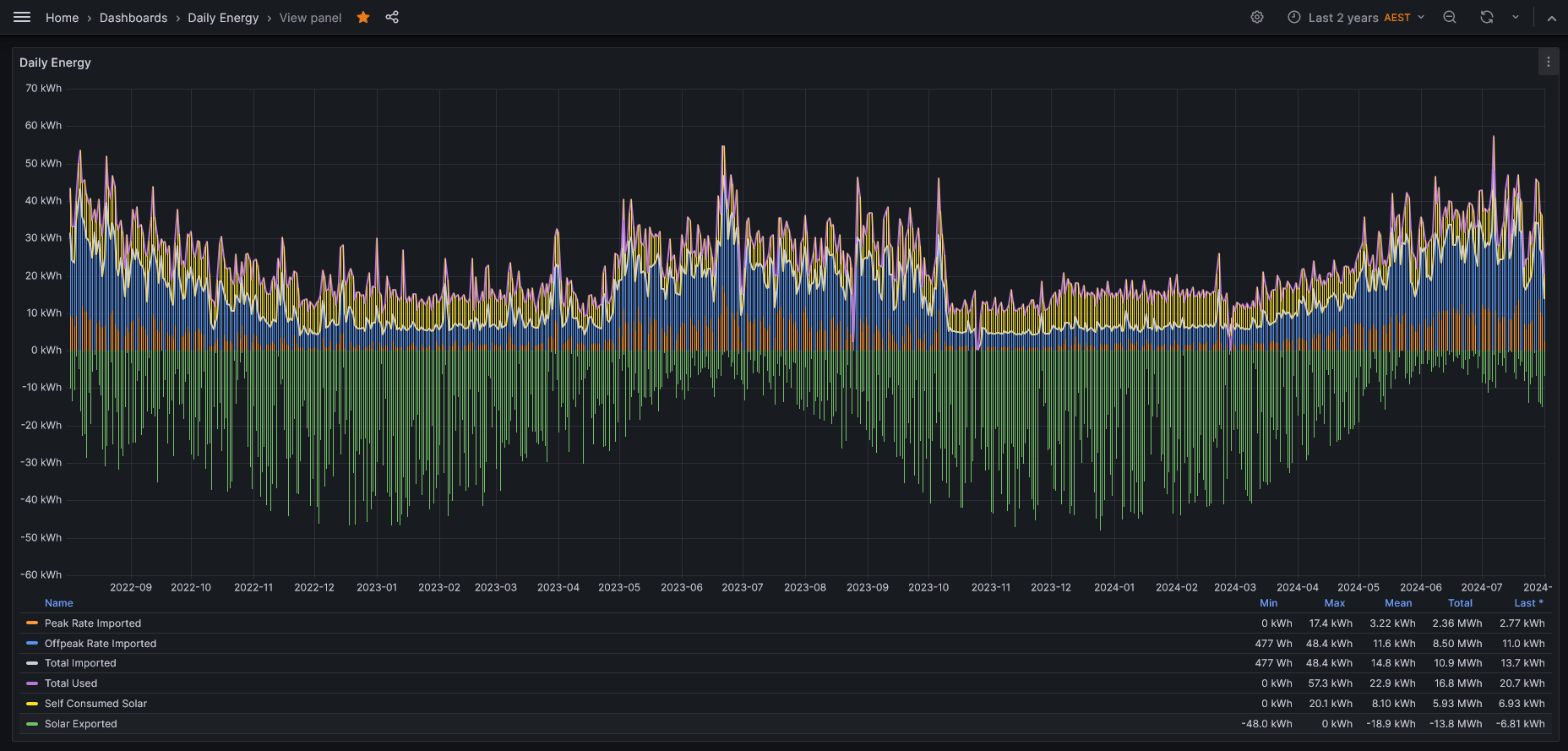
My problem is that I have the data but no real way to graph/visualize it.
Does anyone have any suggestions??
Thanks in advance for your help