I’m excited to introduce background-graph-entities, a lightweight Lovelace custom card that displays entities with their current state alongside a compact background graph.
What It Does
This component gives you a sleek, visual snapshot of sensor data — like temperature, humidity, or other metrics — by combining the best of a state display and a history graph in one tidy list.
Why It Stands Out
Ultra-compact & clean — significantly more compact than the popular mini-graph-card when displaying multiple entities side by side.
Built-in features — includes custom icons, clickable entities (to open detailed info), and options to tweak the graph’s appearance (length, color, opacity, width, data density, and refresh rate).
Conditional graph coloring — apply gradients to the graph line using color_thresholds to highlight varying values.
Quick Setup
For setup examples, please check out the repository:
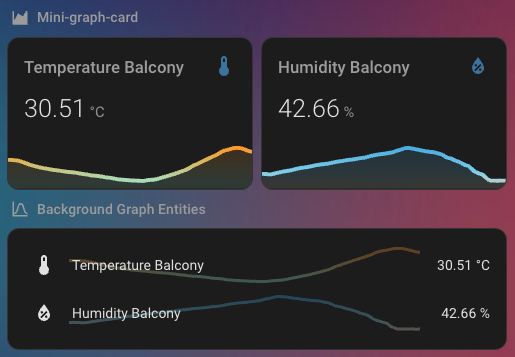
Comparison with mini-graph-card
With similar settings applied, you can see that the background-graph-entities card offers the same compactness as the default entities card, while also giving you a quick glance at the history data:
Feel free to test it, customize it, and share your thoughts — especially if you’d like additional features or tweaks! This component already provides a clean, efficient way to visualize multiple sensor states and trends at a glance.
If not easily achieved, then in this case being able to set the icon colour would be enough. I wasn’t able to get it working with card_mod either. For the entities card I can using the following on an entity:
I’m not planning to recreate the mini-graph-card look shown above in my screenshot — that card already exists and does a great job.
My goal with background-graph-entities is to provide a sleek, compact list view of entities, with just a sneak peek of their history data in the background. It’s meant for quick-glance dashboards where you want state + minimal history without taking up much space.
1. Using Other Row Types (e.g., custom:template-entity-row)
Allowing arbitrary row types like custom:template-entity-row inside background-graph-entities isn’t really feasible without a major architectural overhaul. This card is built to render its own row structure — icon, name, value, and a dedicated <div> for the background graph. It’s not a generic container like the standard entities card, so injecting the graph into another card’s internal layout would be messy and unreliable.
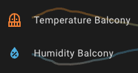
2. Customizing the Icon Color
This is a fantastic suggestion, and I’ve gone ahead and added it! You can now set icon_color per entity to any valid CSS color (orange, #ffaa00, rgb(255, 165, 0), etc.). This should give you most of the visual flexibility you were aiming for, without needing card_mod or a different row type.