Thanks for the help, looks like I had an old card installed. Installed the latest from HACS, made some config changes and now its getting close  Just need a few mods to style and should be good, cheers!

Thanks for the help, looks like I had an old card installed. Installed the latest from HACS, made some config changes and now its getting close Just need a few mods to style and should be good, cheers!
Good!
Try to decrease sizes of icons (card-mod), it will look better I think ))
Does anyone know how to add animations? I only want animations when my tablet is being charged. Here is the relevant Lovlace Yaml. I’m just guessing on the animation part.
- severity:
      - color: Red
        from: 0
        to: 25
      - color: Orange
        from: 26
        to: 50
      - color: Green
        from: 51
        to: 100
    type: 'custom:bar-card'
    entities:
      - entity: sensor.fire_tablet_battery_level
    columns: '0'
    positions:
      icon: inside
      indicator: outside
      minmax: 'off'
      value: inside
    height: '3'
    icon: m
    animation:
      state: 'on'
      speed: '50'
      entity_id: switch.shelly_1_fire_tablet_power
      to: 'on'
columns: 1
square: false
I’m imagining animation that moves left to right inside the bar.

Where did you take this code?
Look here for the right syntax:
I guess that when animation is ON then the progress is always moving - if the sensor’s state is changing.
I was just guessing there. I originally had just
animation:
      state: 'on'
      speed: '50'
but that didn’t work so I added the entity just to try it. Have tried several different speed numbers too but I never see any animations.
Specify "speed: 2"
As I understood you need an animation which is displayed all the time without any breaks while the sensor is “charging”. I think this is not easy.
In my opinion, there are two facts:
1.The animation is displayed only just after the state is changed.
2.The animation is displayed for some duration.
The following conditions must be met:
1.The sensor must be updated with a high frequency - a period between two consecutive updates must be close to the animation’s duration.
2.The sensor’s state must be changed after every update.
In your case, the battery_level sensor must be used as the “entity for bar”. And I do not think that this value is changing after every update))).
But you can achieve this animation - even if your sensor is not changing at all.
This can be implemented not by using the native animation feature - but by using card-mod.
It didn’t like
"speed: 2"
So I used
speed: "2"
and it worked for a few seconds. Not the way I was wanting as the animation was on the tail end of the bar. I was envisioning the entire bar to be used. Sounds like what I’m after is not easily achieved but I appreciate your time trying to help. I know when it is charging because I set up the automation but thought it would be cool for others to see.
type: 'custom:bar-card'
title: animation
columns: 1
entities:
  - entity: sensor.battery_life360_ildar_iphone_5s
    direction: right
    name: Battery
    icon: 'mdi:battery'
    height: 40px
    decimal: '0'
    min: '0'
    max: '100'
    target: '100'
style: |
  bar-card-row bar-card-card bar-card-background bar-card-targetbar {
    {% if is_state('binary_sensor.battery_charging_life360_ildar_iphone_5s','on') %}
    animation: filling 5s linear infinite;
    {% endif %}
    --bar-percent: 0 !important;
  }
  @keyframes filling {
    0% {
      --bar-target-percent: 0;
    }
    10% {
      --bar-target-percent: 10%;
    }
    20% {
      --bar-target-percent: 20%;
    }
    30% {
      --bar-target-percent: 30%;
    }
    40% {
      --bar-target-percent: 40%;
    }
    50% {
      --bar-target-percent: 50%;
    }
    60% {
      --bar-target-percent: 60%;
    }
    70% {
      --bar-target-percent: 70%;
    }
    80% {
      --bar-target-percent: 80%;
    }
    90% {
      --bar-target-percent: 90%;
    }
    100% {
      --bar-target-percent: 100%;
    }
  }
  bar-card-row bar-card-card bar-card-background bar-card-markerbar {
    display: none;
  }
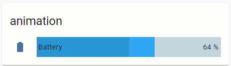
Wow! That is what I’m going for. Still not working for me but I’m sure I must have something wrong.
- severity:
      - color: Red
        from: 0
        to: 25
      - color: Orange
        from: 26
        to: 50
      - color: Green
        from: 51
        to: 100
    type: 'custom:bar-card'
    entities:
      - entity: sensor.fire_tablet_battery_level
        direction: right
        decimal: '0'
        min: '0'
        max: '100'
        target: '100'
    columns: '0'
    style: |
      bar-card-row bar-card-card bar-card-background bar-card-targetbar {
        {% if is_state('sensor.fire_tablet_battery_level','on') %}
        animation: filling 5s linear infinite;
        {% endif %}
        --bar-percent: 0 !important;
      }
      @keyframes filling {
        0% {
          --bar-target-percent: 0;
        }
        10% {
          --bar-target-percent: 10%;
        }
        20% {
          --bar-target-percent: 20%;
        }
        30% {
          --bar-target-percent: 30%;
        }
        40% {
          --bar-target-percent: 40%;
        }
        50% {
          --bar-target-percent: 50%;
        }
        60% {
          --bar-target-percent: 60%;
        }
        70% {
          --bar-target-percent: 70%;
        }
        80% {
          --bar-target-percent: 80%;
        }
        90% {
          --bar-target-percent: 90%;
        }
        100% {
          --bar-target-percent: 100%;
        }
      }
      bar-card-row bar-card-card bar-card-background bar-card-markerbar {
        display: none;
      }
    positions:
      icon: inside
      indicator: outside
      minmax: 'off'
      value: inside
    height: '3'
    icon: m
columns: 1
square: false
Can you tell what I need to change?
Seems to be misplaced code.
This is not good to start a card or row definition with a property which is not a "type: XXXX".
This is not an error but makes life more difficult.
Many many many people do it, unfortunately.
I think when you start with the UI editor and then click on “show editor” it puts it in a random order. I made it more logical but the animation still doesn’t work.
- type: 'custom:bar-card'
    entities:
      - entity: sensor.fire_tablet_battery_level
        direction: right
        decimal: '0'
        min: '0'
        max: '100'
        target: '100'
    severity:
      - color: Red
        from: 0
        to: 25
      - color: Orange
        from: 26
        to: 50
      - color: Green
        from: 51
        to: 100
    columns: '0'
    positions:
      icon: inside
      indicator: outside
      minmax: 'off'
      value: inside
    height: '3'
    icon: m
    style: |
      bar-card-row bar-card-card bar-card-background bar-card-targetbar {
        {% if is_state('sensor.fire_tablet_battery_level','on') %}
        animation: filling 5s linear infinite;
        {% endif %}
        --bar-percent: 0 !important;
      }
      @keyframes filling {
        0% {
          --bar-target-percent: 0;
        }
        10% {
          --bar-target-percent: 10%;
        }
        20% {
          --bar-target-percent: 20%;
        }
        30% {
          --bar-target-percent: 30%;
        }
        40% {
          --bar-target-percent: 40%;
        }
        50% {
          --bar-target-percent: 50%;
        }
        60% {
          --bar-target-percent: 60%;
        }
        70% {
          --bar-target-percent: 70%;
        }
        80% {
          --bar-target-percent: 80%;
        }
        90% {
          --bar-target-percent: 90%;
        }
        100% {
          --bar-target-percent: 100%;
        }
      }
      bar-card-row bar-card-card bar-card-background bar-card-markerbar {
        display: none;
      }
Surely it will not.
Look at this:
You must use binary_sensor (charging or not).
Also, what is this?
I’ll have to work on getting the binary sensor to change state.
The icon: m is something made via the UI visual editor. It’s under the “bar settings”.
I got the binary state to change now and unfortunately the animation still doesn’t work.
- type: 'custom:bar-card'
    entities:
      - entity: sensor.fire_tablet_battery_level
        direction: right
        decimal: '0'
        min: '0'
        max: '100'
        target: '100'
    severity:
      - color: Red
        from: 0
        to: 25
      - color: Orange
        from: 26
        to: 50
      - color: Green
        from: 51
        to: 100
    columns: '0'
    positions:
      icon: inside
      indicator: outside
      minmax: 'off'
      value: inside
    height: '3'
    icon: m
    style: |
      bar-card-row bar-card-card bar-card-background bar-card-targetbar {
        {% if is_state('binary_sensor.fire_tablet_power','on') %}
        animation: filling 5s linear infinite;
        {% endif %}
        --bar-percent: 0 !important;
      }
      @keyframes filling {
        0% {
          --bar-target-percent: 0;
        }
        10% {
          --bar-target-percent: 10%;
        }
        20% {
          --bar-target-percent: 20%;
        }
        30% {
          --bar-target-percent: 30%;
        }
        40% {
          --bar-target-percent: 40%;
        }
        50% {
          --bar-target-percent: 50%;
        }
        60% {
          --bar-target-percent: 60%;
        }
        70% {
          --bar-target-percent: 70%;
        }
        80% {
          --bar-target-percent: 80%;
        }
        90% {
          --bar-target-percent: 90%;
        }
        100% {
          --bar-target-percent: 100%;
        }
      }
      bar-card-row bar-card-card bar-card-background bar-card-markerbar {
        display: none;
      }
When the tablet is charging, binary_sensor.fire_tablet_power turns to on and turns off when it stops charging.
Do you have card-mod installed?
That was the issue. After installing card-mod it is working. You’re a genius! Thanks for the help.
Is it possible to have the full code (button-card as well ? )
Thanks
Hi, I was looking to create something similar as well, in my case I wanted to compare various statistics from last month and current month (time on, used kWh, etc.). There’s a trick you can do to achieve something close to what you’re looking for. Create a picture-elements card and stack both bar cards on top of each other. Use transparent picture with a size of the bar card (I use https://www.photopea.com/ to create those) and play with transparency colors to get the result that fits you.
For example:
        - type: picture-elements
          image: /local/bar2.png
          elements:
          - type: 'custom:bar-card'
            style:
              top: 50%
              left: 50%
              width: 100%
            card_mod:
              style: |
                ha-card {
                  background: #ffffff00;
                }
            entities:
              - entity: sensor.komfovent_mode_1_time_on
                decimal: '0'
                max: '500'
                icon: mdi:fan
                name: Mode 1
              - entity: sensor.komfovent_mode_2_time_on
                decimal: '0'
                max: '500'
                icon: mdi:fan
                name: Mode 2
            direction: right
            height: 80%
            color: '#ef080870'  # red

          - type: 'custom:bar-card'
            style:
              top: 50%
              left: 50%
              width: 100%
            card_mod:
              style: |
                ha-card {
                  background: #ffffff00
                }
                bar-card-value {
                  margin-right: 70px;
                  font-size: 13px;
                  color: grey;
                }
            entities:
              - entity: sensor.komfovent_mode_1_time_on_last_month
                decimal: '0'
                max: '500'
                icon: 'off'
                name: Mode 1
              - entity: sensor.komfovent_mode_2_time_on_last_month
                decimal: '0'
                max: '500'
                icon: 'off'
                name: Mode 2
            direction: right
            height: 80%
            color: '#00b2f960' #blue
The result:

Thanks for code! I was thinking about something similar, but never found the time to investigate
One drawback of this solution is that we have 3 colors here (lower, middle upper parts of the bar). Ideally lower and upper parts should be same color (background) and middle part have bar color. I wanted to use it in weather forecast chart to show daily span of temperatures… yet need to experiment
I see what you mean, for my scenario having 4 colors was a benefit since then I can see whether this month’s result is better or worse compared to last.
What you can do is use the bar color (empty part) for the min value (no transparency) and then whatever color for max value, for example:
It’s little rough around the edges but that’s something that could work out.