Yes, your code works in my setup:
    type: custom:auto-entities
    card:
      type: custom:bar-card
    show_empty: false
    filter:
      template: >-
        {% for state in states.sensor | selectattr('attributes.device_class', '==', 'battery') %}
          {% if 90 <= state.state | int(-1) %}
            {{ state.entity_id }}
          {% endif %}
        {% endfor %}
Gives a list of batteries >= 90% (if “90” is specified).
1 Like
kdzoha
December 8, 2021, 7:48am
633
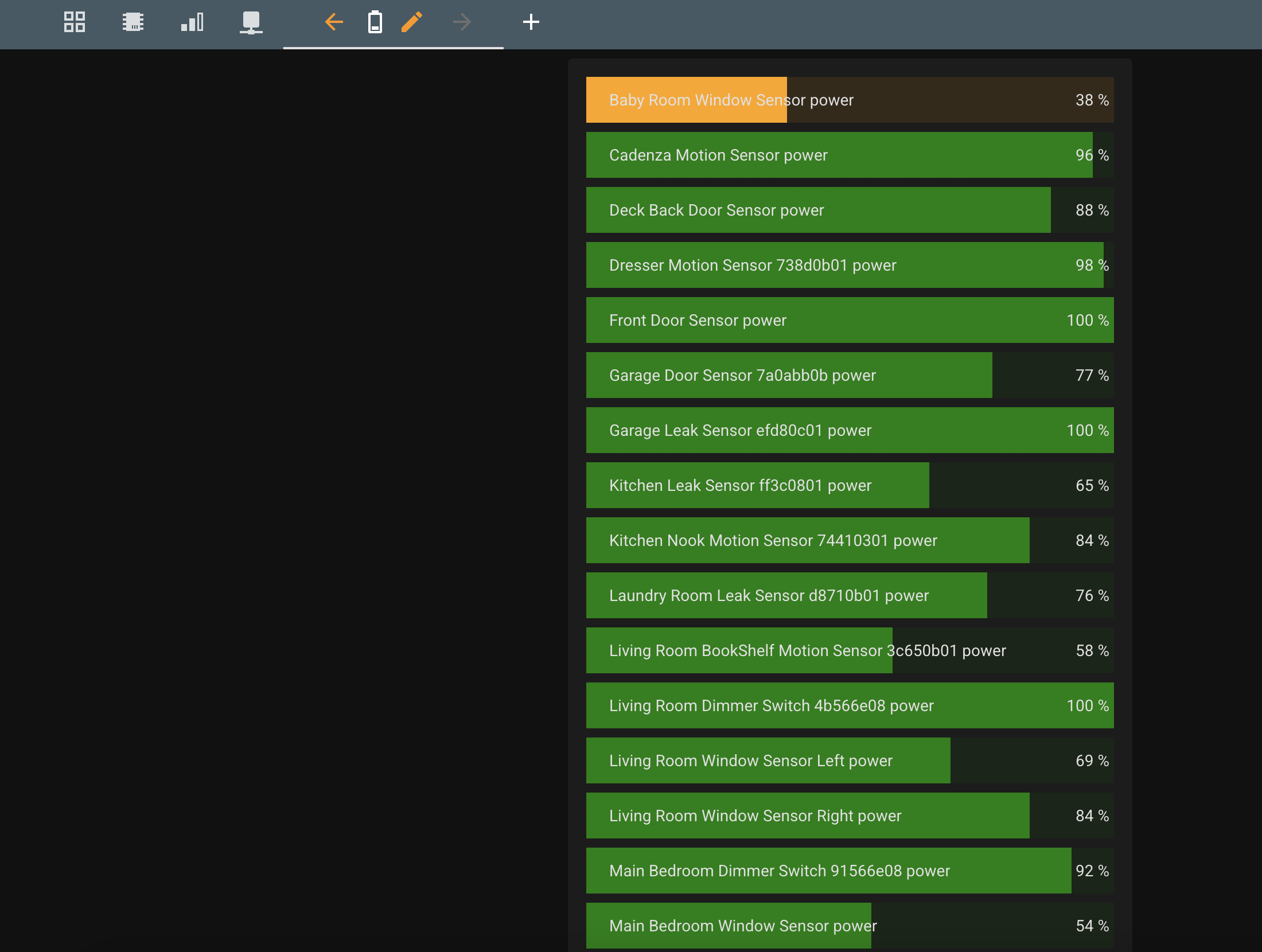
Thank you so much. This is definitely one of the things I find tricky to do on HA as a noob. I didn’t identify that type in auto entities could be bar-card.
kdzoha
December 13, 2021, 6:05pm
634
So this
type: custom:auto-entities
card:
  type: custom:bar-card
  icon: mdi:battery
  positions:
    icon: 'off'
    indicator: inside
    name: inside
  severity:
    - color: Red
      from: 0
      to: 25
    - color: Orange
      from: 26
      to: 50
    - color: Green
      from: 51
      to: 100
  columns: 1
show_empty: false
filter:
  template: >-
    {% for state in states.sensor | selectattr('attributes.device_class', '==',
    'battery') %}
        {{  state.entity_id }}
    {% endfor %}
yields the following
which mostly meets my needs.
Does someone know how to significantly reduce font size to fit the long names… I’m maybe hoping for 2 columns OR, is there a way to select the entities friendly_name which would remove "Hash Power " from each of the entities listed
3 Likes
scootaash
December 18, 2021, 9:16pm
635
I am pretty sure I am being stupid, but I can’t for the life of me get the text in the individual bars to change style. Can anyone help? Tried the code below and a whole pile of variations on a theme including putting styles against the various entities but nothing seems to change the font. Would like to centralise the text too.
Card-mod is installed
If anyone is interested it is linked to the excellent sensors for zwift and is a power meter for my home cycling setup.
Thanks!
type: custom:bar-card
color: rgba(117,189,111,1.0)
stack: horizontal
style: |-
  bar-card-name{
    margin-right: auto;
    font-size: 10px;
    font-weight: bold;
    text-shadow: 1px 1px #0005;
  }
positions:
  icon: 'off'
  title: 'off'
  name: inside
  value: 'off'
  indicator: 'off'
entities:
  - entity: sensor.zwift_power_215592
    color: rgb(127, 127, 127)
    name: Active Recovery
    min: 56
    max: 125
  - entity: sensor.zwift_power_215592
    color: rgb(55, 138, 245)
    name: Endurance
    min: 125
    max: 171
  - entity: sensor.zwift_power_215592
    color: rgb(89, 189, 89)
    name: Tempo
    min: 171
    max: 206
    bar_style:
      font-size: 50%
  - entity: sensor.zwift_power_215592
    color: rgb(248, 204, 68)
    name: Threshold
    min: 206
    max: 240
  - entity: sensor.zwift_power_215592
    color: rgb(237, 99, 52)
    name: VO2 Max
    min: 240
    max: 275
  - entity: sensor.zwift_power_215592
    color: rgb(236, 49, 35)
    name: Anaerobic
    min: 275
    max: 338
  - entity: sensor.zwift_power_215592
    color: rgb(236, 49, 35)
    name: Neuromuscular
    min: 338
    max: 1500
1 Like
kongjudas
January 12, 2022, 6:24pm
636
Any ideas how to use templates in bar-card? I want the target to show the max entity. Is it at all possible to use templates in this card?
type: custom:bar-card
entities:
  - name: Badet
    target: "{{ 'states('sensor.badet_gulvvarme_electric_consumption_max' ) }}"
    unit_of_measurement: w
    entity: sensor.badet_gulvvarme_electric_consumption_w
    icon: mdi:shower
2 Likes
Put the card into config-template-card
1 Like
kongjudas
January 12, 2022, 9:30pm
638
Brilliant! That did the trick. Thanks
ZyberSE
January 22, 2022, 12:27pm
639
I’m looking to have a graph (0-100%) showing the current progress of my washing machine, but with a little twist.
Would it be possible todo this?
Put the card inside config-template-card
Hi, nice card.
I don’t get the bars on the correct position.
jchasey
January 25, 2022, 4:16pm
642
          - type: custom:button-card
            icon: mdi:printer
            entity: binary_sensor.epsonprinter
            aspect_ratio: 1/1
            styles:
              card:
                - border-radius: 5%
                - padding: 10%
                - font-size: 12px
                - text-transform: capitalize
              name:
                - font-weight: bold
                - font-size: 15px
                - align-self: middle
                - justify-self: start
                - padding-bottom: 4px
              img_cell:
                - justify-content: start
                - align-items: start
                - margin: none
              icon:
                - color: '[[[ if (entity.state != "on") return "red"; ]]]'
                - width: 70%
                - margin-top: -10%
              custom_fields:  # removing this line buggers up card - why?
                tr:
                  - align-self: start
                  - justify-self: end
                line1:
                  - align-self: start
              grid:
                - grid-template-areas: '"i tr" "n n" "line1 line1"'
                - grid-template-columns: 1fr 1fr
                - grid-template-rows: 40% min-content min-content
            custom_fields:
              tr: >
                [[[
                  return `<span>${entity.state}</span>`
                ]]]
              line1:
                card:
                  type: 'custom:bar-card'
                  height: 11
                  positions:
                    value: outside
                    indicator: outside
                    icon: off
                    name: off
                  entities:
                    - entity: sensor.epson_wf_3520_series_black_ink
                      color: Black
                      name: Black
                    - entity: sensor.epson_wf_3520_series_cyan_ink
                      color: MediumTurquoise
                      name: Cyan
                    - entity: sensor.epson_wf_3520_series_magenta_ink
                      color: MediumOrchid
                      name: Magenta
                    - entity: sensor.epson_wf_3520_series_yellow_ink
                      color: Gold
                      name: Yellow
                  style: |-
                    ha-card { box-shadow: none;}
                    bar-card-card { margin-bottom: -8px; }
                    bar-card-value { padding-left: 10px; padding-bottom: 2px; margin: -1px; }
                    .card-content { text-align: start; padding: 1px; margin: 0px; margin-bottom: 8px; }
Thx. This works. It was the style part of the ‘custom: bar-card’ that did the trick.
Hello guys!
      - type: horizontal-stack
        cards:
          - type: custom:bar-card
            title: Abastecimento Bloco 1

            direction: up
            height: 400px #altura da barra
            width: 150px #largura da barra
            stack: horizontal #posição da barra
            entity_row: true
            positions:
              icon: inside
              indicator: outside
              name: outside
              value: outside
            style: |-
                bar-card-currentbar, bar-card-backgroundbar { border-radius: 20px;}
                ha-card {border-radius: 20px; box-shadow: none; background-image: none; background-color: transparent; color: black;}
                bar-card-value { overflow; visible; padding-left: 5px; margin: 0px; font-size: 21px; }
                bar-card-title {font-size: 15px; font-weight: bold; }

            entities:
              - entity: sensor.volume
                name: Cisterna
                icon: mdi:water-percent
                unit_of_measurement: '%'
                decimal: 0

              - entity: sensor.sensor_caixa_b
                name: Caixa
                icon: mdi:water-percent
                unit_of_measurement: '%'
                decimal: 0

            severity:
            - color: '#FF0000'
              from: 0
              to: 20
            - color: '#FF6347'
              from: 21
              to: 40
            - color: '#FFA500'
              from: 41
              to: 60
            - color: '#32CD32'
              from: 61
              to: 80
            - color: '#228B22'
              from: 81
              to: 100
Can anyone help me?
Gluwc
February 11, 2022, 3:56pm
645
bar-card-name should work as a style element.
1 Like
Hi everyone,
first, thanks for the great card.
Thanks in advance | Best | W
Has anyone managed to get color gradient bars?
Hi all.
I was wondering if there is a way to configure a horizontal bar with 0 (zero) in the centre to display a sensor that can swing to positive and negative, so that the bar could progressively fill either way from that zero (centre) point.
So far, I’ve only had success with bars that fill from the minimum value to the sensor actual value, so basically a zero value shows half the bar, what would be ideal is a zero value shows no fill and then whether the value is positive of negative the bar could fill from that point either to the left or right.
TIA
MisterTFM
April 9, 2022, 7:13pm
650
Is there a way to create a horizontal bar graph, but sort the order of the entities by their values. Similiar to the bar graph in the Energy card.
1 Like
type: vertical-stack
cards:
  - type: custom:auto-entities
    card:
      type: entities
    entities: []
    sort:
      method: state
      numeric: true
    filter:
      include:
        - entity_id: input_number.test_level_*
  - type: custom:auto-entities
    card:
      type: custom:bar-card
    entities: []
    sort:
      method: state
      numeric: true
    filter:
      include:
        - entity_id: input_number.test_level_*
4 Likes