I want an input_select in lovelace without the icon on the left, so the dropdown box can be a bit wider. How can I do this? I know I can change the icon, but how do I remove it?
Have you already tried
icon: ""
?
Yes. No change. In fact, it doesn’t matter which icon I set in lovelace. It shows the icon defined in the entity definition in configuration.yaml regardless. And I’ve tried the same there (icon: “”). Then the icon disappears, but it occupies the same space.
Maybe some “style:” stuff could help? I’m not very good at that.
If you post your current Lovelace yaml I can try to think with you.
Here it is.
 - type: horizontal-stack
    cards:
      - entities:
          - entity: input_select.hage_ampel1_valg
            name: Ampler
        type: entities
      - entity: sensor.hage_ampel1_moisture
        font_size: 60
        height: 75
        hide_icon: true
        labels: true
        name: ' '
        type: 'custom:mini-graph-card'
      - type: glance
        show_name: false
        entities:
          - entity: sensor.hage_ampel1_conductivity
            icon: 'mdi:emoticon-poop'

And here’s how it looks. I need to get rid of the icon on the left, so the texts in my input_select eill be more visible.
I think you have run into a bug. I tried to set and icon of one of my input selects, too and that didn’t change it. I was able to overwrite the UI icon for another entity (with mdi:home). Changing the icon for an input_select type entity does not work (yet).
On the other end, I tried both
icon: ' '
(Mind the space between the quotes) and
icon: []
Both removed the icon (no icon) but the space was still taken:
So I think what you want is impossible at the moment for 2 reasons.
Aha: I can see the bug clearly now  !
!
I’ll look for other solutions in some of the great custom cards or something.
Thanks for trying!
One thing to try out while the bug is still here might be a vertical stack with the input.select in a solo row and then a horizontal stack under it with the rest.
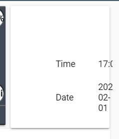
So with this even if you get rid of the icon, it doesn’t shift over the content correct? So with a date/time element I’m getting:

Was hoping with or ’ ’ it would remove and shift but it just removes.
Hello here !
Any solution found ? I have the same problem. when i remove the icon with both solution, the buttons beside the text aren’t fit in the card.
I’m using hass:none but I think the space for the ‘empty’ icon is still occupied.
I found a solution using css styles in mod-card:
type: 'custom:mod-card'
style:
  hui-entities-card$hui-input-select-entity-row$: |
    state-badge {
      width: 0px;
    }
  'hui-entities-card$hui-input-select-entity-row$ha-paper-dropdown-menu$paper-input$#container$': |
    div.floated-label-placeholder {
      line-height: 0px;
    }
Changing the width in “state-badge” to 0px gets rid of the icon box and stretches the input select line over the icon. You still have to set your icon to ’ ’ to remove the image.
Changing the line-height in “div.floated-label-placeholder” to 0px gets rid of the entity name box above the input select line and centers the line vertically in the container. Set the name to [] and you can be fully rid of that part as well.

type: entities
entities:
  - entity: input_select.test_sensors_for_graph
    style: |
      :host state-badge {
        display: none;
      }
Works beautifully ! Thanks a lot !
Nice! It works fine on input select. But not on input numbers. How can that be done?
Of course it will not, these are different things.
You should ask your question here:
icon_height: 0px
Works for me, give it a try
I just noticed that this has stopped working. It looks like something has changed in the interface code.
Tried this option, it didn’t work either.
Are there any other options for how to do this?
Just in case, my code is like this:
                  - type: 'custom:hui-element'
                    card_type: horizontal-stack
                    cards:
                      - type: custom:mod-card
                        card:
                          type: entities
                          entities:
                            - entity: input_select.nachalo_stirki
                              style: |
                                :host state-badge {
                                  display: none;
                                }
                          style: |
                            ha-card {
                              box-shadow: none;
                            }
                      - type: custom:mod-card
                        card:
                          type: entities
                          entities:
                          - type: buttons
                            entities:
                              - entity: automation.wm_start_auto
                                state_color: true
                                icon: 'mdi:washing-machine-alert'
                                name: Запустить по расписанию
                                tap_action:
                                  action: call-service
                                  service: automation.toggle
                                  service_data:
                                    entity_id: automation.wm_start_auto
                          style: |
                            ha-card {
                              box-shadow: none;
                            }
And now it looks like this:

