Prefixes / suffixes for data:
code
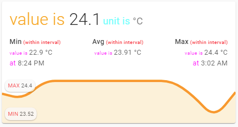
type: custom:mini-graph-card
entities:
  - sensor.cleargrass_1_temperature
show:
  labels: true
  average: true
  extrema: true
  name: false
  icon: false
style: |
  .states.flex .state .state__value.ellipsis::before {
    content: "value is ";
    color: orange;
  }
  .states.flex .state .state__uom.ellipsis::before {
    content: "unit is ";
    color: cyan;
  }
  .info.flex .info__item .info__item__type::after {
    content: " (within interval)";
    font-size: 10px;
    text-transform : none;
    color: red;
  }
  .info.flex .info__item .info__item__value::before {
    content: "value is ";
    font-size: 10px;
    color: magenta;
  }
  .info.flex .info__item:nth-child(odd) .info__item__time::before {
    content: "at ";
    color: magenta;
  }
  .graph .graph__container .graph__labels .label--max::before {
    content: "MAX ";
    color: red;
  }
  .graph .graph__container .graph__labels .label--min::before {
    content: "MIN ";
    color: red;
  }
For several entities:

code
type: custom:mini-graph-card
entities:
  - entity: sensor.xiaomi_cg_1_temperature
  - entity: sensor.xiaomi_cg_1_co2
    show_state: true
    y_axis: secondary
show:
  name: false
  icon: false
  labels: true
  labels_secondary: true
style: |
  .states.flex > .state .state__value.ellipsis::before {
    content: "v_1 ";
    color: orange;
  }
  .states.flex > .state .state__uom.ellipsis::before {
    content: "u_1 ";
    color: cyan;
  }
  .states.flex > .states--secondary .state .state__value.ellipsis::before {
    content: "v_2 ";
    color: red;
  }
  .states.flex > .states--secondary .state .state__uom.ellipsis::before {
    content: "u_2 ";
    color: lightgreen;
  }
  .graph .graph__container .graph__labels.--primary .label--max::before {
    content: "MAX_1 ";
    color: red;
  }
  .graph .graph__container .graph__labels.--primary .label--min::before {
    content: "MIN_1 ";
    color: red;
  }

  .graph .graph__container .graph__labels.--secondary .label--max::before {
    content: "MAX_2 ";
    color: cyan;
  }
  .graph .graph__container .graph__labels.--secondary .label--min::before {
    content: "MIN_2 ";
    color: cyan;
  }