I have now edited the original post, I did not post results of things like cache false because as i have said, changing anything fixes it, but reverting the change brings it back.
Please do not post info which was not requested. Soory, but you are confusing yourself too.
Post only info which was requested. We are spending lot of time with this(. Several posts about one issue.
Do not post History page - it was clearly mentioned to post history-graph with a code.
Also, no info about a sensor was provided.
Check again what was requested.
nope still stuck here…
Edited my OP again to conform to the github request.
IMO you will not be able to follow the issue without the extra information I posted previously, but since you insist, i have done as requested. the additional is still visible in the edit history.
Thank you very much for this.
This issue - if it is not related to a user’s error - seems to be very serious, that is why we have to handle it seriously: provide only basic info (+any additional if needed), reduce a probability to confuse each other, start testing on the simplest example and then increase complexity.
Based on data you provided we may say that:
– mini-graph-card for this particular “sensor.new_lambton_temp” is not flatlined;
– compared to history-graph (which is precise, not a statistical approximation) - the mini-graph-card seems to show at least similar data;
– since actual data for this “sensor.new_lambton_temp” are updated more often that 1 minute (you said - 10 minutes) than “points_per_hour: 60” show rather precise picture.
So, here on THIS particular case everything seems to be OK.
Pardon me, English is not my native language.
Are you saying that you first observed the flatline BEFORE updating to 2023.3 - so it happened on 2023.2.x?
Do you mean that after update to 2023.3 your graphs stopped being flatlined - but for previous hours they were still flatlined?
Did you check the same with history-graph? This is important because the only case I observed flatline in mini-graph is when history-graph was flatlined too. There are still some open issues on Github; think this was a Recorder issues.
Also, I have not understood - did you clear a browser’s cache?
This is not clear for me.
If I understood you properly earlier - “after update to 2023.3 your graphs stopped being flatlined - but for previous hours they were still flatlined”.
So, do you mean that “fixed the charts” = “even previous hours became not flatlined”?
As for bar graph: in general it is advised (at least by me) to use in only some cases, you may see a difference between card with absolutely same code except “graph: bar” & “graph: line”: the “line” graph will always give you a more precise picture.
No, and it didn’t matter which sensor i picked for those examples, all would be the same (i.e not flatlined).
Yes the data seems perfectly fine to me too.
Yes i should have set it to 6 or 12, but as you can see, it does not change the fact that:
correct. i observed it on 2023.2.x for several days but did not give it much attention.
correct. I observed since updating that the new data is no longer flatlined, but old data is still flatlined.
Yes, the history graph is not flatlined.
yes, it did not fix anything. Issue is on multiple devices.
I appreciate this is true. Unfortunately for the purpose of giving you more information now, I only have a bar chart to display the ongoing issue.
Explanation:
I have the following yaml and chart
type: custom:mini-graph-card
aggregate_func: last
color_thresholds:
  - color: var(--graph-color-4)
    value: 3
  - color: var(--graph-color-7)
    value: 2
  - color: var(--graph-color-1)
    value: 1
  - color: var(--graph-color-9)
    value: 0
color_thresholds_transition: soft
entities:
  - sensor.electricity_total_cost_daily
name: Electricity
align_header: center
align_state: center
group_by: date
hour24: true
hours_to_show: 240
lower_bound: 0
show:
  fill: fade
  graph: bar
  labels: true
  icon: false
smoothing: false
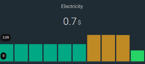
here is the relevant 10 day history graph of this sensor. I have marked the last value for each day which is what the bar chart should show.

Now if I change ANY parameter (by deleting a parameter, adding a new parameter or altering any of existing values [e.g true to false or change a number value]) the graph looks correct like this:

In this example, all i have done is change the name.
type: custom:mini-graph-card
aggregate_func: last
color_thresholds:
  - color: var(--graph-color-4)
    value: 3
  - color: var(--graph-color-7)
    value: 2
  - color: var(--graph-color-1)
    value: 1
  - color: var(--graph-color-9)
    value: 0
color_thresholds_transition: soft
entities:
  - sensor.electricity_total_cost_daily
name: Electricity 2
align_header: center
align_state: center
group_by: date
hour24: true
hours_to_show: 240
lower_bound: 0
show:
  fill: fade
  graph: bar
  labels: true
  icon: false
smoothing: false
In 8 days, i believe the graph will look correct and I will not be able to reproduce this further. I am unable to provide any further images of flatlining because altering the charts to extend them further back in time also fixes them.
If you would like me to copy this entire post into my original one instead, please let me know.
Not related to the flatline, just my experience.
In history-graph we have “steps” - some value is “flatlined” till a next change; in mini-graph-card (“line” graph) all points are connected by lines (not saying about “smoothing: true” which I never use). I myself prefer “steps” presentation which currently may be achieved in mini-graph only with a big “points_per_hour”.
Example: speedtest graph for last 72 hours, measured every hour. In case of “points_per_hour: 1” (as it seems to be) we have a “curve” (points are connected by lines) - looks like readings take place between actual points (i.e. more often than once an hour). So I set “points_per_hour: 60” and get “steps” which give more precise picture.
Sorry, it WAS not flatlined for previous hours which were still displayed as flatlined?
If so - that was a mini-graph issue.
Do you mean that with 2023.3 you still have the “flatline” issue with bar graph (which disappears if name is changed)? And if you change back to the prev. name - will the graph be same wrong?
What happens if you create a NEW card and paste a “bad” (i.e. with unchanged name) code? Is the new card is still wrong?
Do you still have “flatline” issue with any “line” graphs? If yes - does changing any option “heal” these graphs? Are they again wrong after reverting changes?
No, we are only two users here so far, all info is almost in one place.
Correct
Correct. Those screenshots were only taken at the time of that post. The 10 day history graph is fine. The mini graph is wrong. Editing the name (or anything else) fixes it. Changing the name back brings back the problem.
All screenshots I have posted currently are from a fresh dashboard . New cards with pasted original code = same display issue.
Not any more as it has been more than the 20 hours they displayed. But yesterday the answer was yes to all parts of your question. The bar chart is the only one that was set to show back far enough to still give screenshots.
The most weird thing here imho was that changing one option like a “name” fixes a graph and again breaks after reverting changes. The only suggestion here could be clearing a browser’s cache - but it did not help you as you said…
Yes I do not think the mini graph card is bugged in some new way. It is likely a weird cache issue with my server.
As I said many people for last 2 weeks reported flatlines on Github. Probably some their cases were related to wrong using, cannot say for sure since just a few of them provided requested info, others ignored it and became ignored themselves))
1 Like
Hi,
I have an issue with Mini graph card that looks like the flat line error, but may be unrelated.
When I load any pages with a graph from mini graph card, the graph is completely empty, nothing appears.
At the same time, an error is raised,
WARNING (MainThread) [homeassistant.components.http.ban] Login attempt or request with invalid authentication from 192.168.1.48 (192.168.1.48). Requested URL: '/api/history/period/2023-03-22T13:13:12.526Z?filter_entity_id=sensor.global_temperature&end_time=2023-03-22T13:57:57.220Z&skip_initial_state&minimal_response'. (Mozilla/5.0 (X11; Linux x86_64; rv:102.0) Gecko/20100101 Firefox/102.0)
I’ve quickly noticed the error because fail2ban is banning my IP rather quickly because of it…
I thought I solved the issue by cleaning up the entire Local Storage of my browser.
But I soon as I restart HA, the error come back.
I have the error since I’ve upgraded from 2023.2.3 to 2023.3.4. When going back to 2023.2.3, the error disappears.
I can set up any graph that may help to investigate if needed.
EDIT: Damn the error is more serious than it appears at first !
I can’t edit any automation either because of a similar error !
WARNING (MainThread) [homeassistant.components.http.ban] Login attempt or request with invalid authentication from 192.168.1.48 (192.168.1.48). Requested URL: '/api/config/automation/config/1679494064809'. (Mozilla/5.0 (X11; Linux x86_64; rv:102.0) Gecko/20100101 Firefox/102.0)
If you see a similar issue with other cards & features - then probably this is not related to mini-graph-card.
now I am stumped… In all of my mini-graph-card configs with color-thresholds, I use html color names without issue.
example:
footer:

  type: custom:mini-graph-card
  icon: mdi:speedometer
  entities:
    - entity: sensor.speedtest_download
      name: Download
#       color: green
    - entity: sensor.speedtest_upload
      name: Upload
      color: skyblue # set fixed color, overriding the color thresholds
#          - entity: sensor.speedtest_ping
#            name: Ping
#            color: yellow
  color_thresholds:
    - value: 1000
      color: lightgreen
    - value: 800
      color: green
    - value: 700
      color: gold
    - value: 600
      color: orange
    - value: 500
      color: orangered
    - value: 400
      color: firebrick
    - value: 300
      color: purple
    - value: 200
      color: black
Except this one:
footer:

  type: custom:mini-graph-card
  entities:
    - entity: sensor.processor_use
      state_adaptive_color: true
  height: 100
  line_width: 4
  hours_to_show: 72
  show:
    average: true
    extrema: true
    icon: false
    labels: true
    name: false
  color_thresholds:
    - value: 5
      color: '#008000' #green
    - value: 15
      color: '#ffd700' #gold
    - value: 20
      color: '#ffa500' #orange
    - value: 40
      color: '#f00000' #red
if I replace the hex numbers with the color names, a completely black graph is displayed (note the state_adaptve_color is correct),

while with the hex numbers the graph looks likes this:

what possibly could be the issue here?
update
seems to be a lot of issues with those color_thresholds, checking the repo once more: this one is particularly connected bug(color_thresholds): defaults to black instead of closest out-of-bounds color · Issue #764 · kalkih/mini-graph-card · GitHub
Ive now set a full range of possible values in the thresholds:
  color_thresholds:
    - value: 0
      color: green
    - value: 15
      color: gold
    - value: 20
      color: orange
    - value: 40
      color: red
    - value: 60
      color: purple
    - value: 100
      color: black
and that results in

still not as it should, but at least we have colors…
and I also noticed the GitHub - kalkih/mini-graph-card: Minimalistic graph card for Home Assistant Lovelace UI mentions colors have to be in hex format… even though that is not true, or at least most configs just work fine with color names. as they should ofc.
moving the back to hex:
  color_thresholds:
    - value: 100
      color: '#000000' #black
    - value: 60
      color: '#800080' #purple
    - value: 40
      color: '#f00000' #red
    - value: 20
      color: '#ffa500' #orange
    - value: 15
      color: '#ffd700' #gold
    - value: 0
      color: '#008000' #green
is perfect:

guess we do have to use those ugly and human unfriendly hex colors after all… hope this would be fixable in a PR, with the new team of maintainers.

I’ve came to same conclusion, it seems to be more of an issue between the API and Firefox, and I’ve opened an issue about it, as it seems I’m not the only one concerned by that error.
Hey! Is there any way to create ‘dynamic’ threshold values? I’d like to create a dynamic coloring for room temperature based on the last 7 days avg temperature.
Example how I tried without success:
color_thresholds:
- color: ‘#0033da9’
value: {{ is_state(“sensor.avg_temperature” }}-1 - color: ‘#00c0e3’
value: {{ is_state("sensor.avg_temperature }} - color: ‘#009865’
value: {{ is_state("sensor.avg_temperature }}+1
Everything which is not described in docs - is not supposed to work.
Hello! I’m having trouble with the mini-graph card not displaying full data from a longer period. Specifically, I want to display data from the last 30 days and the graph shows the same value for half of that period. Even though HA official history graph does show correct data.
Here’s a screenshot showing both graphs:

Am I doing something wrong or is it a bug?
My config of the mini-graph card:
type: custom:mini-graph-card
name: Powietrze 30 dni
entities:
  - entity: sensor.home_pm2_5
    name: PM2.5 na zewnątrz
  - entity: sensor.mi_air_purifier_3_3h_pm2_5
    name: PM2.5 w domu
points_per_hour: 0.1
aggregate_func: max
hour24: true
hours_to_show: 720
line_width: 3
1 Like
Try clearing a browser’s cache.
Also, check in another browser.