LINK TO THE FINAL CARD WITH UPDATED CODE
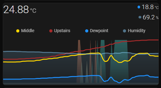
I have set upper bound to 100 because I have put humidity on the Y-axis with my ON/OFF (0/100) sensor. Humidity is measured on a scale of 0-100%.
This allows me to have temperature on the X-axis which ranges from -5 to 40 degrees where I live. Not that I would see that full range in a day.
As you can see by comparing the two graphs between the posts.
- I can now see the upward or downward trend of temperature with more detail. (Not just a straight bumpy line.)
- At a glance where the humidity line sits on the graph gives me a rough approximation of percentage.
- Plus the humidity line sits lower in the graph allowing the 0/100 sensor to be seen above at all times.
- Humidity will never be 100%.
Before

After
EDIT: Example shows what happens when not setting aggregate_func: max and ‘upper_bound_secondary: 100’
Different time spans in the above pictures. But was able to add a third temperature from the mezzanine of my living room without the graph looking messy.