Displaying a legend is controlled by a “legend” option - RTFM.
1 Like
Tell me please.
I have the temperature and humidity readings of one sensor in my code. The color scheme is written for the two lines in the same way. Is it possible to set the line colors separately for each line separately?
>     cards:
>       - type: custom:mini-graph-card
>         entities:
>           - sensor.datchik_temperatury_na_vtorom_etazhe_temperature
>           - sensor.datchik_temperatury_na_vtorom_etazhe_humidity
>         hours_to_show: 24
>         points_per_hour: 2
>         line_width: 1
>         hour24: true
>         animate: true
>         height: 80
>         show:
>           extrema: false
>           icon: false
>           name: false
>           legend: false
>         color_thresholds:
>           - value: 30
>             color: '#d32f2f'
>           - value: 20
>             color: '#388e3c'
>           - value: 10
>             color: '#0000ff'
Hi, I would like to display the duration of a timer per day. But it dosnt works.
type: custom:mini-graph-card
show_state: false
state_map:
  - value: idle
    label: test
  - value: active
    label: test
entities:
  - entity: timer.gardena_ventil_feuer
name: Feuerstelle
hours_to_show: 168
height: 300
aggregate_func: avg
group_by: date
show:
  graph: bar
  name: true
  legend: true
  icon: true
  labels: false
  state: false

There are no values (Date and Durations) at the bars …?
Thankyou!
All my mini graph cards are flat for a few days. Did something break in a recent update?
I updated to 2023.3 yesterday but i’m pretty confident it was already occurring a few days prior. I’ve not changed anything with my recorder settings. The history graphs look fine. These graphs (and all my others including bar charts) have worked fine for about a year until now.
- minimal
mini-graph-cardconfig to demonstrate an issue, w/o color_thresholds & state_map, for only ONE sensor which is flatlined:
type: custom:mini-graph-card
entities:
  - entity: sensor.new_lambton_temp
show:
  labels: true
hours_to_show: 24
points_per_hour: 60
smoothing: false
aggregate_func: last
line_width: 1
lower_bound: 0
- a screenshot of that
min-graph-card(default light theme);

- a conventional
history graphfor the samehours_to_showfor the same ONE sensor - not a History page, not a more-info (read above why more-info may be WRONG);
type: history-graph
entities:
  - entity: sensor.new_lambton_temp
hours_to_show: 24
- a screenshot of that
history-graph(default light theme);

-
info about sensor - how often it is polled (a real update freq);
- polled every 10 minutes
- provided by a custom BOM integration
- other sensors from other integrations also effected, including template sensors which update as frequently as every 3 seconds
-
when you started observing flatlines (after which event, after which HA update);
- approx 1 week ago. Not after any particular event. It was prior to updating to 2023.3.x but is possibly resolved since that update which i performed yesterday. Previously I was on 2023.2.x
-
did it stop after HA reboot or after clearing a browser’s cache (also, test with
cache: falseoption);-
No
-
Even if updating to 2023.3.x resolved it now, after the update all previous hours were still flat, but now that 1 day has passed, those flat areas are beyond the visible area on my dashboard.
-
-
For the bar chart which goes back 10 days it is still reproducible.
-
difference in different browsers if present.
- none, occurred on multiple browsers on multiple machines. Including brave, edge, chrome.
-
one bonus point sorry
- Changing any parameter and saving fixed the charts. reverting the change later caused the issue to reappear.
Edit your post (to avoid scattering data in several places), add additional info as described here.
Some people also faced a similar behaviour, reasons are different (a possible bug in mini-graph-card, issues with Recorder, a wrong use in MOST cases).
I myself observe flatlines ONLY when there are issues with Recorder - so same flatlines are with history-graph.
Update: copy/pasted since you do not have access to Github:
1.One issue = 1 post. No “wrote above/earlier”, all info in ONE place.
2.One post must contain this info:
– minimalmini-graph-cardconfig to demonstrate an issue, w/o color_thresholds & state_map, for only ONE sensor which is flatlined:type: custom:mini-graph-card entities: - entity: sensor.my_sensor show: labels: true hours_to_show: 24 ## not too big & not too small - to show that 2/3 of time the graph is OK, then became flatlined points_per_hour: 60 ### at least equal to the real update interval or x2 smoothing: false aggregate_func: last line_width: 1 lower_bound: 0 ### or any other value to see a flatline– a screenshot of that
min-graph-card(default light theme);
– a conventionalhistory graphfor the samehours_to_showfor the same ONE sensor - not a History page, not a more-info (read above why more-info may be WRONG);
– a screenshot of thathistory-graph(default light theme);
– info about sensor - how often it is polled (a real update freq);
– when you started observing flatlines (after which event, after which HA update);
– did it stop after HA reboot or after clearing a browser’s cache (also, test withcache: falseoption);
– difference in different browsers if present.P.S. Do not use default values for
hours_to_show,points_per_hour&smoothing, use what is explained above.
1 Like
I can’t access github currently unfortunately, updated with the yaml. let me know if I should post anything further.
Updated, check above.
+replace “bar” with “line”
+no grouping
1 Like
Appreciate it, I will update the original post further in a moment but seem to have resolved both.
For the line graph, changing the hours to show to 24 or removing the hour24: true parameter and saving seemed to fix it. (didn’t try everything, but those work)
For the bar graph, removing color_thresholds_transition: soft fixed that too.
very odd. I’ll see what i can figure out.
edit, seems changing any one thing fixes it, but reverting it causes the issue again, maybe a cache issue, but on multiple devices seems unlikely.
This is a guesswork, but if it solved your issue, then fine.
I told that first you should test & provide results for the case described there (+ no grouping & no bars) to simplify.
I have now edited the original post, I did not post results of things like cache false because as i have said, changing anything fixes it, but reverting the change brings it back.
Please do not post info which was not requested. Soory, but you are confusing yourself too.
Post only info which was requested. We are spending lot of time with this(. Several posts about one issue.
Do not post History page - it was clearly mentioned to post history-graph with a code.
Also, no info about a sensor was provided.
Check again what was requested.
nope still stuck here…
Edited my OP again to conform to the github request.
IMO you will not be able to follow the issue without the extra information I posted previously, but since you insist, i have done as requested. the additional is still visible in the edit history.
Thank you very much for this.
This issue - if it is not related to a user’s error - seems to be very serious, that is why we have to handle it seriously: provide only basic info (+any additional if needed), reduce a probability to confuse each other, start testing on the simplest example and then increase complexity.
Based on data you provided we may say that:
– mini-graph-card for this particular “sensor.new_lambton_temp” is not flatlined;
– compared to history-graph (which is precise, not a statistical approximation) - the mini-graph-card seems to show at least similar data;
– since actual data for this “sensor.new_lambton_temp” are updated more often that 1 minute (you said - 10 minutes) than “points_per_hour: 60” show rather precise picture.
So, here on THIS particular case everything seems to be OK.
Pardon me, English is not my native language.
Are you saying that you first observed the flatline BEFORE updating to 2023.3 - so it happened on 2023.2.x?
Do you mean that after update to 2023.3 your graphs stopped being flatlined - but for previous hours they were still flatlined?
Did you check the same with history-graph? This is important because the only case I observed flatline in mini-graph is when history-graph was flatlined too. There are still some open issues on Github; think this was a Recorder issues.
Also, I have not understood - did you clear a browser’s cache?
This is not clear for me.
If I understood you properly earlier - “after update to 2023.3 your graphs stopped being flatlined - but for previous hours they were still flatlined”.
So, do you mean that “fixed the charts” = “even previous hours became not flatlined”?
As for bar graph: in general it is advised (at least by me) to use in only some cases, you may see a difference between card with absolutely same code except “graph: bar” & “graph: line”: the “line” graph will always give you a more precise picture.
No, and it didn’t matter which sensor i picked for those examples, all would be the same (i.e not flatlined).
Yes the data seems perfectly fine to me too.
Yes i should have set it to 6 or 12, but as you can see, it does not change the fact that:
correct. i observed it on 2023.2.x for several days but did not give it much attention.
correct. I observed since updating that the new data is no longer flatlined, but old data is still flatlined.
Yes, the history graph is not flatlined.
yes, it did not fix anything. Issue is on multiple devices.
I appreciate this is true. Unfortunately for the purpose of giving you more information now, I only have a bar chart to display the ongoing issue.
Explanation:
I have the following yaml and chart
type: custom:mini-graph-card
aggregate_func: last
color_thresholds:
  - color: var(--graph-color-4)
    value: 3
  - color: var(--graph-color-7)
    value: 2
  - color: var(--graph-color-1)
    value: 1
  - color: var(--graph-color-9)
    value: 0
color_thresholds_transition: soft
entities:
  - sensor.electricity_total_cost_daily
name: Electricity
align_header: center
align_state: center
group_by: date
hour24: true
hours_to_show: 240
lower_bound: 0
show:
  fill: fade
  graph: bar
  labels: true
  icon: false
smoothing: false
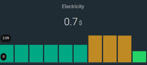
here is the relevant 10 day history graph of this sensor. I have marked the last value for each day which is what the bar chart should show.

Now if I change ANY parameter (by deleting a parameter, adding a new parameter or altering any of existing values [e.g true to false or change a number value]) the graph looks correct like this:

In this example, all i have done is change the name.
type: custom:mini-graph-card
aggregate_func: last
color_thresholds:
  - color: var(--graph-color-4)
    value: 3
  - color: var(--graph-color-7)
    value: 2
  - color: var(--graph-color-1)
    value: 1
  - color: var(--graph-color-9)
    value: 0
color_thresholds_transition: soft
entities:
  - sensor.electricity_total_cost_daily
name: Electricity 2
align_header: center
align_state: center
group_by: date
hour24: true
hours_to_show: 240
lower_bound: 0
show:
  fill: fade
  graph: bar
  labels: true
  icon: false
smoothing: false
In 8 days, i believe the graph will look correct and I will not be able to reproduce this further. I am unable to provide any further images of flatlining because altering the charts to extend them further back in time also fixes them.
If you would like me to copy this entire post into my original one instead, please let me know.
Not related to the flatline, just my experience.
In history-graph we have “steps” - some value is “flatlined” till a next change; in mini-graph-card (“line” graph) all points are connected by lines (not saying about “smoothing: true” which I never use). I myself prefer “steps” presentation which currently may be achieved in mini-graph only with a big “points_per_hour”.
Example: speedtest graph for last 72 hours, measured every hour. In case of “points_per_hour: 1” (as it seems to be) we have a “curve” (points are connected by lines) - looks like readings take place between actual points (i.e. more often than once an hour). So I set “points_per_hour: 60” and get “steps” which give more precise picture.
Sorry, it WAS not flatlined for previous hours which were still displayed as flatlined?
If so - that was a mini-graph issue.
Do you mean that with 2023.3 you still have the “flatline” issue with bar graph (which disappears if name is changed)? And if you change back to the prev. name - will the graph be same wrong?
What happens if you create a NEW card and paste a “bad” (i.e. with unchanged name) code? Is the new card is still wrong?
Do you still have “flatline” issue with any “line” graphs? If yes - does changing any option “heal” these graphs? Are they again wrong after reverting changes?
No, we are only two users here so far, all info is almost in one place.
Correct
Correct. Those screenshots were only taken at the time of that post. The 10 day history graph is fine. The mini graph is wrong. Editing the name (or anything else) fixes it. Changing the name back brings back the problem.
All screenshots I have posted currently are from a fresh dashboard . New cards with pasted original code = same display issue.
Not any more as it has been more than the 20 hours they displayed. But yesterday the answer was yes to all parts of your question. The bar chart is the only one that was set to show back far enough to still give screenshots.
The most weird thing here imho was that changing one option like a “name” fixes a graph and again breaks after reverting changes. The only suggestion here could be clearing a browser’s cache - but it did not help you as you said…
Yes I do not think the mini graph card is bugged in some new way. It is likely a weird cache issue with my server.