Lovelace: mini graph card

type: custom:mini-graph-card
entities:
  - entity: sensor.xiaomi_cg_1_co2
    unit: €
  - entity: sensor.xiaomi_cg_2_co2
    unit: $
    show_state: true
  - entity: sensor.mijia_300_1_co2
    unit: €
    show_state: true
icon: mdi:currency-eur
card_mod:
  style: |
    .states > .state {
      flex-direction: row-reverse;
    }
    .states .states--secondary .state:nth-child(2) {
      flex-direction: row-reverse;
    }            

изображение

1 Like

is there any way to have colour threshold per entity in a stacked graph?

type: custom:mini-graph-card
name: Speedtest
align_state: center
icon: mdi:speedometer
line_width: 3
hours_to_show: 168
points_per_hour: 0.2
show:
  extrema: true
  labels: true
  icon_adaptive_color: true
entities:
  - entity: sensor.speedtest_download
    name: Download
    color_thresholds:
      - value: 100
        color: red
      - value: 200
        color: amber
      - value: 300
        color: green
  - entity: sensor.speedtest_upload
    name: Upload
    color: red
  - entity: sensor.speedtest_ping
    name: Ping
    color: yellow

above gives me: image
instead of: image
if i hard code it to always green

Currently no, these thresholds are card-wide.
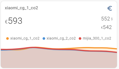
Imho these thresholds (especially with fill) for more than 1 sensor might be like “too much info” & confusing.

1 Like

Can someone explain, why this is always showing the FIRST state and not the last:

>       type: custom:mini-graph-card
>       name: Network RX / TX (7 Days)
>       entities:
>         - entity: sensor.fritz_box_6660_cable_gb_received
>           name: Download
>           color: rgb(52, 152, 219)
>         - entity: sensor.fritz_box_6660_cable_gb_sent
>           name: Upload
>           color: orange
>           y_axis: secondary
>       show:
>         labels: true
>         labels_secondary: true
>         graph: bar
>         icon: false
>       height: 200
>       hours_to_show: 168
>       line_width: 2
>       group_by: date
>       aggregate_func: diff
>       lower_bound_secondary: 0
>       lower_bound: 0
>       style: |
>         ha-card {
>           background:none;
>           }
>         rect.bar {
>           filter: drop-shadow(0px 0px 5px rgba(0, 0, 0, 0.3));
>           width:65px;
>           }
>         .bars:first-of-type {
>           transform: scaleY(49%);          
>           }
>         .bars:last-of-type {
>           transform-origin: center;
>           transform: rotateX(180deg) scaleY(49%) translateY(-51%) translateX(-35.5px);
>           }
>         .graph__labels.--secondary {
>           flex-direction: column-reverse;
>           align-items: flex-end;
>         }
>         .graph__container__svg {
>           margin-bottom: 16px;
>         }

For the record: how to show a graph for TODAY only:
Calculate a value for “hours_to_show”:

type: custom:config-template-card
entities:
  - sensor.xiaomi_cg_1_co2
card:
  type: custom:mini-graph-card
  hours_to_show: >-
    ${
      var date = new Date();
      var curHour = date.getHours() + date.getMinutes()/60.0 + date.getSeconds()/3600.0;
      curHour
    }
  entities:
    - sensor.day_vs_night_time
  points_per_hour: 120
  line_width: 1
  smoothing: false
  aggregate_func: last

Here “day_vs_night_time” is a history stats sensor which is set to 0 at 00:00.

But this method is “too precise” because it may give a tiny amount of data from “yesterday”:

As a possible workaround - do not add seconds))).

I have a graph I am trying to create that has two y-axes and I would like to overlay with a state map. The first y-axis is a humidity value. The second y-axis is a humidity derivative sensor I have created. I have that working fine, but I would also like to overlay when the exhaust fan is running on the graph. I cannot figure out how to show that on the same graph. I currently have it as a secondary graph below using a custom stack-in card. Is there a way to show the three on the same graph where the gray fill is just overlaid over the other sensors.

image

Short answer: no, not with this card, since you’re talking about having 3 y-axes in reality. This might be easier with the Apex chart.

But you could hack it… You haven’t posted your config so I’ll make some necessary assumptions. Give the humidity axis a fixed lower and upper bound of 0% and 100% respectively. Make a template sensor of the exhaust fan’s state that’s 0% for off and 100% for on. You can now plot those two on the same axis.

… or place the 2nd card with the 3rd Y-axis over the 1st card.
Example was provided above, search for “display: grid”.

Yes, very nifty! But, I think, ultimately one must choose the right tool for the job.

Sometimes values of sensors are too different and you cannot place 2 of them on a same axis.
For instance, CO2 + temperature + day/night.

Indeed, which is, with only two axes, I know that humidity is 0-100% so they can scale the overlay to be binary 0 or 100 (these values don’t matter in this case since its purely visual), and the secondary axis can then display the other series.

graph

I’m having some issues with the background of my card. No matter what I do its always cut in two like the picture above.

Anyone have a solution either through card_mod or the mini graph its self? I want the entire background above and below the line to be one color.

Try this and read the manual.

type: custom:mini-graph-card
entities:
 - sensor.illumination
align_icon: left
align_state: center
show:
  fill: false
1 Like

Start with testing the simplest code:

type: custom:mini-graph-card
entities:
  - one entity
hours_to_show: 24

Since you have not given a code of your card, people may only guess.

2 Likes

Thanks. Code probably would have helped. :man_facepalming:

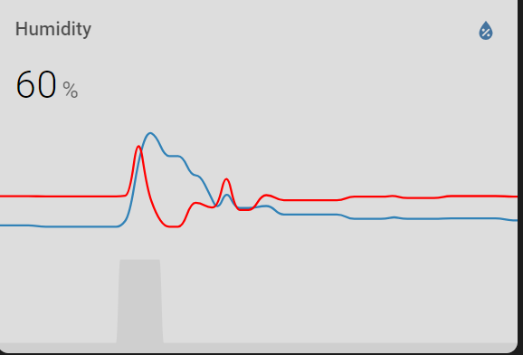
After trying the suggestions from both of you neither fixed it and hiding the fill actually made it worse. I decided to use inspector to dig through the css and found a conflicting .graph { section in my theme. After removing that, it’s fixed.

Thanks for the help! Much appreciated.

1 Like

“With my all due respect”, you should have at least explain people here what was a reason of your issue.
You neither posted a code for your card nor shown an origin of your issue.
Not to mention a fact that the very issue is unclear - either you were talking about a NORMAL fill below the graph line or about ABNORMAL fill above the graph line (which only may occur in case of presence of the 2nd graph w/o line):
image
Asking a question and then saying “ok, nevermind, I sorted out” w/o sharing details about a reason is not cool. Not meant to be rude, sorry if offended.

2 Likes

Yes, I jumped the gun and didn’t think. My apologies. It was the abnormal fill that I was having troubles with. My theme file had conflicting css with the graph causing the oddity. Removing the css from the theme file fixed it.

Could you share this wrong style here? Many people are using themes, your experience will be very helpful.

Greetings,
so i have 3 sensors.
1.Electricity usage from grid
2.Electricity usage of the home
3.Solar production

How can i make this graph like this one, colors below the solar production is a different color for the electricity usage and above solar production is electricity usage from grid.

Perhaps look at the Apex Charts custom card. You’ll have a lot more control. I can’t tell you how exactly to do that, but look at the examples where a series is one colour when positive and another when negative. This might get you in the right direction.