Lovelace: mini graph card

Hello,
first of all I would like to say that mini graph card is really great card. I am new with HA so I would like ask you if I do something wrong.

What I want is that I will see graph blue for temperature bellow -10, light blue for bellow zero, orange over zero and red over 28.

I set this:

        color_thresholds_transition: hard
        color_thresholds:
          - color: blue
            value: -50
          - color: '#039BE5'
            value: -10
          - color: var(--accent-color)
            value: 0
          - color: '#E74C3C'
            value: 28

Problem is that I do not see expected graph with correct color, bu I se black graph.

obrazek

What I have is that my temperature sensor have samples from 1,5C to 18C. It means that my database do not have temperatures bellow zero and over 28C.
I did some test.
TEST 1. When I set thresholds in “samples” range it works same way as I expected. But with wrong thresholds for me.

        color_thresholds_transition: hard
        color_thresholds:
          - color: blue
            value: 2
          - color: '#039BE5'
            value: 5
          - color: var(--accent-color)
            value: 7
          - color: '#E74C3C'
            value: 10

obrazek

TEST 2. Last threshold over then existing data set highest part to black color, same behavior is for lowest threshold:

        color_thresholds_transition: hard
        color_thresholds:
          - color: blue
            value: 2
          - color: '#039BE5'
            value: 5
          - color: var(--accent-color)
            value: 7
          - color: '#E74C3C'
            value: 28

obrazek

TEST 3. Required thresholds with lower and upper bound works, but it create small graph:

        upper_bound: ~50
        lower_bound: ~-50
        color_thresholds_transition: hard
        color_thresholds:
          - color: blue
            value: -50
          - color: '#039BE5'
            value: -10
          - color: var(--accent-color)
            value: 0
          - color: '#E74C3C'
            value: 28

obrazek

TEST 4: If I change upper_bound lower then highest threshold graph is changed to black

I would like to use threshold for see temperature ranges. It does not mean that I will see all colors it should be depended on values from last 48 hours (set in hours_to_show).

Thank you for your advices and help

I have the same problem as Fanful.

My overall history is set to only 3 days BUT I used to be able to graph long term statistic sensors without issue. Now it only shows the last 72 hours. It’s like it is only using history data now instead of the statistical data that is kept forever.

Is it possible to use different color_thresholds for each line for a graph with two entities please?

Or use {% if %} {% else %} style markup in the card template to set the line_color for each entity dynamically?

No currently.

No. Use card-mod instead.
Example.

1 Like

I also have a state_map question. I am trying to show two entities:

  • Green line: water heating off/on
  • Red line: central heating off/on
    …but the two seem to be stacking on the secondary axis:

Screenshot 2023-05-06 at 11.20.12

If it helps explain, I am trying to replicate this graph below which uses apexcharts-card (very slow to load and i’d like to remove it)
Screenshot 2023-05-06 at 11.21.17

Here is my yaml, any pointers gratefully received:

- type: custom:mini-graph-card
  points_per_hour: 60
  hour24: true
  group: true
  line_width: 2
  state_map:
    # for sensor.hive_water_reported_action
    - value: 'off'
      label: 'Off'
    - value: 'on'
      label: 'On'
    # for sensor.hive_heating_reported_action
    - value: 'idle'
      label: 'Off'
    - value: 'heating'
      label: 'On'
  entities:
    - entity: sensor.hive_heating_reported_target_temp
      name: "Hive setpoint"
      color: yellow
      smoothing: false
    - entity: sensor.hive_heating_reported_current_temp
      name: 'Hive thermostat'
      color: Orchid
      show_fill: false
    - entity: sensor.hive_heating_reported_action
      y_axis: secondary
      color: red
    - entity: sensor.hive_water_reported_action
      y_axis: secondary
      color: green
  show:
    name: false
    icon: false
    state: false
    legend: false
    labels: true
    #labels_secondary: true
    points: false
  tap_action: none

Hi can you post or send me the code for the graph. This looks great! Exactly what i´ve tryin to find!

1 Like

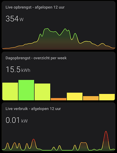
So I use this card to display information regarding my solar panels. Love the customization possibilities!

Right now I got it all pretty by displaying the graph and data per day with graph points (the one on top) and per week, but with solar output per day.

But what if I want to bring up the week before? Or the detailed graph like the one on top but from the day before? Or let’s say a couple of days before? Is there for example a way to add small arrows so you can browse trough the history? Or is there a different card recommended to achieve this?

Normally the apps from inverter manufacturers have such possibilities but I’d like to have it nicely laid out in home assistant.

Thanks in advance for helping me out!

The power of this card is its simplicity.

There are some options though: Apex charts or the history explorer chart. Both are custom components available via HACS.

1 Like

Agreed.
Strongly prefer this over the others, only miss a stacked graph option. (which is what I use Apex for then)

Thanks for the good work @kalkih !

Why is is the extrema tied to graph ? If you do not want graph, automagically extrema also disappears even if show: extrema: true …
Perhaps I’m missing something …

It is possible to show extreme/average info without showing a graph.

Hi all,

is it possible to have extrema for 2 sensors displayed?
If not, how to place min and max together on the left side under the state of the first sensor?
Actually min is on the left side under state of sensor1, and max is on the right under state of sensor2.

have scrolled the complete thread, but not found a solution.

Can anybody help?

ok, played arround and got this:

but now Min and max is not aligned with the values.

this is what I’ve done:

    .info.flex {
      justify-content: left;
    }

I have a problem with sensors that have missing values in their timeline like this one:

image

This is to be expected, although usually the value falls to zero before the connection gets lost, but such things happen.

In the mini graph card I get the last read value written forward until a new one is available.

image

It’s OK to break the line when there are no values are available, but THIS seems a bit odd. although I would be happy to produce >1kW “solar” power in the middle of an overcast night. :heart_eyes:
It’s the same sensor that’s shown in the traditional graph.

image

Is there an option to change this behavior that I’m missing so far?

type: custom:mini-graph-card
entities:
  - entity: sensor.hausstrom_energie_p
    name: Bezug [W]
    legend: false
    color: red
  - entity: sensor.warmepumpe_energie_p
    name: Heizung [W]
    legend: false
    color: blue
  - entity: sensor.hausstrom_energie_p_2
    name: Einspeisung [W]
    legend: false
    color: green
  - entity: sensor.symo_5_0_3_m_leistung_ac
    name: Solar [W]
    legend: false
    color: orange
  - color: gray
    entity: sensor.co2_intensity
    name: gCO₂eq/kWh
    show_legend: false
    show_line: false
    show_pints: false
    y_axis: secondary
hours_to_show: 24
points_per_hour: 12
update_interval: 300
line_width: 1
hour24: true

Agree.
Here 2 issues for this:

1 Like

Beautiful work!
Can you advise is there a way to display entities names aligned with states?
I’m trying to visualise 4 differente temperature entities on one graph:
image

I’d love to see the names and the states close to oneanother. Is it doable? :slight_smile:

1 Like

I’m trying to have the blue entity to be drawn on top of the light grey ones:


Is there a way to draw the main entity after the secondary ones?
Or maybe there is a way to display the last entity’s value instead of the first one?
Thanks!

  1. There is an issue for this.

  2. Probably could be fixed by playing with “z-index” for:
    – fill
    – line
    – points
    by card-mod.

1 Like

Oh thanks! That makes sense. I will follow the issue thread :+1:

Brilliant! If displaying the states of two entities on the card, Is it possible to identify just one entity and display the UoM before the state for just that one - while leaving the other UoM displaying after the state? My use case is displaying $ (before state) and kw (after state) . Thanks.