I do not understand. Consider explaining your needs with details & pics, otherwise too cryptic.
Anyone an idea how to change font style of the title?
And what is the standard font style in HA (from scratch)?
greetings
card-mod thread → 1st post → link at the bottom → mini-graph
It’d be nice if we could use a slider to dynamically adjust hours_to_show. Or better yet, having support for it natively in mini graph.
I mostly use mini graph to show temperature and humidity in each room for the last 24h to give me an idea, but I often want to only see the last 1 to 6 hours to have a bit more details. In order to do so, for a 1-hour step slider for instance, I’d need conditional cards wirh 24 different cards:
- Now to -1hr
- Now to -2hr
- Now to -3hr
etc…
If someone has a suggestion to achieve this, I’m all ears. Because the latter solution would be quite cumbersome when you have a mini graph for humidity and another one for temperature in every room. But yeah, having support of it natively would be a blessing!
There’s two other options:
- Use config-template-card to template the graph duration based on a helper entity you create.
- Look into apexcharts-card and its brush functionality.
Happy searching ![]()
I am coming back to this to see if anyone can help. I tried to create a template sensor and use that in the graph, but still could not show the legend. Can anyone help me to figure out how to show the state of my input_select helper in the legend of each graph? Or is it just not possible to show the input_select helper state in the legend? Thanks in advance.
I seem to miss something. I want to a bar chart with rounded corners. Similar like the the example with hte custom:bar-chart shown in the screenshot in the lower half. I want similar design, but using custom:mini-graph-card in a bar chart with daily grouped values like shown in the upper part of the screenshot.
How do I get rounded corners in the upper graph?
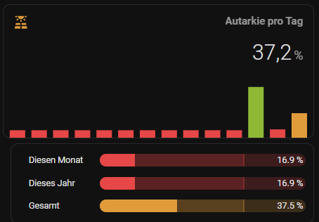
For reference the YAML code to create both cards
type: vertical-stack
cards:
  - type: custom:mini-graph-card
    name: Autarkie pro Tag
    icon: mdi:solar-power-variant
    align_icon: left
    align_state: right
    group_by: date
    hours_to_show: 336
    aggregate_func: last
    entities:
      - entity: sensor.solar_autarky_daily
    show:
      graph: bar
      icon_adaptive_color: true
    bar_spacing: 10
    lower_bound: 0
    upper_bound: 100
    color_thresholds:
      - value: 0
        color: '#e64747'
      - value: 10
        color: '#e64747'
      - value: 30
        color: '#e09c3b'
      - value: 50
        color: '#e6e22e'
      - value: 70
        color: '#8fb935'
    card_mod:
      style: |
        ha-card {
          box-shadow: 0px 0px;
          background: none;
        }
  - type: custom:bar-card
    height: 20
    severity:
      - color: '#e64747'
        from: 0
        to: 29.9
      - color: '#e09c3b'
        from: 30
        to: 49.9
      - color: '#e6e22e'
        from: 50
        to: 69.9
      - color: '#8fb935'
        from: 70
        to: 100
    entity_row: true
    positions:
      icon: false
      indicator: false
      name: outside
    width: 75%
    entities:
      - entity: sensor.solar_autarky_monthly
        icon: mdi:calendar-blank
        name: Diesen Monat
        target: 70
      - entity: sensor.solar_autarky_yearly
        icon: mdi:calendar-clock-outline
        name: Dieses Jahr
        target: 70
      - entity: sensor.solar_autarky
        icon: mdi:calendar-clock-outline
        name: Gesamt
        target: 70
    card_mod:
      style: |
        ha-card {
          padding: 12px;
          margin-left: 12px;
          --bar-card-border-radius: 15px;
        }
        bar-card-backgroundbar {
          opacity: 0.2;
          filter: brightness(1);
        }
1 Like
I want to do a bar graph below, but I don’t find a configuration option similar to ‘change’ in the default statistics graph card.
My sensor is an increasing value…

got my graphs back, and based on other entities this time, all core now, so thats better.

as we have negative prices currently id love that to show in the bars poiting down, but cant find an option to do so in mini-graph-card.
Cant this be done, would appreciate if anyone had tried that.
I do have an apex charts graph, but find that to be very heavy on the system, especially with more than 1 graph per view
it does show what I am after though
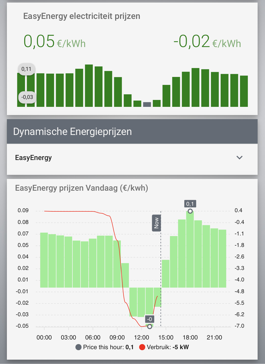
please let me know if it can be done with mini-graph-card
  - type: custom:mini-graph-card
    hours_to_show: 1
    icon: none
    name: EasyEnergy electriciteit prijzen
    show:
      graph: bar
      labels: true
      legend: false
#       extrema: true
#       average: true
#     lower_bound: 0
flip negative would be nice.
Hello,
I have the following mini graph card displaying:
- ceiling temperature (blue)
- floor temperature (yellow line)
- night/day alternance: yellow area
- ceiling fan activity (red line)

Everything is fine except the red line. The fan.fan_bureau entity value is ‘on’ or ‘off’.
When state is off I want to display the line in the bottom of the screen. But it appears in the middle.
As you can see in the code, I use 2 “y_axis: secondary”. It may not be the right way to do it but I couldn’t find a better way.
Any help will be more than welcome ![]()
Thanks so much !!!
type: custom:mini-graph-card
name: Contraste de température
entities:
  - entity: sensor.capteur_bureau_temperature
    name: Temp bas
    show_graph: true
    show_state: true
    show_fill: false
  - entity: sensor.bureau_temperature_plafond
    name: temp plafond
    show_graph: true
    show_state: true
    show_fill: false
  - entity: fan.fan_bureau
    name: Brasseur
    color: red
    show_legend: false
    show_line: true
    show_points: false
    y_axis: secondary
  - entity: sensor.nuit
    color: yellow
    name: Nuit
    show_legend: false
    show_line: false
    show_points: false
    y_axis: secondary
show:
  labels: true
  labels_secondary: true
  extrema: true
line_width: 1
font_size: 60
hour24: true
points_per_hour: 60
state_map:
  - value: '1'
    label: nuit
  - value: 'off'
    label: 'off'
  - value: '0'
    label: jour
  - value: 'on'
    label: 'on'
1 Like
Try increasing points per hour to 120 and set average func to last.
Thanks for your answer. Do you mean set agregate_fun to last ?
And remove y_axis ? like this:
  - entity: fan.fan_bureau
    name: Brasseur
    color: red
    show_legend: false
    show_line: true
    show_points: false
    aggregate_func: last
Then it look like this. Indeed the red line is floored but the scale is completely changed if you compare with previous graph.

I would like to keep the temperature range/scale like in my previous post. Just get the red line down, like I did for day/night.
Hey. Hey,
I’d like to ask you about my problem.
I am monitoring the energy consumption of a small boiler through a smart plug. I use a helper to calculate hourly, daily energy consumption.
When I would graph it it shows me a different value than the helper.
Here is the graph for the last 7 days. Today it shows me 0.08kWh (last bar):

But the current value is 0.16kWh:

Yesterday it was 0.22kWh:

But if I look at historical measures, the last value was 0.45:
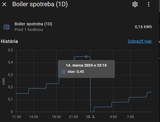
Here is my configuration:
type: custom:mini-graph-card
name: boiler (7dní)
icon: mdi:lightning-bolt-circle
hours_to_show: 168
hour24: true
points_per_hour: 1
line_width: 4
group_by: date
entities:
  - sensor.boiler_spotreba_1d
show:
  graph: bar
  labels: true
  extrema: true
  state: true
  name: true
  average: true
color_thresholds:
  - value: 0
    color: '#2b603c'
  - value: 0.05
    color: '#3d8540'
  - value: 0.1
    color: '#fcef1c'
  - value: 0.5
    color: '#f6b92b'
  - value: 1
    color: '#c4252d'
Do I something wrong?
OK.
I have figured it out.
I need to use aggregate_func: last then it show me the last value that represent the energy consumption. ![]()
How did you made the Mülltermine card?
hi, i have issue by reducing my font size, can some please have a look
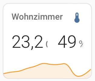
i want to reduce the font size, and hav try a lot different versions
type: custom:mini-graph-card
entities:
  - entity: sensor.channel10_temperature
    name: Wohnzimmer
    unit: C
    font_size: 20
  - entity: sensor.channel10_humidity
    font_size: 10
    font_size_header: 20
    unit: '%'
    show_state: true
    show_graph: false
    font_size: 10
Your font options are misplaced. Check the Docs.
So I have been working on this off and on for a while now. I finally got it to show, but there is a catch. In order for the legend to show up, I have to show both legends. I would prefer to only have the legend for the input select helper show up. I have another graph that has 4 entities and I am able to show legends for two of them and hide the other two.
However, this graph only has two entities and I either have to show them both or I get nothing. I am not sure if this is a bug or intended. Like I said, I would prefer to show only the input select. But this at least gets me something.
Here is my code.
type: custom:stack-in-card
card_mod:
  style: |
    ha-card {
      --ha-card-background: rgba(115, 115, 115, 0.25);
      --primary-text-color: '#97989c';
      border-radius: 10px;
      border: none;
    }
cards:

  - type: custom:mini-graph-card
    entities:
      - entity: input_select.washer
        name: Washer
        color: '#3182b7'
        show_line: false
      - entity: sensor.basement_aqara_washer_active_power
        name: Power
        color: 'rgb(255,0,0)'
        y_axis: secondary
    line_width: 1
    decimals: 0
    hours_to_show: 12
    points_per_hour: 60
    hour24: true
    state_map:
      - value: Empty
        label: Empty
      - value: Complete
        label: Complete
      - value: Running
        label: Running
    lower_bound_secondary: 0
    upper_bound_secondary: 500
    show:
      name: false
      icon: false
      state: false
      fill: true
      points: false
      legend: true
      extrema: false
      labels: false
      labels_secondary: false
    card_mod:
      style: |
        ha-card {
          --ha-card-background: rgba(115, 115, 115, 0.25);
          --primary-text-color: '#97989c';
          border-radius: 10px;
          border: none;
        }
        .graph__legend__item {
          justify-content: center
        }
        .graph__legend__item:nth-of-type(1) .ellipsis:after {
          content: ": {{states('input_select.washer')}}";
          color: '#97989c';
        }
        .graph__legend__item:nth-of-type(2) .ellipsis:after {
          content: ": {{states('sensor.basement_aqara_washer_active_power')}}";
          color: 'transparent';
        }
        .graph .graph__legend {
          font-size: 12px;
        }

  - type: custom:mini-graph-card
    entities:
      - entity: input_select.dryer
        name: Dryer
        color: '#3182b7'
        show_line: false
      - entity: sensor.basement_aqara_dryer_active_power
        name: Power
        color: 'rgb(255,0,0)'
        y_axis: secondary
    group: true
    line_width: 1
    decimals: 0
    hours_to_show: 12
    points_per_hour: 60
    hour24: true
    state_map:
      - value: Empty
        label: Empty
      - value: Complete
        label: Complete
      - value: Running
        label: Running
    lower_bound_secondary: 0
    upper_bound_secondary: 500
    show:
      name: false
      icon: false
      state: false
      fill: true
      points: false
      legend: true
      extrema: false
      labels: false
      labels_secondary: false
    card_mod:
      style: |
        ha-card {
          --ha-card-background: rgba(115, 115, 115, 0.25);
          --primary-text-color: '#97989c';
          border-radius: 10px;
          border: none;
        }
        .graph__legend__item {
          justify-content: center
        }
        .graph__legend__item:nth-of-type(1) .ellipsis:after {
          content: ": {{states('input_select.dryer')}}";
          color: '#97989c';
        }
        .graph__legend__item:nth-of-type(2) .ellipsis:after {
          content: ": {{states('sensor.basement_aqara_dryer_active_power')}}";
          color: '#97989c';
        }
        .graph .graph__legend {
          font-size: 12px;
        }
And here is the result.

Also, is there a way to remove the decimal in the legend? I would prefer to have whole numbers without creating a bunch of template sensors.
This is my card @wookiee
type: custom:stack-in-card
card_mod:
  style: |
    ha-card {
        height: 100% !important;
        #padding-bottom: 5px !important;
    }
cards:
  - type: custom:auto-entities
    card:
      card_mod:
        style: |
          ha-card {
            --mdc-icon-size: 26px;
            margin: 10px;
            margin-top: -5px;
            border: 0px !important;
            height: 160px !important;
          }
          .card-content div {
            margin-top: 0px !important;
            margin-bottom: 0px  !important;
            height: 24px;
            font-size: 14pt;
          }
      title: Mülltermine
      type: entities
      state_color: false
      show_header_toggle: false
    entities:
      - entity: sensor.grune_tonne
        card_mod:
          style: |
            :host {
              --paper-item-icon-color: green;
            }
      - entity: sensor.graue_tonne
        card_mod:
          style: |
            :host {
              --paper-item-icon-color: gray;
            }
      - entity: sensor.blaue_tonne
        card_mod:
          style: |
            :host {
              --paper-item-icon-color: blue;
            }
      - entity: sensor.gelbe_tonne
        card_mod:
          style: |
            :host {
              --paper-item-icon-color: yellow;
            }
    sort:
      method: attribute
      attribute: daysTo
      reverse: false
      numeric: true
      ignore_case: true
  - type: custom:mini-graph-card
    line_width: 2
    font_size: 100
    lower_bound: 0
    upper_bound: 100000
    height: 100
    name: Internetverbindung
    align_header: left
    show:
      icon: false
      name: true
      legend: false
      state: true
    entities:
      - entity: sensor.kg_lan_fb7530_maximaler_download_durchsatz_der_verbindung
        color: '#00FF0022'
        show_fill: false
        show_legend: false
        show_state: true
        show_graph: true
      - entity: sensor.kg_lan_fb7530_maximaler_upload_durchsatz_der_verbindung
        color: '#FF000022'
        show_fill: false
        show_legend: false
        show_state: true
        show_graph: true
      - entity: sensor.fritzboxdownloadumgerechnet
        color: green
        name: Download
      - entity: sensor.fritzboxuploadumgerechnet
        color: red
        name: Upload
    hours_to_show: 1
    points_per_hour: 60
    card_mod:
      style: |
        ha-card {
          height: 250px !important;
          border: 0px !important;
          margin: 10px;
        }
        .header.flex {
          font-size: 20px !important;
        }
        .states.flex {
          font-size: 8px !important;
        }