Lovelace: mini graph card

I am very new to HomeAssistant and just playing around to get familiar with it. I like these charts and have set up one for a Kasa Switch with monitoring that controls my coffee machine. The chart shows current W. There are two things I was wanted if it was possible.

  1. Can I use the tap-action function to get the tap to toggle the switch? Below is what I have tried.
type: custom:mini-graph-card
name: Coffee Machine
entities:
  - entity: sensor.coffee_machine_current_consumption
    name: Current
hours_to_show: 5
points_per_hour: 10
updated_interval: 5
animate: true
tap-action:
  action: call-service
  service: switch.toggle
  entity_id: switch.coffee_machine
more_info: false

Currently when I click it the More Infor still shows up

  1. I was wandering if there was a way to change the Unit of Measure to KW?

Ildar_Gabdullin

Thanks bro, it worked excellent, thanks for show me how it works and also for help me to learn about the CCS path use…

do you know where I can find information about how to use “config.entity” option to manipulate the mini-graph-card’s a this level, I have tried several ways and examples that I found but I have not been able to use in my code, and it looks or maybe I have not see any documentation repository about the use of “config.entity”

Thanks in advance

1 Like

I do not think that config.entity works with mini-graph-card.

The only card I know, that works with that is the markdown-card.

At least, config.entity works here:
Entities card
Entity card
Glance
multiple-entity-row (for the main entity)
badge

2 Likes

Wow, didn’t know that, thanks! :slight_smile: :+1: I should try the standard-cards from HA sometimes… :rofl: :rofl:

Use value_factor: 1000 to multiply (never used by myself, just read in the docs).
Then use unit: kW to display the new unit.

Thanks for the post. The unit: setting worked but for some reason value_factor does not work. I will have to go back through the document to see what I am missing.

Thanks again

Random question, I am struggling to see if there is an answer to my weird question,

I am using the graph card t show the last price of a stock from a day over the last 7 days, one thing I am wondering is, is it possible to set the colour thresholds based on the previous days last value?

type: custom:mini-graph-card
name: Stock Price - Last 7 Days
icon: hass:currency-usd
entities:
  - sensor.yahoofinance_stock
aggregate_func: last
group_by: date
hour24: false
hours_to_show: 168
show:
  extrema: true
  icon: true
  graph: bar
  name: true
  name_adaptive_color: true
  icon_adaptive_color: true

It is.

  1. Use config:template-card to set thresholds (there was my post here about it, find it) dependingly on some sensor.my_last_value.
  2. Create the my_last_value template sensor (you should find out how to set it). Possibly by automation: run it at 23:59 (dependingly on how often the data updated) every day to save the last value. Kind of: trigger=sensor changed, condition=time>23:00.

Guys
where I can find documentation to learn how to create the path used in Style code/configuration, for example: how to cascade the style to “hui-masory-view” → “colums” (div id=“columns”) → “column” (div class=“column”)

I suppose exist something to learn, right?
Thanks in advance
image

Hey there,

i want to display two sensors (temperature and humidity) with this card.

For tap_action I want to open the more-info dialog of a third entity (climate).

I tried this code - but nothing happens when tapping. Could you experts help me?

      - type: custom:mini-graph-card
        tap_action:
          - action: more-info
            entity: climate.heizung_wohnzimmer
        entities:
          - sensor.heizung_wohnzimmer_temperature
          - entity: sensor.heizung_wohnzimmer_humidity
            show_state: true
            show_line: false
            show_fill: false
            show_legend: false
            y_axis: secondary

Wrong code.
Should be:

tap_action:
  action: more-info
  entity: climate.heizung_wohnzimmer

Hello
How to not have a blue area for a second the second entity? only a blue line.

Capture

entities:
  - entity: sensor.temperature_chambre_parents
    name: Temperature
    show_state: true
    state_adaptive_color: true
  - entity: sensor.humidity_chambre_parents
    name: Humidity
    show_state: true
    y_axis: secondary
    state_adaptive_color: true
hour24: true
more_info: true
name: Parents
decimals: 0
height: 200
font_size: 55
icon: mdi:bed
line_width: 3
hours_to_show: 24
bar_spacing: 2
points_per_hour: 0.5
animate: false
aspect_ratio: 10/9
show:
  labels: true
  icon: false
  legend: false
  fill: fade
  points: true
  labels_secondary: false
style: |
  ha-card .header.flex .name.flex { 
    margin-top: -10px;
  }
  ha-card .states.flex {
    margin-top: -20px;
    font-weight: bold;
  }
  ha-card .graph .graph__container {
    margin-top: -15px;
  }
  ha-card .graph .graph__container .graph__labels.--primary.flex {
    color: #ff7800;
  }
  ha-card .graph .graph__container .graph__labels.--secondary.flex {
    color: #3498db;
  }
  ha-card .header.flex .icon {
    --mdc-icon-size: 15px;
    margin-top: -11px;
    color: #ff9800;
  }
type: custom:mini-graph-card

Is it possible to display a graph like in the picture? Or maybe you can add some option to invert the values or something else.

image

Hey there,

I think this should work:

entities:
  - entity: sensor.temperature_chambre_parents
    name: Temperature
    show_state: true
    state_adaptive_color: true
  - entity: sensor.humidity_chambre_parents
    name: Humidity
    show_state: true
    show_fill: false
    y_axis: secondary
    state_adaptive_color: true

Got some DST quirck
sensor history:


poured into graph with ‘last’ aggregation (which worked fine whole year)
image
The 0.2 value is mostly at 1am, so the 24 hours for day cycle seems bit off
now it only shows right values with ‘max’ value, but as it is daily sum, it isnt the right aggregation as ‘max’ in summer is not the right value at the end of a day.

Probably it will correct after 7 days, i’ll be patient. :smile:

No solution for that?

There is a solution - use template sensors with different accuracy.

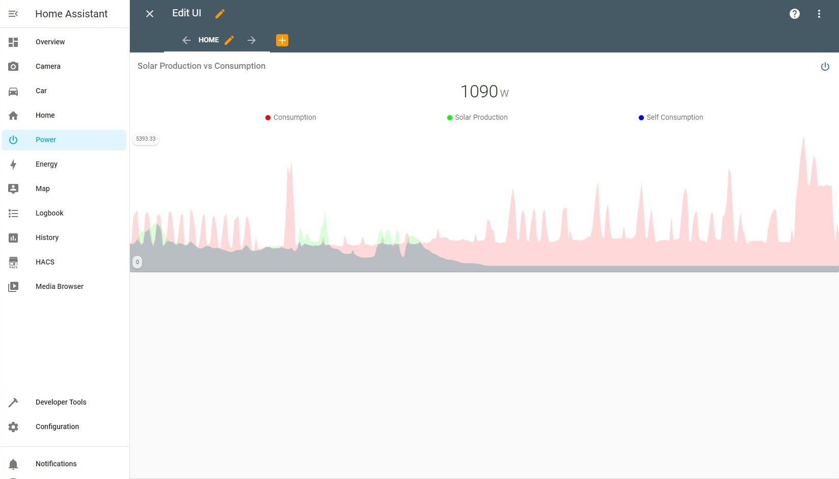
How can I get 3 graphs with non-opaque fill below each line, where each graph is overlaying the other? I have built this once in grafana and with this it is e.g. easy to see 1) what energy is consumed from the net, 2) what is solar-produced and self-consumed and 3) what is returned to the net.

I love mini-graph-card and tried to mimic the same. However, I get as far as what you see below and is more or less what you get out-of-the-box. It seems the fill is opaque and is mixing in with the other fills so it appears as grey where the 3 overlap. I have been playing with card-mod and tried to change the opacity for the 3 graphs but can’t get it to work.

You see it is still showing very faint colors where I would like these to be more solid.
Last I have tried is this:

style: |
  .fill--rect {
    opacity: 1.0;
  }

How can I get this to work if at all possible?

1 Like