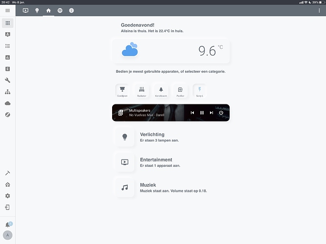
@N-l1 Hi I had a question about the scripting for the context information (like the Spotify ones). Is it also possible to have an ‘and’ variable set? So that you have two lines of text in the same entry.
For instance: Music is playing. The volume is at 10.
I have managed this by creating an extra content card under it, but that takes too much space. Is it possible to have multiple contents one line basically? What my main goal is, is to have as my welcoming message:
Good morning! Sarah is at home. The windows are open. The front door is open. The temperature is set at 20.
And if the door/windows are closed, that entry disappears.
Is this at all possible or am I forced to create a separate content card for each message under eachother?
Edit: I got it working partly. But I think also dissapearing states will be not possible, since it will be tied to different variables. But I will find out!
To have an ‘and’ variable it would be something like this:
{% if is_state('input_boolean.first', 'on') and is_state('input_boolean.second', 'on')%}
I’m not sure if you can have multiple templates in one line, but you can use a lot of ‘if…and…’ statements to achieve what you want.
Something like this:
Goedemorgen! {% if is_state('device_tracker.sarah', 'home' and
is_state('binary_sensor.window','on')%} Sarah is thuis. Het raam is open
{% elif is_state('device_tracker.sarah', 'home' and
is_state('binary_sensor.window','off')%} Sarah is thuis. {% endif%}
Thanks! Yeah I’ve been experimenting and had some stuff working, but I quickly realised I would need a lot of templates if I want the door/windows to appear/disappear. For now I’ll just stick with persons and the temperature, and will create a dedicated tab for sensors (like doors, windows, motion etc).
Quick update: I also added conditional media player cards for Chromecast/Spotify, AppleTV and PS4. They appear/disappear when something is playing/not playing. Tapping the media player directs to the correct tab where the entity is located. Everything is starting to look very clean and polished now
Also quick tip: use the Custom Layout Card so you have a clean and consistent experience with different displays
This is how it looks with vertical layout on my iPad Pro 12.9. I experienced heavy cropping and out of place cards on iPad (especially when using splitscreen). The vertical layout elimates all that. Granted, you have more useless space around the sides, but it looks way cleaner and consistent. Also, unless you have separate tabs with more cards for larger screens, you will have useless space anyway, but messier.
Ah that one. I decided to not use badges at all anymore so I didn’t understand you right away. But that badge is the Dark Sky sensor (0day forecast) which shows the current forecast. There are many variations for different forecasts.
After hou have integrated Dark Sky, you can use the sensor as a badge.
Can you share a bit of your code? Also can you make sure that it is currently day in you region, since the code will automatically change to a darker shadow at night
I don’t think it is a problem with the theme, since I also use the Google Home theme
It appears you have the sun below horizon automation activated while using a light day theme. Use a dark background for the dark theme and a light theme for light theme.
Go to developer tools and activate the sun.sun state to ‘above_horizon’. This will force the state of the sun (not in real life lol) which allows you to test light themes after the sun is down
Just have to chime in and say that this looks amazing! It makes me so happy to see that the user experience part of home automation (especially in a platform this big) is improving so much. Will definitely use this when I have the time to configure everything. A thousand thumbs up to you!
@N-l1 I want to thank you again for your previous help and effort. I learned some very important stuff by studying your code. I shaped my UI more and more and allthough it is different now, it was started as your Soft UI and is still inspired by some elements (especially the context aware concept.)
Here’s a preview of what I have created now, inspired by your work, Popup-cards of Custom Lovelace Card - Homekit style card and some creativity of my own. I have finedtuned a lot and a lot of cards are content aware/conditional. I heavily focus on visibility, usability and design. I also changed the codings so I can create custom themes I can activate as a button card and change everything on the fly with one user press.
Hi @ASNNetworks, that looks great! Looks like you have came a long way since you first started! Thanks for checking out my setup!
Best wishes!
Hi @Cadish, seems like you forgot the ‘’ (quotes) so it would be something like this. I don’t have any cover entity so I’m not sure if it will be ‘open’ or ‘on’. Try ‘on’ if this doesn’t work.