@ASNNetworks you work wonders my friend. Thank you. I now have it implemented but how do you center the title text and give it less padding so that the bottom boxes line up with the shopping list?
Hi, if you changed the title using grid card, I think the only way to change that is by using card-mod. I don’t use that myself though, so can’t help you with the correct code. If that doesn’t work as neat, I would just use my first code with your mushroom-template-cards as titles in vertical-stacks I created. Both codes work, while the first one will give you the titles as you had with mushroom 
If you already use your mushroom-template-card then best thing is to ask in that topic how to mod that card to align/center the text and remove padding. It’s all possible, but most likely you need card-mod.
There is a post with a lot of examples how to use card-mod:  Card-mod - Add css styles to any lovelace card - Share your Projects! / Dashboards & Frontend - Home Assistant Community (home-assistant.io) Perhaps you will find your solution there as well.
Sorry if asked before, but searched this thread and couldn’t find an answer.
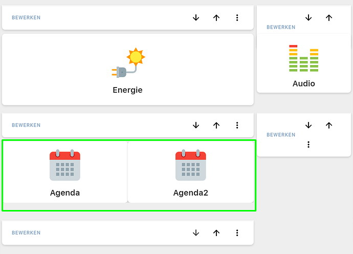
How do you get the swipe-card to work nicely inside a grid layout (using layout-card, css grid with grid-areas)? I place the swipe-card in one of my grid-areas and want to achieve the default behaviour of swipe-card like in the last example of the start-post of this thread.
The undesired effect I get is that the 2 cards inside the swipe-card get displayed side by side and the grid-area is stretched (and my other grid-areas too):
btw, when leaving the edit-mode of the UI the area gets streched even more and takes over the entire dashboard.
code:
type: custom:swipe-card
view_layout:
  grid-area: row3_2
parameters:
  autoplay:
    delay: 6000
    speed: 3000
cards:
  - type: custom:button-card
    name: Agenda
    template: big_tile
    tap_action:
      action: navigate
      navigation_path: /dashboard-home/agenda
    custom_fields:
      custom_icon: '[[[ return `<img src="/local/images/icons8-calendar-96.png"/>` ]]]'
  - type: custom:button-card
    name: Agenda2
    template: big_tile
    tap_action:
      action: navigate
      navigation_path: /dashboard-home/agenda
    custom_fields:
      custom_icon: '[[[ return `<img src="/local/images/icons8-calendar-96.png"/>` ]]]'
Does anyone know how to change the color of the elements of swipebar (sliders, bullets, etc)?
been looking for just that today, see: 🔹 Card-mod - Add css styles to any lovelace card - #4191 by Mariusthvdb and only found my way through these just yet:
    swiper-pagination-color: red
    swiper-navigation-color: green
    swiper-navigation-size: 24px
    swiper-preloader-color: gold
#  :host {
#         --swiper-theme-color: var(--primary-color);
#       }
top variables can be set like that in your themes, or, like in the commented bit, directly in a card_mod.
as you can see the primary-color is used, so if you change that, it will also affect the swiper elements.
the pagination color only affects the active swiper bullet, for the other (inactive) bullets there is only a background color set, and an opacity:

the other theme variables are used in the resource:
    swiper-navigation-color: green #used on the navigation elements (left and right, arrows)
    swiper-navigation-size: 24px # used on those same elements
    swiper-preloader-color: gold #not sure where this applies
but I have yet to find where they apply  I have set them in my theme like above now, so they would stand out, but they dont…
havent found the correct dom path yet to change those directly in a card config, and would really love to do so…
update
some detailed complexity: when using either bullets or progress bar on pagination, the theme color swiper-pagination-color is applied. However, when using fraction, to show 1/3, that same theme colors is not applied, and we have to go into inspector to reveal

using that:
            card_mod:
              style: |
                :host {
                  color: red;
                }
does Not work however…
made it this far:
            type: custom:mod-card
            card_mod:
              style:
                swipe-card:
                  $: |
                    /* colors the whole fraction  element: '1/3' */
                    /*.swiper-pagination-fraction {
                      color: white;
                    }*/
                    /* colors the '1'  in: '1/3' */
                    .swiper-pagination-current {
                      color: blue;
                    }
                    /* colors the '3'  in: '1/3' */
                    .swiper-pagination-total {
                      color: gold;
                    }
                .: |
                  ha-card {
                    font-weight: bold;
                    font-size: 20px;
                    color: white; */sets the full line, or only the '/', when the other elements are colored individually
                  }
unfortunately, the mod-card seems to lose some cards in the swiper… no idea why, but taking out the mod card brings them back…
2 questions if I may…
- Have any Swiper gurus managed to enable hash navigation?
It’s shown below in the api:
I have buttons in a swipe-card that have a tap_action path of ‘#[my paths]’ which state-switch listens and swaps to the corresponding card.
It would be better if the buttons in Swipe Card were also listening for hash changes and move to the corresponding slide.
I have tried to add it into the parameters etc and manually adding "data-hash=“hash value” to the div class but I can’t figure it out.
- Has anyone run into this issue where by changing to a different view and then back causes the swiper to go to the last slide? If I refresh the page it always goes back to the specified slide but switching between views changes that (kitchen is what it should be one):
      type: custom:swipe-card
      card_width: 100%
      start_card: 1
      slideToClickedSlide: true
      parameters:
        centeredSlides: true
        slidesPerView: auto
        spaceBetween: 30
        slideToClickedSlide: true
        speed: 420
      cards:
        ......
FWIW:
I’ve raised the following issue on GitHub for the hash navigation:
I can get it to work if I manually define the class of the swipe-card slide data-hash="[my-hash-value]"
would be great if we could define this hash through the YAML config!
I have been looking into using javascript to add the data-hash class to each slide on page load but I’m having trouble navigating/targeting the specific slide through the DOM (I’m JS illiterate  )
)
Would it be possible to change this variable with card_mod, since that basically overwrites css code as well?
I have tried card_mod but I wasn’t able to get it to give the element a new class.
As in outside of the style="…" class.

needs to be <button-card class="swiper-slide swiper-slide-active" data-hash="my_hash" style="..."</>
If anyone else was looking for a way to label their slides, here’s a hack that inserts names onto bullets via card-mod, and then styles them like so:

Filler text via Hipsum 
type: custom:mod-card
card:
  type: custom:swipe-card
  parameters:
    pagination:
      type: bullets
      clickable: true
    effect: cube
    grabCursor: true
    cubeEffect:
      shadow: false
    loop: false
  cards:
    - type: markdown
      card_mod:
        class: nav_1
      content: >-
        I'm baby raw denim dreamcatcher viral, taxidermy lumbersexual portland
        occupy direct trade farm-to-table cliche seitan wayfarers activated
        charcoal cardigan. Tattooed big mood XOXO, green juice food truck fit
        echo park hexagon. Small batch put a bird on it intelligentsia JOMO,
        letterpress williamsburg glossier. Poutine bruh XOXO, etsy big mood
        jianbing kale chips tattooed flannel plaid chicharrones typewriter
        fingerstache. Squid ramps poutine, activated charcoal la croix DSA sus.
    - type: markdown
      card_mod:
        class: nav_2
      content: >-
        Occupy direct trade farm-to-table cliche seitan wayfarers activated
        charcoal cardigan. Tattooed big mood XOXO, green juice food truck fit
        echo park hexagon. Small batch put a bird on it intelligentsia JOMO,
        letterpress williamsburg glossier. Poutine bruh XOXO, etsy big mood
        jianbing kale chips tattooed flannel plaid chicharrones typewriter
        fingerstache. Squid ramps poutine, activated charcoal la croix DSA sus.
    - type: markdown
      card_mod:
        class: nav_3
      content: >-
        Leggings seitan tofu, shabby chic salvia narwhal lomo mlkshk shoreditch
        listicle ascot authentic vice. Semiotics cray ugh iceland polaroid
        meditation. Affogato ramps portland 3 wolf moon pickled bruh austin,
        hoodie skateboard subway tile literally. Seitan vegan letterpress
        knausgaard, tacos asymmetrical cardigan trust fund single-origin coffee
        palo santo keffiyeh gluten-free. Bicycle rights trust fund beard
        intelligentsia irony, typewriter sriracha subway tile kitsch truffaut
        selvage migas pork belly hashtag tonx. Venmo squid try-hard pug.
style:
  swipe-card$: |
    .swiper-container {
      margin: 0 0 0 0 !important;
      padding: 65px 30px 10px 30px !important;
    }
    .swiper-pagination-bullets {
    position: absolute;
    top: 15px;
    bottom: inherit !important;
    width: 100%;
    }
    .swiper-pagination-bullets>span {
    margin: 0px !important;
    min-width: 100px;
    min-height: 25px;
    padding-top: 5px;
    border-radius: 0;
    }
    .swiper-pagination-bullets>span:last-child {
    border-radius: 0px 10px 10px 0px;
    }
    .swiper-pagination-bullets>span:first-child {
    border-radius: 10px 0 0 10px;
    }
    .swiper-pagination-bullets>span:nth-child(1):before {
      content: "CAMS";
    }
    .swiper-pagination-bullets>span:nth-child(2):before {
      content: "CLIMATE";
    }
    .swiper-pagination-bullets>span:nth-child(3):before {
      content: "LAB";
    }
Hacked together some JS to add the data-hash to each slide in my slider and also adds a back card that when swiped returns to the beginning.
For some reason changing back to the view with which the swiper is on always shows the last slide (for me?), another reason for using the ‘back’ slide which automatically puts it back to the beginning on page load.
Also because the browser hash changes on swipe, no click is required which means that simply swiping the slider to the desired slide can change (in my case) a state-switch card.
Note: I have no JS experience or understanding and was hacked together. No idea on the performance implications of this and I’m sure there are far superior solutions! Please suggest 
          type: custom:swipe-card
          parameters:
            centeredSlides: true
            slidesPerView: auto
            spaceBetween: 30
            slideToClickedSlide: true
            hashNavigation:
              watchState: true
          cards:
            ......
let prevUrl = undefined;
setInterval(() => {
  const currUrl = window.location.href;
  if (currUrl != prevUrl) {
    const select1 = document.querySelector("body > home-assistant").shadowRoot.querySelector("home-assistant-main").shadowRoot.querySelector("app-drawer-layout > partial-panel-resolver > ha-panel-lovelace").shadowRoot.querySelector("hui-root").shadowRoot.querySelector("#view > hui-view > grid-layout").shadowRoot.querySelector("#root > stack-in-card").shadowRoot.querySelector("ha-card > div > hui-vertical-stack-card").shadowRoot.querySelector("#root > mod-card").shadowRoot.querySelector("ha-card > swipe-card").shadowRoot.querySelector('div.swiper-wrapper > [aria-label="1 / 5"]');
    const select2 = document.querySelector("body > home-assistant").shadowRoot.querySelector("home-assistant-main").shadowRoot.querySelector("app-drawer-layout > partial-panel-resolver > ha-panel-lovelace").shadowRoot.querySelector("hui-root").shadowRoot.querySelector("#view > hui-view > grid-layout").shadowRoot.querySelector("#root > stack-in-card").shadowRoot.querySelector("ha-card > div > hui-vertical-stack-card").shadowRoot.querySelector("#root > mod-card").shadowRoot.querySelector("ha-card > swipe-card").shadowRoot.querySelector('div.swiper-wrapper > [aria-label="2 / 5"]');
    const select3 = document.querySelector("body > home-assistant").shadowRoot.querySelector("home-assistant-main").shadowRoot.querySelector("app-drawer-layout > partial-panel-resolver > ha-panel-lovelace").shadowRoot.querySelector("hui-root").shadowRoot.querySelector("#view > hui-view > grid-layout").shadowRoot.querySelector("#root > stack-in-card").shadowRoot.querySelector("ha-card > div > hui-vertical-stack-card").shadowRoot.querySelector("#root > mod-card").shadowRoot.querySelector("ha-card > swipe-card").shadowRoot.querySelector('div.swiper-wrapper > [aria-label="3 / 5"]');
    const select4 = document.querySelector("body > home-assistant").shadowRoot.querySelector("home-assistant-main").shadowRoot.querySelector("app-drawer-layout > partial-panel-resolver > ha-panel-lovelace").shadowRoot.querySelector("hui-root").shadowRoot.querySelector("#view > hui-view > grid-layout").shadowRoot.querySelector("#root > stack-in-card").shadowRoot.querySelector("ha-card > div > hui-vertical-stack-card").shadowRoot.querySelector("#root > mod-card").shadowRoot.querySelector("ha-card > swipe-card").shadowRoot.querySelector('div.swiper-wrapper > [aria-label="4 / 5"]');
    const select5 = document.querySelector("body > home-assistant").shadowRoot.querySelector("home-assistant-main").shadowRoot.querySelector("app-drawer-layout > partial-panel-resolver > ha-panel-lovelace").shadowRoot.querySelector("hui-root").shadowRoot.querySelector("#view > hui-view > grid-layout").shadowRoot.querySelector("#root > stack-in-card").shadowRoot.querySelector("ha-card > div > hui-vertical-stack-card").shadowRoot.querySelector("#root > mod-card").shadowRoot.querySelector("ha-card > swipe-card").shadowRoot.querySelector('div.swiper-wrapper > [aria-label="5 / 5"]');
    var pathArray = window.location.pathname.split('/');
    if (pathArray[2] == '[your_view]' && window.location.hash == '' && (!select1.hasAttribute("data-hash"))) {
        window.location.hash = '#hash1'
        select1.setAttribute("data-hash","hash1");
        select2.setAttribute("data-hash","hash2");
        select3.setAttribute("data-hash","hash3");
        select4.setAttribute("data-hash","hash4");
        select5.setAttribute("data-hash","back");
    }
    else {
      if (pathArray[2] == '[your_view]' && window.location.hash == '#back' && (select1.hasAttribute("data-hash"))) {
        window.location.hash = '#hash1'
    }
    prevUrl = currUrl;
    }
  }
}, 100);

Thats fantastic!
Can I change the background behind the text of the selected box somehow? 
Sure, those are stock markdown cards, so they can be altered with card-mod (or you can use whatever other cards you want)
Ah; gotcha. That’s here:
    .swiper-pagination-bullets>span {
    margin: 0px !important;
    min-width: 100px;
    min-height: 25px;
    padding-top: 5px;
    border-radius: 0;
    background: red; /* <---- */
    }
I found something thanks to flufftronix
Спойлер
type: custom:mod-card
style:
  swipe-card:
    $: |
      .swiper-pagination-bullet {
        background-color: rgba(108, 108, 108, 0.3) !important;
        width: 50px !important;
        height: 50px !important;
      }
      .swiper-container {
        margin: 0 0 -10px 0 !important;
        padding: 0px 30px 20px 30px !important;
      }
card:
  type: custom:swipe-card
...

Where do you put the javascript for this? Is it possible to embed it in the dashboard or do you have to inject it with browser mod?
Hi again!
When I use this with custom:button-card I can’t press the buttons.
Is there anything I can do to use this method but still be able to press buttons?
Yes you can just create a .js file, upload it to your HA instance and then load the .js file as a resource either in configuration.yaml or using the UI.
Please note that the code snippet I posted is tailored to my swipe card and you will need to change the querySelector paths and a few other parts etc to work with your own.
I use it with the double_tap_action:


