Could you please share the code of your Lovelace?
Hey Plouf34👋
Here is my lovelace file
button_card_templates: !include lovelace/button_card_templates/button_card_templates.yaml
title: 'Home'
views: !include_dir_merge_list lovelace/views/
This is how my lovelace folder is organized

Guys, the code is shared in the first post.
4 Likes
I love how it looks on you! I need help where I have to integrate the “template” I was looking in the documentation of “template” but I can’t find how it works or where I could place the file. I hope you can help me. Thanks!
playing some more with this, I just got to say I love the use of those nice icons in the buttons. Forgot I had 1 of those myself,
    - type: custom:button-card
      name: 🎂 ♡♡ 🍰  🎈 Celebrations 🎈 🍰  ♡♡ 🎂
but now I see you explicitly use them (in the pilule templates), will re-visite that frontend enhancement.
so cool. nice and easy colored icons, without the hassle of needing to create these in svg ourselves.
this really should get some more wide-spread attention 
edited your chip template and button a bit:
template:
chip:
  variables:
    view: >
      [[[ return window.location.pathname.split('/')[2]; ]]]
  tap_action:
    action: more-info
  show_icon: false
  show_name: false
  show_state: false
  show_label: true
  size: 80%
  styles:
    img_cell:
      - width: 24px
    card:
      - border-radius: 30px
      - box-shadow: var(--box-shadow)
      - height: 36px
      - width: auto
      - padding-left: 6px
      - padding-right: 6px
    grid:
      - grid-template-areas: '"l"'
    label:
      - justify-self: center
      - padding: 0px 6px
      - font-weight: bold
      - font-size: 14px
button:
type: custom:button-card
template: chip
entity: weather.buienradar
hold_action:
  action: navigate
  navigation_path: >
    [[[ return variables.view != 'weer_klimaat'
        ? '/lovelace/weer_klimaat' : 'null'; ]]]

label: |
  [[[
    var inter = states['sensor.temp_current'].state;
    var exter = states['sensor.temperatuur_living'].state;
    var condition = states['sensor.dark_sky_icon'].state;
    var mapper = {'clear-day':'☀️','clear-night':'🌙','rain':'🌧️',
                  'snow':'❄️','sleet':'❄️','wind':'🌫️','fog':'🌫️',
                  'cloudy':'☁️','partly-cloudy-day':'⛅️','partly-cloudy-night':'⛅'};
    var icon = mapper[condition] ? mapper[condition] :'☀️';
    return icon + ' ' + inter + '° / ' +  exter + '°' ;
  ]]]
allowing for adjusted navigation with an entity for the more-info, so we have useful actions for both
2 Likes
Hey jonathanathe 
You can write the content of the template file in your ui-lovelace.yaml file or include the file like this
button_card_templates: !include button_card_templates.yaml
1 Like
Great work - love the simplicity.
Could you post an example of the YAML needed for a temperature line chart - my attempts using just the “graph” template render incorrectly.
Hey Tom
Here is an example
- type: 'custom:button-card'
  template: graph
  variables:
    entity: "sensor.fibaro_multisensor_salon_temperature"
    color: "var(--google-blue-500)"
    name: "Température"
Fantastic - works great!
@tben can you maybe share your full config via (for example) github. I’d like to know how your configuration.yaml is looking, and your ui-lovelace with the other pages that you created (beside home)
thanks!
3 Likes
Hi Mart
Here are the 4 pages
I also edited my first post
4 pages
 01_home.yaml
 02_temperature.yaml
 03_consommation.yaml
 04_localisation.yaml
11 Likes
Merci! Beautiful design
1 Like
this is a beautiful template, i finally got myself to manage my dashboard just because of this template.
Awesome! 
But I have a problem with the bordures template, is this correct?
  bordures:
    styles:
      card:
        - width: 0px
Card:
entity: sensor.dummy_sensor
template:
  - bordures
type: custom:button-card
tap_action:
  action: toggle
For me it shows nothing more as soon as I use this template. everything else works great so far.
Hi D0doooh
A problem with the bordures template? The bordures template just allows me to leave space between the edge of the screen and the cards

If you don’t see it it’s normal!
If there is no space, there is a problem
1 Like
Great. Simple and beautiful.
After a few experiments and not so beautiful designs by myself this design is perfect for my needs.
Thanks for sharing. And answering questions.

playing some more, I added the chips in a swiper, a bit of a mixed set of feelings (sometimes the swiper behaves counter intuitive… and the hold_action isnt executed )on Desktop, I discovered today it IS executed on iPhone…) but it is kind of nice to be able to swipe a few main functions in the Home:
  - type: custom:swipe-card
    parameters:
#      simulateTouch: true
      spaceBetween: 8
#      effect: coverflow
      freeMode: true
#      grabCursor: true
#      centeredSlides: false
#      slidesPerView: 4
    cards:
      - !include /config/lovelace/includes/include_chip_temperature.yaml
      - !include /config/lovelace/includes/include_chip_presence.yaml
      - !include /config/lovelace/includes/include_chip_energy.yaml
      - !include /config/lovelace/includes/include_chip_alarm_clock.yaml
with my shortcut menu bar, to compare size
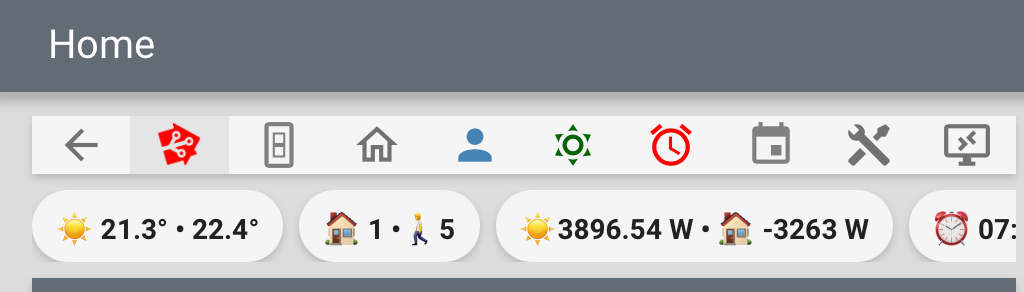
swipe left

a simple conditional icon for alarm
btw where do you pick your colorful icons? I took several from the WhatsApp app, but am looking for more tbh, like solar grid in the energy consumption settings to name but one.
1 Like
Really cool! Where do you find those nice colored icons?
as said above, the icons in the chips are picked from WhatsApp app and copied form the config by @tben himself.
the colored icons in my shortcut menu bar are regular mdi icons, colored in the button-templates of the custom button-cards. you can check them out here Shortcut menu bar · GitHub
Aren’t they just emoji? I use emoji instead of text myself in some cards. Looks like emoji, or are you talking about other icons I’m missing?
1 Like